Interior Design
Full-service decorating that blends high and low, vintage finds with modern pieces for spaces that feel personal and collected.
Learn More
DIY Projects
Step-by-step tutorials for refinishing furniture, sewing pillows, styling bookshelves, and transforming rooms on a budget.
Learn More
E-Decorating
Personalized design guidance delivered online — perfect for clients anywhere in the world who want a professional eye.
Learn More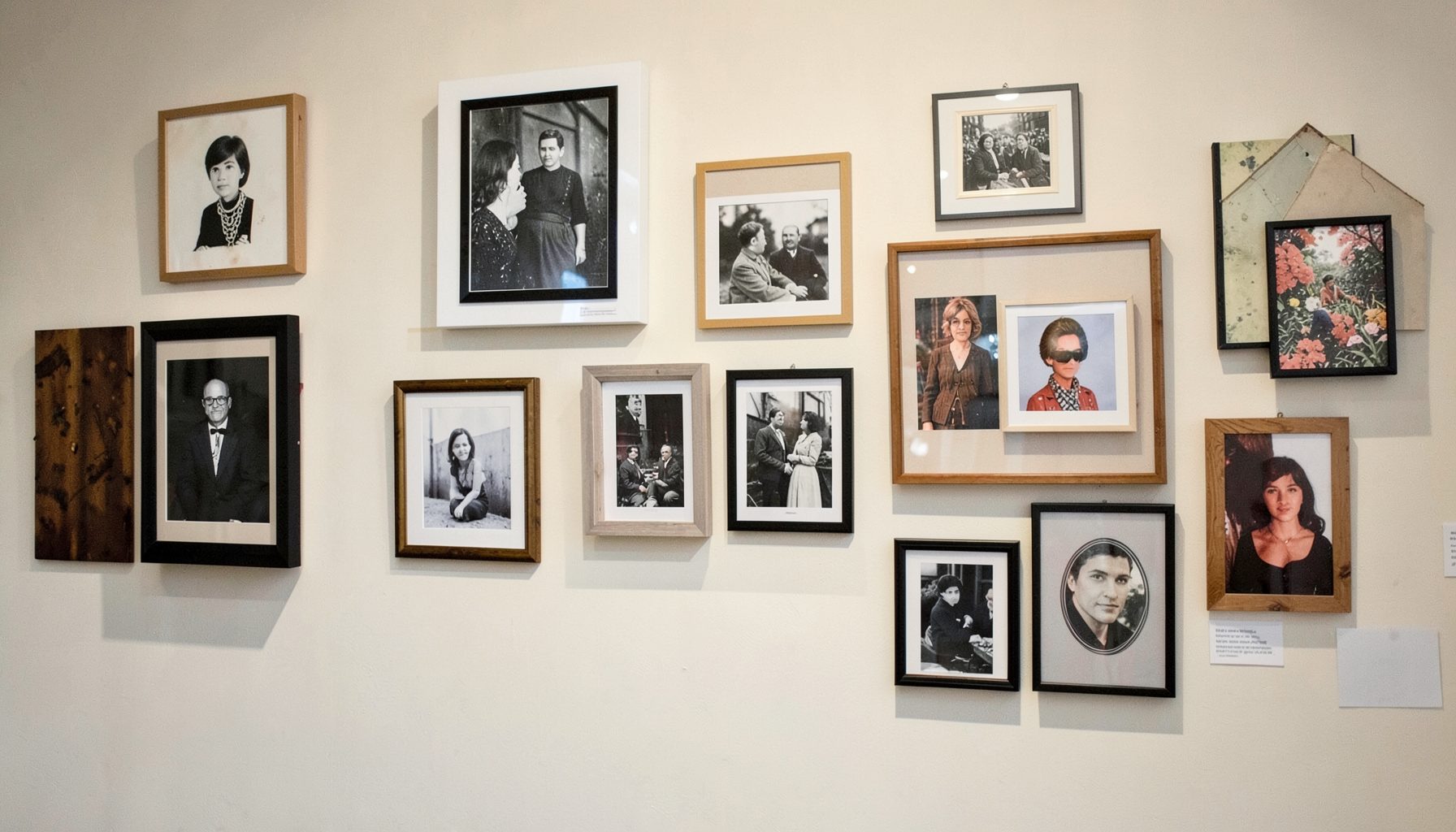
Portfolio
Browse completed room makeovers, before-and-after transformations, and styling projects from Bay Area homes.
Learn More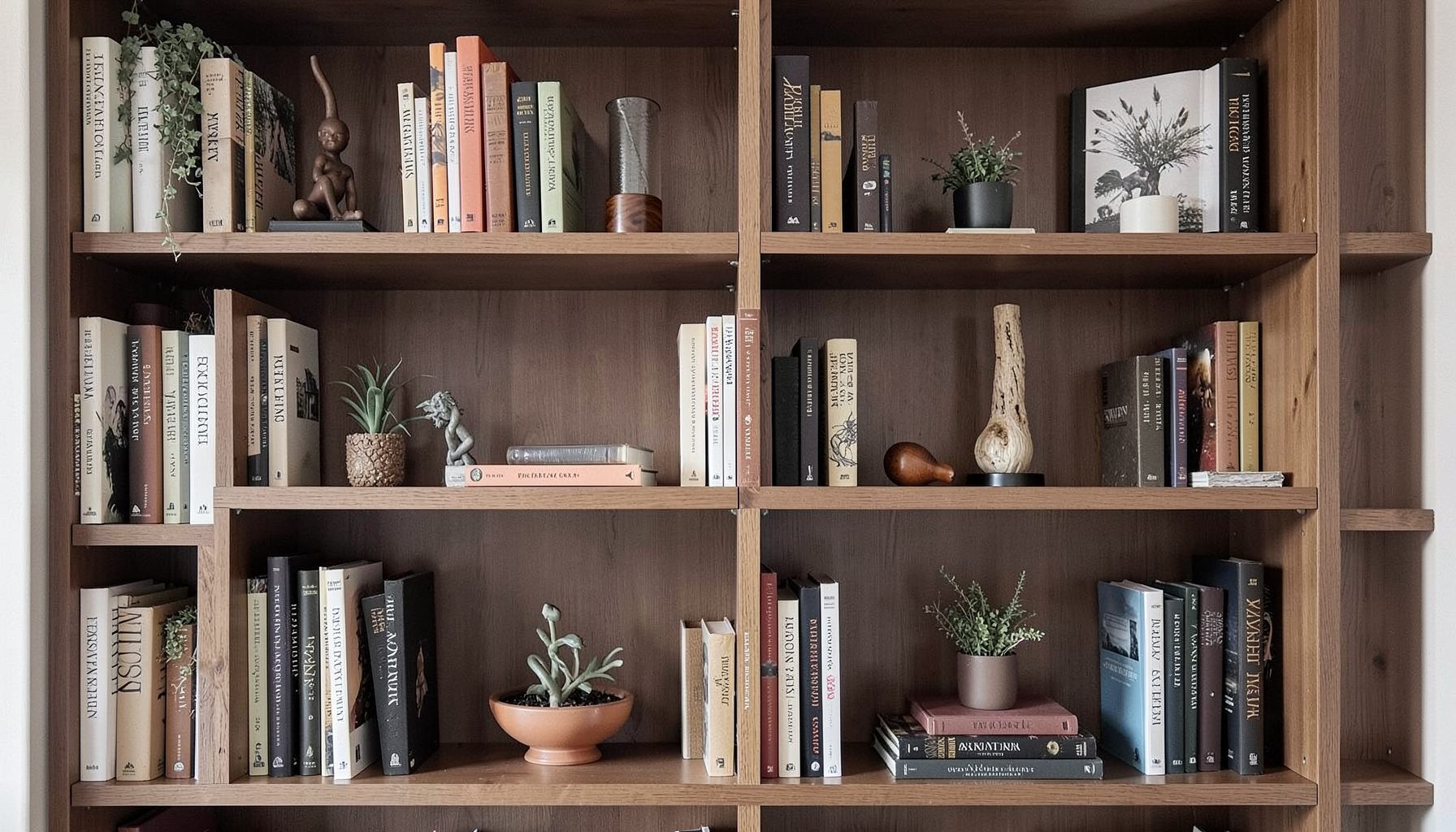
Blog
Interior design inspiration, fashion finds, entertaining ideas, and peeks into real home renovations and styling projects.
Learn More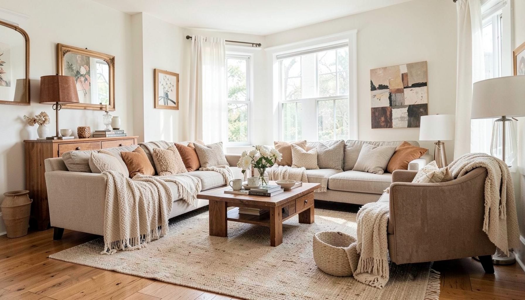
Downloads
Free curated resources for home decorating and design — guides, checklists, and inspiration to help you get started.
Learn MoreHow to Create A Family Photo Gallery That Feels Intentional
A hallway can do far more than connect one room to another. With the right arrangement, it becomes a warm visual record of family life: grandparents laughing at a barbecue, children muddy from a beach day, a wedding portrait, or a faded holiday photograph from long before anyone lived in the house. A gallery of family photos in a hallway should feel personal, yet composed enough to belong with the rest of the interior.
The key is to treat the display as part of the architecture rather than a collection of frames added whenever a new picture is printed. Scale, spacing, colour, lighting, and the character of the photographs all matter. Whether you live in a narrow Sydney terrace, a Melbourne weatherboard, or a modern Brisbane home, a thoughtful photo wall can make an often-overlooked passage feel layered, welcoming, and distinctly yours.
Start With The Hallway Itself
Before choosing frames, study the hallway as a room. Notice its width, ceiling height, skirting boards, door openings, flooring, and natural light. A long corridor can support a generous linear arrangement, while a compact passage may need a smaller vertical cluster that leaves plenty of breathing space around door handles and light switches. Measure the available wall area from the top of the skirting board to the level of nearby door frames.
Australian homes often have hallways that are narrower than they first appear, particularly in older terraces and cottages. A display that looks balanced in a spacious showroom can feel crowded in a Darlinghurst terrace or a compact apartment in inner Melbourne. Keep the outer edge of the arrangement clear of corners, architraves, and door swings. If people regularly carry washing baskets, school bags, or groceries through the space, allow a comfortable passage rather than pushing frames too far into the walkway.
Light deserves careful attention as well. Strong afternoon sun can fade prints, especially behind glass, while Brisbane’s humidity may affect paper, mats, and timber over time. Choose archival-quality prints where possible, use UV-filtering glazing for treasured originals, and avoid placing valuable photographs on a wall that receives intense direct sunlight. A hallway gallery should be enjoyed every day, so practical durability is part of the design.
Build A Cohesive Frame Collection
A family photo wall does not need every frame to match. In fact, a mix of timber, aged brass, painted wood, and simple black frames can create the collected quality that makes a home feel established. The composition becomes intentional when one or two elements repeat. You might use the same warm oak tone throughout, repeat a slim black edge, or keep all mats white even when the frames vary.
Think about the mood of the home before settling on a finish. Pale timber works beautifully with relaxed coastal interiors and light-filled Queensland houses. Dark walnut or stained oak brings depth to a Victorian-era property, while brushed brass can connect the gallery to hallway lighting or antique furniture. If the space already contains patterned rugs, colourful artwork, or ornate mirrors, quieter frames may provide a visual pause.
Photographs themselves can supply another layer of consistency. Black-and-white images are naturally cohesive, but a gallery can feel more intimate when colour photographs sit beside monochrome portraits. To unite different eras, print images in a similar tonal range or choose a restrained palette: sun-washed neutrals, soft greens, warm browns, and muted blues. A photograph from a recent family holiday can sit comfortably beside a scanned sepia wedding portrait when the surrounding presentation gives both images equal care.
Choose A Layout Before Making Holes
The most reliable way to plan a photo display is to create full-size paper templates. Cut pieces of kraft paper or newspaper to match each frame, mark the hanging point on the back, and use painter’s tape to arrange them on the wall. This lets you test the overall silhouette from the hallway entrance and from the adjoining rooms. It also reveals whether the arrangement feels too low, too high, too heavy on one side, or awkward around a doorway.
A formal grid suits families who prefer order and repetition. Aligning the outer edges and keeping consistent gaps gives even a varied collection a calm, architectural quality. A salon-style arrangement feels more relaxed and collected, with different frame sizes gathered around a central image. It works particularly well in homes that combine vintage furniture with contemporary pieces, although the spacing still needs to be deliberate rather than accidental.
For a long hallway, a horizontal sequence can guide the eye from one end to the other. Place the centre of the arrangement around average eye level, usually close to 145 to 155 centimetres from the floor, then adjust for the household and surrounding architecture. In a high-ceilinged home, the display may need to sit slightly higher to relate to tall doors and mouldings. In a rental, removable hanging strips can help, but check their weight limits and the condition of the paint before trusting them with heavy glass frames.
Give The Display A Personal Rhythm
A gallery feels more meaningful when it tells a story rather than presenting a random archive. You could arrange photographs chronologically, beginning with older generations and moving towards the present, or group them by family branch, place, or shared occasions. Another approach is to create visual rhythm: a portrait followed by a landscape, a close-up beside a group photograph, and a quiet image balanced by one full of movement.
Avoid filling every frame with a formal face looking directly at the camera. Include small details that express the family’s life: a child’s hands holding a seashell, a dog asleep on the sofa, cousins gathered around a birthday cake, or a favourite beach seen across several years. These images bring warmth and variation to the display, particularly when the hallway is viewed in passing rather than studied as a single composition.
Leave room for the collection to evolve. Rather than filling every available centimetre, keep one or two spaces open for future photographs. This prevents the display from looking complete in a rigid way and gives new memories somewhere to belong. For a particularly personal touch, add one small handwritten note, a pressed botanical print, or a child’s drawing in a frame that matches the collection. The extra piece should support the family story, not turn the wall into a general noticeboard.
Add Lighting And Styling Details
Hallway lighting can determine whether a photo wall feels polished or flat. If the existing ceiling fixture casts harsh shadows, consider replacing it with a warmer globe or adding a discreet picture light above the arrangement. Wall sconces can be especially effective in a wider passage, though their position should be planned before hanging the frames. Warm-white bulbs generally make timber, sepia photographs, and skin tones feel more inviting than cool blue-white light.
A narrow console, small stool, or slim ledge can anchor the gallery if the hallway has enough width. Style it sparingly with a ceramic bowl for keys, a small lamp, or a vase of seasonal branches. In a very tight passage, skip the furniture and let the photographs carry the focus. The goal is to create a layered entrance, not an obstacle course between the front door and the kitchen.
If your home needs a custom solution for an unusually tall or awkward wall, look at how built-in projects use vertical space; this loft-bed project offers useful inspiration for thinking about structure, timber, and practical joinery. A simple timber picture ledge or shallow panelled backing can give a family display a considered architectural setting, especially in a newer Australian home where the hallway lacks original detailing.
Styling should also reflect how the house is actually used. In many Australian households, the entry and hallway absorb the rush of the school run, the post-work arvo, and weekend visitors arriving with sandy shoes or shopping bags. Choose frames with secure fixings, wipeable finishes, and glazing that can be cleaned easily. A gallery that survives everyday life will always feel more authentic than one that looks beautiful but needs constant protection.
Install Carefully And Edit Over Time
Once the paper layout feels right, mark each hanging point clearly and use fixings suited to the wall. Plasterboard, brick, concrete, and timber-lined walls each require a different approach. In older homes, walls may not be perfectly straight, so check the alignment with a spirit level rather than relying on the skirting board or ceiling line. For heavier frames, secure fixings into studs where possible or use appropriate masonry anchors.
Hang the largest or most important photograph first, then build around it. Keep the gaps measured rather than estimating by eye, especially if you are creating a grid. Small differences become obvious in a corridor because the viewer sees the arrangement in sequence. Step back regularly and check the gallery from both ends of the hallway, including the view from the living room or front door.
Once the collection has been in place for a few weeks, edit it with fresh eyes. Remove a frame that feels too similar to another, replace a faded print, or shift one image if the balance seems heavy. Family photographs carry emotional value, but the display still benefits from restraint. A smaller group with room around each image often has greater impact than a wall packed from skirting to ceiling.
The finished arrangement should feel as though it belongs to the people who live there and to the house that holds their stories. It can be refined without becoming precious, personal without looking disorderly, and collected without requiring every frame to come from the same shop. Begin by measuring the clearest hallway wall and marking its usable width, then create paper templates for your first arrangement.

Recent Projects