Interior Design
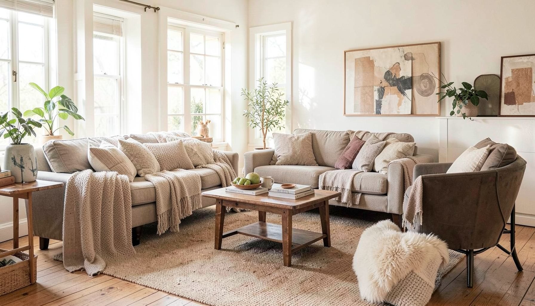
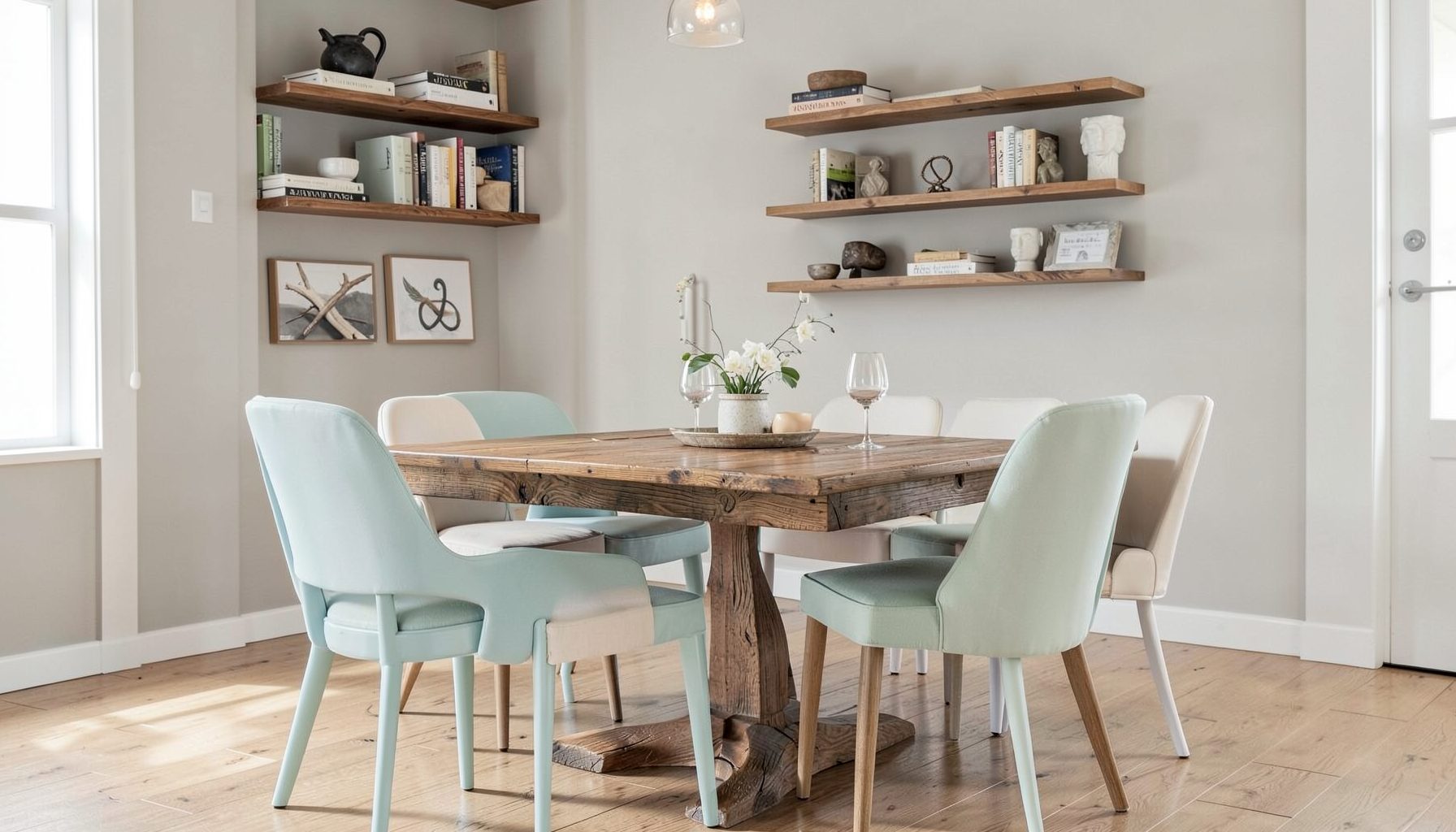
Full-service decorating that blends high and low, vintage finds with modern pieces for spaces that feel personal and collected.
Learn More
DIY Projects
Step-by-step tutorials for refinishing furniture, sewing pillows, styling bookshelves, and transforming rooms on a budget.
Learn More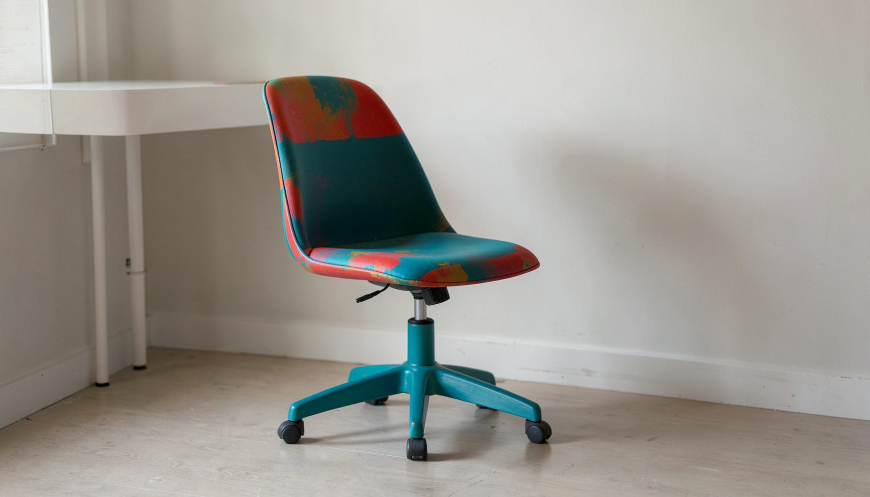
E-Decorating
Personalized design guidance delivered online — perfect for clients anywhere in the world who want a professional eye.
Learn More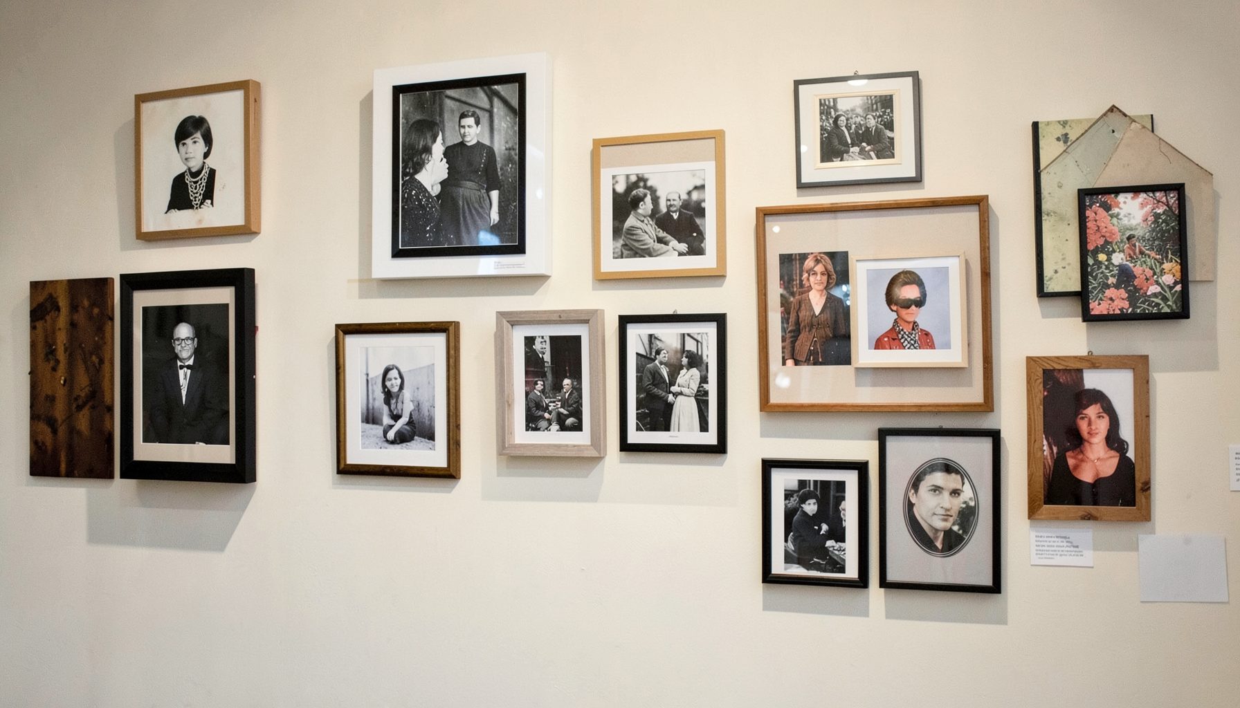
Portfolio
Browse completed room makeovers, before-and-after transformations, and styling projects from Bay Area homes.
Learn More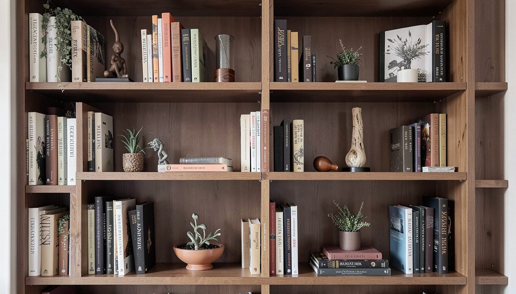
Blog
Interior design inspiration, fashion finds, entertaining ideas, and peeks into real home renovations and styling projects.
Learn More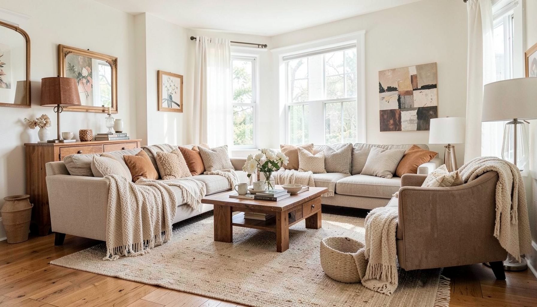
Downloads
Free curated resources for home decorating and design — guides, checklists, and inspiration to help you get started.
Learn MoreCreating a Monochromatic Bedroom with Subtle Texture Variations
A monochromatic bedroom can feel calm, generous and quietly sophisticated without relying on a single flat shade. The most successful rooms use a family of related colours, then create depth through linen, timber, boucle, aged metal, wool and softly patterned textiles. This approach suits both contemporary apartments and older Australian homes, where natural light, ceiling heights and architectural details can vary dramatically from room to room.
The aim is not to make every surface identical. Instead, choose one tonal direction and allow its light, mid and deep versions to move across the walls, bedding, window treatments and furniture. A collected look emerges when modern pieces sit beside vintage finds, practical storage and objects with personal meaning.
Choose a tonal direction
Begin with the mood you want the room to hold. Warm whites, sand, oatmeal and mushroom create a soft neutral bedroom, while layered olive, sage and eucalyptus bring an organic quality. Deep blue-grey, ink and washed denim feel cocooning, particularly in a room with generous daylight. Blush, terracotta and clay can also work as a restrained monochromatic palette when balanced with timber and chalky finishes.
Study the bedroom at different times of day before committing to paint. A cool grey that appears elegant in a Melbourne showroom may feel icy under southern light, while a creamy beige can turn noticeably yellow in a Brisbane room flooded with afternoon sun. In Sydney or Perth, strong north-facing light may intensify warm colours, so test large sample boards against the actual walls rather than relying on small paper chips.
A useful palette includes three or four related values: a light background, a middle tone for upholstery or curtains, a deeper shade for timber, artwork or accents, and perhaps one softened highlight. The colours should sit close enough together to feel connected, but not so closely that the room loses visual definition.
Build depth with wall and ceiling colour
Paint is the broadest colour field in a bedroom, so it establishes the foundation for every other decision. Using a slightly deeper shade on the ceiling can make a large room feel more intimate, while a pale ceiling keeps a compact bedroom open. Painting the skirting boards and architraves in a related tone rather than stark white gives the space a more enveloping, tailored appearance.
Flat, eggshell and low-sheen finishes each contribute a different quality. A low-sheen wall finish is generally practical for Australian homes because it can be wiped more easily than a completely flat coating, while a matte ceiling prevents distracting reflections. Keep the finish consistent across adjoining walls, especially in open-plan apartments where the bedroom may be visible from a hallway or living area.
Wallpaper can add a tonal pattern without breaking the colour story. Look for designs with barely visible stripes, botanical forms or irregular brush marks. A grasscloth-style texture, whether natural or vinyl, introduces shadow and movement while remaining quiet. In humid areas such as coastal Queensland, check the manufacturer’s care instructions and ventilation requirements before choosing natural wallcoverings.
Layer tactile materials
Texture is what prevents a single-colour bedroom from looking unfinished. Start with the largest tactile elements: a linen duvet cover, a wool or cotton rug, upholstered bedhead and curtains with a little body. Then add smaller contrasts such as a knitted throw, washed velvet cushion or hand-thrown ceramic lamp base. Each material should react differently to light, even when the colours are nearly identical.
Australian bedrooms often need to accommodate both warm summers and cooler winter nights. A cotton quilt, lightweight blanket and breathable linen sheets are more adaptable than one heavy layer, particularly in homes that rely on ceiling fans or split-system air conditioning. In cooler regions, a wool blanket folded across the foot of the bed adds insulation as well as a rich, nubby surface.
Vary the scale of the weave. Fine cotton percale beside open linen, a chunky wool throw beside smooth timber and a softly brushed fabric beside polished metal create gentle friction. Avoid buying every item from one collection, as matching sets tend to flatten the room. A vintage bedside table, a contemporary lamp and a simple woven basket can make the palette feel collected rather than staged.
Shape natural and artificial light
Lighting determines whether subtle texture can actually be seen. Daylight grazing across linen or plaster highlights small variations, while a single overhead fitting can leave the room visually dull. Use at least three sources: ambient light, reading light and low-level decorative light. Wall sconces, bedside lamps and a small floor lamp create useful pools of illumination at different heights.
Window treatments deserve careful attention. Sheer curtains soften bright Australian sun and protect flooring, artwork and timber from ultraviolet exposure, while blockout lining supports sleep in city bedrooms affected by street lighting. In a north-facing room, layered curtains allow the colour scheme to remain soft without sacrificing comfort. In a darker south-facing room, choose fabrics with a slight sheen or open weave to make the available light feel more active.
For a bedroom reading corner, position a chair where it benefits from daylight without obstructing circulation or a wardrobe door. A compact table, adjustable lamp and small footstool can turn an unused corner into a practical retreat; this reading nook guide offers useful direction for fitting one into a room without making it feel crowded.
Select furniture with tonal contrast
Furniture should support the palette while preventing it from becoming visually monotonous. In a warm neutral room, pale oak, smoked timber and natural cane can sit together because their grain provides variation. In a blue-grey bedroom, dark timber or painted cabinetry gives the eye an anchor. A stone, travertine or ceramic bedside table can introduce a harder surface against upholstered furniture.
The bed is usually the dominant piece, so consider its silhouette as carefully as its colour. A curved upholstered headboard softens a boxy room, while a simple timber bed allows textured bedding to take the lead. If the bedroom is narrow, choose floating or slimline bedside tables to preserve floor area. This is particularly helpful in many Australian apartment bedrooms, where storage, circulation and a queen-sized bed must share limited space.
Mixing old and new pieces keeps a monochromatic room personal. A vintage chest can become a bedside table, provided it is stable and appropriately sized, while a modern lamp provides a clean counterpoint. Check second-hand furniture for odours, pests and structural damage, and measure lifts, stairwells and doorways before purchasing larger pieces from the local market.
Use pattern without losing calm
A monochromatic scheme does not require a pattern-free room. Pattern becomes more restful when it repeats the established colour family and changes scale across the space. For example, a fine stripe on the duvet can sit beside a larger, faded botanical print on a cushion, while a small geometric motif appears on a bench or lampshade.
Keep the strongest pattern in one or two locations rather than distributing it evenly. A patterned bedhead wall may need quieter bedding, while patterned curtains can be balanced with plain walls and a textured quilt. If the room already has architectural details such as pressed-metal ceilings, timber panelling or decorative cornices, treat those features as part of the pattern language.
Artwork can supply contrast without introducing a new colour family. Choose black-and-white photography, tonal landscapes, charcoal drawings or abstract work that includes several shades already present in the room. A timber or painted frame can repeat the finish of a bedside table, helping the artwork feel integrated rather than added as an afterthought.
Make the scheme practical and personal
A beautiful bedroom still needs to support ordinary routines: charging a phone, storing laundry, making the bed, finding clothes in the morning and controlling the temperature at night. Hide cables where possible, provide a surface for glasses and water, and choose washable or replaceable textiles for high-contact areas. A monochromatic palette is forgiving, but pale bedding still benefits from removable covers and sensible care instructions.
Renters can achieve much of this effect without permanent alterations. In Australia, tenancy rules differ between states and territories, and changes such as repainting, installing fixed lighting or drilling extensively may require the landlord’s written consent. Removable hooks, freestanding mirrors, plug-in sconces and layered rugs offer flexibility, while any electrical work should be handled by a licensed electrician in accordance with Australian requirements.
Personal details keep tonal decorating from feeling generic. Display a small collection of ceramics, a framed textile, books with softly coloured spines or an object brought home from travel. Add one unexpected material, such as aged brass in a room of cool blue-grey or a glossy lacquered box among matte neutrals. These small interruptions give the eye places to rest and make the bedroom belong to its occupant.
The local Australian interiors market makes this mix especially achievable. Independent makers, vintage stores, larger homeware retailers and architectural salvage suppliers offer different price points, so a room can combine a quality mattress and durable curtains with a budget-friendly lamp or second-hand chest. Prioritise the pieces that affect comfort and longevity, then allow decorative layers to develop gradually rather than purchasing everything at once.
Before shopping, photograph the room in morning and evening light, record the dimensions of every wall and mark the opening arcs of doors and drawers. Gather paint cards, fabric samples and timber references on one board, then remove anything that feels too sharp, too bright or too disconnected from the chosen tonal family. The finished bedroom should feel quiet because the elements relate to one another, not because the room lacks character.
Begin with three physical samples—a paint colour, a bedding fabric and a timber or metal finish—and place them in the bedroom for a full day before making the first purchase.

Recent Projects