Interior Design
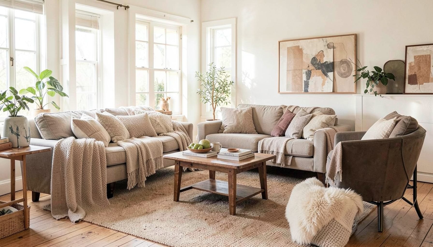
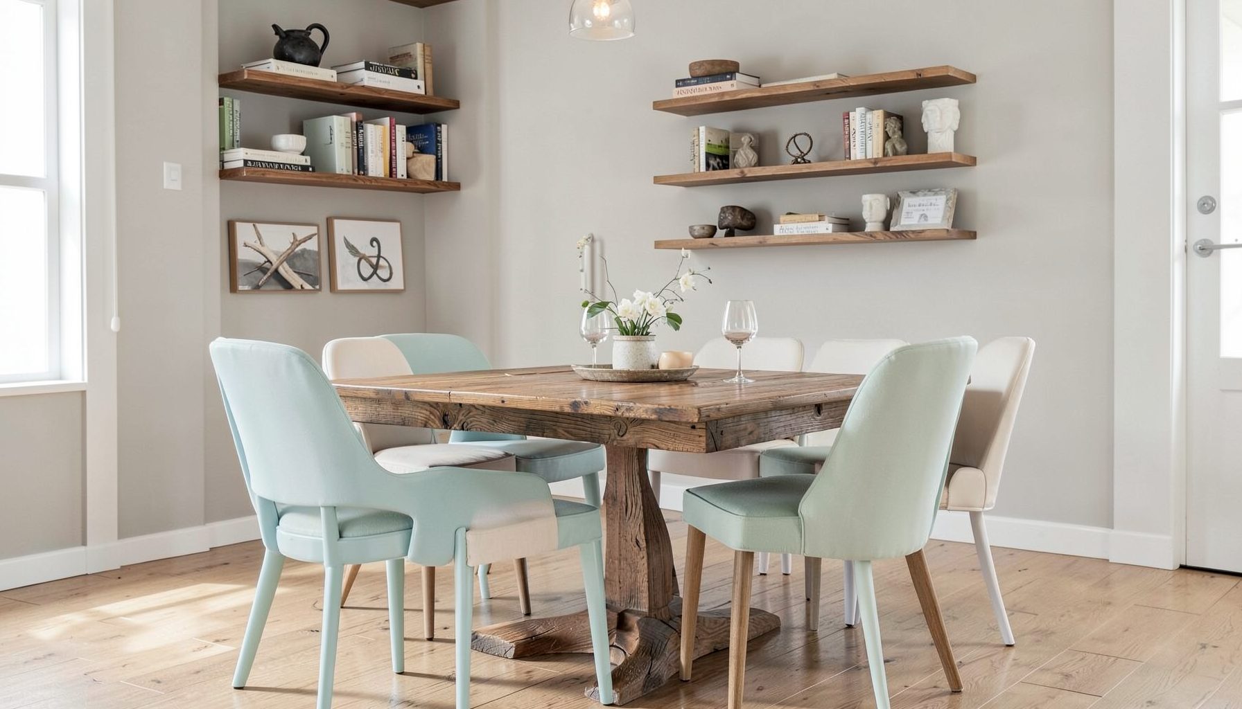
Full-service decorating that blends high and low, vintage finds with modern pieces for spaces that feel personal and collected.
Learn More
DIY Projects
Step-by-step tutorials for refinishing furniture, sewing pillows, styling bookshelves, and transforming rooms on a budget.
Learn More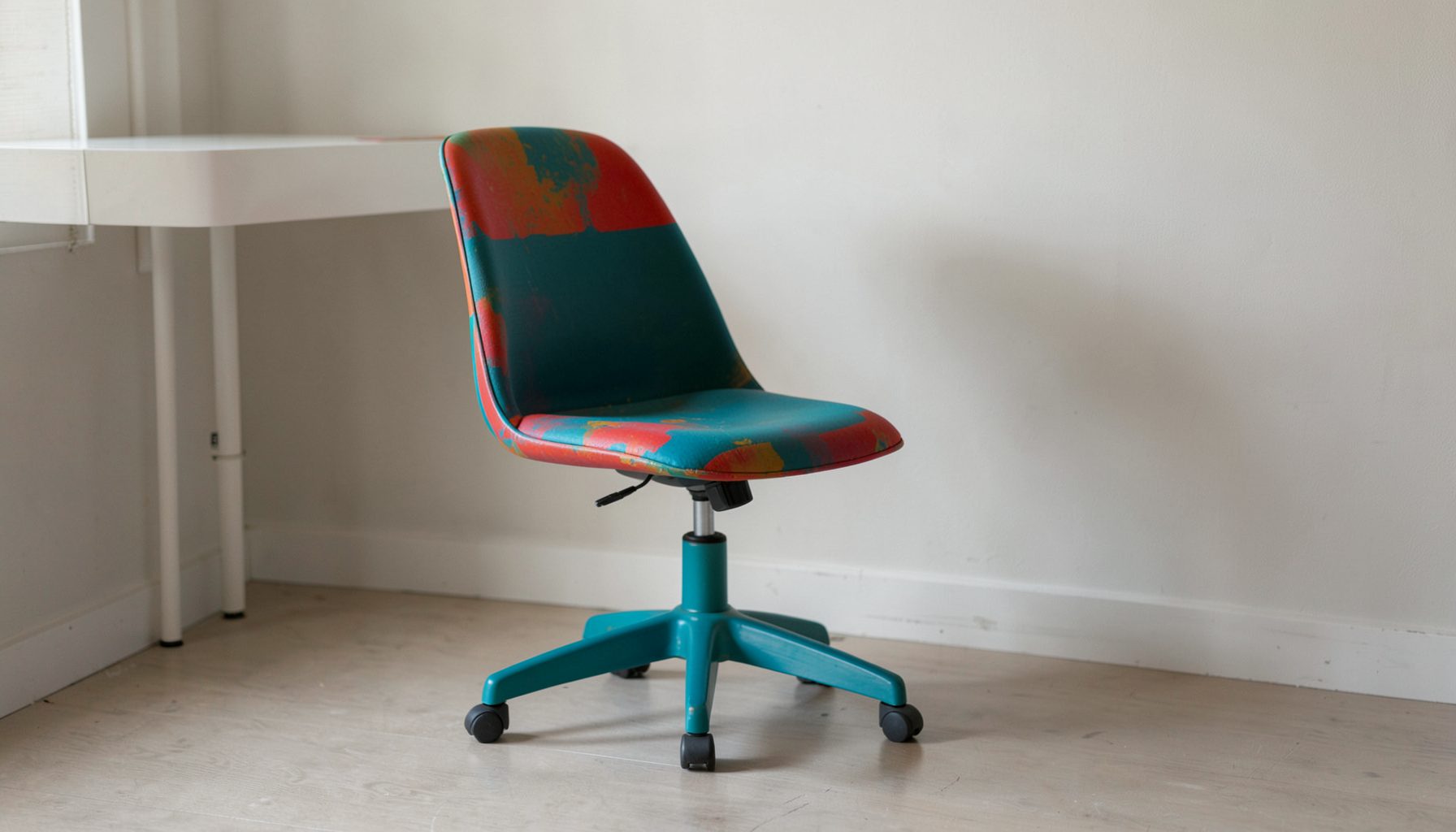
E-Decorating
Personalized design guidance delivered online — perfect for clients anywhere in the world who want a professional eye.
Learn More
Portfolio
Browse completed room makeovers, before-and-after transformations, and styling projects from Bay Area homes.
Learn More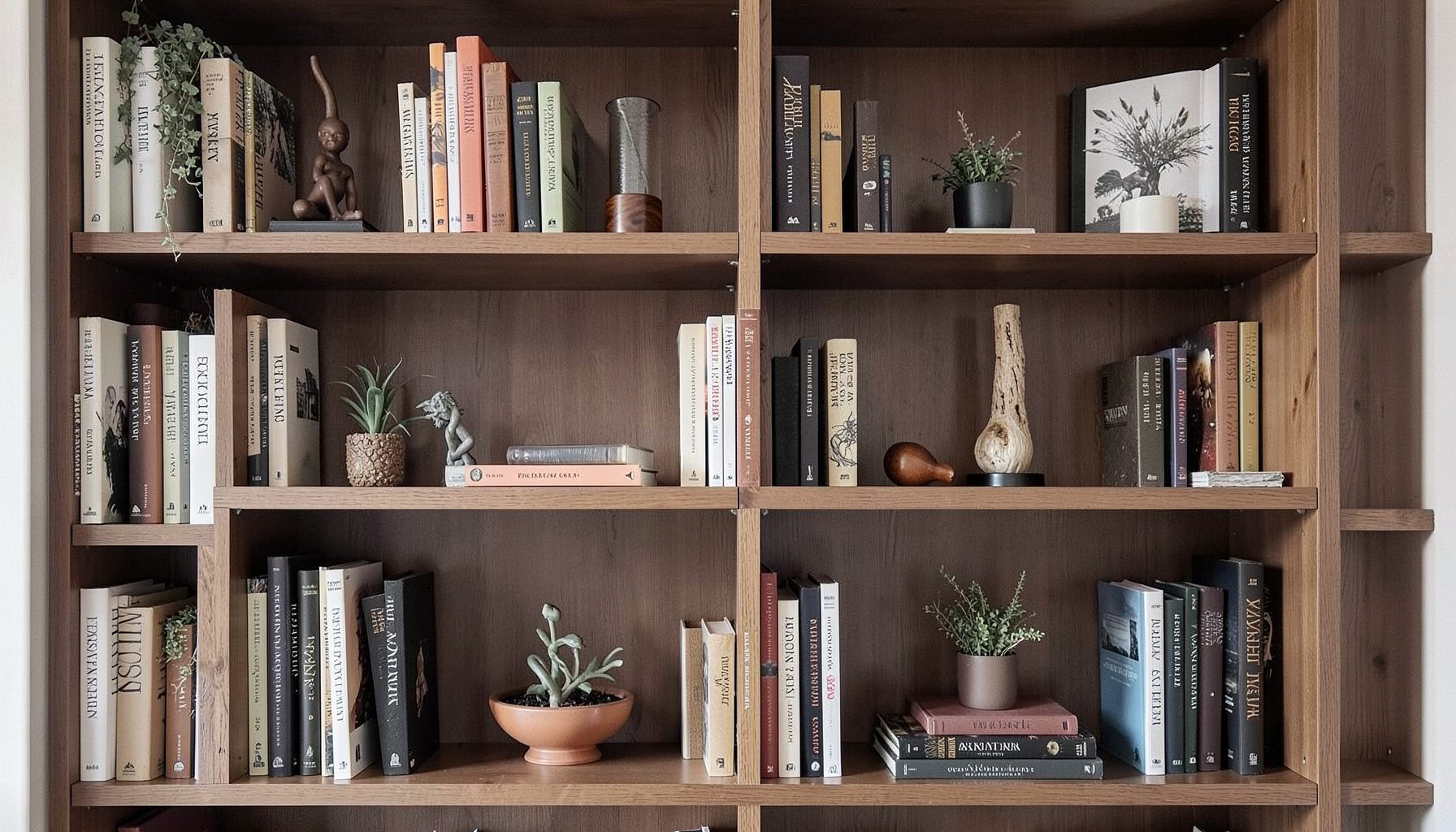
Blog
Interior design inspiration, fashion finds, entertaining ideas, and peeks into real home renovations and styling projects.
Learn More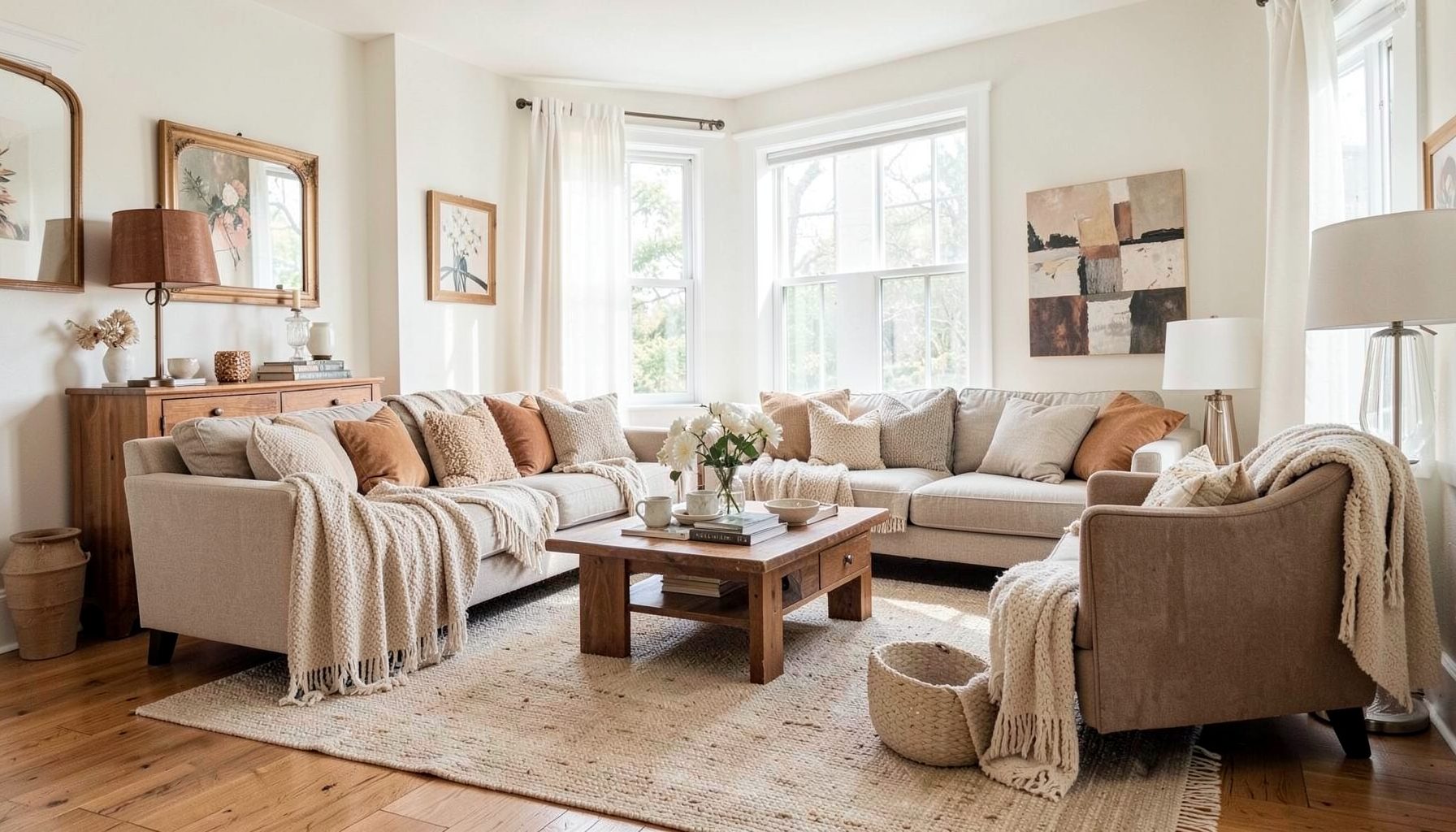
Downloads
Free curated resources for home decorating and design — guides, checklists, and inspiration to help you get started.
Learn MoreThe Best Paint Colors for a Warm, Layered Living Room
A living room feels warm and collected when its colors have depth, softness, and a clear relationship to the furnishings around them. The right paint can make linen upholstery look richer, wood tones feel more intentional, and vintage pieces sit comfortably beside contemporary shapes. Color is the foundation, but the finished effect comes from how that color interacts with light, texture, and personal style.
For a layered room, the safest choice is rarely the starkest white or the most obvious beige. Gentle, complex shades tend to work harder because they shift throughout the day. A warm neutral may look creamy in morning light, softly taupe by afternoon, and slightly golden under evening lamps.
The goal is a living room that feels welcoming rather than overly matched. Paint should support the room’s architecture and furnishings while leaving space for patterned textiles, artwork, aged metals, natural fibers, and colorful accents. With a thoughtful palette, even budget-friendly pieces can look part of a deliberate, finished composition.
Start With Undertones And Natural Light
Before choosing a paint chip, identify the undertones already present in the room. Floors, stone fireplaces, wood beams, upholstery, rugs, and window treatments all influence how a color will read. A beige with a pink undertone can look rosy beside yellow oak, while a gray with a blue undertone may feel cold next to warm leather.
Natural light is equally important. North-facing rooms typically receive cooler, softer light, so creamy whites, mushroom taupes, and muted clay shades can add welcome warmth. South-facing spaces receive stronger, warmer light and may handle balanced beige, soft olive, or gentle gray-green without appearing too yellow.
Test large swatches on several walls instead of relying on a small card. Watch the samples in the morning, afternoon, and evening, and place them near trim, flooring, and major furniture. Paint can look dramatically different beside a white ceiling than it does beside a dark walnut cabinet.
Creamy Whites For An Airy Foundation
Warm white is a versatile choice when you want a bright living room with a relaxed, residential feeling. Look for shades with subtle cream, beige, or greige undertones rather than a blue base. These whites create a soft backdrop for collected furnishings and prevent a room from feeling stark or newly constructed.
A creamy wall color pairs beautifully with natural materials such as rattan, jute, oak, cane, and woven cotton. It also allows a colorful vintage rug or patterned armchair to become a focal point without creating visual competition. In a small living room, warm white can reflect available light while preserving a sense of comfort.
The trim does not have to be bright white. Painting baseboards, doors, and crown molding in the same family as the walls creates a seamless, enveloping effect. For subtle contrast, choose a trim color one or two shades lighter or use the same color in a satin finish against walls in eggshell.
Earthy Neutrals Add Quiet Depth
Soft taupe, mushroom, putty, and greige are excellent choices for a living room that needs more depth than white can provide. These colors sit between beige and gray, creating a flexible background for both warm and cool furnishings. Their muted quality makes them especially effective in rooms with layered patterns and a mix of materials.
Mushroom tones work well with aged brass, charcoal accents, dusty blue, olive, and cognac leather. Putty shades bring a slightly mineral quality that complements stone, plaster, and natural wood. Greige can bridge different finishes when a room contains several wood tones or furnishings collected over time.
To keep an earthy neutral from feeling flat, vary the finishes and textures around it. A matte wall can sit behind a boucle sofa, a velvet pillow, a rough ceramic lamp, and a woven basket. The restrained paint color becomes a quiet stage for tactile contrasts rather than the only source of interest.
Choose Color Families That Coordinate
A layered palette usually feels more sophisticated when several shades share a common undertone. Instead of selecting unrelated colors for the walls, ceiling, trim, and adjoining spaces, build a small family of tones. A warm cream might connect to a deeper camel, a muted terracotta, and a dusty olive used in smaller doses.
The table below compares several paint directions and the atmosphere each can create.
| Paint direction | Overall feeling | Works well with | Best use |
|---|---|---|---|
| Creamy white | Bright, gentle, relaxed | Oak, rattan, linen, colorful art | Small or naturally dark rooms |
| Soft taupe | Grounded, calm, refined | Leather, brass, wool, stone | Rooms needing quiet depth |
| Mushroom beige | Collected, earthy, inviting | Vintage wood, olive, clay, black accents | Eclectic and traditional spaces |
| Muted sage | Organic, restful, quietly colorful | Natural fibers, cream, walnut, aged metal | Rooms connected to gardens or greenery |
| Dusty terracotta | Warm, expressive, welcoming | Ivory, rust, tan, dark wood | Accent walls or rooms with southern light |
| Deep olive | Moody, tailored, enveloping | Cognac, brass, cream, artwork | Large rooms or dramatic focal walls |
Adjacent rooms matter as much as the living room itself. A warm white hallway can transition into taupe walls, while a soft olive built-in or terracotta niche can introduce color without making the main room feel busy. Repeating one undertone across the home helps separate rooms feel connected.
Ceilings are often overlooked in color planning. A ceiling painted a pale version of the wall shade can make the room feel more enveloping and intentional. In a room with interesting molding, a slightly deeper ceiling can highlight architectural detail; in a low-ceilinged space, a light warm color keeps the effect open.
Bring In Muted Greens And Earthy Colors
Muted green is a natural partner for warm layered interiors because it carries the calm of a neutral while introducing color. Sage, lichen, eucalyptus, and gray-green shades work especially well with cream upholstery, walnut furniture, woven shades, and botanical artwork. They can feel fresh in daylight and cozy under lamps.
Use soft green when the living room has a connection to the outdoors or when the existing palette includes plants, natural stone, or wood. A gray-green can balance a room with warm floors, while an olive-leaning shade brings richness to a space with pale upholstery. Sample carefully because some greens become much more yellow or blue depending on the light.
Terracotta, clay, and dusty rose offer another route to warmth. These shades are more expressive than beige but remain livable when softened with gray or brown undertones. They are particularly effective on a fireplace wall, in a library-style living room, or in a room furnished with cream, tan, and dark wood.
A saturated color does not have to cover every wall. It can define a reading corner, emphasize built-ins, or create a visual anchor behind a sofa. If the living room is open to a dining area, use the stronger shade selectively so the color feels intentional rather than abruptly divided.
Consider Moody Shades For An Enveloping Room
Deep paint colors can make a living room feel intimate, elegant, and deeply comfortable. Charcoal brown, smoky olive, deep blue-green, and warm brown-black are especially effective when balanced with light upholstery and reflective accents. These shades suit rooms with generous windows, layered lighting, or a naturally cozy architectural character.
A dark wall color can also make artwork stand out. Warm white mats, aged frames, brass lighting, and vivid textiles gain more presence against a moody background. The key is to repeat the dark shade in small details, such as a side table, lamp base, picture frame, or patterned pillow, so the wall color feels integrated.
Dark colors require careful attention to finish. A flat or matte finish can create a velvety, cocoon-like effect, while eggshell adds a small amount of light reflection and may be easier to clean. If the walls have imperfections, a lower-sheen finish generally disguises them more effectively.
Lighting determines whether a dark color feels sophisticated or heavy. Combine overhead lighting with floor lamps, table lamps, sconces, and candlelight. Warm bulbs around 2700K usually complement earthy paint colors and reinforce the inviting atmosphere that makes a layered living room feel finished after sunset.
Layer The Room Beyond The Walls
Paint establishes the backdrop, but a warm living room comes alive through relationships between color, material, and scale. Pull one or two tones from the walls into pillows, artwork, or a rug rather than matching every item exactly. A taupe room might include rust, faded blue, ivory, and tobacco brown in varied patterns.
Contrast is useful when it is distributed thoughtfully. Pale walls can support a dark coffee table, a patterned rug, and black accents. A deep olive wall may need cream curtains, light upholstery, and reflective metal to keep the room balanced. The most appealing spaces usually combine quiet areas with moments of visual emphasis.
For a collected look, mix polished and timeworn elements. Pair a streamlined sofa with an antique chest, a modern lamp with a vintage painting, or a tailored chair with a loosely woven throw. Resources from Maggie Rose Interiors can provide additional direction for combining personal pieces, approachable furnishings, and layered styling.
Paint color should also account for practical living. A busy household may benefit from a washable matte or durable eggshell finish. If the room includes pets, children, or frequent entertaining, a beautiful color in a cleanable finish will remain more useful than a delicate surface that discourages everyday use.
A Practical Paint Selection Checklist
The best color is the one that works with the actual room, not merely the one that looks appealing in a showroom. Use these steps to narrow the palette before purchasing several gallons:
- List the fixed elements that will remain, including flooring, fireplace materials, cabinetry, and large upholstered pieces.
- Identify whether those elements lean warm, cool, pink, yellow, green, or gray.
- Test at least three large samples on different walls and observe them throughout the day.
- Check the color beside trim, flooring, windows, and the largest piece of furniture.
- Plan the finish according to use, maintenance needs, and the amount of wall texture.
Give each sample time to settle before making a decision. Fresh paint can appear brighter or more saturated during the first hours, and surrounding colors may influence your impression. Live with the samples through several lighting conditions and move them around if one wall receives dramatically different light than another.
When the palette is chosen, buy enough paint to maintain a consistent batch and keep a labeled sample for future touch-ups. A carefully selected warm neutral, earthy color, or moody shade can support years of changing artwork and furnishings, allowing the room to evolve without losing its sense of harmony.
Bring the finished palette to life with furniture, lighting, textiles, and objects that reflect how the room is actually used. Explore design guidance and decorating resources through Maggie Rose Interiors, then let the paint become the quiet foundation for a living room that feels personal, welcoming, and collected over time.

Recent Projects