Interior Design
Full-service decorating that blends high and low, vintage finds with modern pieces for spaces that feel personal and collected.
Learn More
DIY Projects
Step-by-step tutorials for refinishing furniture, sewing pillows, styling bookshelves, and transforming rooms on a budget.
Learn More
E-Decorating
Personalized design guidance delivered online — perfect for clients anywhere in the world who want a professional eye.
Learn More
Portfolio
Browse completed room makeovers, before-and-after transformations, and styling projects from Bay Area homes.
Learn More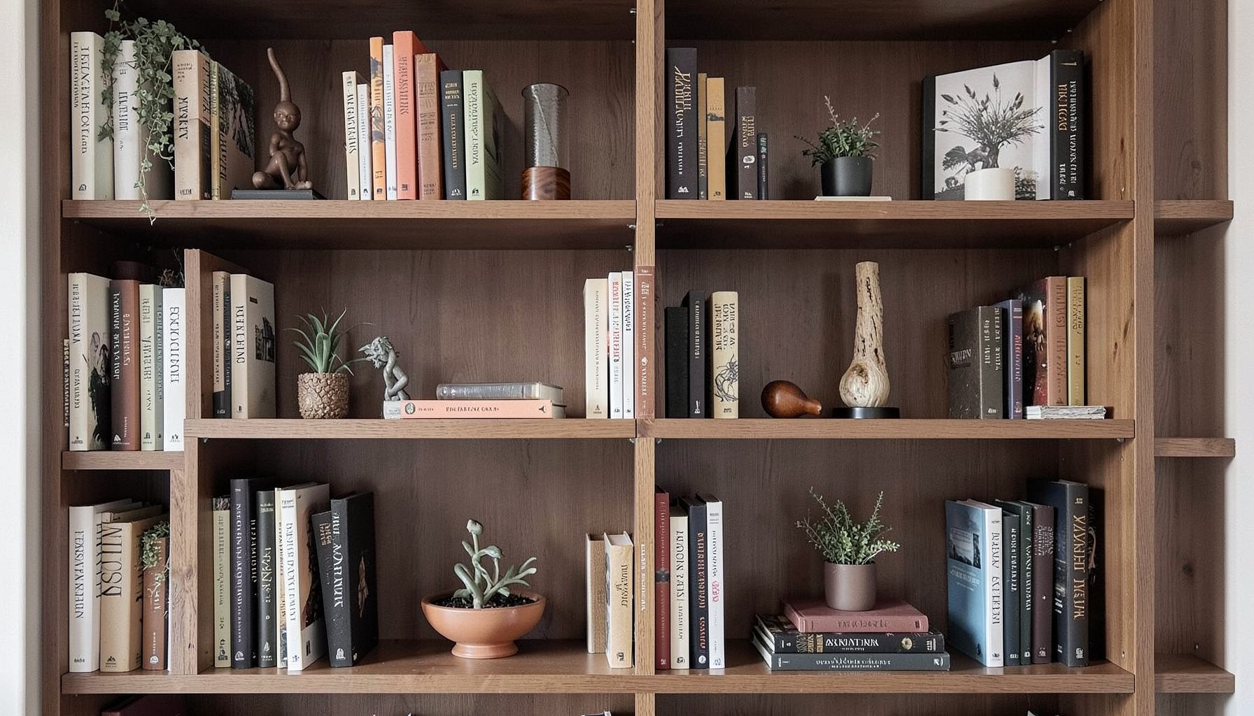
Blog
Interior design inspiration, fashion finds, entertaining ideas, and peeks into real home renovations and styling projects.
Learn More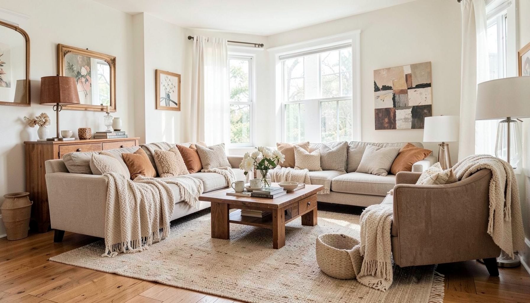
Downloads
Free curated resources for home decorating and design — guides, checklists, and inspiration to help you get started.
Learn MoreA Balanced Bedside Vignette for Books, Greenery and Time
A bedside table has to function before it photographs well. It holds a phone, water, medication, a charger, and whatever is read before sleep, so every styled object needs a practical reason to remain. A layered arrangement can still feel calm when the functional zone is protected and the decorative pieces share a clear visual language.
Styling a nightstand with a stack of books, a small plant, and a clock gives you three useful anchors without filling every inch of the surface. Books provide texture and height, greenery softens hard edges, and a clock adds structure. Together, they create a vignette that feels collected rather than staged, provided scale and placement are handled with care.
That mix reflects the collected approach at Maggie Rose Interiors, where vintage and modern pieces, affordable finds, and personal details belong in the same room. The principles translate easily to Australian homes, including compact apartments in Sydney and Melbourne where bedside surfaces are often narrow. Thoughtful proportions matter even more when the nightstand must accommodate everyday essentials as well as decoration.
Building a Book Stack That Looks Intentional
Begin with books you actually use, choosing two or three that work well together in colour, material, or subject. Hardbacks, art books, travel guides, and Australian poetry anthologies can make an appealing foundation because their covers and spines bring different textures to the arrangement. A neat row of matching novels may look orderly, while varied sizes create the relaxed, collected character associated with a layered interior.
The largest and heaviest book should sit at the bottom. Place smaller books above it, turning each one slightly so a narrow edge remains visible. Some stacks benefit from one book laid horizontally, creating a step between the vertical lines. Keep the stack compact enough that it occupies no more than roughly one-third of the table, particularly if the surface is only 40 to 50 centimetres wide.
Avoid stacking books too high beside the bed. A tall pile can look attractive when the room is still, but it becomes vulnerable to bumps, pets, and the movement involved in turning down a doona. Weight the lower books with the upper ones rather than using small decorative objects on top. A simple ceramic dish, a brass bookmark, or a remote control can rest there without making the stack look precarious.
The colours should relate to the room rather than compete with it. Pull one or two tones from the doona, curtains, rug, or bedside lamp, then let the remaining books introduce subtle variety. The Maggie Rose decorating ideas collection offers practical inspiration for extending this layered approach through accessories, colour, and collected pieces.
Choosing a Small Plant for Real Australian Conditions
Choose a plant according to the light and routine of the room, not simply its appearance in the nursery. A small pothos, snake plant, heartleaf philodendron, or compact ZZ plant usually works better on a crowded nightstand than a large trailing plant. All four tolerate lower-light conditions, although their growth and water needs differ.
Australian climates should influence the choice. Brisbane’s humidity can encourage fast growth, but it does not prevent root rot when a plant sits in constantly wet soil. Melbourne’s cooler, drier winters generally mean less frequent watering than many people expect. Direct afternoon sun through a west-facing window can scorch leaves, so an east-facing room or a position behind a sheer curtain is often more suitable.
The pot should be only slightly wider than the root ball and should have a drainage hole. Terracotta is attractive and readily available at Australian nurseries and garden centres, while glazed ceramic gives a more finished look and retains moisture longer. A neutral pot can disappear into the background; a coloured or textured one can become a deliberate feature. White, matte black, and warm clay tones pair easily with timber, painted walls, and metal bedside lamps.
Scale is the detail that most often separates a polished arrangement from a crowded one. The plant should add a soft shape without hiding the clock or pushing the books towards the edge. It also needs enough room for the leaves to spread naturally. Keeping it slightly lower than the top of the book stack usually creates balance while preserving a clear line of sight across the table.
Selecting a Clock That Belongs on the Table
A bedside clock should be readable at a glance but small enough to share the surface with other essentials. An analogue clock can complement a layered interior with its sculptural case, while a simple digital clock offers cleaner lines and practical features. Check the size from a seated position, not only while standing over the table, because the view from the bed is what matters.
Match the clock’s character to the surrounding furniture. A wooden, brass, or vintage-style clock can warm up a plain nightstand, while a black or brushed-metal model provides contrast against a pale wall. Round faces generally soften a table dominated by rectangular books. Square digital clocks create a sharper, more graphic composition when the rest of the room already feels collected and informal.
For inspiration beyond Australian dealers, the selection at Dealle G. vintage pieces can help with sourcing ideas for a characterful clock or frame. If an imported piece runs on mains electricity, check the voltage and plug compatibility before ordering. Battery-powered clocks avoid those concerns and keep the surface free of cables.
Place the clock towards the back or side of the arrangement, where it can be seen without becoming the first object to be knocked over. Its face should not be blocked by a plant. Leave a little space around the numbers, especially if the case has an ornate edge, and avoid placing the clock directly against the wall if that makes it difficult to set or wind.
Balancing Colour, Texture and Negative Space
Begin with the room’s existing palette. Warm timber, linen, wool, soft white walls, and muted greenery are familiar elements in many Australian interiors, but the bedside arrangement does not need to copy them exactly. A blue book, rust-coloured pot, or black clock can provide contrast when used in one or two places rather than scattered throughout the vignette.
Texture does much of the work. The spines of hardbacks, the grain of a wooden clock, the matte finish of a ceramic pot, and the leaves of the plant should feel different from one another. This variety creates depth without buying additional objects. Keep one material dominant and let the others support it; too many competing surfaces can make a small table feel busy.
A mixed budget is entirely compatible with a polished result. Bunnings, IKEA Australia, and Freedom offer useful foundations for storage and accessories, while Australian op shops, weekend vintage markets, and local makers provide pieces with more character. A thrifted book or plant pot can sit beside an affordable clock as long as scale, condition, and colour are considered. Value comes from how the pieces work together, not from their individual price tags.
Negative space is what keeps the arrangement breathable. Keep the rear half of the table visually active and preserve a clear area towards the front for a phone, glass of water, or medication. The books and plant may sit slightly to one side, with the clock balancing them across the surface. This controlled asymmetry often feels more relaxed than placing every object in a perfect row.
Checking the Details Before the Vignette Is Finished
Test the arrangement in both daylight and softer evening light. Look at it while seated on the edge of the bed and while lying down. The clock should be easy to read, the plant should not cast an excessive shadow across the face, and the books should not block the controls needed for a lamp or charger. If the arrangement only works in one lighting condition, adjust it before adding anything else.
Check the surface for practical conflicts. Australian power points and plug types differ from those in many overseas markets, so imported electrical accessories may require an adaptor or a compatible voltage. Route charging cables behind the table where possible and keep them away from the plant’s drainage area. A small moisture ring beneath a pot can protect the timber or painted finish.
Consider who uses the bedside space. Books and plants look harmless, but stable arrangements matter in homes with young children or energetic pets. Place heavier books at the back, choose a plant that can tolerate an occasional knock, and keep small clock parts or decorative objects out of reach. Stability should be settled before style is judged.
The practical takeaway is to build the book stack first, keep the plant slightly lower, set the clock where it can be read at a glance, and preserve one clear patch for the objects used every night.

Recent Projects