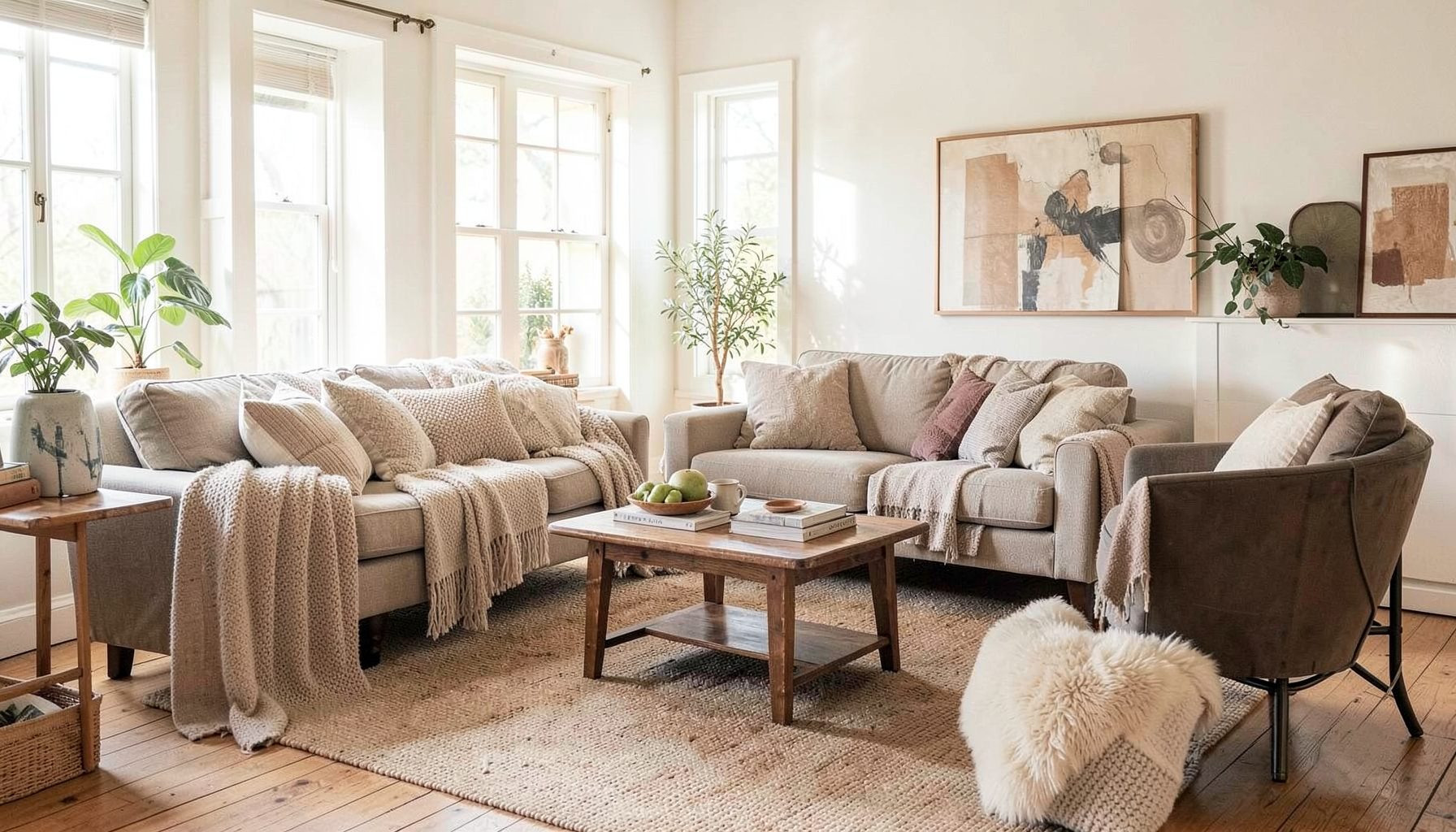
Interior Design
Full-service decorating that blends high and low, vintage finds with modern pieces for spaces that feel personal and collected.
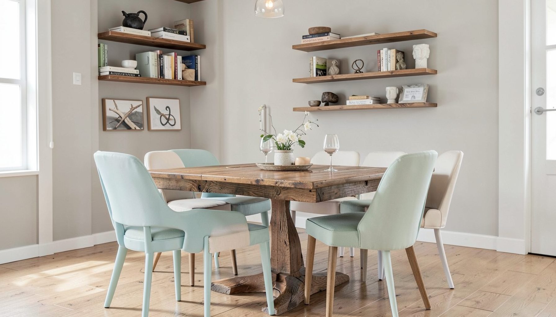
Learn More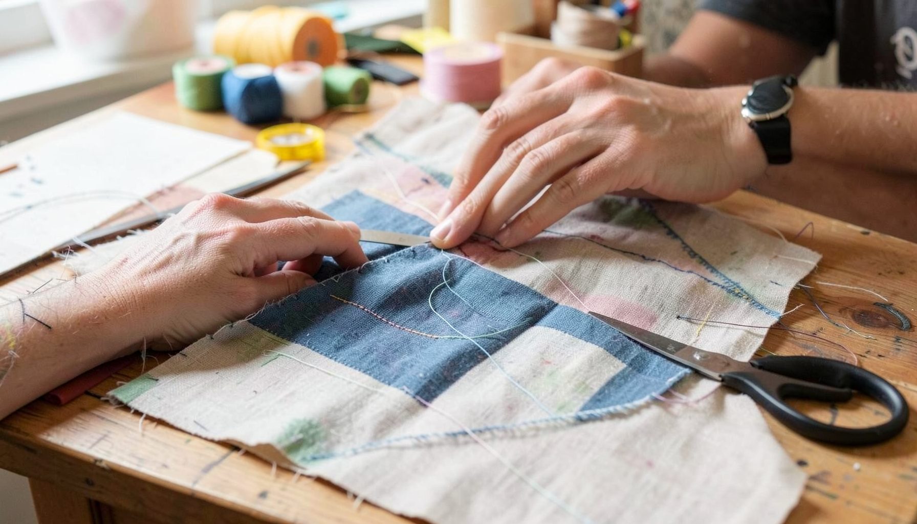
DIY Projects
Step-by-step tutorials for refinishing furniture, sewing pillows, styling bookshelves, and transforming rooms on a budget.
Learn More
E-Decorating
Personalized design guidance delivered online — perfect for clients anywhere in the world who want a professional eye.
Learn More
Portfolio
Browse completed room makeovers, before-and-after transformations, and styling projects from Bay Area homes.
Learn More
Blog
Interior design inspiration, fashion finds, entertaining ideas, and peeks into real home renovations and styling projects.
Learn More
Downloads
Free curated resources for home decorating and design — guides, checklists, and inspiration to help you get started.
Learn MoreStyling a Kitchen Counter with a Coffeemaker, Fruit Bowl, and Cutting Board
A kitchen counter has to work hard. It may be the place where coffee is made before the school run, fruit is washed for breakfast, sourdough is sliced for lunch, and guests gather during an evening meal. Yet it also occupies a large visual area, so a few everyday objects can shape the entire feeling of the room.
The most successful benchtop arrangements look considered without feeling staged. A well-loved timber board, a generous bowl of produce, and a coffeemaker used every morning can create warmth and personality when they are arranged with enough space around them. The aim is a layered kitchen that feels collected, practical, and unmistakably yours.
Choose a visual anchor
Start by deciding which object should lead the arrangement. In many Australian homes, the coffeemaker naturally becomes the anchor because it is often the most substantial item and the one used most frequently. A stainless-steel espresso machine may provide a crisp focal point in a contemporary kitchen, while a cream, sage, or pale blue model can soften a white space.
If the machine is visually dominant, keep the fruit bowl and cutting board quieter. A simple ceramic bowl and a slim timber board will support it without competing for attention. If your coffeemaker is compact and understated, the board can supply height and texture, while the fruit bowl adds colour.
Look at the counter from the room’s main entrance, rather than standing directly in front of it. This reveals what catches the eye first and whether the arrangement blocks a sightline. In an open-plan kitchen, the counter is seen from the living and dining areas as well as from the sink, so the display should have an attractive profile from several directions.
Build a relaxed three-part arrangement
A pleasing coffee station often works as a loose triangle. Place the coffeemaker at the back or to one side, position the fruit bowl near it, and lean the cutting board vertically to create a change in height. This arrangement gives the eye three related points to move between instead of presenting a flat row of objects.
The triangle does not need to be symmetrical. In fact, slightly uneven spacing usually feels more natural. A large board can lean against the splashback, with the bowl in front of one corner and the coffeemaker offset to the other side. Leave a little breathing room between each item so the display does not look like a shop shelf.
Use repetition to make varied pieces feel connected. A timber board may echo the oak of nearby stools, the fruit bowl may repeat a colour from a runner, and a dark coffee machine may relate to black tapware or pendant lights. These small links help a mixture of modern and vintage pieces sit comfortably together.
Give the coffeemaker a proper home
The coffeemaker should be positioned where its daily ritual makes sense. Keep it near power, water, cups, beans, and the part of the counter where milk is poured. Avoid placing it directly beside the sink if splashing is likely, but do not move it so far away that making a flat white becomes an awkward trek across the kitchen.
Check the cord, plug, and ventilation before styling around the appliance. Australian kitchens use 230–240 volts, and imported machines may require careful checking before purchase or installation. Steam wands also need clear space, and heat from a machine can affect delicate timber, painted surfaces, or anything stored immediately above it.
A small tray underneath the coffee setup can gather loose essentials without turning the counter into a clutter zone. Keep beans, a knock box, and a small canister together if they are used every day. Mugs can sit on an open shelf or in a nearby cupboard rather than surrounding the machine in a crowded cluster.
For a polished look, choose one or two coffee accessories with intention. A sculptural grinder, a hand-thrown cup, or a folded linen tea towel can add character. Several branded packets, mismatched scoops, and unused gadgets will make even a beautiful kitchen feel visually noisy.
Select a fruit bowl with useful scale
A fruit bowl brings colour and an organic shape to a hard-working surface. Choose one that is large enough to hold the amount of produce your household actually eats. An undersized bowl filled beyond its rim looks untidy, while an oversized bowl with three pieces of fruit can make the counter feel sparse.
Material matters. Timber creates a warm, relaxed mood and suits coastal, Scandinavian, and farmhouse interiors. Ceramic feels more substantial and can introduce a glaze or hand-painted detail. Wire and woven bowls are airy options for smaller kitchens, while stone, marble, or terracotta can echo finishes used elsewhere in the room.
Think about the fruit itself as part of the palette. Lemons and oranges bring brightness to a neutral kitchen, green apples feel fresh and restrained, and bananas add a softer yellow note. In a Melbourne winter, a bowl of citrus can bring welcome colour; during a Queensland summer, mangoes, passionfruit, or limes may become part of the display.
Avoid keeping every kind of produce in one bowl if some fruit ripens quickly or releases ethylene gas. Bananas and avocados may need their own space, and tomatoes can look better on a shallow plate. Styling should support food storage rather than make the fruit harder to reach.
Let the cutting board add texture
A cutting board is one of the easiest ways to make a benchtop arrangement feel useful rather than decorative. Leaning a board upright introduces height and a broad natural surface behind smaller objects. It also gives the eye a visual pause between the coffeemaker and the splashback.
Look for a board with enough character to stand on its own. End-grain timber, rounded handles, visible knots, and subtle knife marks can make a board feel collected over time. You do not need an expensive designer piece; a well-made board from a local maker, market stall, or quality kitchen shop can provide the same warmth.
Use a board that is safe for its intended purpose. Timber boards should be washed according to the manufacturer’s instructions and dried thoroughly, while decorative boards should be clearly separated from those used for raw meat. If a board is leaning against the wall, place a discreet silicone bumper or folded cloth beneath it to protect the surface.
Layer a smaller item in front only if it remains easy to move. A little bowl of salt, a jar of wooden utensils, or a folded tea towel can work, but the board should still be visible. Its purpose is to add texture and a sense of daily life, not to become a backdrop buried under accessories.
Keep the styling practical
The best kitchen counter decor respects the rhythm of the household. Leave the primary food preparation area clear, especially around the knife drawer, cooktop, and sink. If the counter is narrow, group the display at one end and preserve a generous uninterrupted work zone at the other.
Consider how the arrangement behaves during a busy arvo. Can someone make toast without moving the fruit bowl? Can the board be lifted with one hand? Is there somewhere to put a hot portafilter or steaming milk? These practical questions are more valuable than achieving perfect symmetry.
In a rental, removable details can make a difference without permanent changes. A freestanding shelf, a ceramic utensil pot, or a small framed print leaning against the splashback can add personality while remaining easy to take with you. Renters may also need to avoid drilling into tiled walls or changing power points, so styling should rely on portable layers.
For a family kitchen, use durable objects with forgiving finishes. Glazed ceramic, sealed timber, and washable linen will cope better with fingerprints and spills than fragile decorative pieces. Homes in Sydney apartments may need a compact vertical arrangement, while spacious Adelaide or Brisbane kitchens can accommodate a wider composition with more generous gaps.
Refine the colour and finishing touches
Once the main objects are in place, remove anything that does not serve the arrangement. Three strong pieces usually have more impact than ten small additions. A single vase of leafy stems, a vintage sugar bowl, or a framed recipe card may be enough to give the station a personal note.
Use contrast thoughtfully. Pale stone benchtops benefit from timber, woven fibres, and softly coloured ceramics. Dark cabinetry can be lifted by a light bowl, pale cutting board, or brushed metal coffee machine. If the kitchen already contains strong veining, patterned tiles, or colourful cabinetry, keep the counter styling restrained.
Consider the view beyond the bench. A bowl may relate to a dining pendant, the board may echo timber flooring, and a coffee cup may pick up the colour of artwork in the adjoining living area. This is particularly useful in open-plan Australian homes, where the kitchen, lounge, and dining spaces need to feel connected without matching exactly.
Personal design guidance can help when the room has good pieces but the arrangement still feels unresolved; a design consultation can bring clarity to scale, colour, and placement. The goal is not to create a showroom vignette. It is to make ordinary routines look intentional while allowing the kitchen to remain comfortable and lived in.
Begin with the coffeemaker in its most practical position, then place the cutting board behind it and add the fruit bowl where it balances the composition without interrupting preparation space. Live with that arrangement for a day, and move only the piece that proves inconvenient.

Recent Projects