Interior Design
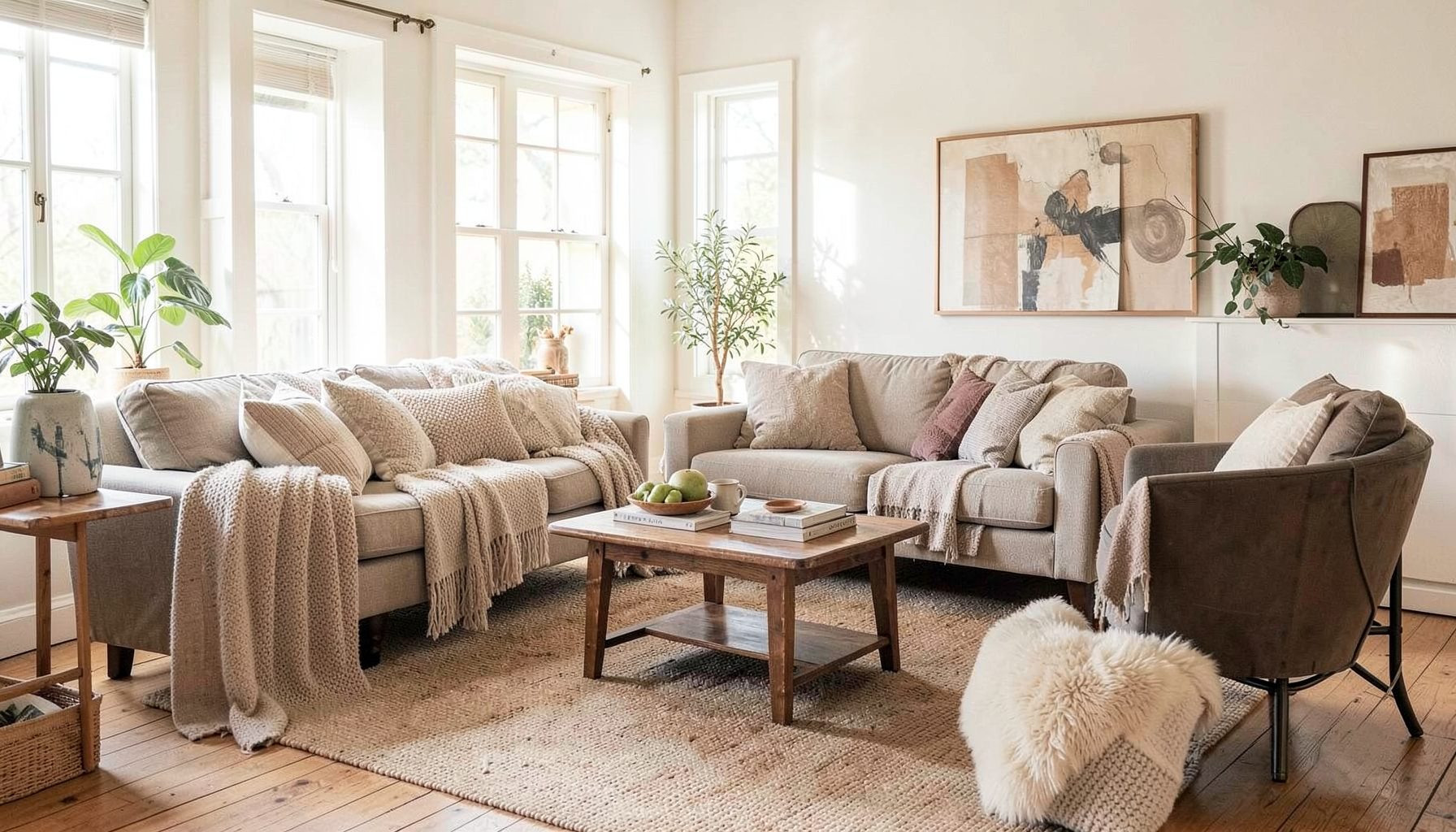
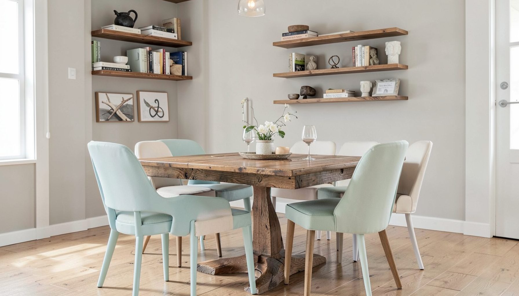
Full-service decorating that blends high and low, vintage finds with modern pieces for spaces that feel personal and collected.
Learn More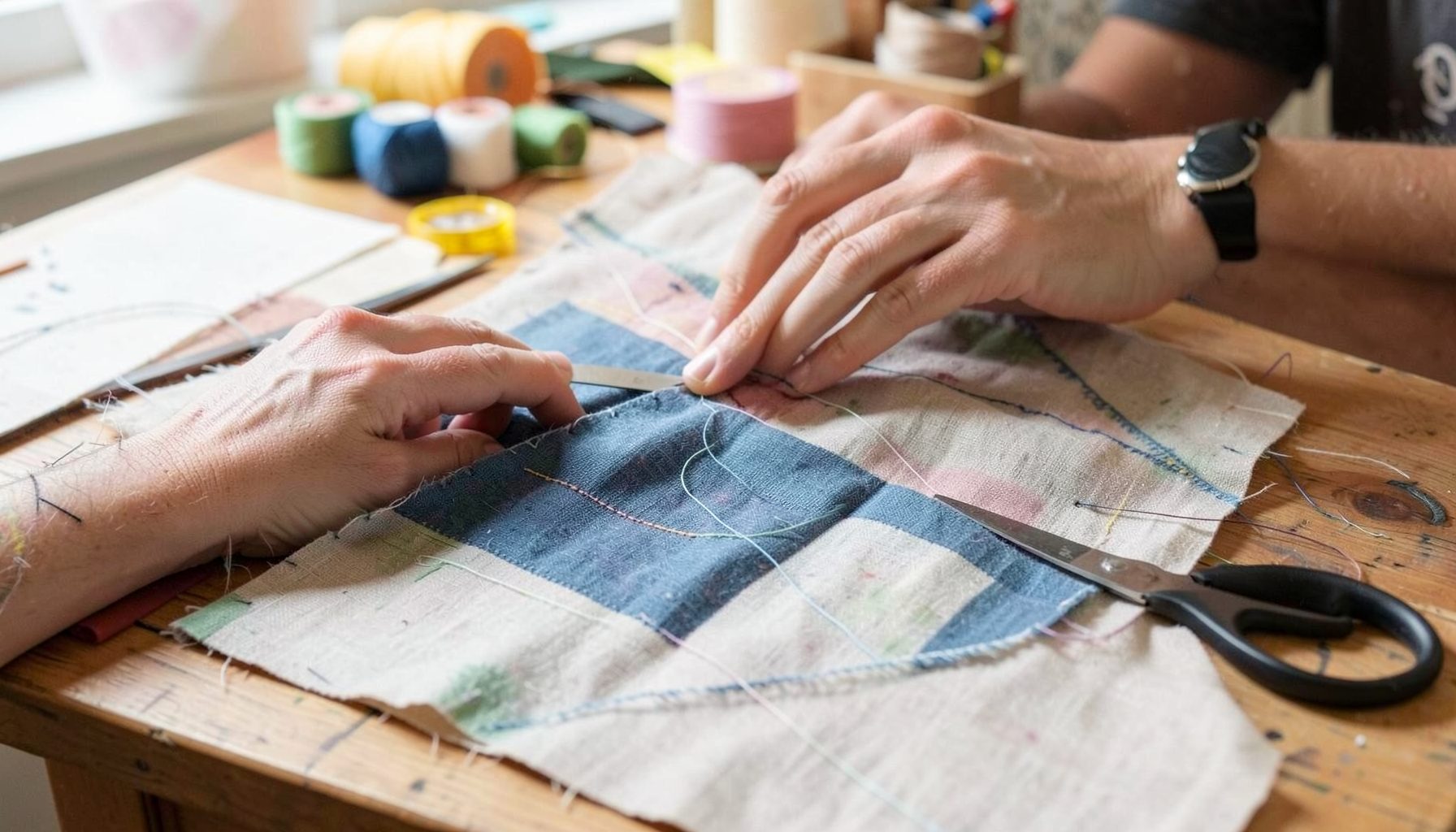
DIY Projects
Step-by-step tutorials for refinishing furniture, sewing pillows, styling bookshelves, and transforming rooms on a budget.
Learn More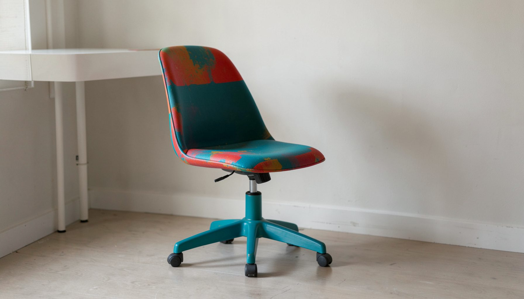
E-Decorating
Personalized design guidance delivered online — perfect for clients anywhere in the world who want a professional eye.
Learn More
Portfolio
Browse completed room makeovers, before-and-after transformations, and styling projects from Bay Area homes.
Learn More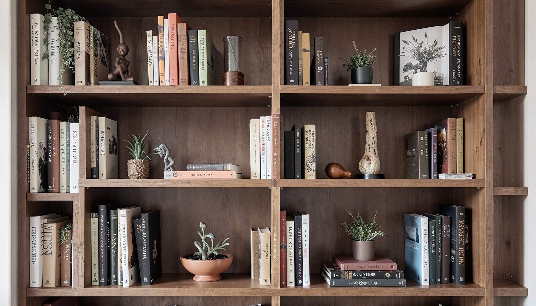
Blog
Interior design inspiration, fashion finds, entertaining ideas, and peeks into real home renovations and styling projects.
Learn More
Downloads
Free curated resources for home decorating and design — guides, checklists, and inspiration to help you get started.
Learn MoreColour and Height Styling for a Visually Balanced Bookshelf
A bookshelf is often the most personal canvas in a home, holding everything from well-loved novels to family heirlooms, framed photographs, and objects gathered on travels. When styled with care, it becomes a quiet piece of artwork that anchors a room. When styled carelessly, it can read as cluttered or visually jarring, no matter how beautiful each individual piece may be. The key to getting it right lies in two simple but powerful principles: organising by colour and arranging by height.
At Maggie Rose Interiors, the approach always begins with the client's story, layering vintage and modern pieces, blending luxury with budget-friendly finds, and letting personality lead the design. A bookshelf is the perfect place to put that philosophy into practice. Whether the goal is a calm, tonal display or a vibrant, eclectic collection, a few intentional choices about palette and proportion can transform the everyday into something quietly extraordinary.
Establishing a Cohesive Colour Palette
Before placing a single object, stand back and look at the shelf as a whole. The colours already in the room, the sofa fabric, the rug underfoot, the wall paint, will guide the overall mood. A bookshelf does not need to match everything perfectly, but it should feel like it belongs to the same conversation. In a neutral living room in Sydney or a colourful terrace in Melbourne, the shelf can echo one or two tones from the surrounding scheme while introducing a quieter supporting cast.
A practical method is to choose three to four dominant colours and repeat them across the shelves in varying weights. For example, if the palette is sage, cream, and terracotta, group cream-spined books together, place a terracotta vase on one level, and balance the eye with sage ceramics or framed prints on another. This repetition creates rhythm and prevents the eye from skipping randomly from object to object. The gaze naturally travels across colour clusters, which is exactly what makes a styled shelf feel curated rather than chaotic.
Mapping Height and Rhythm
Height is the silent partner of colour. Even a perfectly colour-coordinated shelf will feel flat if every object sits at the same level. The trick is to think in terms of a rising and falling rhythm, almost like a city skyline viewed from a distance. Tall objects, such as stacked books standing upright or a tall vase, anchor one zone. Mid-height pieces, like framed art or candleholders, create a transition. Low items, such as small bowls, figurines, or horizontally stacked paperbacks, settle the eye back down.
A useful rule is to vary heights within every shelf, not just between shelves. On one shelf, place a tall hardback book standing up, a medium framed photo, and a small object in front. On the next, flip the arrangement so the tallest item sits on the opposite side, creating a zigzag effect that draws the gaze across the entire unit. In a Brisbane living room with high ceilings, this technique helps the shelf feel integrated with the architecture rather than competing against it.
Layering Vintage and Modern Pieces
The most lived-in shelves combine old and new, balancing family heirlooms with contemporary ceramics, thrifted finds with new purchases. A vintage brass candlestick beside a modern abstract print creates a dialogue between eras, while a stack of old paperbacks next to a sleek new design monograph adds depth and storytelling. The colour and height principles guide how these pieces sit together so the mix feels intentional.
When sourcing from Australian markets, such as the Finders Keepers in Sydney and Melbourne, or the op shops scattered through Adelaide and Perth, look for objects with interesting silhouettes or textures rather than perfect matches. A chipped old jug in a warm tone can become a favourite piece if it earns its place in the colour story. Similarly, a brand-new piece with sharp lines can ground a cluster of softer, more ornate vintage items. The goal is harmony through contrast, not uniformity.
Letting Light Shape the Display
Light changes how colour reads, and a bookshelf that looks balanced at noon can feel uneven by evening. Natural light from a window nearby will wash across the spines and objects, highlighting some and leaving others in shadow. Artificial light, whether from overhead downlights, floor lamps, or integrated shelf lighting, does the same in the evening hours. When planning the arrangement, observe the shelf at different times of day and adjust the position of darker or more reflective objects accordingly.
For renters or homeowners wanting to avoid hardwiring, clip-on picture lights, small LED puck lights, or rechargeable shelf lights offer flexible solutions. If the budget allows a more permanent upgrade, consider the layered approach used by designers who treat a bookshelf as both storage and focal feature. A practical budget-friendly DIY lighting updates guide can walk through simple swaps that change the entire mood of a shelf without major renovation.
Working Within Australian Rental and Heritage Rules
Many Australians rent their homes, and the rules around mounting shelves, drilling into walls, or installing integrated lighting vary by state. In New South Wales, the Residential Tenancies Act allows reasonable modifications with the landlord's written consent, while Victorian and Queensland laws have similar provisions with their own paperwork and expectations. Built-in or fixed bookshelves are often classified as fixtures, meaning they cannot be removed without permission, and heritage-listed terraces in Paddington or South Yarra may have additional restrictions on drilling into original plasterwork.
For renters, freestanding bookshelves remain the most flexible option, allowing full creative control without breaching a lease. Where built-ins exist in older homes, styling is the safest route: work with the existing joinery, add height and colour through objects alone, and avoid any fixings that might damage heritage detailing. A Queenslander with original VJ walls or a Melbourne Edwardian with pressed metal ceilings deserves styling that respects the architecture rather than competes with it.
Styling for Compact Urban Spaces
Apartments in cities like Sydney and Melbourne often feature narrow or unusually shaped built-ins, which can feel limiting but actually invite creative styling. Narrow shelves benefit from a more disciplined colour approach, using two main colours and a single accent to avoid visual noise. Height becomes even more important when vertical space is limited, as every centimetre counts. Stacking books horizontally on top of vertically arranged rows creates instant height variation without adding bulky objects.
Another strategy is to edit ruthlessly. A small shelf with too many objects feels cluttered, even when the colours and heights are perfectly planned. Curate the collection regularly, rotating favourites in and out of storage. This is also a chance to incorporate locally made ceramics or textiles from weekend markets, adding personality without permanent commitment. The Australian lifestyle of indoor-outdoor living often means that a small bookshelf in a Sydney apartment or Brisbane unit can be styled seasonally, echoing the colours of the garden or balcony just beyond the glass doors.
Refreshing the Shelf with Local Finds and Seasons
A bookshelf is never really finished. As the seasons change, so do the colours outside the windows, and the shelf can quietly follow. In summer, a few shells from a coastal walk, a linen-bound book, or a pale ceramic bowl keep the palette light. In winter, swap in warmer tones, heavier textures, and perhaps a small framed botanical print. Bunnings, local nurseries, and weekend markets are reliable sources for affordable accents that can rotate through the shelves without major expense.
The final layer is the personal. Family photos in mismatched frames, a child's drawing in a simple wooden frame, a postcard from a favourite trip, these are the pieces that turn a styled shelf into a story. By keeping colour and height as the underlying structure, every personal item finds a place where it belongs, supported by the rhythm of the arrangement rather than fighting against it. The result is a bookshelf that feels collected, considered, and quietly expressive of the life lived around it.

Recent Projects