Interior Design
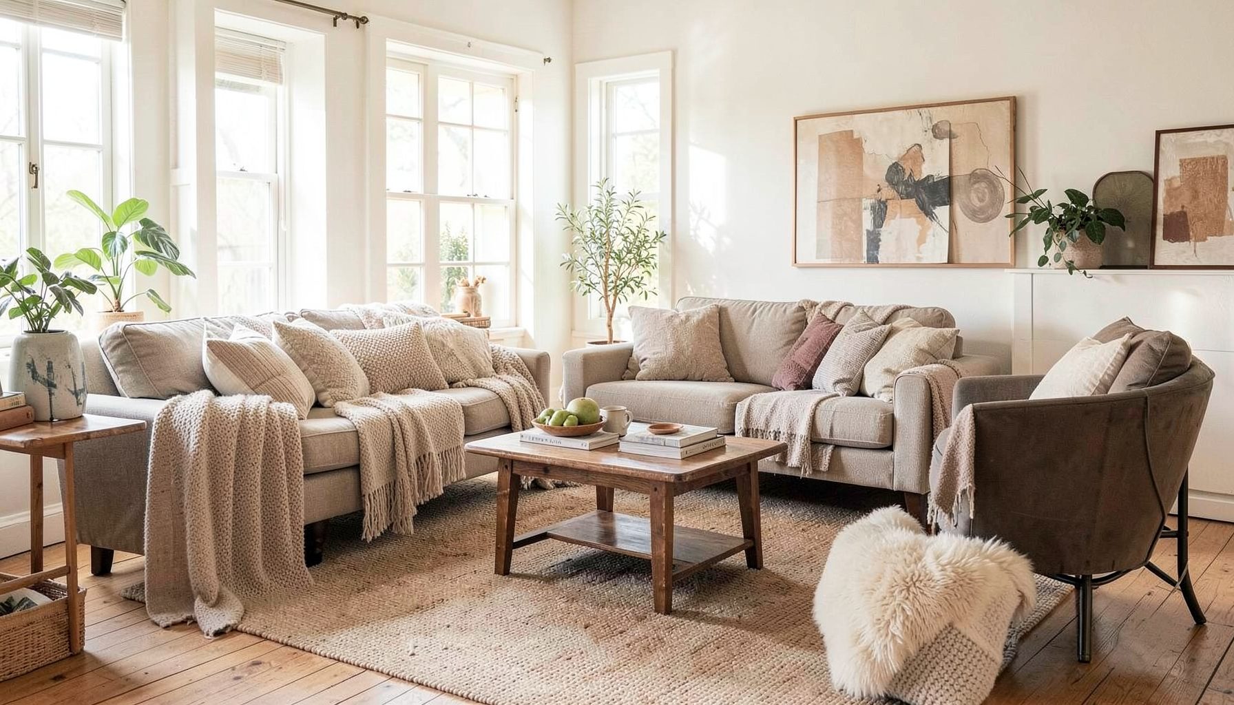
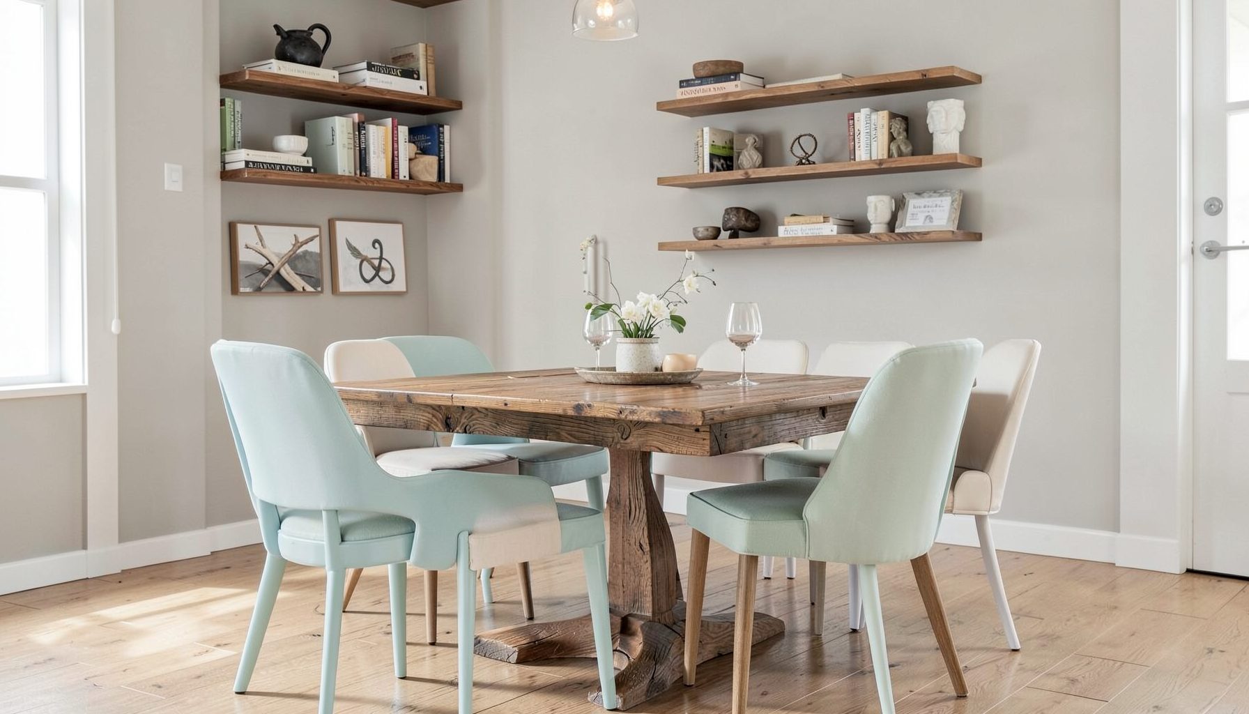
Full-service decorating that blends high and low, vintage finds with modern pieces for spaces that feel personal and collected.
Learn More
DIY Projects
Step-by-step tutorials for refinishing furniture, sewing pillows, styling bookshelves, and transforming rooms on a budget.
Learn More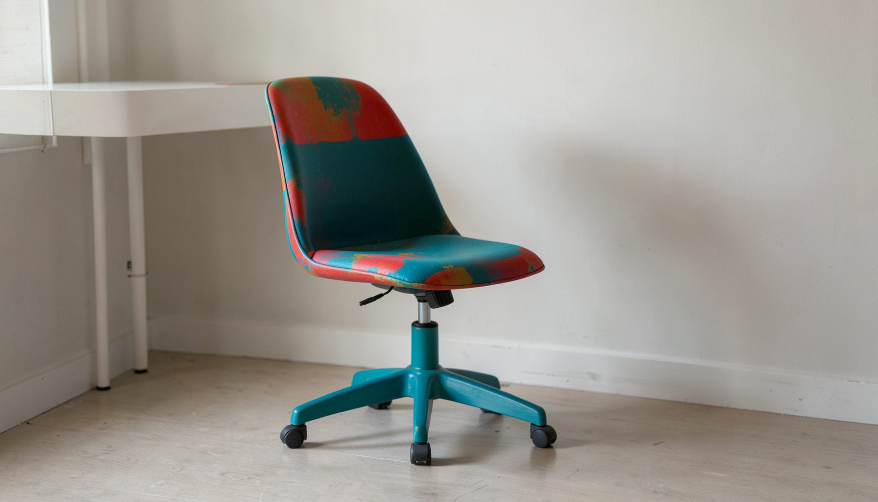
E-Decorating
Personalized design guidance delivered online — perfect for clients anywhere in the world who want a professional eye.
Learn More
Portfolio
Browse completed room makeovers, before-and-after transformations, and styling projects from Bay Area homes.
Learn More
Blog
Interior design inspiration, fashion finds, entertaining ideas, and peeks into real home renovations and styling projects.
Learn More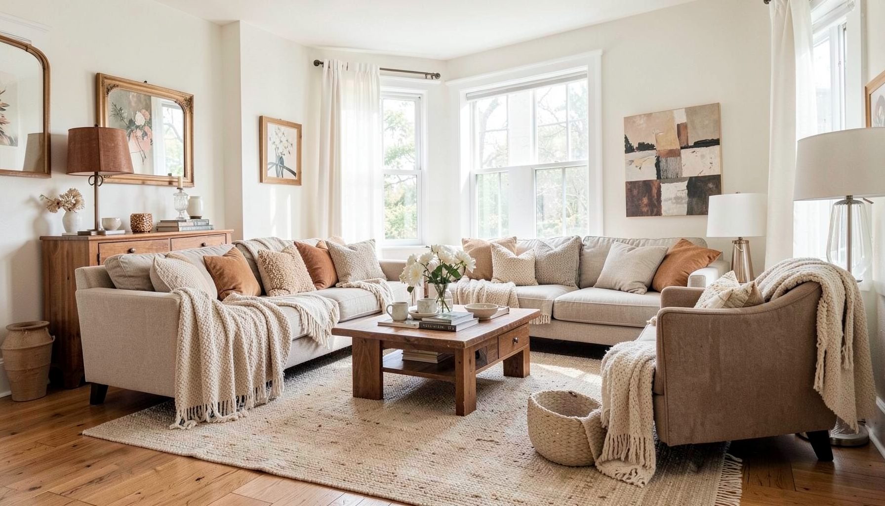
Downloads
Free curated resources for home decorating and design — guides, checklists, and inspiration to help you get started.
Learn MoreSelecting unsaturated neutral tones for south-facing rooms
South-facing rooms receive generous daylight for much of the day, making them bright, welcoming, and full of decorating potential. That abundance of light can also exaggerate color. A beige may turn yellow, a gray may appear icy, and a soft white may become glaring by midday. The most successful palette usually begins with understanding how sunlight changes the colors already present in the room.
Unsaturated neutrals offer a flexible answer. These quiet shades contain less intensity than clear, highly colored paints, so they can support vintage furniture, modern silhouettes, patterned textiles, and layered accessories without competing with them. They create a calm background while still bringing warmth, depth, or atmosphere to a space.
For Bay Area homes, where natural light can shift from cool morning brightness to warm afternoon glow, paint selection deserves more attention than a small swatch can provide. The goal is not simply to find a pale color. It is to choose a restrained neutral with the right undertone, depth, and relationship to the room’s finishes.
Why southern light changes neutral colors
South-facing windows generally bring warm, direct daylight into a room. In the Northern Hemisphere, this light is often strongest around the middle of the day and can make warm pigments look richer. Cream, camel, tan, and greige may take on a golden cast, while muted greens and blue-grays can appear more balanced than they would in a north-facing room.
Brightness also affects perceived saturation. A strong wash of sun can make some colors look cleaner and more vivid, even when the paint itself is subdued. Glossy floors, white trim, mirrors, and pale upholstery amplify that effect by reflecting light around the room. A color that seems pleasantly understated on a paint card may feel much more pronounced across four walls.
The room’s orientation is only one part of the picture. Trees, neighboring buildings, window treatments, nearby exterior walls, and the size of the glazing all influence the color temperature. A south-facing room shaded by mature trees may read quite differently from one with uninterrupted exposure, so broad rules should always be checked against the actual space.
What makes a neutral feel unsaturated
An unsaturated neutral has a restrained level of chroma. It may be beige, gray, taupe, mushroom, putty, stone, ivory, or a softened version of a color such as sage or blue. The shade still has an identifiable undertone, but it does not announce itself as a strong color. This lower intensity allows architecture and furnishings to share attention.
Warm unsaturated neutrals often include hints of red, yellow, or orange. Cool versions lean toward blue, green, or violet. Balanced neutrals sit closer to the center, although no paint is entirely free of undertone. Even a white may contain enough yellow, gray, or blue to change noticeably throughout the day.
In a sunny room, low-chroma colors can prevent the visual fatigue that comes from overly bright walls. They absorb some of the light’s energy and give the eye a quieter surface. This is especially useful in living rooms, bedrooms, and open-plan spaces where the wall color needs to connect several furniture finishes without making the entire scheme feel flat.
Read the room before choosing paint
Start with the fixed elements that will remain in place: flooring, stone, cabinetry, tile, woodwork, window frames, and large upholstered pieces. Hold paint samples next to these materials rather than evaluating them against a blank white wall. A neutral that looks elegant beside walnut may seem pink near red oak, while one that complements limestone could appear green next to cool porcelain tile.
Observe the room at several times of day. Morning light can reveal a cool cast that disappears by afternoon, while late-day sun may bring out yellow or peach undertones. Turn on lamps after sunset as well. Warm LED bulbs can make a beige look richer and a gray look muddier, especially when the walls have a matte finish.
Large sample boards are more reliable than small cards. Paint two coats on movable boards and place them on different walls, including the wall opposite the windows. Shift them around during the day and leave them in the room for at least a few days. This simple test shows whether a shade remains composed in direct sun, shadow, and artificial light.
| Neutral family | Typical impression in southern light | Works well with | Watch for |
|---|---|---|---|
| Soft ivory | Warm, luminous, and welcoming | Natural wood, linen, brass, woven textures | Can become yellow beside creamy furnishings |
| Mushroom taupe | Grounded, quiet, and sophisticated | Walnut, leather, antique brass, muted textiles | May feel muddy in rooms with little contrast |
| Greige | Flexible and contemporary | Stone, black accents, oak, tailored upholstery | Blue or violet undertones may emerge |
| Dusty sage | Gentle color with a neutral character | Terracotta, rattan, aged wood, cream | Can read greener in reflected garden light |
| Warm stone | Calm and architectural | Travertine, plaster, wool, dark metal | May look flat without layered texture |
| Soft blue-gray | Airy and collected | White oak, charcoal, faded rugs, silvered finishes | Can feel cool near bright white trim |
Choose a depth that can hold the sunlight
The palest neutral is not always the best choice for a bright room. Very light paint can reflect so much daylight that the walls lose definition, particularly when paired with white ceilings and untextured surfaces. A slightly deeper shade may create a more comfortable envelope while still keeping the space open.
Consider the room’s size and visual weight. In a compact bedroom, a muted taupe or pale mushroom can feel enveloping without becoming heavy. In a large living room with tall windows, a mid-tone greige or warm stone may provide enough presence to balance the scale. The right depth should support the furniture rather than disappear behind it or dominate it.
Sheen matters as well. Matte and eggshell finishes soften reflections and make a neutral feel more settled. Satin finishes highlight architectural details but can create noticeable glare on walls receiving direct sun. In many residential spaces, a washable matte or low-sheen eggshell provides a practical balance between a refined surface and everyday durability.
Build a layered palette around the walls
A neutral room gains character through variation, not through using one color everywhere. Pair a wall shade with neighboring neutrals that differ in value and texture. For example, warm stone walls can work with ivory linen, caramel leather, faded charcoal, and a rug combining sand and muted blue. The colors remain related, while the materials keep the scheme from becoming monotonous.
Trim does not have to be bright white. A softened white, pale putty, or slightly deeper version of the wall color can create a more integrated look. In a sunny room, stark white trim may increase contrast and make the wall color appear stronger. A tonal trim treatment often feels calmer and gives older architectural details a collected, intentional quality.
Furniture and accessories can introduce controlled contrast. Dark wood, blackened metal, rust, olive, dusty rose, and denim blue all sit comfortably beside many low-chroma neutrals. Use these accents in measured doses through art, pillows, ceramics, lamps, and vintage pieces. Their purpose is to give the eye places to rest and move, not to turn the room into a saturated color story.
Balance warmth with furnishings and finishes
When a south-facing room already contains warm materials, a neutral with a slightly cooler undertone may provide useful balance. Honey oak floors, cognac leather, terracotta, and brass can become overly golden when surrounded by yellow-based paint. A restrained greige or green-leaning taupe may calm the composition without making it feel cold.
The reverse is also true. If the room has polished concrete, blue-gray upholstery, white marble, or chrome, a gentle warm neutral can add comfort. Look for shades described as putty, oatmeal, mushroom, or warm stone rather than choosing a stark cream automatically. The objective is to create temperature contrast with control, so the room feels dimensional rather than divided.
Textiles are valuable testing tools because they reveal undertones quickly. Lay rugs, curtains, and upholstery samples against the wall at different angles. A neutral that works with one small cushion may not support a large patterned rug. Layering materials before finalizing paint helps create a palette that feels intentional from the beginning.
Refine the palette with a practical process
Paint selection becomes easier when each decision is made in sequence. Begin with the light, then examine fixed finishes, establish the desired atmosphere, and finally compare a limited number of paint samples. Avoid bringing home dozens of near-identical swatches. Too many options can make subtle differences harder to see.
Use these checkpoints while narrowing the field:
- Select three to five large sample boards with different undertones, not just different shades of beige.
- Compare each sample against flooring, upholstery, cabinetry, and trim in both sunlight and lamplight.
- Keep the sample visible for several days and assess it from the room’s main seating positions.
- Choose the finish after considering glare, cleaning needs, and the texture of the walls.
- Recheck the final color beside art, rugs, and window treatments before purchasing the full amount.
A professional color consultation can be particularly helpful when a room connects to several others. An open-plan home may need a neutral that transitions gracefully through changing light, while a separate bedroom can support a more atmospheric tone. Online e-decorating guidance can also help organize photographs, samples, measurements, and a cohesive palette before work begins.
The most appealing result usually includes a little variation. Use a quiet wall color as the foundation, then add tonal upholstery, aged finishes, tactile fabrics, and objects with history. Vintage and modern pieces can sit together naturally when the background is restrained enough to let their shapes and patinas show.
South-facing rooms reward thoughtful color choices because their daylight reveals every decision. Choose a low-chroma neutral that responds well to the existing materials, test it at full scale, and let texture carry some of the visual interest. For personalized help developing a layered palette, explore Maggie Rose Interiors’ decorating services and design resources, or begin with a room consultation tailored to your home.

Recent Projects