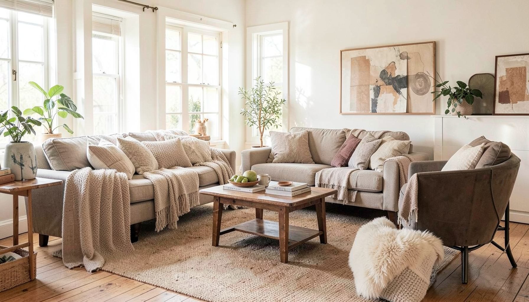
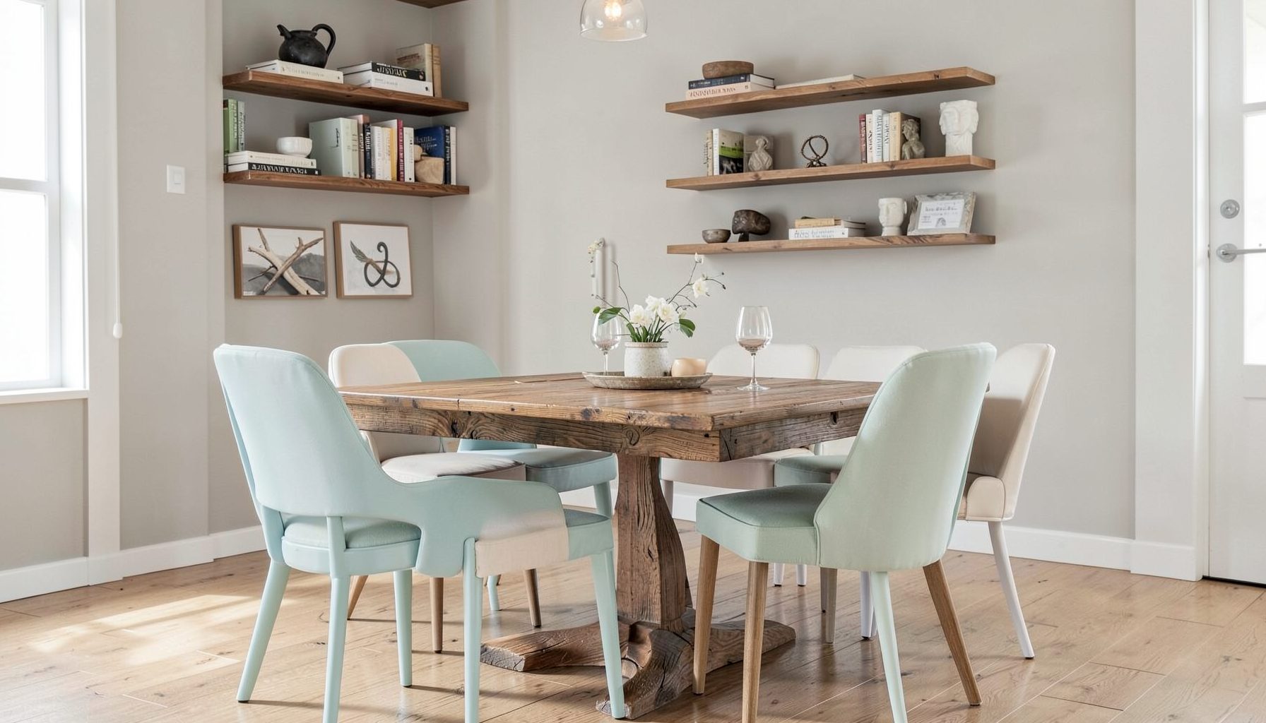
Interior Design
Full-service decorating that blends high and low, vintage finds with modern pieces for spaces that feel personal and collected.
Learn More
DIY Projects
Step-by-step tutorials for refinishing furniture, sewing pillows, styling bookshelves, and transforming rooms on a budget.
Learn More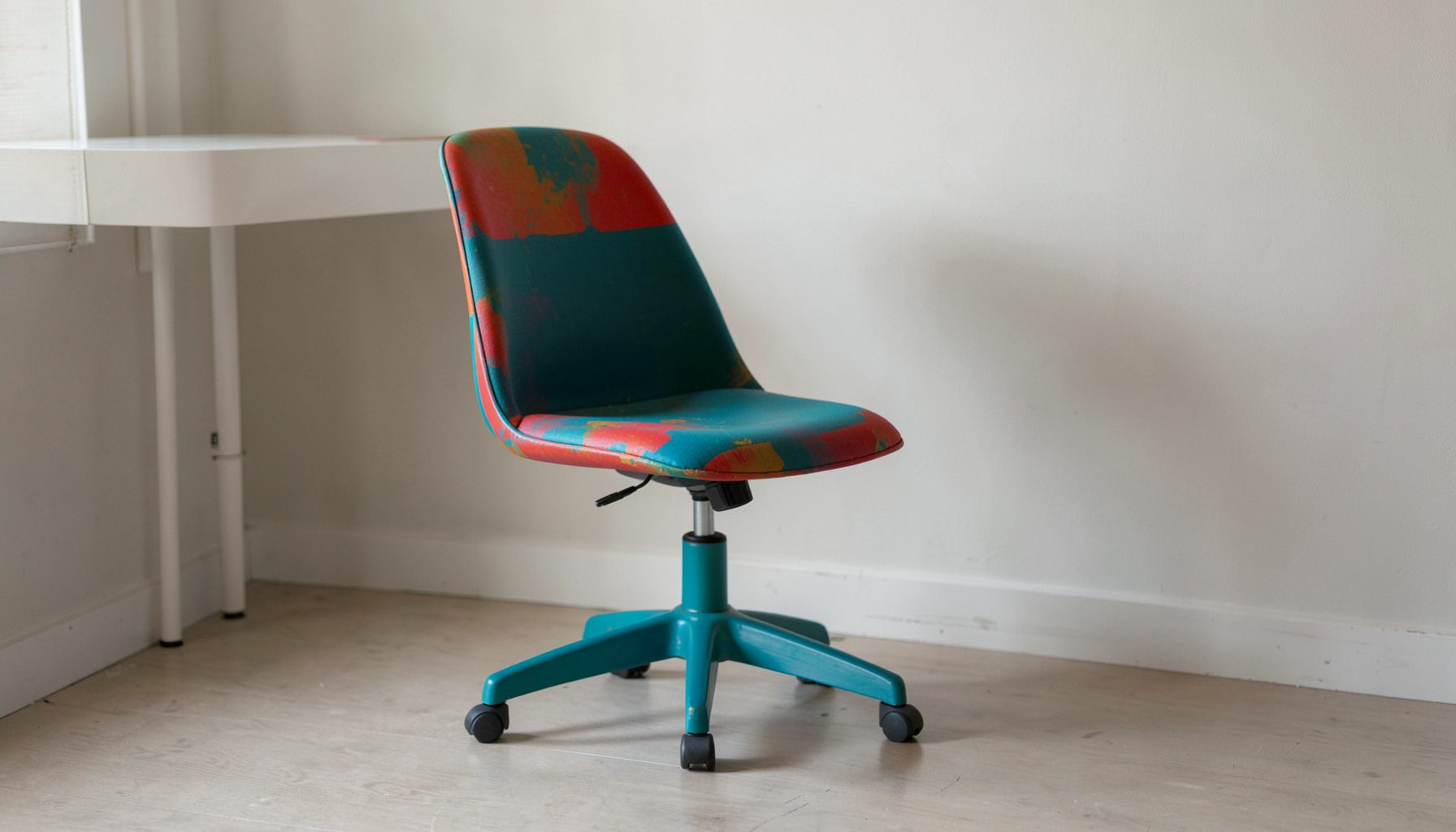
E-Decorating
Personalized design guidance delivered online — perfect for clients anywhere in the world who want a professional eye.
Learn More
Portfolio
Browse completed room makeovers, before-and-after transformations, and styling projects from Bay Area homes.
Learn More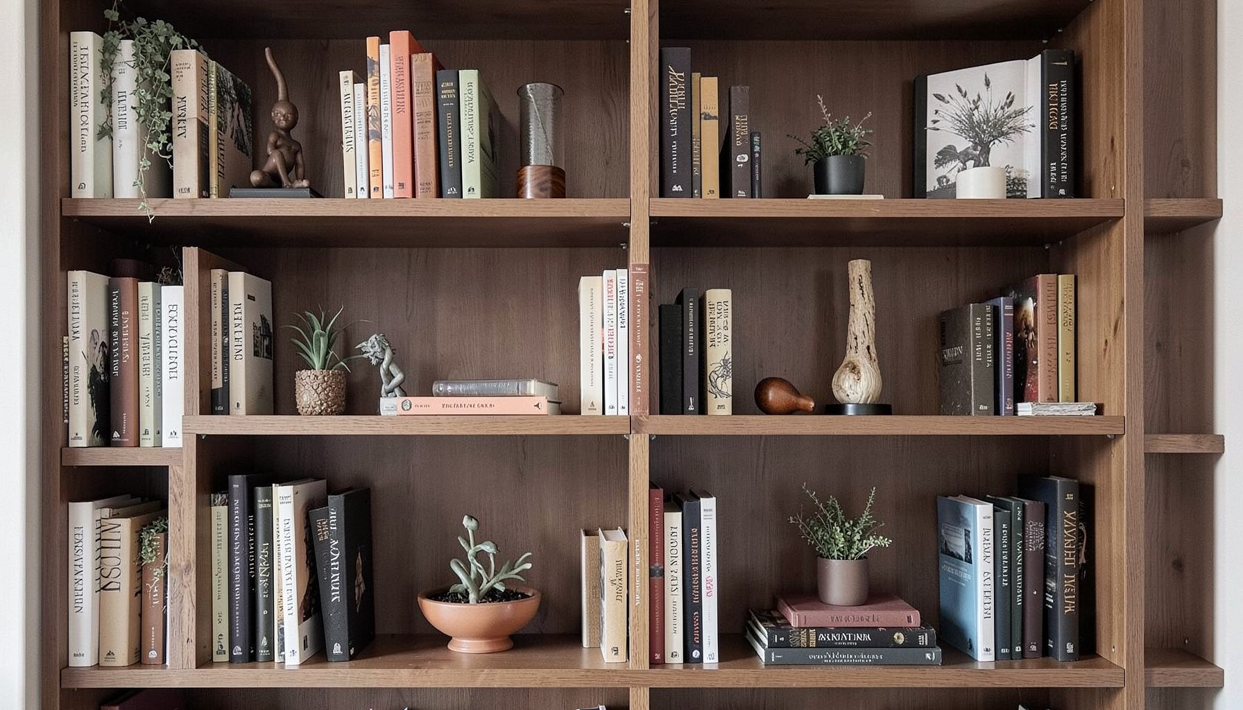
Blog
Interior design inspiration, fashion finds, entertaining ideas, and peeks into real home renovations and styling projects.
Learn More
Downloads
Free curated resources for home decorating and design — guides, checklists, and inspiration to help you get started.
Learn MoreChoosing the Right Paint Colour for a North-Facing Bedroom
A north-facing bedroom in Australia receives a very different quality of daylight from a north-facing room in the northern hemisphere. Here, northern windows generally bring the brightest, warmest natural light, particularly during the middle of the day. That can make pale colours glow, deepen warm neutrals and reveal undertones that remain hidden beneath a cooler artificial light.
The ideal wall colour depends on more than the direction of the windows. Ceiling height, flooring, curtains, nearby brickwork, garden views and the bedroom’s light fittings all influence how paint appears. A soft greige can feel calm and balanced in one room, then look distinctly beige or yellow in another.
Bedrooms also need to feel restful at night, when the natural light has disappeared. A colour that looks airy at 2 pm may seem muddy beneath warm bedside lamps. The best choice therefore works through a full day, complementing both the room’s sunlit character and its evening atmosphere.
A layered approach is particularly effective for this kind of space. Rather than matching every item, combine a considered wall colour with timber, linen, aged metal, artwork and textiles that reinforce the mood. This creates a bedroom that feels collected and personal instead of decorated around a single paint chip.
Understand how northern light changes colour
In Australian homes, a north-facing window usually receives abundant sunlight. In Sydney and Melbourne, that light can be crisp in winter and intensely bright in summer. In Brisbane, the stronger sun and higher humidity may make warm colours feel even more vivid. The result is often a room that benefits from restraint rather than extra warmth.
Pale warm whites, creamy off-whites and sandy neutrals can become noticeably golden in direct sun. This may be appealing if the bedroom contains natural timber, tan leather or woven fibres, yet too much yellow can feel dated or restless against cool white bedding. If the room already receives strong sun, a slightly muted neutral may provide a calmer backdrop.
Cool colours behave differently. Blue, green and blue-grey paint can balance the warmth of northern daylight, creating a serene retreat. However, a cool colour with a strong grey base may become unexpectedly icy in the early morning or under LED globes. The aim is usually a softened version of the hue, such as dusty sage, smoky blue or a greyed eucalyptus, rather than a pure, highly saturated colour.
Look at the room at several times before making a decision. Morning light shows how the colour behaves when the sun is lower, midday reveals its warmth and intensity, and evening lighting exposes its undertones. A colour that remains comfortable across all three periods is more reliable than one that looks perfect for a single photograph.
Start with undertones, not paint names
Paint names are useful for browsing, but they are not a dependable description of what a colour will do in a particular bedroom. Words such as “stone”, “cloud”, “shell” and “linen” can refer to colours with very different yellow, pink, green or blue undertones. Two near-identical sample cards may separate dramatically once they cover a full wall.
Begin by identifying the fixed elements that will remain in the room. Timber floors often carry yellow, orange or red tones. Carpet may introduce beige, mauve or grey. A tiled ensuite, white wardrobe, exposed brick wall or charcoal window frame can shift the appearance of nearby paint. The chosen colour should sit comfortably beside these permanent finishes before you consider cushions or artwork.
For a natural and versatile bedroom, look for neutrals with a gentle green or grey undertone. These can soften bright sunshine and work well with Australian timbers, rattan and linen. Beige with a red or yellow base can be beautiful in a room with muted furnishings, though it may become too peachy beside bright white trim.
Blue is a popular choice for sleeping spaces, but the undertone matters. A blue with a violet base can look sophisticated with warm oak and brass, while a green-blue often feels more grounded with eucalyptus tones and off-white linen. If you prefer a stronger wall colour, choose a complex, slightly dusty shade; it will absorb changing light more gracefully than a clean primary blue.
Compare samples in the actual room
Small paint cards are helpful for narrowing the field, but they are too limited for a final decision. Paint several large sample boards, ideally at least 600 millimetres square, and move them between the walls. Painting directly onto a wall can also work, though multiple layers may be needed to cover the test areas later.
Place one sample beside the window, another in the darkest corner and a third behind the bed. Watch how each patch relates to the skirting boards, curtains and floor. A colour may look beautifully soft in the centre of the wall and distinctly green near a leafy garden view. This is valuable information rather than a problem to hide.
Test the finish as well as the colour. In a bedroom, low-sheen or washable matte finishes tend to provide a restful surface with less glare than higher-sheen products. In Australia, where dust, sunscreen and everyday marks can accumulate, a durable washable finish is practical, especially in a children’s room or a guest bedroom. Ask the paint supplier about the exact sheen available in your chosen product, as names vary between brands.
Leave the boards in place for at least two full days. Turn on the bedside lamps after sunset, close the blinds during the afternoon and view the colour beside both warm and neutral-white globes. A sample that looks balanced under a 2700K lamp may look quite different beneath a cooler 4000K fitting. This simple test prevents many expensive repainting decisions.
Match the colour to the bedroom’s mood
Soft green is often an excellent choice for a sunny northern bedroom. Sage, olive-grey and muted eucalyptus shades connect with the Australian landscape while taking the edge off bright daylight. They pair naturally with oat-coloured linen, timber furniture, aged brass and artwork featuring ochre or clay tones.
Blue works well when the goal is a quieter, cooler feeling. Consider dusty denim, pale mineral blue or a subdued blue-grey rather than an intense marine shade. These colours can feel fresh in summer and cocooning in winter when combined with wool throws, heavier curtains and warm timber. In a compact room, a light version can preserve a sense of airiness without relying on stark white.
Warm neutrals suit bedrooms that need softness and flexibility. Mushroom, putty, biscuit and pale taupe can support vintage bedside tables, contemporary wardrobes and patterned fabrics. In a bright north-facing room, select a neutral with a restrained undertone so the sunlight does not turn it overly yellow. A warmer colour can then be introduced through a headboard, rug or bed linen, where it is easier to change.
Deeper colours can be highly effective if the bedroom is large enough or the furniture is relatively light. Charcoal green, inky blue and earthy brown-grey create a cocooning effect and can make a sunny room feel more intimate. Use them on all walls for a deliberately enveloping scheme, or create a quieter feature behind the bed while keeping the other walls lighter. The finish, lighting and amount of contrast will determine whether the result feels elegant or heavy.
If the room’s proportions, finishes or furnishing choices make the decision difficult, full-service design support can help bring the colour, lighting and wider scheme together rather than treating paint as an isolated choice.
Build the rest of the scheme around the walls
Once the wall colour is selected, avoid rushing to match every item to it. A successful bedroom usually contains several related tones rather than one exact colour repeated throughout. If the walls are soft sage, bring in olive through a cushion or artwork, warm the scheme with timber and add contrast with cream, charcoal or aged metal.
Window treatments deserve particular attention in a north-facing room. Sheer curtains can diffuse strong daylight while preserving brightness, and blockout curtains help protect sleep during early summer sun. In Australia, where sunrise can be very early, a lined blockout fabric is often more useful than a beautiful but translucent treatment. Choose a curtain colour that sits close to the wall for a calm effect, or use a subtle pattern to add texture.
The ceiling and trim do not need to be brilliant white. A softened white with a compatible undertone can make the walls appear more intentional and reduce harsh contrast. If the walls are pale and the room has low ceilings, keeping the ceiling lighter will maintain a sense of height. In a dramatic scheme, carrying the wall colour onto the ceiling can create a boutique-hotel feeling, particularly in a room with decorative cornices or strong architectural details.
Furniture should support the paint rather than compete with it. In a relaxed coastal or contemporary Australian bedroom, pale oak, woven cane and washed linen can keep a cool wall from feeling stark. In a Federation or Victorian home, richer timber, antique pieces and patterned textiles may give a soft neutral more depth. Mixing an op-shop find with a modern bedside lamp often creates more character than purchasing a perfectly matched suite.
Remember that the bed occupies a large visual area. White bedding reflects the wall colour and keeps the room crisp, while oatmeal, clay, faded rose or muted blue can pull out subtle undertones. Layering quilts, blankets and cushions gives the colour somewhere to resonate without making the room look overly coordinated.
Choosing paint for a north-facing bedroom is a process of observing, testing and balancing. Start with the direction of the light, study the undertones of the fixed finishes and use large samples in several parts of the room. Judge the colour during daylight and beneath the lamps you will use every night.
The most dependable shades are usually complex enough to adapt as the light changes: a softened blue, a greyed green, a balanced warm neutral or a deeper earthy tone. The finish, curtains, bedding and furniture will shape the final result just as strongly as the paint itself. What the reader should remember is that the perfect colour is the one that feels calm in the room’s brightest hour and comfortable when the day has gone.

Recent Projects