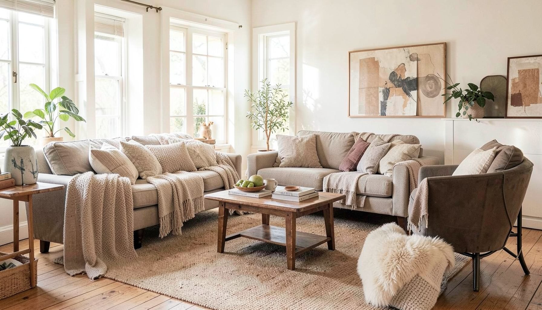
Interior Design
Full-service decorating that blends high and low, vintage finds with modern pieces for spaces that feel personal and collected.
Learn More
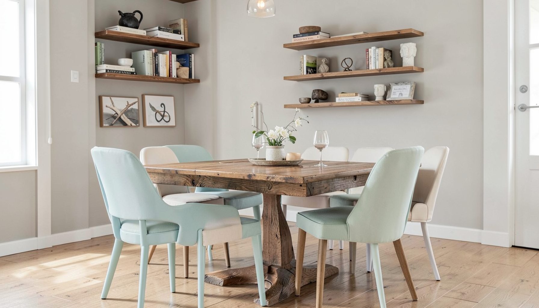
DIY Projects
Step-by-step tutorials for refinishing furniture, sewing pillows, styling bookshelves, and transforming rooms on a budget.
Learn More
E-Decorating
Personalized design guidance delivered online — perfect for clients anywhere in the world who want a professional eye.
Learn More
Portfolio
Browse completed room makeovers, before-and-after transformations, and styling projects from Bay Area homes.
Learn More
Blog
Interior design inspiration, fashion finds, entertaining ideas, and peeks into real home renovations and styling projects.
Learn More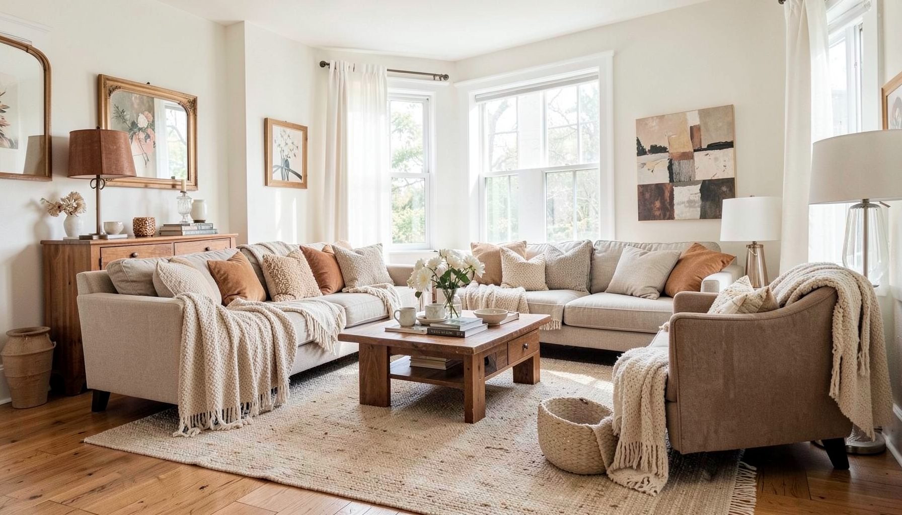
Downloads
Free curated resources for home decorating and design — guides, checklists, and inspiration to help you get started.
Learn MorePainting a Ceiling in a Dark and Moody Color Without Regret
A ceiling is often treated as a blank, forgotten surface, but it can shape the mood of an entire room. A deep green, warm charcoal, inky blue, or muted aubergine overhead adds dimension and gives the space a more enveloping character. When the color is selected and applied thoughtfully, the ceiling can feel intentional rather than heavy.
Dark ceiling paint is especially effective in rooms that already invite comfort: bedrooms, libraries, dining rooms, media spaces, powder rooms, and cozy sitting areas. It can highlight architectural details, make lighting feel warmer, and create a collected look that works beautifully with both vintage and contemporary furnishings.
The key is to consider the ceiling as part of the complete color story. Its success depends on natural light, ceiling height, sheen, trim, furnishings, and the visual relationship between the upper and lower portions of the room. A dramatic choice becomes much easier to live with when those elements are balanced from the beginning.
Understand what a dark ceiling does to a room
A saturated ceiling draws the eye upward and gives the room a defined visual finish. Rather than making a space automatically feel smaller, a dark overhead surface can blur the boundaries of the room and create a cocooning effect. This is often desirable in rooms intended for relaxation, conversation, or evening use.
The emotional quality of the color matters as much as its depth. A smoky blue can feel calm and atmospheric, while forest green brings an organic, library-like mood. Chocolate brown offers warmth and sophistication, and charcoal creates a tailored backdrop for art, brass, leather, and light upholstery. A near-black ceiling can be striking, but it usually needs plenty of contrast elsewhere.
Dark paint also changes how light is perceived. It absorbs more light than a white ceiling, so fixtures, lamps, and daylight become more important to the room’s overall experience. This can be an advantage when you want a softer, less glaring atmosphere, but it requires a layered lighting plan rather than reliance on a single overhead fixture.
Assess light, height, and architectural details
Before choosing a color, observe the room at different times of day. A north-facing room may make blue, gray, or green paint appear cooler and more subdued. South- and west-facing rooms can handle richer pigments, although strong afternoon sun may reveal undertones that are easy to miss on a small swatch.
Ceiling height should guide the intensity and finish, not dictate a strict rule. A low ceiling can benefit from a dark color when the walls, trim, and furnishings create enough continuity to make the room feel intentional. Painting the ceiling and upper wall in related tones can soften the transition, while a sharp contrast may emphasize the ceiling’s height and shape.
Look closely at beams, coffers, crown molding, medallions, skylights, and unusual angles. A dark color can make architectural elements more expressive, especially when beams remain natural wood or trim is painted in a slightly lighter version of the ceiling shade. In a room with little architectural interest, a saturated ceiling can supply its own layer of detail.
Sample the color directly on the ceiling whenever possible. Horizontal paint chips do not show how a color behaves overhead, where shadows and reflected light alter its appearance. Large poster boards can help, but painted test areas are more reliable. View them in daylight, lamplight, and the evening hours when the room is most often used.
Choose a color and finish with staying power
The safest dark ceiling colors are usually complex rather than perfectly pure. Look for shades with gray, brown, green, or blue undertones that connect to existing flooring, upholstery, artwork, or cabinetry. These nuanced colors tend to feel layered and livable, while an overly bright or flat version of a deep hue may appear disconnected.
A ceiling does not have to match the walls exactly. A tonal scheme might pair pale plaster walls with a dusty olive ceiling, or warm white walls with a deep espresso overhead. Another approach is to borrow a color from a rug, textile, or piece of art and deepen it for the ceiling. This creates a subtle thread through the room without making every surface identical.
Paint sheen deserves careful attention. Flat or matte paint is the traditional choice because it minimizes reflections and disguises minor imperfections. An ultra-matte finish can look sophisticated in a well-prepared room, while a low-luster finish may offer greater durability in a kitchen, hallway, or family space. High sheen tends to emphasize flaws and can produce distracting glare, particularly near recessed lights.
| Ceiling color direction | Best atmosphere | Helpful pairings | Considerations |
|---|---|---|---|
| Deep forest green | Organic, intimate, collected | Natural wood, aged brass, linen, cream | Can read blue or black in low light |
| Smoky navy | Calm, tailored, dramatic | Warm white, camel, cognac leather, walnut | Test for cool undertones |
| Charcoal gray | Modern, refined, architectural | Blush, rust, ivory, polished metal | Needs warm lighting to avoid feeling stark |
| Chocolate brown | Rich, enveloping, inviting | Soft blue, parchment, rattan, antique finishes | Works best with some lighter contrast |
| Muted aubergine | Artistic, elegant, unexpected | Dusty rose, ochre, bronze, warm neutrals | Strong undertones require large samples |
| Soft black | Graphic, theatrical, sophisticated | Bright trim, pale upholstery, reflective accents | Use thoughtfully in rooms with adequate light |
Prepare the surface before opening the paint
A dark color makes preparation more important because uneven patches, roller marks, and repaired areas can become visible under angled light. Clean away dust and grease, scrape loose paint, fill nail holes, and sand glossy areas so the new coating can bond properly. Any water stains should be investigated and sealed rather than simply covered.
Primer can improve both coverage and color accuracy. A tinted primer close to the final shade may reduce the number of finish coats, particularly when moving from a white ceiling to a saturated color. Use a stain-blocking primer where needed, and allow each coat to dry according to the manufacturer’s directions before evaluating the result.
Protect the room thoroughly. Remove or cover furnishings, take down light fixtures where practical, and use quality painter’s tape along adjacent surfaces. A sturdy extension pole, a clean roller designed for the ceiling texture, and a well-loaded brush for edges will make the process more controlled. Work in manageable sections and maintain a wet edge to avoid lap marks.
For a seamless appearance, keep the roller pressure consistent and finish each pass in the same direction. Do not overwork paint as it begins to set. If the ceiling is textured, test the roller nap on a small area first; a nap that is too short may leave gaps, while one that is too long can create an uneven surface.
Connect the ceiling to the rest of the room
A moody ceiling looks most convincing when it has visual support below it. Repeat a related color in a pillow, patterned chair, rug, artwork, or lampshade rather than matching the ceiling throughout the room. These smaller echoes make the choice feel integrated and collected.
Contrast keeps the room from becoming visually dense. Light upholstery, pale bedding, creamy plaster walls, reflective metal, or a natural fiber rug can give the eye places to rest. In a darker dining room, an ivory tablecloth or warm pendant shade may provide enough lift. In a bedroom, crisp sheets and softly colored textiles can balance a deep overhead tone.
Trim decisions are equally important. Bright white crown molding creates a traditional, graphic border, while trim painted close to the ceiling color produces a more enveloping effect. Warm white is often easier to live with than a stark blue-white, especially when the ceiling color has green, brown, or red undertones. If there is no crown molding, a carefully painted wall-to-ceiling transition can look especially modern.
Lighting should be layered rather than treated as an afterthought. Combine ambient fixtures with sconces, table lamps, picture lights, or concealed sources. Warm bulbs generally support moody colors better than cool bulbs, though the right temperature depends on the room and materials. Metallic accents and glass shades can reflect light without undermining the intimate atmosphere.
Use the dramatic treatment where it earns its place
A dark ceiling can be especially successful when the room has a clear purpose. In a dining room, it supports candlelight and encourages a more intimate gathering. In a bedroom, it can make the ceiling feel restful and enveloping. In a small powder room, a bold overhead color can turn a practical space into a jewel box.
Open-plan rooms require more care because the ceiling color may be visible from several connected areas. Define the painted zone with a ceiling beam, change in floor material, architectural opening, or natural furniture arrangement. If no boundary exists, a related but less intense color may transition more gracefully than a sudden dark rectangle overhead.
A dark ceiling also works well in spaces with abundant white or pale surfaces, where it adds depth without competing with a collection of art and furnishings. In a room already filled with strong patterns, dark cabinetry, and saturated walls, a quieter tonal ceiling may achieve the same sense of drama with less visual pressure.
For clients who love the look but want a smaller commitment, consider painting a tray ceiling, a recessed area, a porch ceiling, or the interior of a skylight well. These focused applications can provide the atmosphere of a moody ceiling while keeping the surrounding architecture lighter.
Make the decision with confidence
A successful ceiling color is less about following a decorating rule and more about testing how the room responds. These practical guidelines help keep the effect intentional:
- Sample large areas and view them in morning, afternoon, and evening light.
- Choose a complex, muted pigment that relates to existing materials in the room.
- Use matte or low-sheen paint unless the surface is exceptionally smooth and the reflection is deliberate.
- Balance the dark overhead plane with lighter textiles, warm lighting, or reflective accents.
- Repeat a small amount of the ceiling color elsewhere so it feels connected rather than isolated.
If the first coat feels stronger than expected, give the room time to develop before making a rushed change. Add furnishings, install the planned lighting, and live with the color through several lighting conditions. Sometimes a ceiling appears overwhelming when the room is empty, then becomes perfectly balanced once rugs, curtains, artwork, and furniture are in place.
When repainting is necessary, the experience still provides useful information. A softened version of the same color, a more gray-based alternative, or a tonal wall-and-ceiling treatment may deliver the desired mood with less contrast. Paint is a powerful design tool, but it is also one of the most changeable finishes in a home.
A thoughtful dark ceiling can make an ordinary room feel layered, personal, and complete. Maggie Rose Interiors brings together vintage finds, modern pieces, approachable furnishings, and tailored styling to create spaces with that collected sense of ease. Whether the project calls for full-service design, a room refresh, or focused online guidance, a considered color plan can turn the fifth wall into a defining feature.
Explore the design resources and project inspiration from Maggie Rose Interiors, then bring your ceiling color idea into a broader plan for lighting, furnishings, and finishes. With the right preparation and a palette that reflects the room’s personality, a dramatic overhead shade can become one of the most memorable details in the home.

Recent Projects