Interior Design
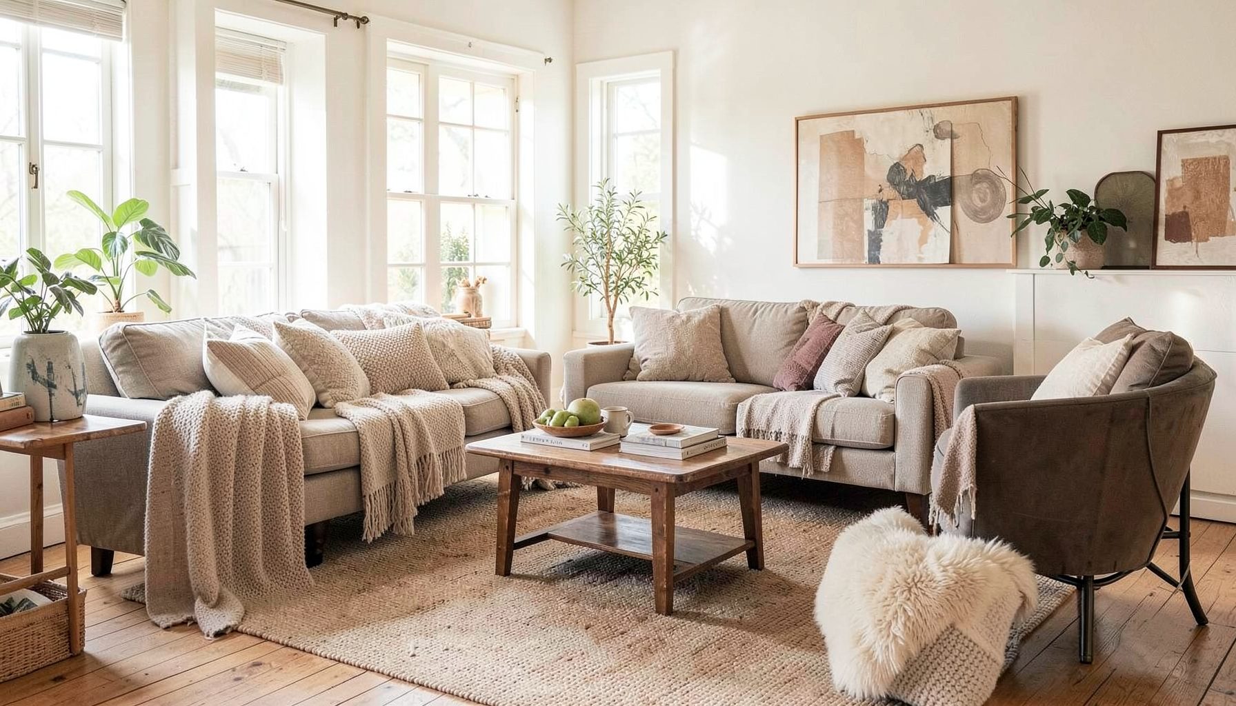
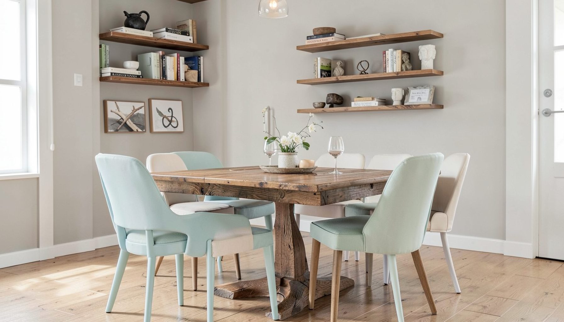
Full-service decorating that blends high and low, vintage finds with modern pieces for spaces that feel personal and collected.
Learn More
DIY Projects
Step-by-step tutorials for refinishing furniture, sewing pillows, styling bookshelves, and transforming rooms on a budget.
Learn More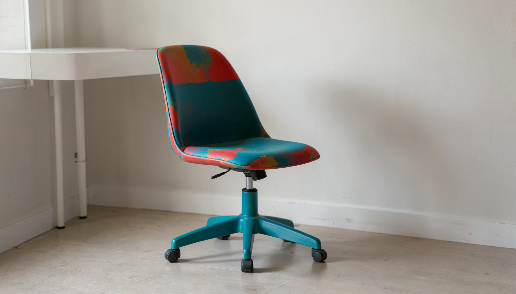
E-Decorating
Personalized design guidance delivered online — perfect for clients anywhere in the world who want a professional eye.
Learn More
Portfolio
Browse completed room makeovers, before-and-after transformations, and styling projects from Bay Area homes.
Learn More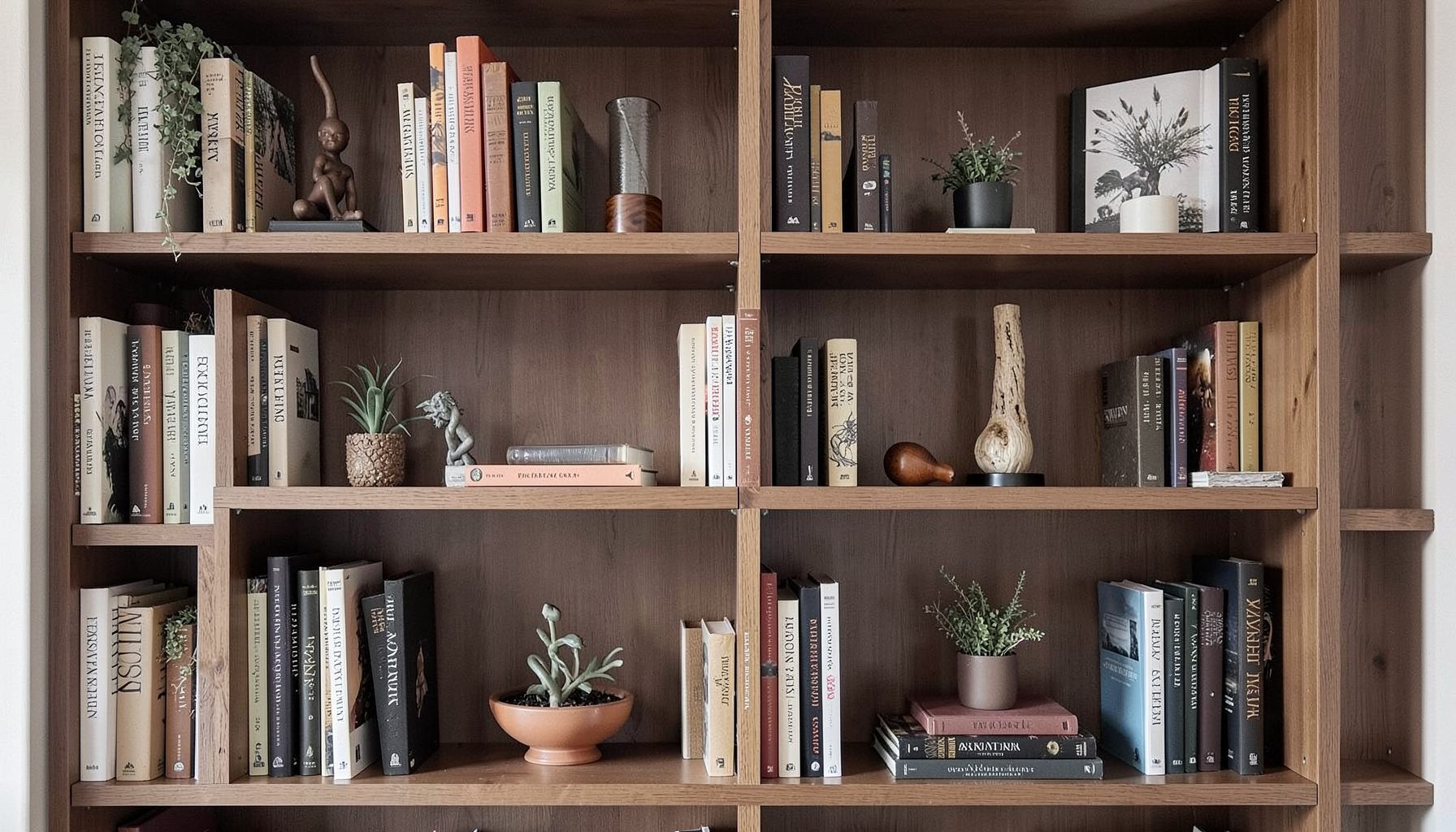
Blog
Interior design inspiration, fashion finds, entertaining ideas, and peeks into real home renovations and styling projects.
Learn More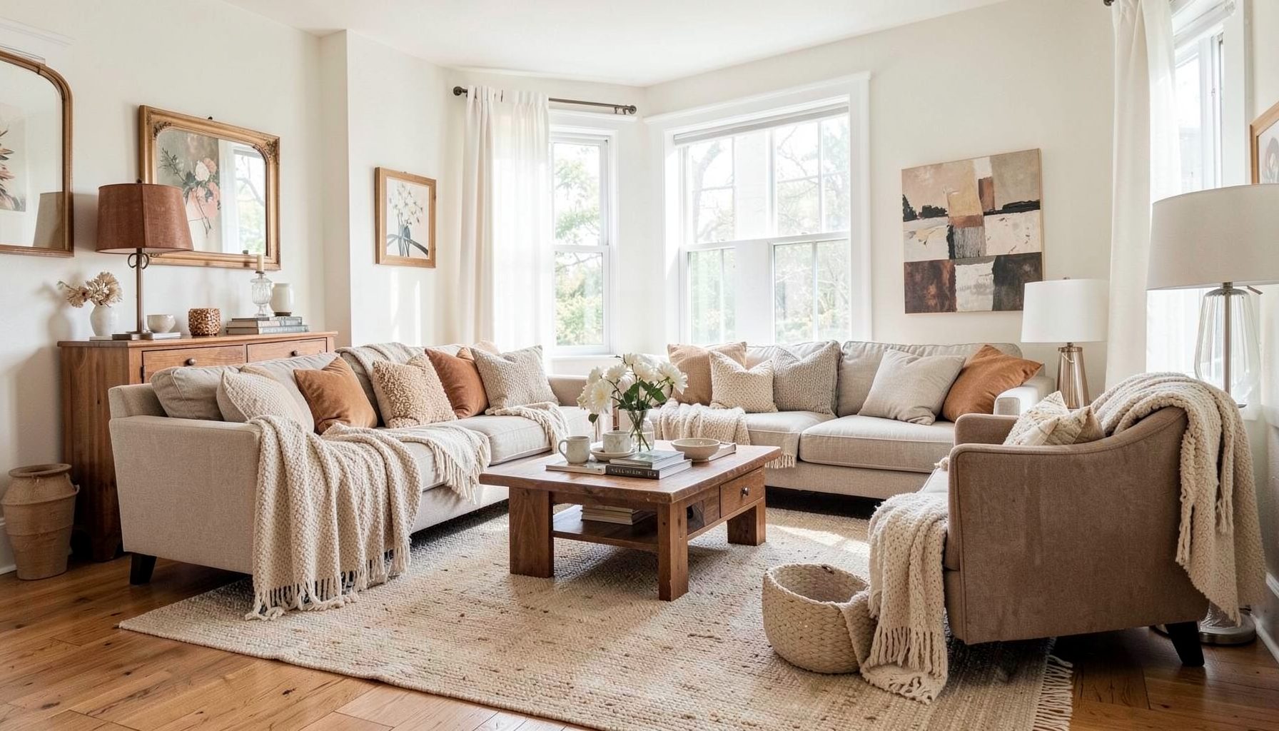
Downloads
Free curated resources for home decorating and design — guides, checklists, and inspiration to help you get started.
Learn MoreMixing Silver And Gold Metal Finishes In One Space
A room does not need to choose between the cool clarity of silver and the warmth of gold. Used with intention, the two finishes can create a layered interior that feels collected rather than overly matched. Silver brings freshness, reflection and a slightly architectural quality, while gold introduces softness, richness and visual warmth.
The most successful schemes usually treat metallic finishes as supporting characters. Timber, stone, linen, painted surfaces and artwork provide the main structure, while metal details guide the eye around the room. A brushed nickel tap, aged brass lamp and antique silver frame can sit comfortably together when their proportions, shapes and levels of shine have been considered.
This approach suits Australian homes particularly well, from compact Sydney apartments to relaxed coastal houses in Brisbane and heritage terraces in Melbourne. Natural light, open-plan living and a mix of old and new furnishings provide an excellent setting for combining warm and cool metal accents without making the space feel busy.
Start With A Clear Metal Hierarchy
Before buying individual pieces, decide which finish will lead and which will provide contrast. A dominant metal might appear on cabinet hardware, tapware and a major light fitting, while the secondary finish appears in picture frames, occasional furniture or decorative objects. A useful starting point is a ratio of roughly 70 per cent dominant metal to 30 per cent supporting metal.
This does not mean counting every handle and ornament with mathematical precision. It means giving the eye a consistent visual anchor. If brushed brass is the main finish in a kitchen, polished chrome can appear in a small appliance, framed artwork or nearby dining light. If satin nickel leads in a bathroom, an aged brass mirror or wall sconce can add warmth without competing with the plumbing.
Repeat each finish at least twice, preferably in different areas of the room. A brass pendant above a dining table can connect to a brass-edged tray on a sideboard, while chrome chair details can echo a silver-toned vase or curtain rod. Repetition makes the combination feel designed, rather than the result of unrelated purchases.
The shape of each item also affects the balance. Rounded brass forms feel gentler beside crisp silver hardware, while angular chrome furniture can sharpen a room filled with soft upholstery. Consider both colour and silhouette when deciding whether a piece belongs in the scheme.
Balance Warm And Cool Undertones
Silver and gold are broad categories rather than single colours. Bright chrome is highly reflective and cool, while brushed nickel has a softer grey appearance. Aged brass may lean earthy and muted, polished brass can appear yellow and glamorous, and champagne gold sits somewhere between beige, bronze and pale yellow.
Undertones matter because the surrounding palette can make a metal look different. Warm white walls, terracotta, camel leather and timber tend to support antique brass and bronze. Blue-grey paint, crisp white, charcoal and green marble often work beautifully with chrome or nickel. When both families are present, a bridge colour such as taupe, mushroom, putty, tan or soft black can help them relate.
Matt and satin surfaces are particularly forgiving. They diffuse light and reduce the visual tension between contrasting finishes. A satin brass mirror can sit beside a brushed stainless steel console more easily than a highly polished gold mirror beside a mirror-finish chrome table. High shine can still be effective, but it is best used selectively as a highlight.
Sample metals in the actual room before committing. Place a tap sample, handle, lamp or framed object beside the benchtop, flooring and wall colour at different times of day. Australian sunlight can be intense, especially in north-facing rooms, and a finish that looks subtle in a showroom may appear much brighter beside a window.
Bring Mixed Finishes Into Every Room
In a kitchen, the permanent finishes deserve the most attention. Tapware, handles, sink accessories and pendant lights are usually the strongest metal signals, so select these as a family before adding decorative details. Brushed nickel handles with aged brass pendants can create a relaxed transition between cool cabinetry and warm timber flooring. Chrome tapware with antique brass knobs offers a similar balance in a more traditional space.
Do not feel obliged to match appliances exactly. Stainless steel appliances already introduce a silver element, even when the visible hardware is brass. In that situation, use stainless steel as part of the room’s background and allow the warmer metal to appear in lighting, stools, open shelving brackets or artwork. This is often more cohesive than adding several competing silver accessories.
Living rooms benefit from smaller, repeated accents. A silver-toned coffee table can connect with a grey-blue cushion, while a brass floor lamp relates to tan leather, warm timber or ochre artwork. Mixing a vintage mirror with a contemporary light fitting adds depth, especially when the furniture includes both modern upholstery and older timber pieces.
Bedrooms can use metal contrast in a quieter way. Choose one finish for bedside lamps and introduce the second through drawer pulls, a frame or a small decorative bowl. In a bathroom, combining finishes is easiest when one is used for functional hardware and the other for the mirror, lighting or accessories. Keep the plumbing layout visually calm, particularly in a small ensuite where too many reflective surfaces can become distracting.
Adapt The Scheme To Australian Homes
Australian interiors often have strong connections to the outdoors, whether through a balcony, courtyard, verandah or large glazed opening. Silver finishes can reinforce a bright, breezy feeling in coastal homes, while brushed brass brings warmth to spaces with spotted gum, blackbutt or other timber tones. In Brisbane and northern parts of the country, a restrained mix of satin metals can prevent an open-plan room from feeling overly glossy in strong daylight.
In Melbourne and Adelaide, where older homes may combine ornate details with renovated kitchens, mixed metals can help connect periods. An aged brass pendant may acknowledge original timber or plasterwork, while nickel tapware keeps a new bathroom feeling clean. In Sydney apartments, where space and natural light can be limited, reflective silver details can increase brightness, with small touches of gold stopping the scheme from becoming cold.
Coastal air deserves practical consideration. Near the Australian coastline, salt can accelerate corrosion on unsuitable metal surfaces, particularly on balconies, outdoor kitchens and homes with frequent sea breezes. Choose products rated for the intended environment, follow the manufacturer’s cleaning instructions and avoid assuming that a decorative indoor finish is suitable outside. Protective coatings can change how a metal ages, so check the product specification before installation.
Rental and apartment rules also influence what can be changed. Tenants generally need the owner’s written consent for alterations, and state or territory tenancy laws differ about fixtures, painting and modifications. Strata buildings may have additional by-laws for plumbing, lighting and works affecting common property. Swapping removable lamps, trays and frames is low risk, while replacing tapware or hardwired lighting should be approved and carried out appropriately.
Use Texture To Keep The Contrast Sophisticated
Texture is often the element that makes mixed metal interiors feel layered. A hammered brass bowl, brushed nickel lamp and antique silver frame each reflect light differently, creating interest without relying on multiple strong colours. Combine smooth, aged, brushed and lightly textured surfaces rather than filling the room with identical polished finishes.
The surrounding materials should provide visual rest. Linen curtains, boucle upholstery, rattan, timber, marble, travertine and handmade ceramics soften the sharper quality of metal. In a dining room, for example, a sculptural brass pendant can be balanced by a timber table, woven chairs and a matt ceramic centrepiece. The result feels tactile instead of showroom-like.
Vintage pieces are valuable because they rarely match perfectly. A silver-plated picture frame with gentle patina can make new brass hardware feel more intentional, while an antique bronze lamp may bridge polished chrome and warm timber. Look for a shared quality such as curved edges, a muted finish or a repeated colour rather than trying to find exact duplicates.
Artwork can also unify the palette. A painting with charcoal, cream, ochre and blue-grey may quietly contain the colours needed to support both metals. Place frames where they can be seen from more than one angle, particularly in an open-plan Australian living area where the kitchen, dining zone and lounge need visual links.
Plan The Details Before Installation
Create a small finish board before ordering. Include photographs or samples of tapware, handles, light fittings, frames, flooring, stone, paint and key furniture fabrics. View the board in daylight and warm evening light. This process reveals when two metals are too similar to distinguish or when their undertones sit awkwardly beside the fixed materials.
Lighting deserves special care because it changes the apparent colour of every finish. Warm LED bulbs can make silver look softer and gold look deeper, while cooler bulbs emphasise the blue-grey quality of chrome and nickel. For homes with dimmable lighting, select compatible lamps and fittings, and use a licensed electrician for hardwired installation in line with Australian requirements and applicable standards.
Scale is another useful control. A large brass pendant can carry the warm side of the scheme, allowing smaller silver details to remain understated. If the room already has a prominent stainless steel kitchen, avoid adding several large chrome objects. Instead, use gold in a few deliberate areas such as a lamp base, mirror trim or sculptural accessory.
For a tailored result, professional guidance can help coordinate permanent selections with the furnishings that will remain in the room. Maggie Rose Interiors provides design services that can support full-room decorating, online guidance and considered styling, which is useful when a project needs to balance existing pieces with new purchases.
Begin with the items that cannot easily be changed, such as flooring, benchtops, tapware and major lighting. Then select a leading metal, choose one supporting finish, and repeat both through smaller objects. This keeps the scheme flexible while preventing every surface from competing for attention.
The goal is a room where silver and gold feel connected by atmosphere rather than forced into a matching set. Let the architecture, natural light and personal collection lead the decisions, then add metal accents gradually. The next practical step is to gather three existing metal objects from the room and arrange them beside samples of two possible finishes in the space where they will be used.

Recent Projects