Interior Design
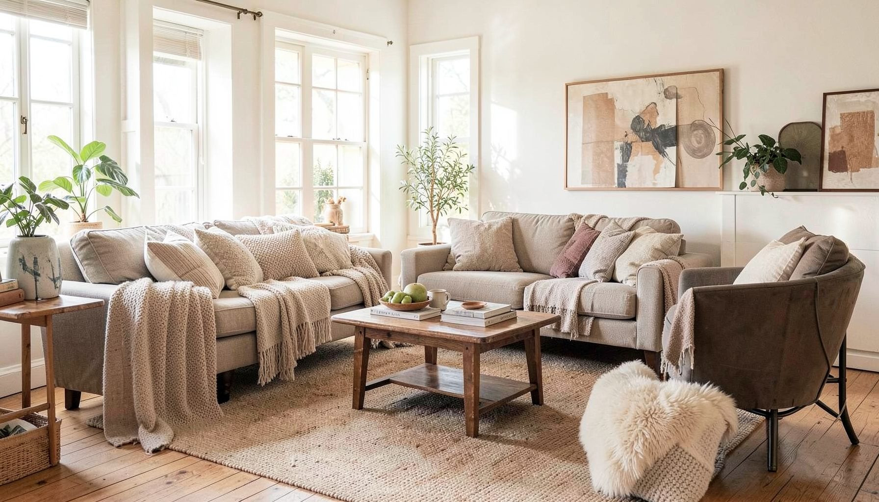
Full-service decorating that blends high and low, vintage finds with modern pieces for spaces that feel personal and collected.
Learn More
DIY Projects
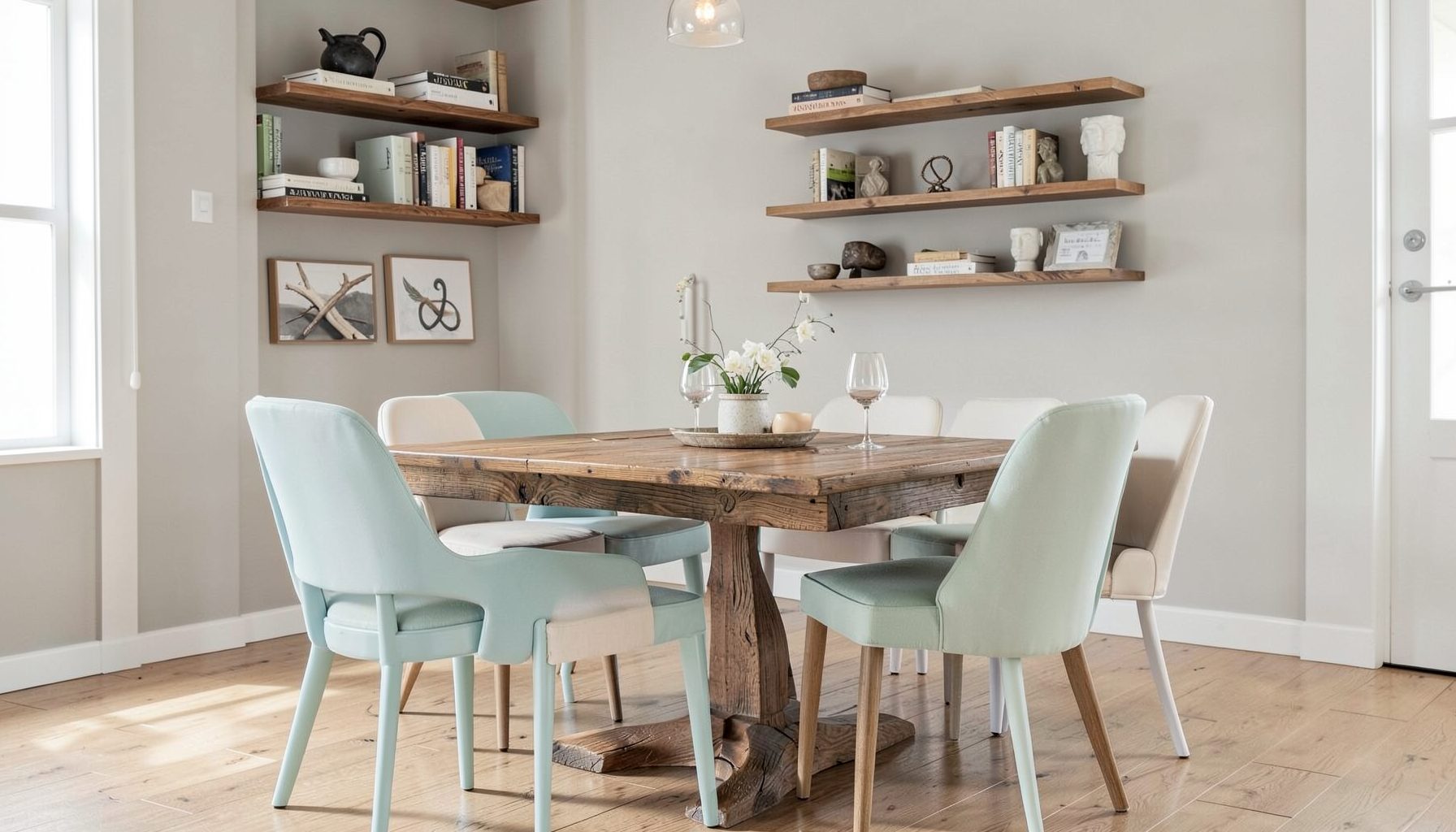
Step-by-step tutorials for refinishing furniture, sewing pillows, styling bookshelves, and transforming rooms on a budget.
Learn More
E-Decorating
Personalized design guidance delivered online — perfect for clients anywhere in the world who want a professional eye.
Learn More
Portfolio
Browse completed room makeovers, before-and-after transformations, and styling projects from Bay Area homes.
Learn More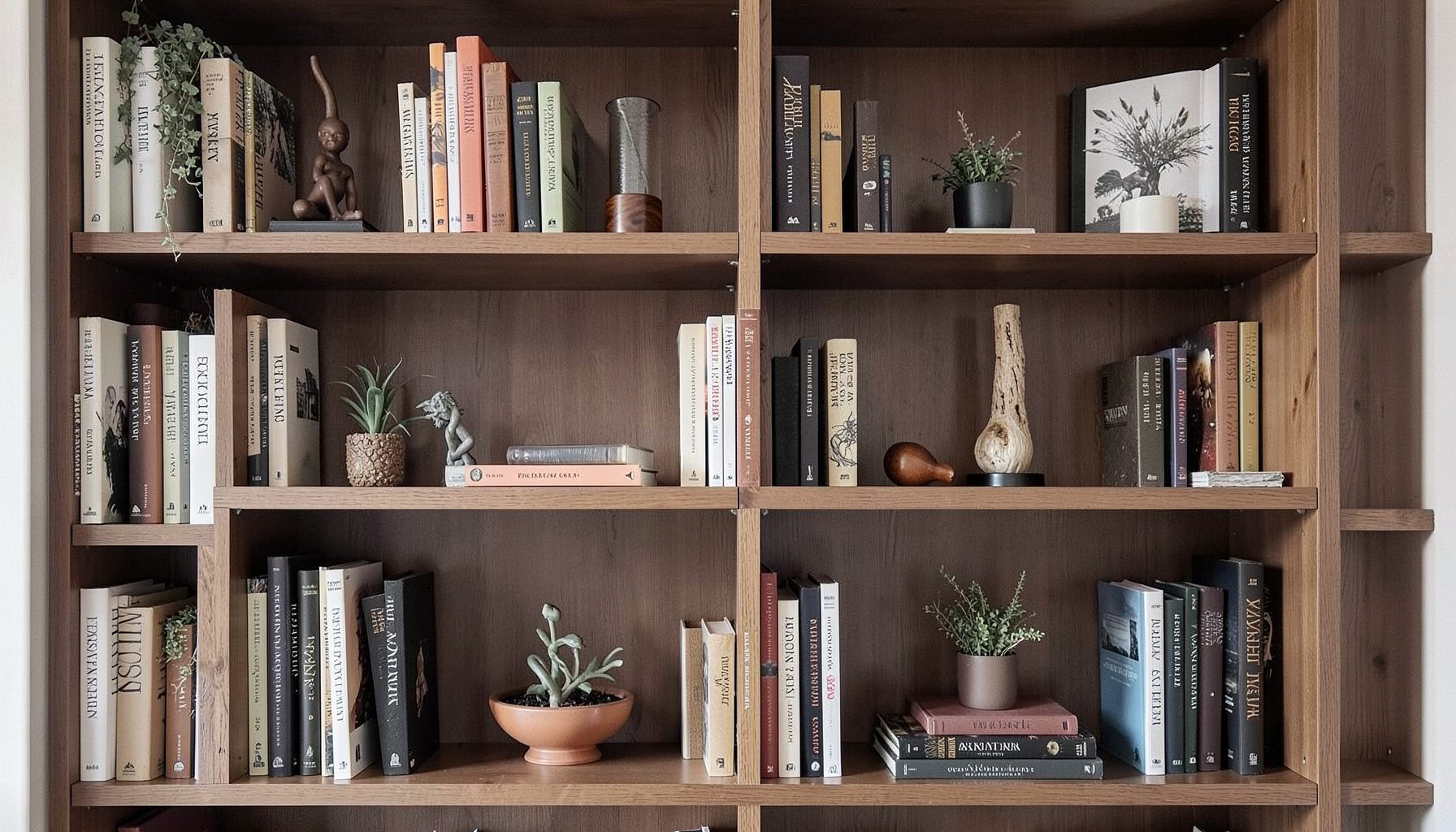
Blog
Interior design inspiration, fashion finds, entertaining ideas, and peeks into real home renovations and styling projects.
Learn More
Downloads
Free curated resources for home decorating and design — guides, checklists, and inspiration to help you get started.
Learn MoreMixing Brass, Chrome, And Black For A Collected Home
A room rarely feels finished when every metal matches perfectly. Repetition has its place, yet a home with one polished finish throughout can look overly coordinated. Combining brass, chrome, and black creates contrast, rhythm, and a more collected appearance, especially when the finishes are balanced across lighting, furniture, plumbing, hardware, and accessories.
The key is to make the combination feel intentional rather than accidental. Warm brass can bring softness and character, cool chrome can add clarity and shine, and black can ground the palette with graphic definition. Together, they work across traditional, modern, transitional, and eclectic interiors.
At Maggie Rose Interiors, layered spaces often draw energy from the tension between vintage and contemporary pieces, luxury furnishings and budget-friendly finds. A mixed-metal scheme follows the same principle: the room becomes more personal when every element does not appear to have come from a single showroom collection.
Start With A Metal Story
Before choosing finishes, consider the overall mood you want the room to convey. Brass tends to feel warm, storied, and decorative, particularly when it has an aged, antique, or unlacquered appearance. Chrome is crisp and reflective, making it useful in spaces that need brightness or a clean modern edge. Black metal brings weight and structure, whether it appears as matte iron, powder-coated steel, or a darkened bronze.
Choose one finish as the visual anchor, then use the others as supporting notes. In a kitchen, for example, brass cabinet hardware might establish the warmth while black pendant frames and chrome faucet details provide contrast. In a bathroom, polished chrome plumbing could lead, with brass mirror trim and black sconces adding variation.
This does not mean one finish must dominate every surface. It simply gives the eye a starting point. Without a visual hierarchy, mixed metals can seem scattered, especially in a compact room where fixtures and accessories sit close together.
Balance Warm And Cool Finishes
Brass and chrome have opposite temperature qualities, which is precisely why they can complement each other. Warm brass softens the hardness of reflective chrome, while chrome prevents brass from making a room feel too yellow or traditional. Black acts as a bridge because its neutral depth can connect both sides of the palette.
The surrounding materials also affect how the metals relate. White marble, pale oak, and linen make brass appear more luminous. Charcoal paint, walnut, and patterned tile can give chrome a richer, less clinical presence. Black metal looks especially considered beside natural textures such as rattan, boucle, leather, stone, and unfinished wood.
Pay attention to sheen as well as color. Three highly polished finishes may compete for attention, while a mix of polished chrome, brushed brass, and matte black usually feels more layered. Varying texture helps each metal retain a distinct identity without turning the room into a collection of unrelated accents.
Give Each Finish A Clear Role
A useful way to mix metals is to assign each one a job. The primary finish can appear on the largest or most repeated elements, such as cabinet pulls, faucets, or major light fixtures. The secondary finish can support it through mirrors, picture frames, furniture legs, or smaller lighting details. The darkest finish can provide punctuation in areas that need definition.
For instance, a dining room might use a brass chandelier as its main statement, chrome candlesticks to echo reflective surfaces, and black curtain rods or chair frames to outline the architecture. In a bedroom, chrome could appear on a reading lamp and dresser pulls, while brass enters through a mirror frame and black shows up in a canopy bed or art frame.
A simple ratio can help when the room feels visually busy. Try using the dominant finish across roughly half of the metal elements, a secondary finish across about a third, and the remaining finish in small accents. These proportions are guidelines rather than rules, but they encourage consistency without demanding an exact match.
Scale matters too. A black picture frame may be enough to balance a large brass light fixture, while a tiny chrome accessory may disappear beside substantial architectural hardware. Let the size and placement of each object determine how much visual weight it contributes.
Compare Finish Characteristics
Each metal creates a different impression, and its performance changes depending on lighting, surrounding colors, and the age of the material. Reviewing those qualities before shopping can prevent impulse purchases that do not support the room’s direction.
| Finish | Visual Character | Works Well With | Best Use |
|---|---|---|---|
| Brass | Warm, luminous, collected, and decorative | Wood, marble, soft textiles, earthy colors | Statement lighting, cabinet hardware, mirrors, accessories |
| Chrome | Cool, polished, reflective, and streamlined | White tile, glass, gray, saturated color | Faucets, bathroom fixtures, lamps, contemporary details |
| Black | Grounded, graphic, architectural, and versatile | Natural fibers, strong patterns, warm wood, pale walls | Frames, rods, furniture bases, sconces, trim |
| Brushed Brass | Soft, muted, and refined | Cream, taupe, oak, stone, velvet | Kitchens, bedrooms, and transitional interiors |
| Polished Chrome | Bright, clean, and crisp | Modern cabinetry, marble, lacquer, glass | Bathrooms, compact spaces, and sleek lighting |
A finish sample is more reliable than a website photograph. Hold hardware, tile, paint, and countertop samples together in both daylight and evening light. Brass can shift dramatically from honey-colored to muted brown, while chrome reflects nearby colors and may appear warmer or cooler depending on the room.
Repeat Metals Through A Room
Mixed-metal design becomes cohesive when finishes appear in more than one location. If brass exists only on a single lamp, it may look incidental. Repeat it in a mirror edge, tray, frame, or decorative object so the eye can recognize a deliberate thread. The same principle applies to chrome and black.
Repetition does not require identical items. A vintage brass candlestick, a modern brass picture frame, and a softly aged cabinet pull can share a color family while maintaining different forms. This variation is often what gives a room its collected personality.
Gallery walls offer an easy opportunity to distribute finishes. A black frame can anchor the arrangement, brass can introduce warmth, and chrome or silver can add a small reflective note. For guidance on creating a composition with varied frame finishes, try this mixed-frame gallery wall guide. The same arrangement principles apply to shelves, tabletops, and open cabinetry.
Think in sightlines when placing repeated metals. A brass mirror in the entry can connect to brass lighting visible in the adjoining dining room. Black hardware in a kitchen can relate to black window frames or stools nearby. These visual echoes help an open-plan home feel connected without making every room identical.
Coordinate Across Kitchens And Bathrooms
Kitchens and bathrooms contain many permanent metal decisions, so they benefit from a little advance planning. Start with the faucets, cabinet hardware, and major light fixtures. These elements are close enough to be compared directly, and they establish the finish language for the rest of the room.
A brass faucet paired with black knobs can look tailored when the lighting includes both finishes. Chrome plumbing with black sconces creates a clean, graphic combination, especially against white or pale tile. If you introduce a third metal, keep it to a supporting detail such as a mirror, stool frame, or small accessory rather than adding it to every fixture category.
The style of the finish should suit the architecture. A polished brass faucet may feel appropriate in a richly detailed traditional kitchen, while brushed brass can be gentler in a quiet transitional space. Matte black is highly adaptable, but too much of it in a small bathroom can make the room feel visually heavy. Use reflective chrome or glass to restore lightness where needed.
Mixed metals also help bridge old and new elements during a renovation. Original wood cabinetry, antique-inspired tile, or a vintage dresser can sit comfortably beside contemporary chrome or black fixtures when the finishes are repeated with care.
Avoid Common Mixing Mistakes
The most frequent mistake is adding too many unrelated finishes. Brass, chrome, and black can coexist, but a fourth or fifth metal may dilute the composition unless the room is intentionally eclectic. Silver, nickel, bronze, and copper each have their own undertones, so introduce them only when they have a clear connection to the existing palette.
Another issue is mixing finishes that are almost, but not quite, the same. Two different brass tones placed side by side can look like an accidental mismatch. If you want variation, create enough contrast to make the difference appear deliberate, such as pairing aged brass with polished chrome or matte black.
Avoid placing every metal in one small cluster. A brass pendant, chrome faucet, black cabinet pull, and silver appliance handle all within a few feet may feel visually crowded. Spread finishes around the room and use larger materials—wood, fabric, stone, paint, and tile—to give the eye moments of rest.
Finally, do not treat metal as the only source of contrast. A room can gain depth through shape, pattern, color, and texture. When those elements are doing their share of the design work, the mixed-metal palette can remain restrained and elegant.
Make Your Choices With Intention
Use these practical checks before ordering fixtures or accessories:
- Select one dominant metal and repeat it on at least two substantial elements.
- Use black as an architectural accent when the room needs definition or stronger contrast.
- Pair warm brass with natural materials and cool chrome with reflective or pale surfaces.
- Compare finish samples beside paint, stone, wood, and textiles in changing light.
- Repeat each supporting metal at least twice, while allowing the pieces to vary in style.
A successful combination should feel visible without becoming the subject of the room. When the metals support the architecture, furnishings, and personal collections, they create a polished background for daily life rather than a rigid decorating formula.
The best interiors usually include a little tension: old beside new, refined beside relaxed, and lustrous beside matte. Brass, chrome, and black can express that balance beautifully when each finish has room to contribute and none is forced to match everything else.
Bring a layered metal palette into your next room refresh with thoughtful samples, repeated accents, and pieces that reflect your own style. Whether you are planning a full-service transformation, updating a single room, or gathering ideas for a weekend makeover, Maggie Rose Interiors can help shape a space that feels collected, personal, and entirely at home.

Recent Projects