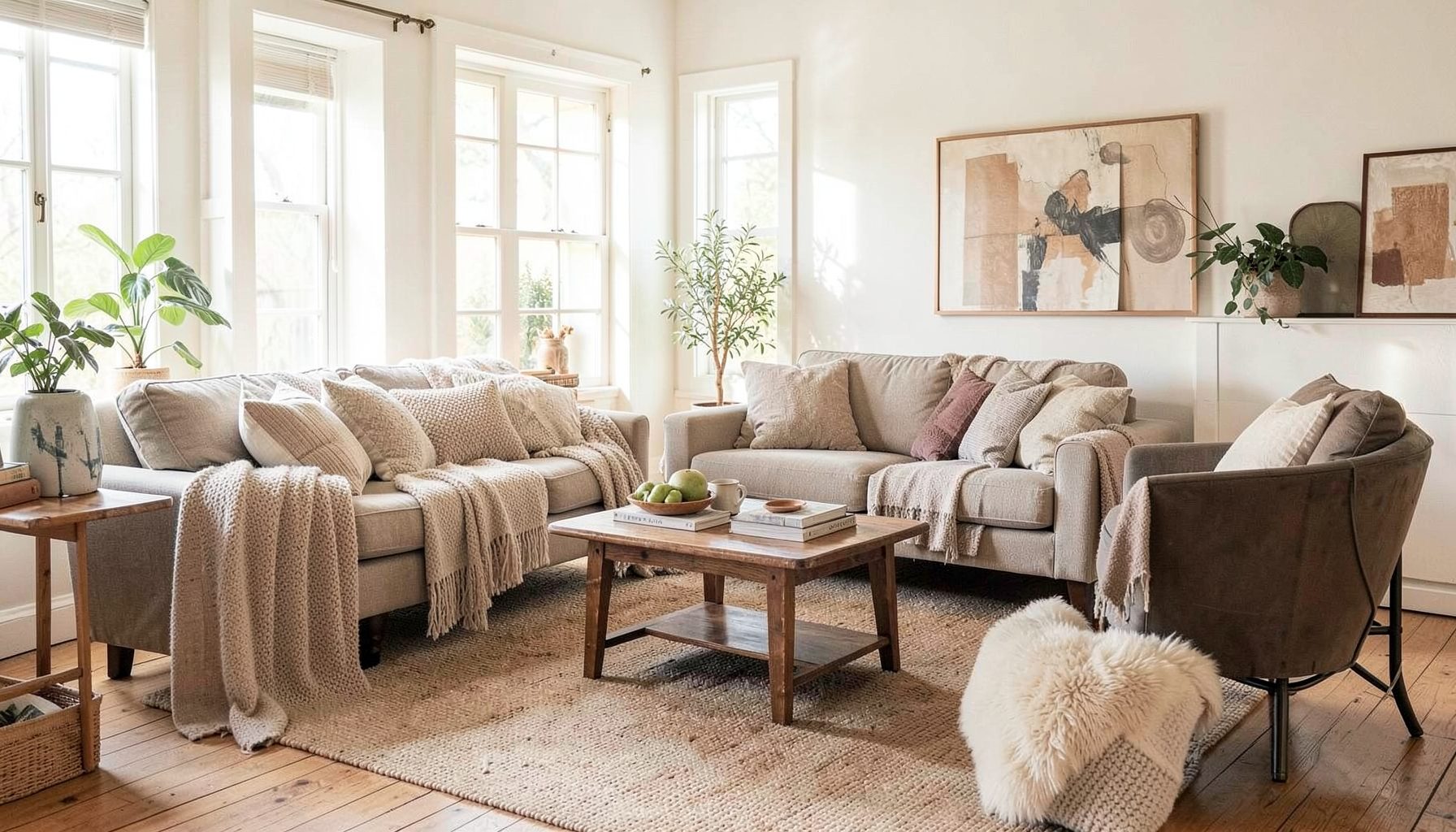
Interior Design
Full-service decorating that blends high and low, vintage finds with modern pieces for spaces that feel personal and collected.
Learn More
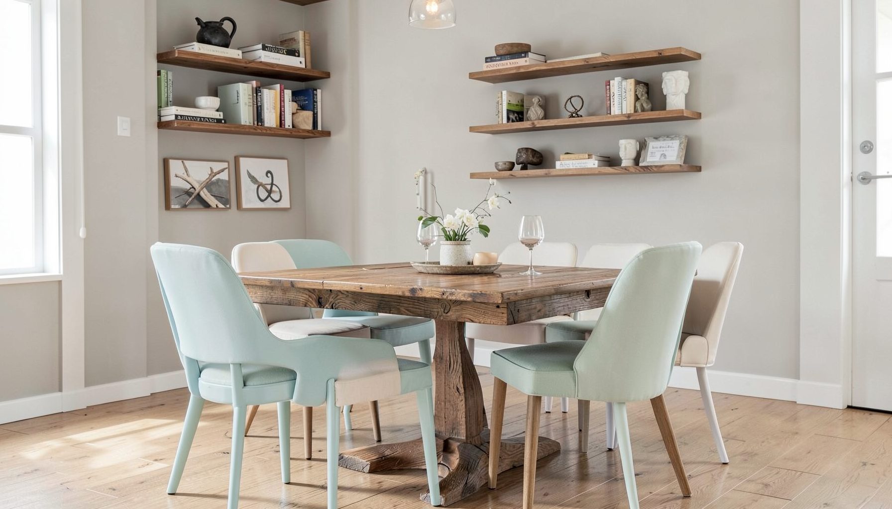
DIY Projects
Step-by-step tutorials for refinishing furniture, sewing pillows, styling bookshelves, and transforming rooms on a budget.
Learn More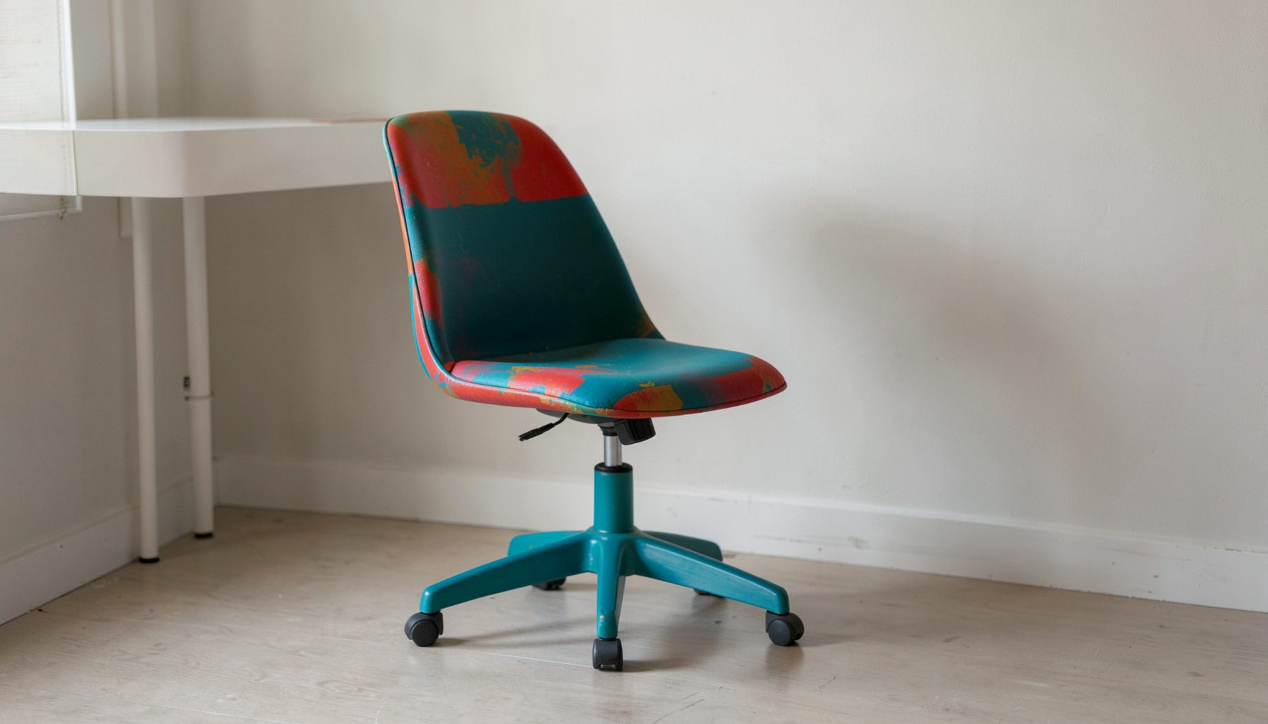
E-Decorating
Personalized design guidance delivered online — perfect for clients anywhere in the world who want a professional eye.
Learn More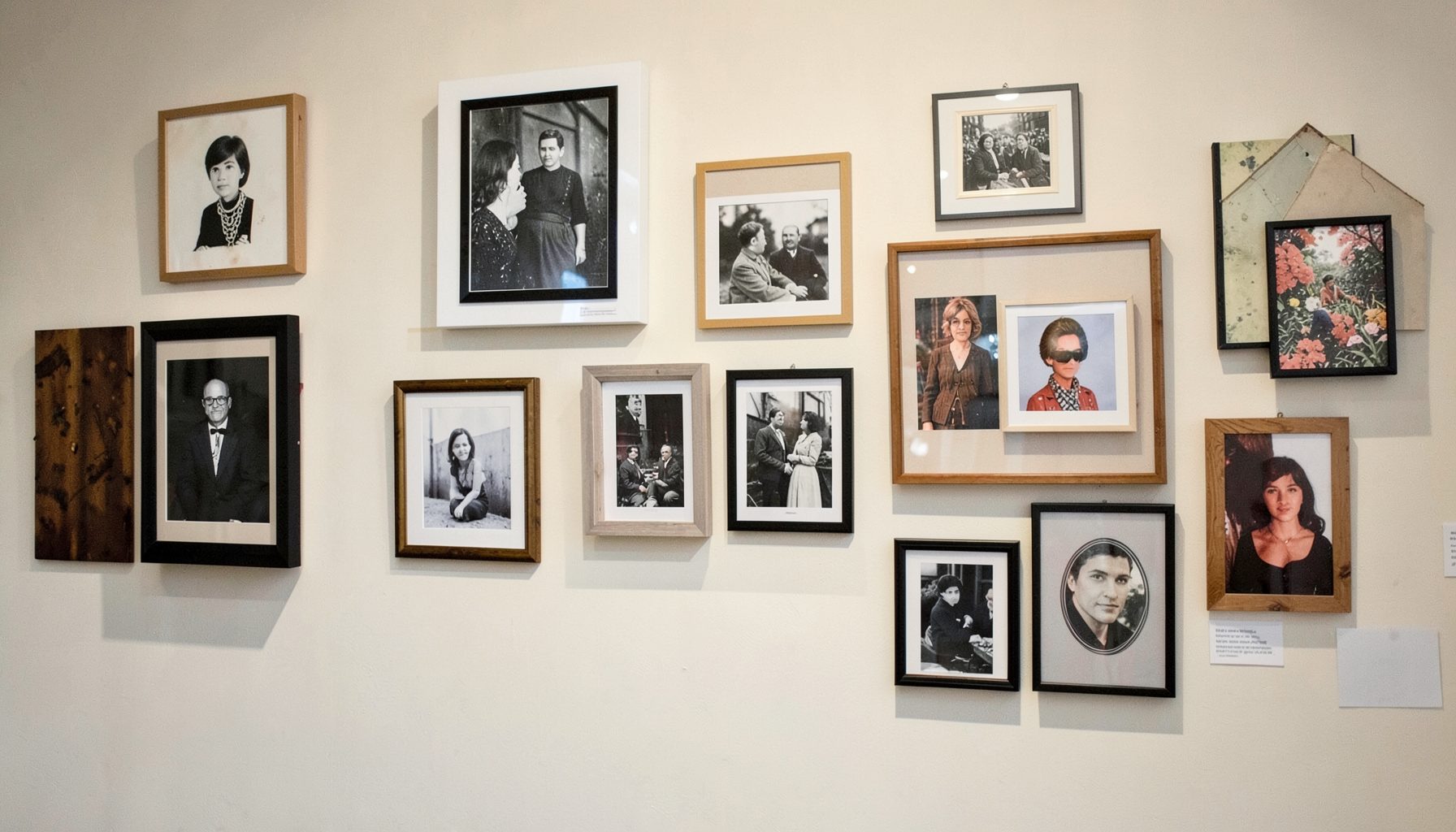
Portfolio
Browse completed room makeovers, before-and-after transformations, and styling projects from Bay Area homes.
Learn More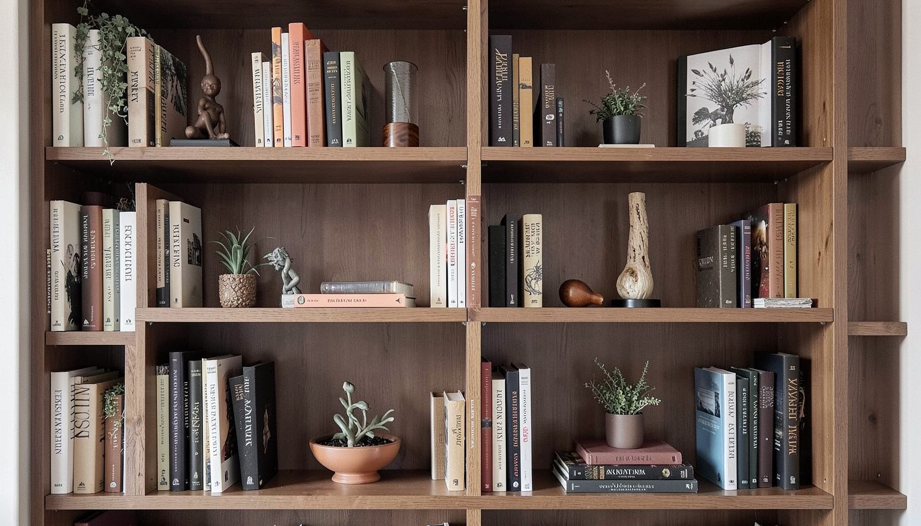
Blog
Interior design inspiration, fashion finds, entertaining ideas, and peeks into real home renovations and styling projects.
Learn More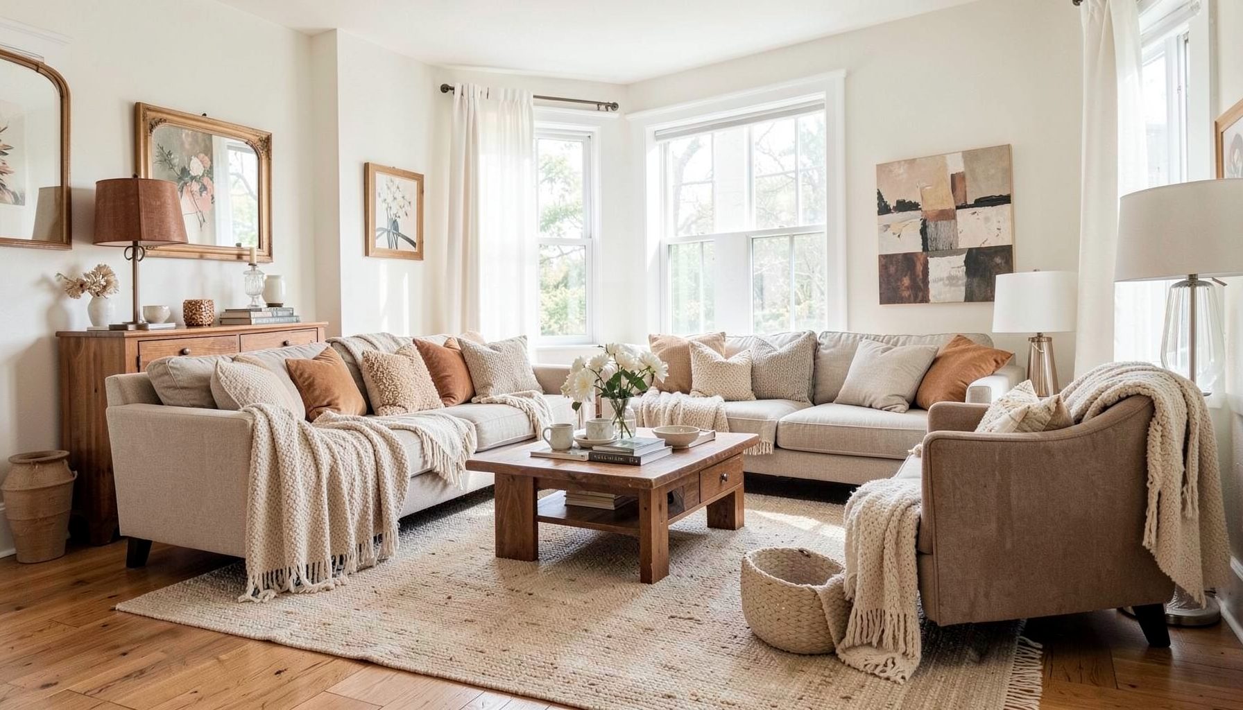
Downloads
Free curated resources for home decorating and design — guides, checklists, and inspiration to help you get started.
Learn MoreLayering Art for a Collected, Balanced Wall
A wall filled with art can bring warmth, personality, and rhythm to a room. A single framed piece may create a focal point, but several works arranged together tell a richer story. Paintings, photography, sketches, textiles, mirrors, and found objects can coexist when they share a thoughtful relationship in scale, color, or mood.
The most successful gallery walls rarely look overly coordinated. They feel collected over time, with a mix of vintage and modern pieces, polished frames and casual discoveries, bold artwork and quiet supporting images. The goal is not to make every item match. It is to create enough visual connection that the arrangement feels intentional.
At Maggie Rose Interiors, layered interiors balance personal expression with practical design. The same principle applies to arranging art: begin with what you love, then use proportion, spacing, and placement to help each piece look its best. Whether you are decorating a hallway in San Francisco, refreshing a San Jose living room, or styling a small apartment online, a curated art wall can transform an ordinary surface.
Start With A Cohesive Visual Story
Before measuring nails or moving furniture, gather the pieces you may want to display. Spread them across the floor, a dining table, or a large piece of kraft paper. Include more options than you expect to use. This makes it easier to compare the overall composition instead of judging each work in isolation.
Look for subtle connections. A collection might share warm wood tones, repeated shades of blue, botanical imagery, architectural lines, or a similar feeling of age. The artwork does not need to follow one theme, but it should have a visual conversation. A black-and-white photograph can sit beside a colorful abstract painting when both have strong graphic shapes or complementary proportions.
Consider the emotional quality of the room as well. Soft landscapes and family photographs create a different atmosphere from high-contrast prints and sculptural objects. Art should support how you want the space to feel, whether that is relaxed, energetic, refined, nostalgic, or eclectic.
Choose The Right Wall And Center Point
The wall itself determines much of the arrangement. A large uninterrupted wall can support a broad salon-style display, while a narrow passage may call for a vertical stack or a slim line of smaller frames. Study the furniture below the art, since the arrangement should relate to the sofa, console, bed, or sideboard rather than float independently.
For art above furniture, aim for a visual connection between the two. In many rooms, the lowest frame sits approximately six to ten inches above the furniture, though the exact distance depends on the scale of the piece and the height of the object below it. A large sofa may need a substantial arrangement, while a delicate console can look overwhelmed by oversized work.
Find the approximate center of the wall composition rather than centering every individual piece. The middle of the arrangement generally works best around eye level, often 57 to 60 inches from the floor. In a dining room or seating area, adjust for the fact that people experience the art while seated. The composition should feel comfortable from the room’s primary viewpoints.
Corners require special attention. Art that wraps slightly around a corner can make a room feel more expansive, but the transition should be deliberate. Keep the strongest piece on the main wall and use smaller works to lead the eye toward the adjoining surface.
Build A Layout Before Making Holes
A paper template is one of the easiest ways to test a gallery wall. Trace each frame onto craft paper, cut out the shapes, and label the back of every template. Use painter’s tape to place them on the wall. This allows you to assess scale, spacing, and alignment without committing to hardware.
Another useful method is to create a floor layout. Begin with the largest piece, then place medium and small works around it. Photograph several versions from a standing position and from the entry point of the room. The arrangement that looks beautiful from above may feel too dense or too spread out once it is on the wall.
Keep the gaps consistent, but do not assume every space must be identical. A standard two- to four-inch gap works well for many gallery walls. Larger art may need more breathing room, while a tightly layered collection of small frames can feel cohesive with narrower spacing. The outside edge of the arrangement should also feel balanced, even when the interior has variation.
Asymmetry can make the display feel relaxed and collected. To keep an eclectic arrangement from becoming chaotic, repeat one or two anchors. Align a few top edges, create a shared baseline, or balance a visually heavy dark frame with a similarly substantial object across the composition.
Mix Scale, Shape, And Material
A compelling art wall depends on contrast. Combine large and small pieces so the eye moves through the arrangement. One substantial painting can act as the anchor, with smaller prints, sketches, and photographs creating layers around it. If every piece is the same size, the display may appear rigid and less personal.
Shape adds another kind of movement. Rectangular frames create structure, while round mirrors, ceramic plates, woven baskets, or irregular sculptural objects soften the grid. A portrait-oriented work can balance a horizontal landscape. A small square print can fill a visual gap without competing with the main artwork.
Frames deserve as much consideration as the art. Matching frames produce a calm, tailored effect, while mixed frames bring character and a sense of history. Try combining antique wood, slim metal, painted finishes, and simple natural frames, but repeat at least one finish so the collection feels connected. A thin brass frame may echo a brass lamp, while a dark wood frame can relate to nearby furniture.
Matting changes the visual weight of a piece. A wide white mat gives a small print presence and creates separation within a busy arrangement. A close-cut mat feels more intimate. For vintage art or delicate paper, archival matting and UV-protective glazing can help preserve the work while keeping the presentation polished.
Use A Flexible Hanging System
Different walls and artwork call for different hanging solutions. Standard picture hooks work well for many lightweight frames, while heavier pieces may need two hooks or wall anchors. For plaster, brick, or textured surfaces, choose hardware designed for the material instead of relying on a general-purpose nail.
Wire and D-rings offer flexibility, but they can cause a frame to tilt forward or shift slightly if the weight is uneven. French cleats provide strong support for larger pieces and can help substantial artwork sit securely against the wall. Picture rails are especially useful in older homes or rentals, where changing the arrangement frequently without adding holes is a priority.
Measure from the top of the frame to the hanging point on the back. Transfer that measurement to the wall rather than guessing where the hook should go. Use a level for horizontal alignment and check every piece from several feet away. A small adjustment at this stage can make the entire composition feel more polished.
Safety matters when art hangs above a bed, seating area, or high-traffic path. Confirm that anchors are rated for the frame’s weight, and use security hardware for valuable or oversized pieces. For a large installation, professional art hanging may be worthwhile, especially when the wall contains delicate finishes or hidden utilities.
Balance Art With The Rest Of The Room
A layered art display should feel connected to the surrounding decor. Pull a color from a rug into one of the prints, repeat a frame finish found in a coffee table, or use a subject that complements the room’s materials. These links can be quiet. They do not need to become an obvious matching scheme.
Leave some visual breathing room. A wall covered from edge to edge can work in a dramatic maximalist interior, but many rooms benefit from a pause around the main collection. Empty space helps important pieces stand out and prevents the display from competing with patterned upholstery, bookshelves, or decorative lighting.
Think about lighting before finalizing the arrangement. Natural light can change how colors appear throughout the day, while direct sunlight may damage works on paper. Picture lights, adjustable sconces, and discreet ceiling fixtures can add evening emphasis, but avoid glare on glass. Test lighting from the room’s usual seating and walking positions.
The surrounding objects should support the art rather than create a second competing display. A console styled with a few books, a vase, and a lamp can ground a gallery wall. Keep taller accessories slightly off-center so they interact with the artwork without blocking the lowest frames.
Compare Arrangement Styles
Different layouts create different moods. A grid feels organized and architectural, while a salon arrangement feels more relaxed and collected. A vertical stack can emphasize ceiling height, and a picture ledge makes it easy to change the display seasonally. Select a format that suits both the wall and your tolerance for rearranging.
| Arrangement Style | Best For | Visual Effect | Helpful Consideration |
|---|---|---|---|
| Structured Grid | Similar-sized frames or coordinated prints | Calm, tailored, and orderly | Keep gaps and edges very consistent |
| Salon Arrangement | Mixed artwork, vintage finds, and varied frames | Collected, expressive, and layered | Balance visual weight around a central anchor |
| Vertical Stack | Narrow walls, hallways, and corners | Emphasizes height and creates rhythm | Align the center line carefully |
| Horizontal Row | Long consoles, sofas, and low furniture | Broadens the wall and feels intentional | Keep the lower edge related to the furniture |
| Picture Ledge Display | Renters or frequently changing collections | Casual, flexible, and dimensional | Layer pieces from tallest in back to smallest in front |
| Symmetrical Pairing | Matching prints, mirrors, or photographs | Refined and balanced | Use equal spacing and similar visual weight |
A ledge also introduces depth that direct hanging cannot provide. Lean larger frames against the wall, overlap smaller works in front, and add a small object such as a ceramic vessel or candleholder. This approach works particularly well for renters, families who like to rotate art, or anyone still building a collection.
Make The Display Personal Over Time
The strongest arrangements include pieces with meaning. A child’s drawing, a travel photograph, an inherited painting, or a small work from a local artist can sit comfortably beside investment pieces. Personal objects prevent the room from feeling like a showroom and give the arrangement a story that belongs to the people who live there.
Do not rush to fill every opening. Start with the pieces that matter most, then live with the arrangement for a few days. You may discover that one area needs a smaller work, a different frame, or no addition at all. Art collections often become more appealing when they evolve gradually.
A few practical habits make future changes easier:
- Photograph the finished arrangement so you can recreate it after painting or moving.
- Record frame sizes, artwork titles, and hanging measurements in one place.
- Keep extra hooks, anchors, and picture wire with your decorating supplies.
- Rotate delicate textiles and works on paper away from intense direct sunlight.
- Add new pieces by comparing their scale and visual weight with the existing collection.
Layering art is a design exercise in editing as much as display. Begin with pieces that express your taste, establish a strong anchor, and let spacing create order. Mix old and new, refine the relationship between art and furniture, and allow the wall to develop with your home.
For personalized help creating a collected gallery wall or refreshing an entire room, explore the portfolio and decorating resources from Maggie Rose Interiors. Full-service design, room makeovers, styling, and online e-decorating guidance can turn a group of meaningful pieces into a finished space with warmth, balance, and unmistakable personality.

Recent Projects