Interior Design
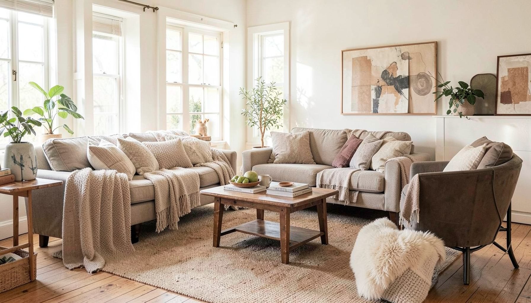
Full-service decorating that blends high and low, vintage finds with modern pieces for spaces that feel personal and collected.
Learn More
DIY Projects
Step-by-step tutorials for refinishing furniture, sewing pillows, styling bookshelves, and transforming rooms on a budget.
Learn More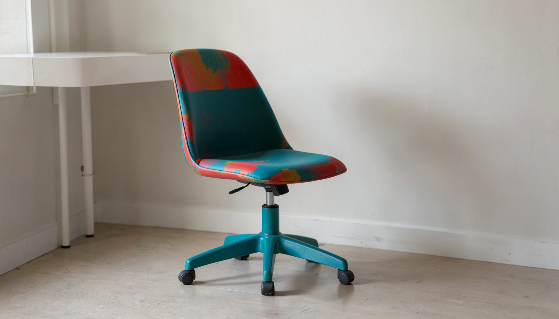
E-Decorating
Personalized design guidance delivered online — perfect for clients anywhere in the world who want a professional eye.
Learn More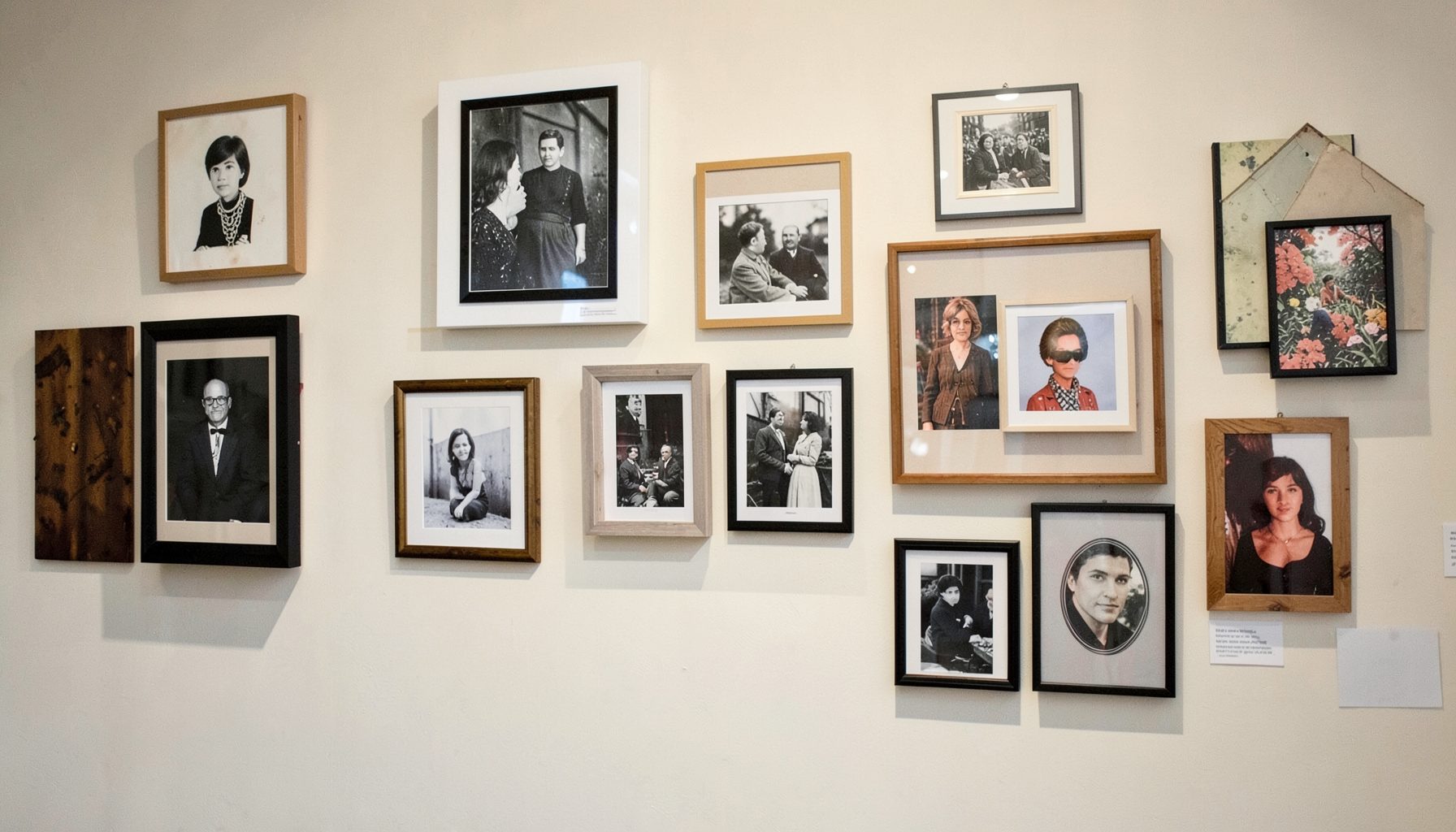
Portfolio
Browse completed room makeovers, before-and-after transformations, and styling projects from Bay Area homes.
Learn More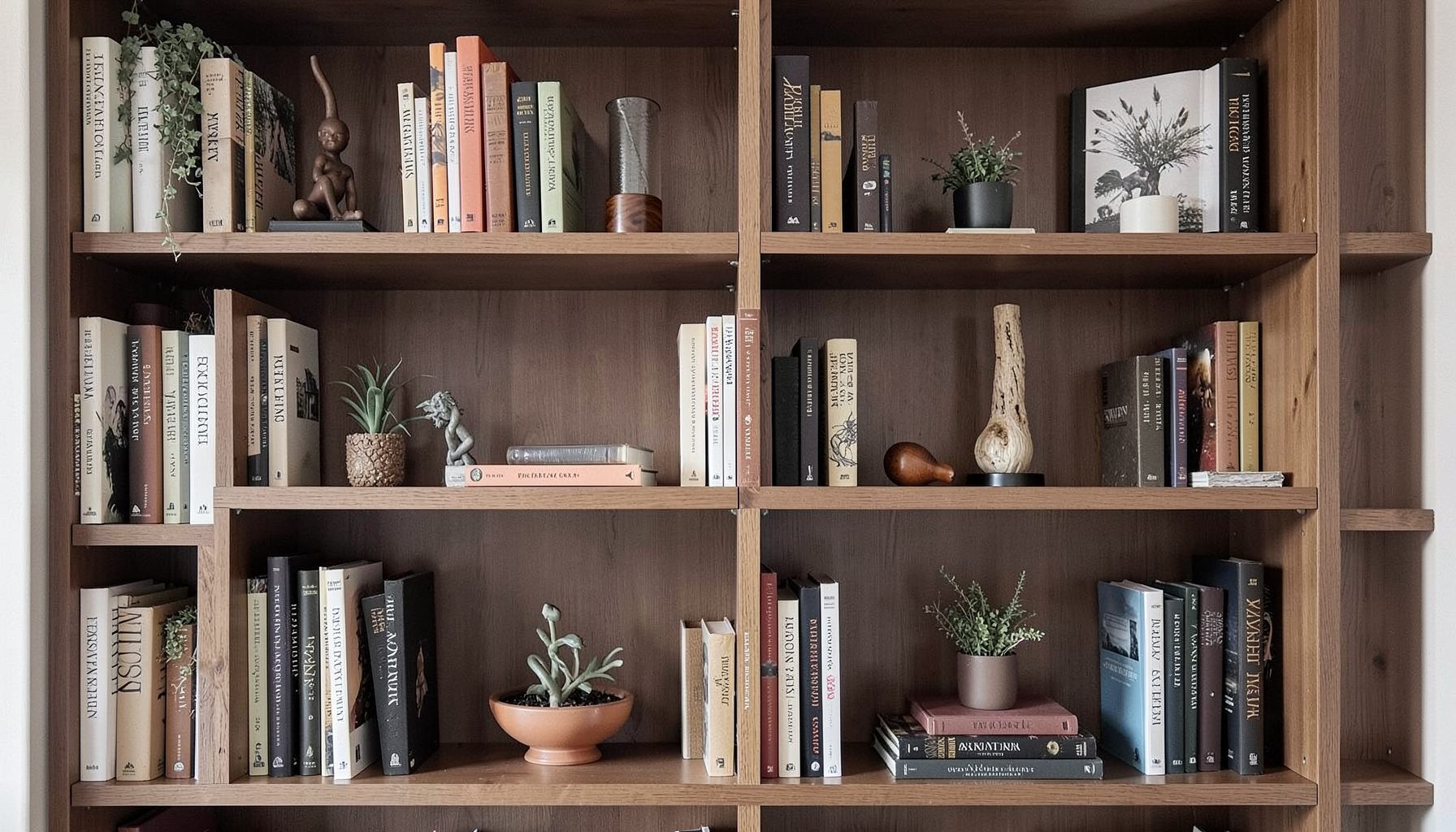
Blog
Interior design inspiration, fashion finds, entertaining ideas, and peeks into real home renovations and styling projects.
Learn More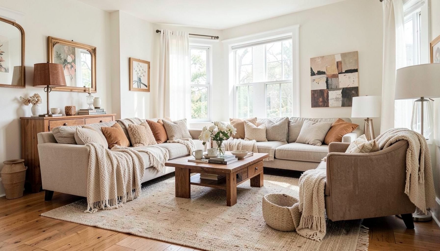
Downloads
Free curated resources for home decorating and design — guides, checklists, and inspiration to help you get started.
Learn MoreHow to Use Tone-on-Tone Contrast in a Modern Interior
A modern room does not need dramatic color changes to feel dimensional. Tone-on-tone contrast creates visual interest by layering lighter and darker versions of a related hue, allowing the space to feel cohesive while still offering depth. The effect can be quiet and refined, richly atmospheric, or warm and collected depending on the colors, textures, and furnishings involved.
This approach works especially well in interiors that balance clean lines with personal character. A pale mushroom wall, a softly patterned rug, a walnut table, and a charcoal accent chair can all belong to the same color family while providing enough variation to keep the room from appearing flat. The result is a polished environment with room for vintage finds, contemporary pieces, and meaningful details.
The key is to think beyond paint color. Tone-on-tone decorating involves value, saturation, finish, pattern, texture, and light. When each layer is considered, a restrained palette can feel as expressive as a multicolor scheme.
Understanding Tone-On-Tone Contrast
Tone-on-tone design uses multiple shades, tints, and intensities of one dominant color or a closely related group of hues. A monochromatic blue room, for example, may include misty blue walls, slate upholstery, indigo ceramics, and dusty blue textiles. A neutral scheme might combine ivory, sand, greige, taupe, caramel, and deep brown.
The most successful rooms include contrast within that limited palette. Contrast can come from a difference in lightness, such as cream beside espresso, or from a difference in saturation, such as muted sage beside a deeper olive. It can also come from the visual character of materials: brushed brass catches light differently from linen, while glossy tile has a different presence from honed stone.
A tone-on-tone interior should feel edited rather than matched. Avoid selecting every item from one narrow paint strip. Instead, establish a color family and allow adjacent shades to create a natural progression. A subtle shift between related tones will feel more sophisticated than a room filled with identical beige or gray.
Building A Layered Color Palette
Begin with one anchor element. This may be a sofa, area rug, artwork, kitchen cabinetry, or a favorite vintage piece. Identify the dominant undertone in that item before selecting supporting colors. Beige can lean pink, yellow, gray, or green, and these differences become visible when several neutral surfaces are placed together.
Once the anchor is established, choose a light, middle, and dark value within the same color family. The lightest shade can appear on walls or large architectural surfaces, the middle tone can shape upholstery and case goods, and the deepest shade can define smaller accents. This simple value structure gives the eye a path through the room.
A modern interior benefits from a restrained ratio of color. Large pieces should generally carry the quieter tones, while stronger shades can be introduced through pillows, artwork, ceramics, books, or a painted cabinet. A deep olive cushion on a pale moss sofa has greater impact than an entire room filled with the same intense green.
Undertones deserve special attention when working with neutrals. Warm whites pair naturally with wood, brass, and earthy fabrics, while cooler grays can support chrome, blackened metal, and blue-based textiles. Samples should be viewed in both daylight and evening light, since a color that appears balanced at noon may look unexpectedly pink or yellow after sunset.
Using Texture To Create Depth
Texture is essential when a room relies on a narrow range of colors. Without it, tone-on-tone decorating can become visually one-dimensional. Layer nubby wool, smooth cotton, slubby linen, velvet, rattan, leather, plaster, and natural wood to create variations that are felt as much as seen.
Consider repeating a color in contrasting materials. A warm clay tone might appear as a matte ceramic lamp, a woven pillow, a glazed vase, and a leather ottoman. Although the color connects these objects, their different surfaces keep the composition dynamic. This is particularly useful in open-plan homes, where consistency helps separate zones feel connected.
Pattern can also provide subtle contrast without introducing a new color. A tonal stripe, organic check, quiet botanical, or geometric motif adds movement while remaining within the established palette. For a contemporary look, pair one or two patterned pieces with solids rather than covering every surface in print.
Accessories are a practical way to build this layered effect gradually. A collection of handmade vessels can add shape and finish variation to a console or shelf, and small decorative projects such as recycled candle holders can bring an individual touch to a carefully edited room.
| Design Layer | Purpose | Tone-On-Tone Example |
|---|---|---|
| Architectural color | Establishes the visual foundation | Warm white walls with pale greige trim |
| Upholstery | Adds a substantial middle value | Oatmeal sofa with taupe lounge chair |
| Textiles | Introduces softness and pattern | Stone linen curtains with a subtle stripe rug |
| Furniture finish | Creates material contrast | Walnut table beside matte mushroom cabinetry |
| Accent color | Adds depth and emphasis | Charcoal lamp, olive pillow, or bronze frame |
| Decorative objects | Supplies personality and variation | Cream ceramics, smoked glass, and aged metal |
Applying The Method Room By Room
In a living room, start with the largest visual elements: walls, sofa, rug, and window treatments. A neutral sofa can be layered with pillows in related shades, while a rug introduces either a tonal pattern or a deeper grounding color. Use wood, metal, and stone to prevent the seating area from feeling overly soft or indistinct.
Bedrooms are naturally suited to tonal layering because textiles occupy so much of the visual field. Combine a painted wall in dusty blue with a linen headboard, washed cotton bedding, and a deeper blue throw. Repeating the hue in a small bench or artwork creates cohesion, while differences in weave and finish preserve a relaxed quality.
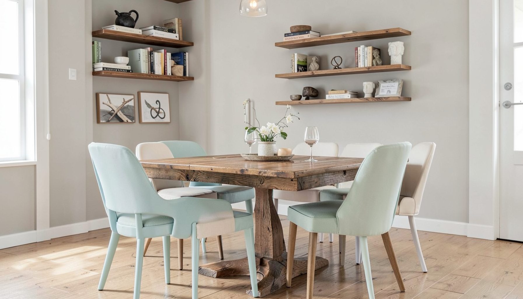
Kitchens and dining areas can use tone-on-tone contrast in a more architectural way. Consider cabinets in a muted color, a backsplash in a lighter variation, and countertops with a related undertone. A wood dining table can bridge the palette between painted cabinetry and woven chairs, adding warmth without disrupting the color story.
In a bathroom, tonal contrast can make a compact space feel considered rather than busy. Pair pale stone tile with a slightly darker vanity, aged brass fixtures, and towels in a quiet variation of the wall color. If the surfaces are all smooth, introduce a woven stool, ribbed glass, or richly grained wood to balance the hard finishes.
Balancing Modern Lines With Collected Details
Tone-on-tone interiors are often associated with minimalism, but the approach can support a much more personal style. Modern furniture provides clarity, while vintage objects and handcrafted pieces supply irregularity and history. A streamlined sofa beside an antique side table can feel intentional when both share compatible undertones.
Scale is important when combining old and new. A small vintage lamp may disappear beside a large sectional, while an oversized framed textile can give a clean room a strong focal point. Choose a few pieces with distinctive silhouettes and allow surrounding furniture to remain quieter.
Black can be used as a punctuation mark, but it should be introduced thoughtfully. A black frame, slender light fixture, or dark wood leg may sharpen a soft tonal palette. Too many high-contrast accents can break the calm progression, so repeat the darkest value in at least two or three locations to make it feel integrated.
Personal objects are most effective when they relate to the room’s color and material language. A ceramic inherited from family, a travel photograph, or a favorite book does not need to match perfectly. Its shape, patina, or emotional meaning can provide the variation that keeps a curated room from feeling staged.
Working With Light And Finish
Natural light changes the appearance of every tone. North-facing rooms tend to emphasize blue and gray qualities, while southern exposure can make warm colors appear brighter and more golden. East- and west-facing spaces shift throughout the day, so large paint samples should remain in place long enough to observe those changes.
Artificial lighting is equally important. Warm bulbs enhance tan, cream, rust, and wood tones, while cooler bulbs may make gray and blue schemes appear cleaner. Layer ambient, task, and accent lighting so the room has several levels of illumination. A dimly lit corner can make a tonal palette appear heavier than intended.
Finish creates another form of contrast. Matte paint absorbs light and gives walls a quiet backdrop, while satin trim outlines architectural details. Polished stone, glazed ceramics, reflective glass, and metallic hardware can provide highlights without adding a new color. Use shine selectively, especially in rooms that already contain several tactile materials.
Window treatments, mirrors, and reflective surfaces can help distribute daylight across a monochromatic scheme. A mirror placed opposite a window may brighten deeper tones, while woven shades soften glare and reinforce the natural texture of the space. These practical choices influence the palette as much as decorative accessories do.
Avoiding A Flat Or Overmatched Look
The most common mistake is relying on one value throughout the room. When walls, furnishings, and accessories all sit at the same level of lightness, the space loses hierarchy. Add a few darker anchors and some pale highlights so that the eye can distinguish the room’s structure.
Another issue is choosing too many materials with the same visual weight. A room filled with chunky boucle, heavy wool, and thick woven textiles may feel dense even when the colors are light. Balance substantial textures with smooth linen, glass, polished wood, or a slim metal detail.
Keep an eye on repetition. Repeating a hue three times can establish rhythm, but placing the same shade on every object can make the room appear overly coordinated. Let some elements sit adjacent to the palette rather than directly inside it. A muted blush, faded denim, or natural rattan may add freshness without competing with the primary color family.
Use these principles when refining a tone-on-tone scheme:
- Select one anchor piece before choosing paint, textiles, or accessories.
- Create a clear range from light to dark within the chosen color family.
- Mix at least three distinct textures to prevent visual flatness.
- Repeat accent colors in small, intentional locations rather than everywhere.
- View samples under natural and artificial light before making final decisions.
Making A Restrained Palette Feel Personal
A successful tonal interior reflects the people who live there. Begin with objects, colors, and materials that already feel meaningful, then build the surrounding scheme around them. This produces a room with character instead of a generic monochromatic finish.
Decorating gradually is often an advantage. Live with the larger pieces first, observe how the room functions, and add accents as you discover what is missing. The final layers may come from a local artisan, a vintage market, a family collection, or a simple handmade detail.
When the palette is thoughtfully balanced, modern simplicity and collected warmth can coexist. Walls, furniture, textiles, lighting, and accessories each contribute a slightly different interpretation of the same visual idea. That quiet variation is what gives a tone-on-tone room its depth.
A layered color scheme can also make future updates easier. Replacing a pillow, artwork, or side table does not require redesigning the entire space when the foundational colors are related. The room remains flexible while retaining a strong point of view.
Bring your palette into focus by choosing one room and identifying its anchor piece, dominant undertone, and darkest supporting value. From there, consider how paint, texture, lighting, and personal objects can work together. For tailored guidance in creating a modern, collected interior, explore Maggie Rose Interiors’ decorating and design services and begin shaping a space that feels distinctly your own.

Recent Projects