Interior Design
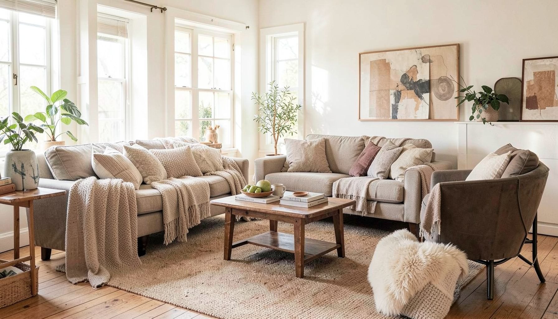
Full-service decorating that blends high and low, vintage finds with modern pieces for spaces that feel personal and collected.
Learn More
DIY Projects
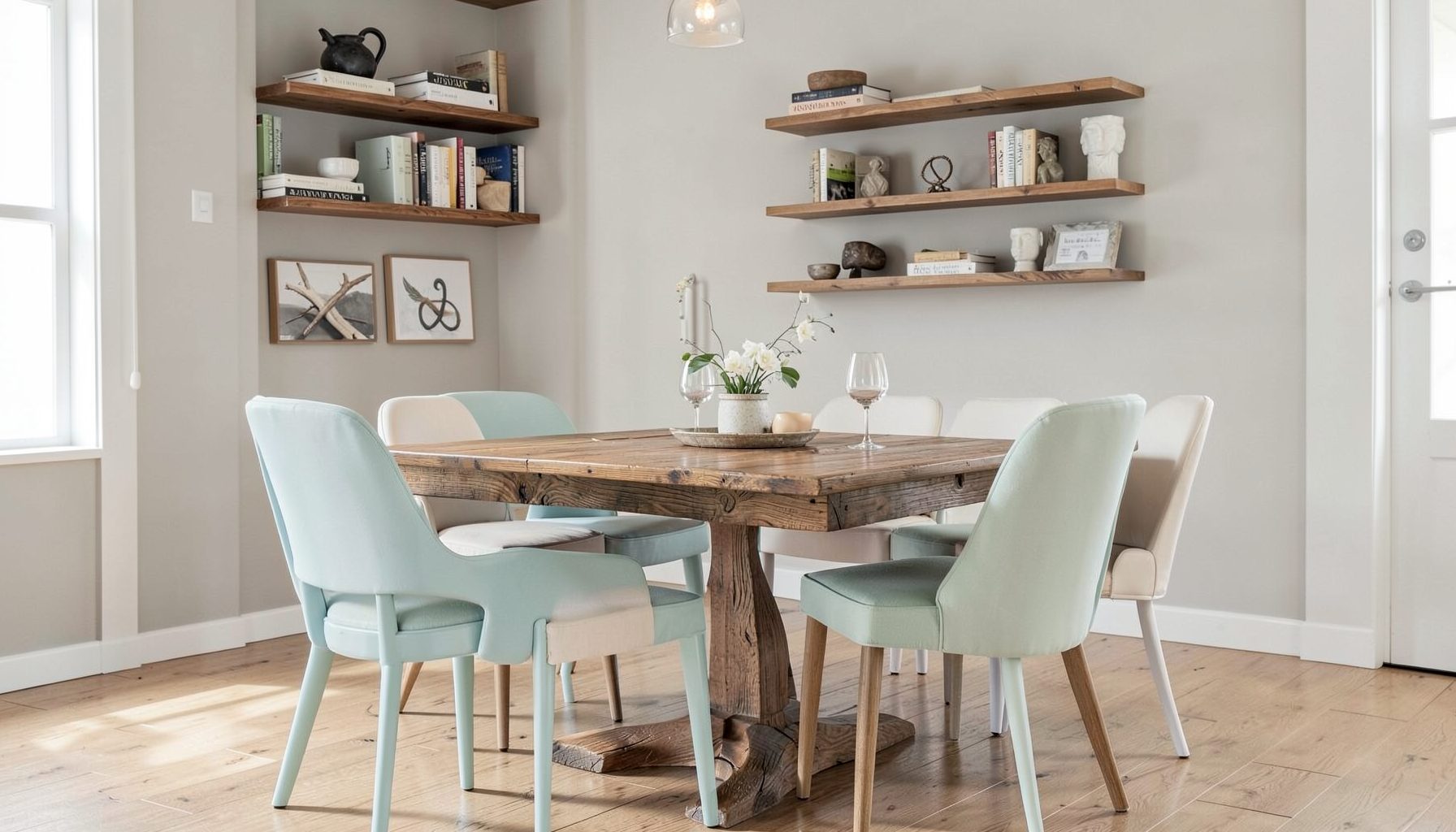
Step-by-step tutorials for refinishing furniture, sewing pillows, styling bookshelves, and transforming rooms on a budget.
Learn More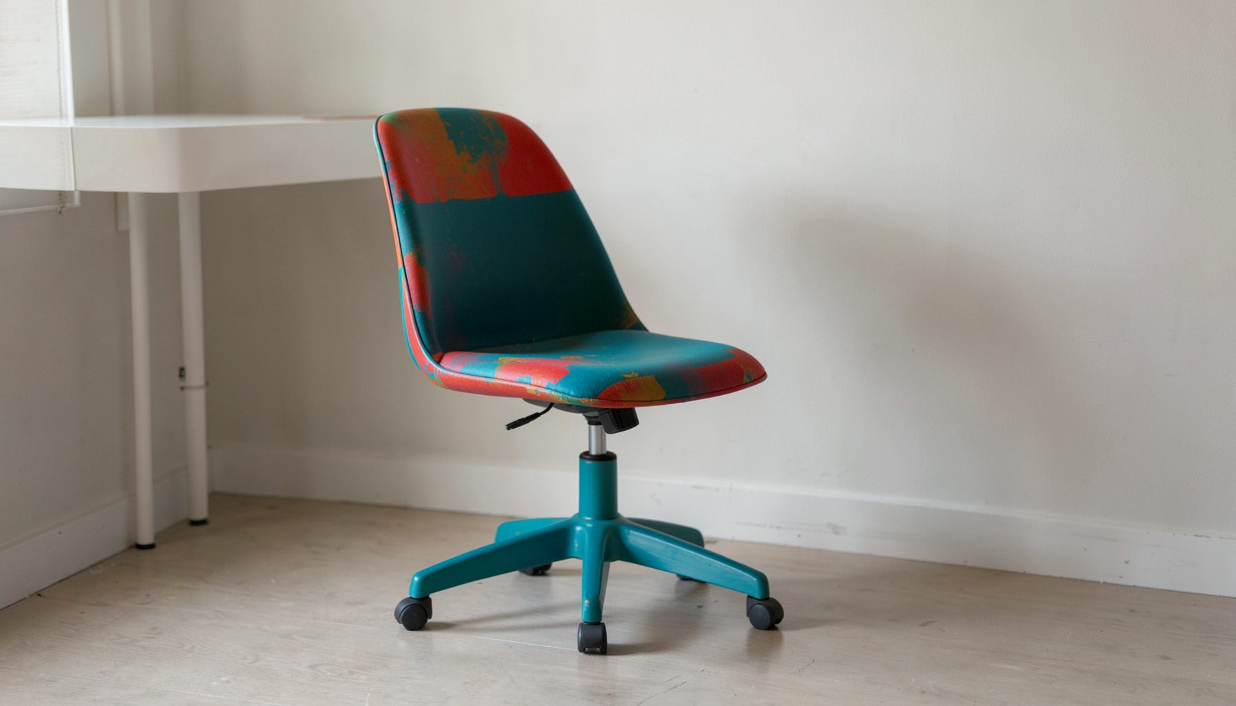
E-Decorating
Personalized design guidance delivered online — perfect for clients anywhere in the world who want a professional eye.
Learn More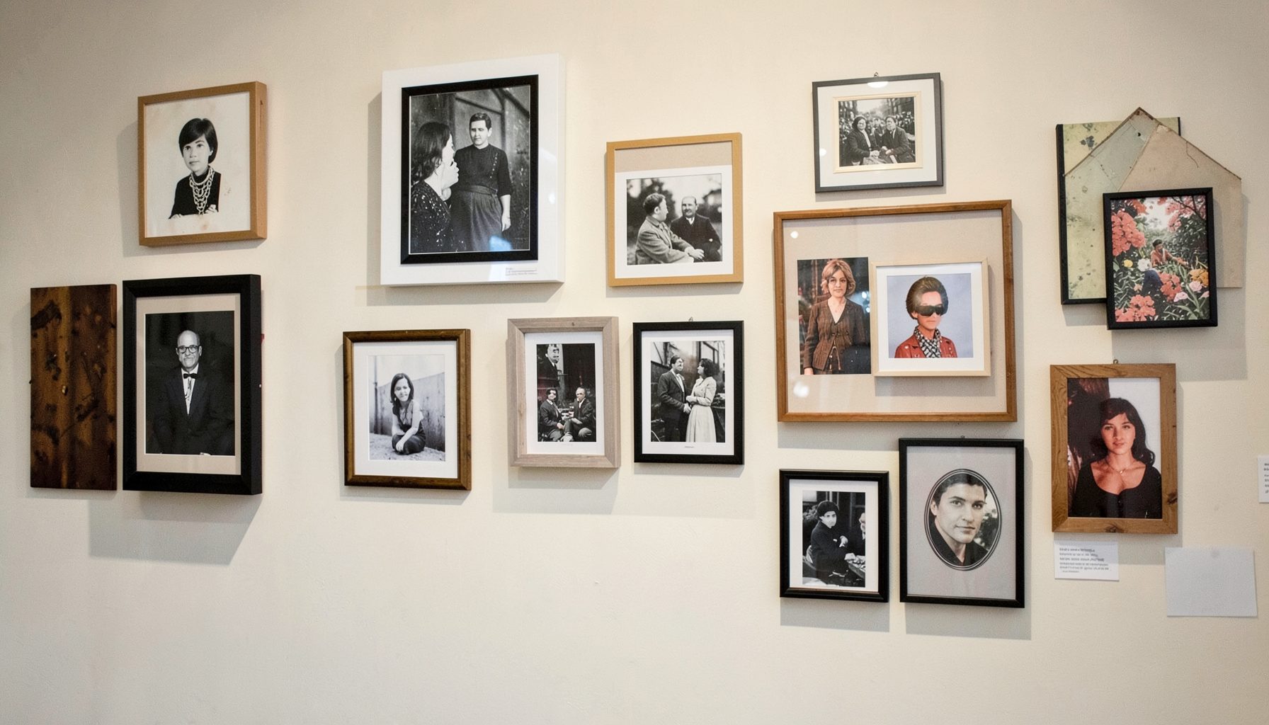
Portfolio
Browse completed room makeovers, before-and-after transformations, and styling projects from Bay Area homes.
Learn More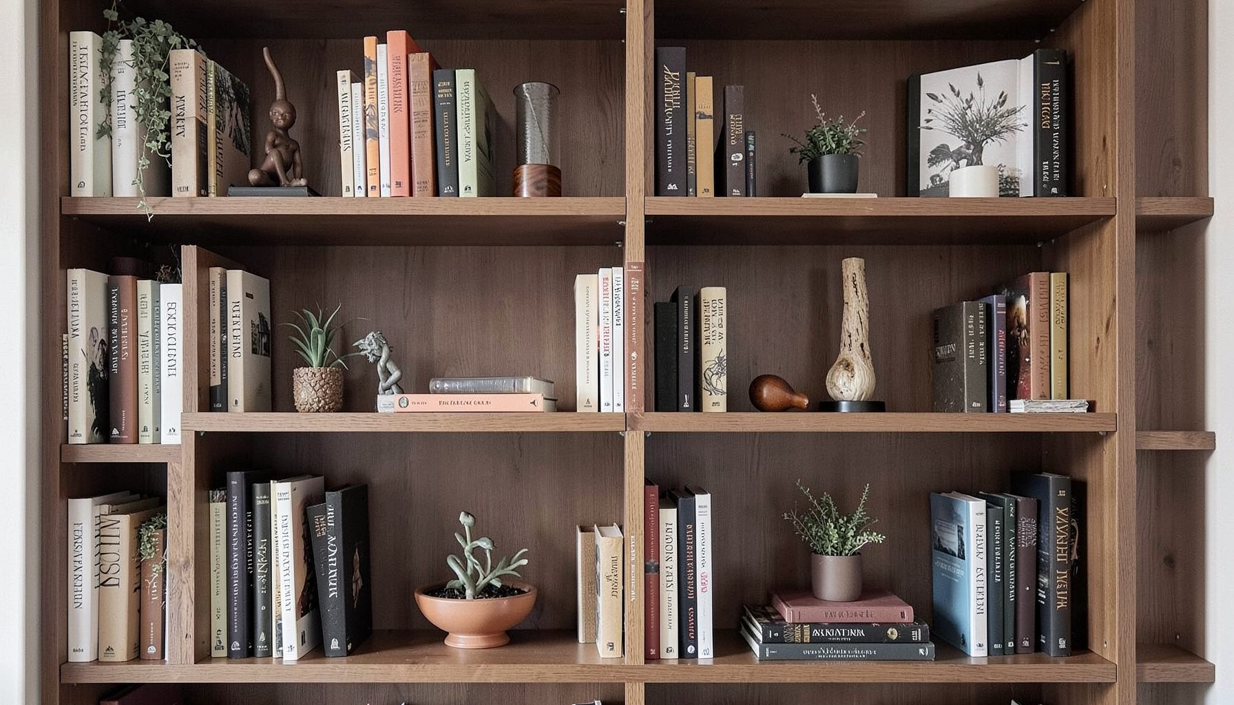
Blog
Interior design inspiration, fashion finds, entertaining ideas, and peeks into real home renovations and styling projects.
Learn More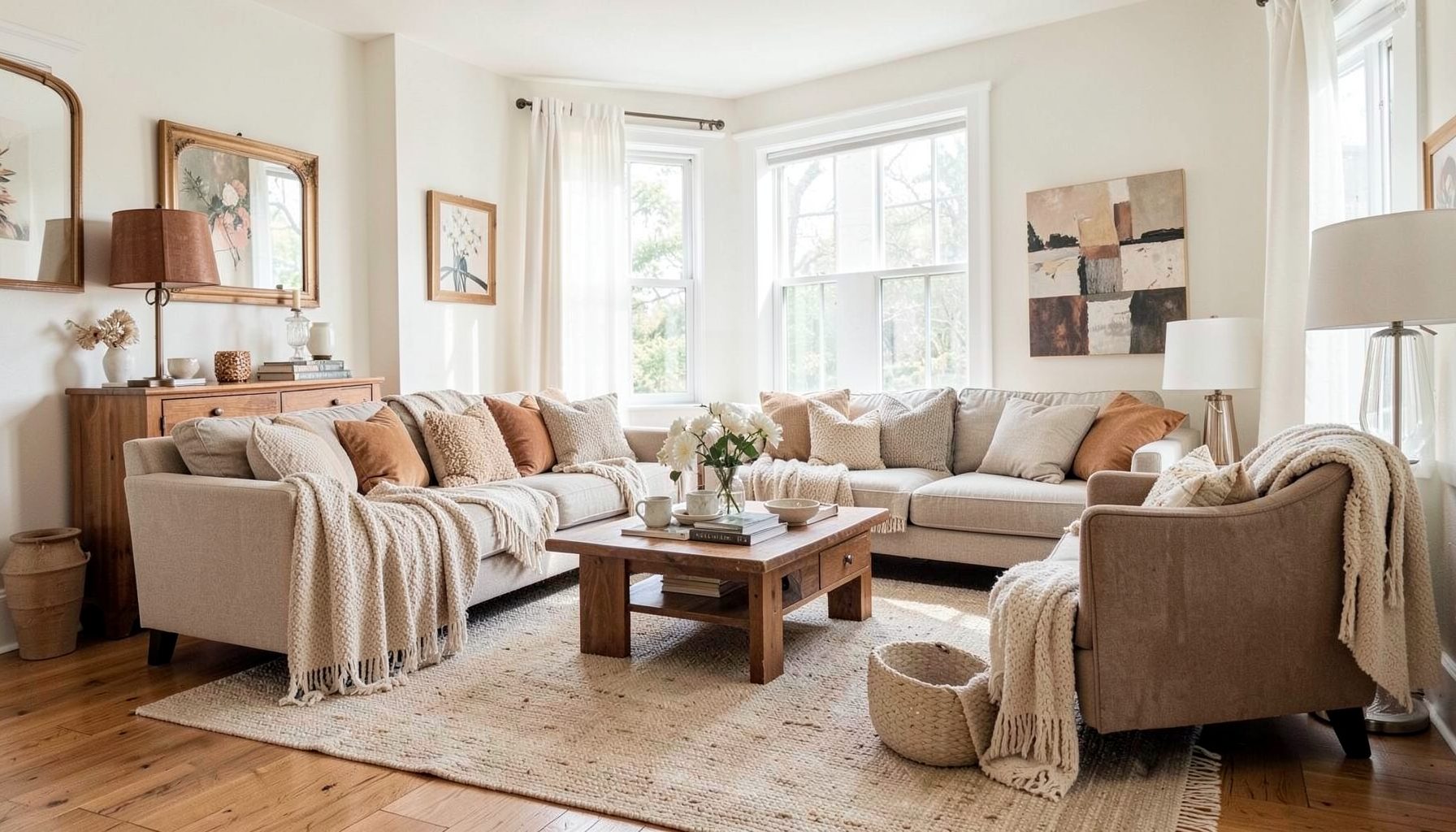
Downloads
Free curated resources for home decorating and design — guides, checklists, and inspiration to help you get started.
Learn MoreHow to Use Color to Create Flow Between Rooms
A home feels cohesive when each room has its own character while still belonging to the same visual story. Color is one of the most effective ways to create that connection. It can guide the eye from an entryway into a living room, make a hallway feel intentional, and help open-plan spaces read as a unified whole.
The goal is not to paint every room the same shade. A successful whole-home color palette includes variation, contrast, and moments of surprise. The relationship between colors matters more than whether every wall matches.
For Bay Area homes, where natural light can shift dramatically from bright coastal gray to warm afternoon sun, a thoughtful color plan is especially useful. By considering sightlines, furnishings, finishes, and the way daylight moves through the house, you can build a layered interior that feels collected rather than overly coordinated.
Start with the home’s visual structure
Before choosing paint colors, study how the rooms connect. Stand in the entry, hallway, or main living area and note which spaces are visible from that position. Those sightlines are where color continuity matters most. If a foyer opens directly to a dining room, the two colors should relate even if they are not identical.
Architectural features can help define your color transitions. Doorways, built-in shelves, wainscoting, fireplaces, and changes in ceiling height create natural stopping points. A deeper shade may work beautifully in a dining room when it is framed by a lighter hallway, while a soft neutral can bridge a kitchen and living area without making either space feel flat.
Consider the floor plan as a sequence rather than a collection of separate rooms. Rooms that are visually connected need a closer color relationship than rooms separated by a door or around a corner. This approach creates a rhythm: one color leads into another, an accent repeats, and a neutral gives the eye somewhere to rest.
Build a flexible color family
A useful whole-home palette often includes three layers: a foundational neutral, supporting colors, and a few accents. The foundation may appear on walls, trim, larger upholstery pieces, or rugs. Supporting colors can shift from room to room, while accents provide personality through art, pillows, ceramics, lamps, and smaller furnishings.
Instead of selecting isolated paint chips, collect samples that share an undertone. Warm whites, sandy beiges, muted greens, and clay tones tend to work naturally together because they have a similar warmth. Cool grays paired with yellow-based creams can feel disconnected unless the contrast is intentional.
Color families can also be built around a favorite material or object. A faded Persian rug might suggest dusty blue, ochre, rust, and olive. A piece of artwork may offer a more personal starting point than a generic palette. Repeating two or three of those tones across nearby rooms creates continuity without requiring each space to look alike.
For a layered, collected home, variation is part of the appeal. A pale sage kitchen may lead to a warm ivory dining room, then connect to a room with muted terracotta accents. These colors feel related when their saturation and undertones have been considered together.
Connect adjacent rooms with deliberate transitions
The transition between rooms can be subtle or dramatic, depending on the architecture and mood you want. In an open-plan home, use related shades to define zones without breaking the overall flow. A light wall color in the living area might shift to a slightly deeper version in the dining area, creating separation while preserving visual harmony.
In homes with enclosed rooms, you have more freedom to make a bold change. Even then, repeat a detail from the previous space. A navy study can connect to a nearby neutral hallway through a navy throw, patterned runner, or painted interior door. A blush-toned bedroom may relate to the bathroom through brass finishes, a floral textile, or artwork carrying the same rosy color.
Trim and ceilings are often overlooked tools for continuity. Painting trim in a consistent warm white can unify rooms with different wall colors. Alternatively, using the wall color on trim in one or two spaces can create a cozy, enveloping effect. A ceiling color that echoes a nearby wall or textile can make a transition feel designed instead of accidental.
When spaces are connected by a hallway, use the corridor as a visual bridge. A runner, framed art collection, or repeated light fixture finish can carry color through the passage. The hallway does not need to be loud; it simply needs to reinforce the relationship between the rooms it joins.
Compare color strategies before committing
Different approaches create different moods and levels of continuity. The best choice depends on the home’s layout, natural light, furnishings, and how much contrast feels comfortable.
| Color strategy | Best for | How to create flow | Potential concern |
|---|---|---|---|
| One continuous neutral | Open plans and smaller homes | Use one wall color throughout and vary textiles and accents | Can feel flat without texture |
| Tonal progression | Connected rooms with clear sightlines | Move from lighter to deeper shades within one color family | Undertones must remain compatible |
| Repeated accent color | Homes with varied room colors | Carry one hue through artwork, fabrics, and accessories | Repetition can feel predictable |
| Warm-cool balance | Homes with mixed materials | Pair related warm and cool colors through furnishings | Too much contrast may fragment the space |
| Strategic bold room | Dining rooms, offices, and powder rooms | Repeat the bold color in small details outside the room | A strong shade can dominate nearby spaces |
| Neutral bridge | Homes with eclectic furnishings | Use hallways, trim, or upholstery to connect distinct palettes | The neutral needs enough depth to feel intentional |
A tonal progression is particularly effective when you want a calm, sophisticated effect. Try a pale greige in the entry, a medium mushroom tone in the living room, and a richer taupe in a nearby library. The palette changes gradually, so the rooms feel individual while remaining visually connected.
For a more collected look, repeat colors through objects rather than paint. A terracotta vase in the kitchen, a rust stripe in the living room rug, and a warm clay-colored cushion in the entry may be all that is needed to establish flow. This is where the principles in collected look tips can help balance color repetition with enough variety and breathing room.
Use furnishings and finishes as color bridges
Paint is only one part of a room’s color scheme. Upholstery, window treatments, rugs, wood tones, metal finishes, and artwork often carry more visual weight than the walls. If two rooms have different paint colors, shared materials can make them feel connected.
A consistent wood tone can bridge a warm beige living room and a muted blue dining room. Similar brass or aged bronze finishes can connect lighting and hardware throughout the home. Even when furniture styles vary, repeating a material gives the eye a point of recognition.
Rugs are especially useful because they can contain several colors at once. In an open-plan space, one large rug can establish the central palette, while smaller rugs in adjacent areas pick up one or two of its tones. Avoid matching every pattern exactly; instead, look for common colors with different scales and textures.
Artwork offers another flexible way to carry color from room to room. A gallery wall does not need to follow a strict palette, but a few recurring shades can make diverse pieces feel intentional. Place colorful art where it can be seen from an adjoining space, allowing it to act as a visual handoff.
Let natural light guide your choices
The same paint color can appear entirely different depending on exposure, time of day, and surrounding materials. North-facing rooms often reveal blue or gray undertones, while south-facing rooms can make colors look warmer and brighter. Morning light may sharpen pale colors, while evening light can deepen earthy shades.
Test large samples on several walls rather than relying on a small swatch. Observe them in the morning, afternoon, and evening, with lamps turned on and off. Look at the sample beside flooring, countertops, upholstery, and trim. A color that seems perfect in isolation may reveal an unwanted undertone next to a fixed finish.
Light also affects the relationship between rooms. A hallway with limited daylight may need a lighter bridge color, while a sun-filled room can handle a deeper shade. If two connected spaces receive very different light, choose colors with a shared undertone rather than forcing them to appear equally bright.
Sheen plays a role in continuity as well. Matte or eggshell walls create a soft backdrop, while satin finishes can highlight trim, doors, or architectural details. Using the same sheen throughout a connected zone usually feels calmer, while a change in sheen can emphasize a deliberate boundary.
Repeat color with restraint
Color flow works best when repetition feels natural. Choose a few anchor hues and allow them to appear in different forms, proportions, and textures. A deep green might show up as a painted vanity in one room, a velvet pillow in another, and a botanical print farther down the hall.
The scale of repetition matters. If the same color appears in every major piece, the home can feel staged. If it appears only once, the connection may be too weak to register. A useful balance is to repeat a color at least twice within a visible sequence, then vary its intensity or material.
Neutrals deserve the same attention as accent colors. A warm white in the trim, oatmeal in upholstery, and natural linen in window treatments can create a quiet thread through colorful rooms. These softer tones prevent the palette from becoming busy and make vintage, modern, high-end, and budget-friendly pieces feel comfortable together.
Practical ways to plan the palette
Use these recommendations before ordering paint or committing to large furnishings:
- Map the main sightlines and identify which rooms need the closest color relationship.
- Choose a foundational neutral and confirm its undertone beside flooring, trim, and countertops.
- Select two or three supporting hues, then vary their depth and texture across the home.
- Repeat accent colors through art, rugs, textiles, and accessories instead of duplicating entire room schemes.
- Test large samples in changing natural light before making a final decision.
Create a palette that feels personal
A cohesive home should support the people who live there, not simply follow a color trend. Think about the atmosphere each room needs. Soft greens and warm neutrals can make a bedroom restful, while a saturated blue or earthy red may give a dining room energy. The colors should reflect how the spaces are used as well as how they connect.
Personal collections can guide the palette in meaningful ways. Books, travel finds, inherited furniture, ceramics, and framed textiles often contain colors that already feel emotionally right. Rather than hiding these differences, use them as evidence of the home’s authentic style. A carefully chosen wall color can make a vintage chair feel at home beside a contemporary sofa.
If the palette feels disjointed, look for the missing bridge instead of replacing everything. A rug, piece of art, curtain fabric, or painted door may connect two spaces more effectively than another round of paint samples. Small styling adjustments can often clarify a color story that is already present.
Professional guidance can be helpful when a home includes multiple exposures, open sightlines, or existing furnishings that must remain. A personalized decorating plan can bring together color, scale, layout, and finishes so that the final result feels layered and livable.
Color flow is created through relationships: between rooms, materials, light, and the objects that matter to you. Begin with the view from one space into the next, build a flexible family of hues, and repeat colors in ways that feel collected rather than calculated.
For support developing a connected palette, room makeover, or full-home decorating direction, explore the design services from Maggie Rose Interiors. Thoughtful color planning can turn separate rooms into a home that feels cohesive, expressive, and distinctly your own.

Recent Projects