Interior Design
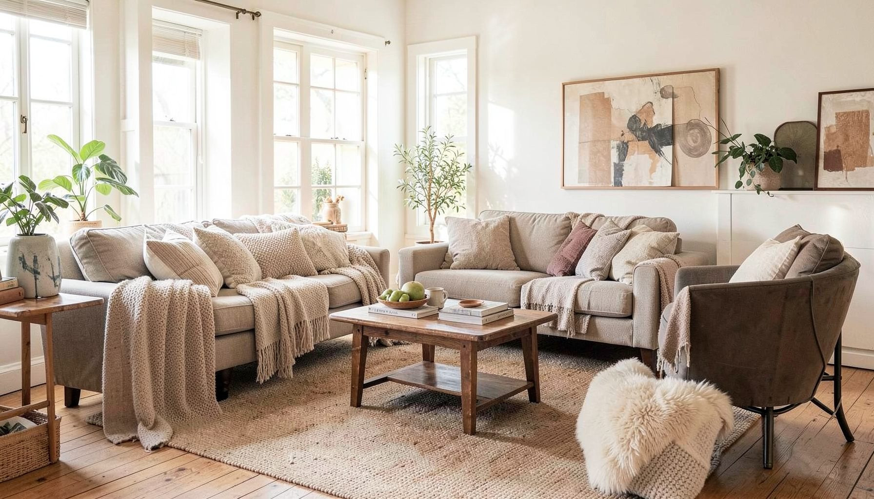
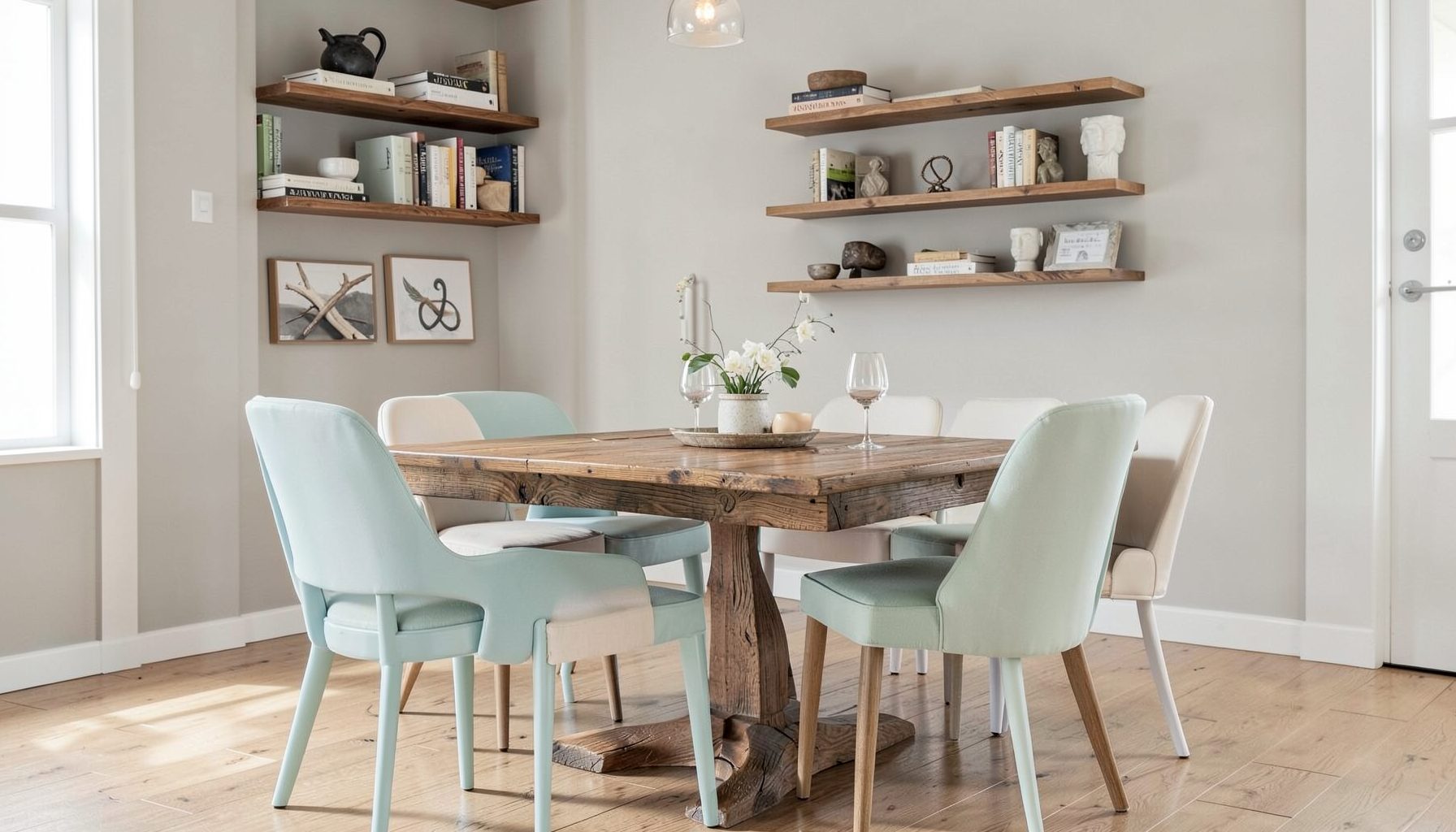
Full-service decorating that blends high and low, vintage finds with modern pieces for spaces that feel personal and collected.
Learn More
DIY Projects
Step-by-step tutorials for refinishing furniture, sewing pillows, styling bookshelves, and transforming rooms on a budget.
Learn More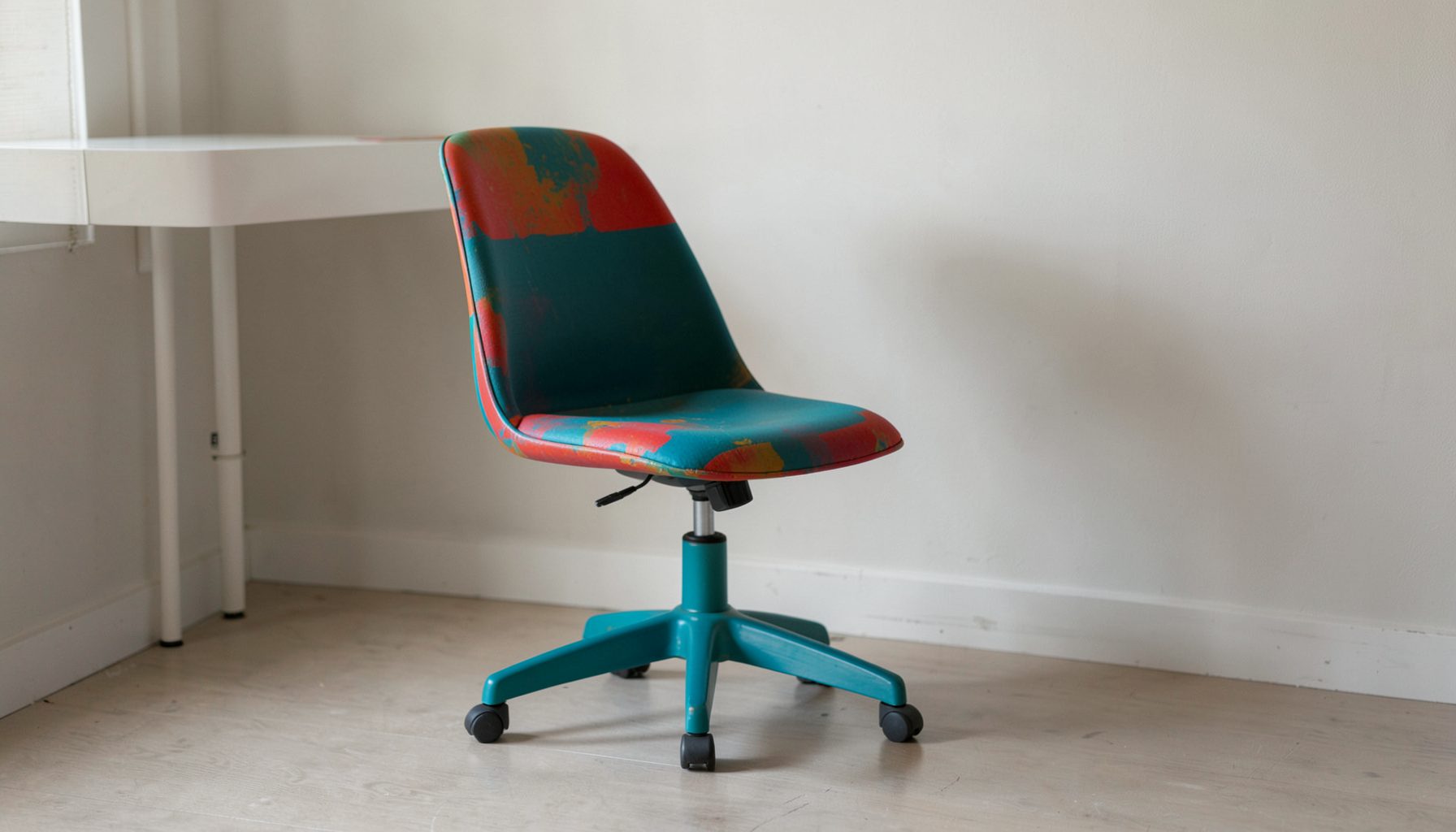
E-Decorating
Personalized design guidance delivered online — perfect for clients anywhere in the world who want a professional eye.
Learn More
Portfolio
Browse completed room makeovers, before-and-after transformations, and styling projects from Bay Area homes.
Learn More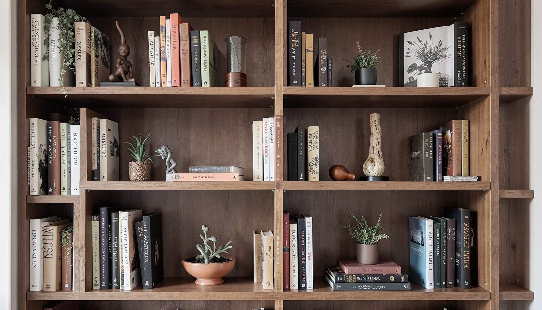
Blog
Interior design inspiration, fashion finds, entertaining ideas, and peeks into real home renovations and styling projects.
Learn More
Downloads
Free curated resources for home decorating and design — guides, checklists, and inspiration to help you get started.
Learn MoreSelecting Kitchen Backsplash Tile to Complement Your Countertops
A kitchen splashback does far more than protect the wall behind your cooktop. It shapes the visual rhythm of the entire room, anchors your cabinetry, and either softens or sharpens the presence of your benchtops. When the relationship between these two surfaces works, a kitchen feels considered and harmonious; when it clashes, even the most expensive stone can look unsettled. In Australia, where renovation budgets stretch across rising labour costs and shipping expenses, getting the pairing right from the start saves both money and rework.
Most homeowners start with the benchtop and treat the splashback as an afterthought, then struggle to find a tile that does not compete with the surface they have already chosen. Reversing this approach, selecting both together or choosing the splashback first and working toward a stone, usually produces a calmer result. The following sections walk through how to make those choices with intention, drawing on the kind of layered, collected kitchens Maggie Rose Interiors is known for.
Reading the Benchtop Before You Choose a Tile
Every countertop sends a visual message. A heavily veined Calacatta slab carries movement, drama, and a sense of luxury. A honed black granite reads moody and architectural. A warm-toned Caesarstone or quartz composite in a quiet speckle gives a softer, more neutral backdrop. Before browsing tile catalogues, it helps to describe your benchtop in plain language: is it bold or quiet, warm or cool, busy or restrained? That single observation usually narrows the tile shortlist by half.
Once you have described the benchtop, ask what role you want the splashback to play. Do you want it to disappear, framing the stone without competing? Or do you want it to be the moment of personality in the room? In a Brisbane kitchen I worked on recently, the clients chose a heavily patterned dolomite benchtop and then panicked when every mosaic they liked felt busy against it. We narrowed the field to a simple handmade-look subway in a soft warm white, and the stone suddenly felt like the artwork it deserved to be.
If the benchtop is quieter, such as a pale engineered quartz, a soapstone, or a butler-style solid surface, the splashback can carry more pattern, texture, or colour without overwhelming the room. A handmade zellige, a patterned encaustic, or a softly mottled handmade-look ceramic can become the focal point.
Climate, Light, and Lifestyle Across Australian Homes
The Australian light is famously intense, and it behaves differently depending on where you live. In Perth and Adelaide, the bright dry sun washes colour from surfaces, so what looks like a soft grey tile in the showroom can read nearly white by mid-afternoon. In Sydney and coastal NSW, the cooler light tends to bring out blue and green undertones. Hobart and Melbourne homes see more overcast days, which means deeper, richer splashback tones can read as cosy rather than heavy. Choosing a tile in person, in the actual room at different times of day, is worth the trip to the supplier.
Lifestyle shapes the practical side of this decision. Australian kitchens often double as the main living and entertaining space, particularly in newer suburban homes around Melbourne's outer growth corridors or the Sunshine Coast, where open-plan layouts dominate. That means the splashback is visible from the sofa, the dining table, and often the outdoor entertaining area. A glossy tile that catches the afternoon glare from a west-facing window can be tiring over time, while a satin or matte finish photographs better and softens reflections.
Humidity is another consideration in subtropical regions. Homes in northern NSW, southeast Queensland, and parts of the Top End deal with higher moisture levels year-round. While splashbacks sit inside the home and rarely face the same exposure as an outdoor wall, the cooktop steam and boiling-pot splashes create localised humidity. Porcelain tiles, which are denser and less porous than ceramic, perform well here, and grout choices should account for regular wipe-downs.
Material, Texture, and Finish Pairings That Work
The right material pairing can make a modest budget look far more expensive than it is. Engineered quartz countertops paired with handmade-look ceramic splashback tiles create the impression of European craftsmanship at a sensible price. Natural marble benches with simple honed limestone-look porcelain tiles honour the stone's heritage without doubling up on veining. A warm timber-look benchtop, increasingly popular in Hamptons-style renovations in Brisbane and the eastern suburbs of Melbourne, sits beautifully against a soft handmade zellige or a vertical stacked subway in a gentle sage or cream.
Texture matters as much as colour. A polished stone benchtop against a flat, glossy subway tile can feel clinical, almost too perfect. Adding a tile with subtle surface variation, such as a handmade edge, a crackled glaze, or a brushed finish, introduces the kind of imperfection that makes a space feel collected rather than catalogued. This is where a layered approach really shines: the goal is a kitchen that looks as though it has been added to over time, not delivered in a single box.
Mosaics and small-format tiles bring their own considerations. They offer more grout line, which can be busy against a heavily patterned benchtop, but they shine when used in compact zones: behind a freestanding cooker, inside a recessed rangehood surround, or as a feature strip above the sink. In heritage homes around Sydney's inner west or Adelaide's eastern parklands, a small-format tile such as a penny round or square mosaic can nod to the home's era while still feeling current.
Colour Coordination Without the Matching Trap
The most common mistake in splashback selection is treating it as a colour match for the benchtop. A tile that is exactly the same hue as the stone tends to flatten the room and highlight every imperfection. Instead, aim for a relationship: a tone or two lighter, a touch warmer, or a complementary rather than identical shade. White stone pairs with soft warm whites, soft greys, or pale greens and blues. Grey stone opens up to charcoal, taupe, sage, blush, or even a confident navy. Warm beiges and creams lean into terracotta, rust, soft mustard, or aged brass-look tiles.
Australian design palettes have shifted noticeably over the past five years. The crisp all-white kitchen that dominated the early 2010s has given way to warmer, earthier schemes: clay, mushroom, eucalyptus, soft black, and natural timber. Suppliers like Beaumont Tiles, National Tiles, and Tile Republic have responded with ranges that lean toward handmade looks, stone-look porcelains in warmer tones, and softer finishes. Browsing their latest collections is a useful starting point before committing.
If you are drawn to a patterned or coloured tile, treat the benchtop as your neutral. A patterned splashback against a quiet stone benchtop creates a clear hierarchy: the eye knows where to rest. A patterned splashback against a busy stone benchtop creates visual static, and no amount of styling will fix that. When in doubt, lay samples of both materials on a board, stand them against the cabinetry, and live with them for a few days before ordering.
Sourcing, Compliance, and Practical Realities in Australia
A few practical realities are worth knowing before you order tile in Australia. The National Construction Code sets out waterproofing and surface finish requirements for wet areas in residential kitchens, and while splashbacks are generally considered a wall finish rather than a wet area, surfaces around sinks and behind dishwashers should use materials that handle regular moisture. Australian Standard AS 3740 governs waterproofing of wet areas, and tilers familiar with kitchen splashbacks will typically recommend a quality grout and sealant, particularly around penetrations and joins.
Lead times vary widely. Stock tiles from major Australian suppliers can arrive within days, while hand-glazed imports or custom-made zellige can take eight to sixteen weeks. If your renovation is part of a larger build around a Sydney or Melbourne kitchen, ordering the splashback tile before the cabinetry goes in lets you align grout lines with joins, light switches, and rangehood edges.
Budget-wise, expect porcelain tiles to range from roughly $40 to $150 per square metre at retail in Australia, with handmade and imported lines sitting higher. Mosaics on mesh backing cost more per square metre but require less cutting waste. Labour for splashback installation typically falls between $50 and $90 per square metre depending on the complexity of the pattern and the tile format, with small-format and diagonal layouts pushing toward the higher end. Getting two or three written quotes from licensed tilers registered with state building authorities protects you if anything goes wrong.
Always order ten to fifteen percent extra tile for cuts, breakages, and future repairs. Stone-look and patterned tiles often change dye lots between batches, and an attic stash from the original run makes a seamless repair possible years down the track. A considered splashback reads as effortless once installed, but the calm it brings to a kitchen is the result of clear decisions made early: read the benchtop, decide what role you want the splashback to play, respect the local light and climate, and source from suppliers who can actually deliver what you have specified.

Recent Projects