Interior Design
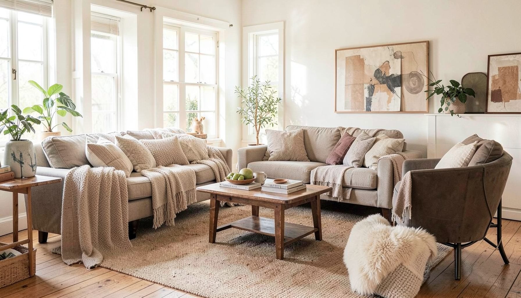
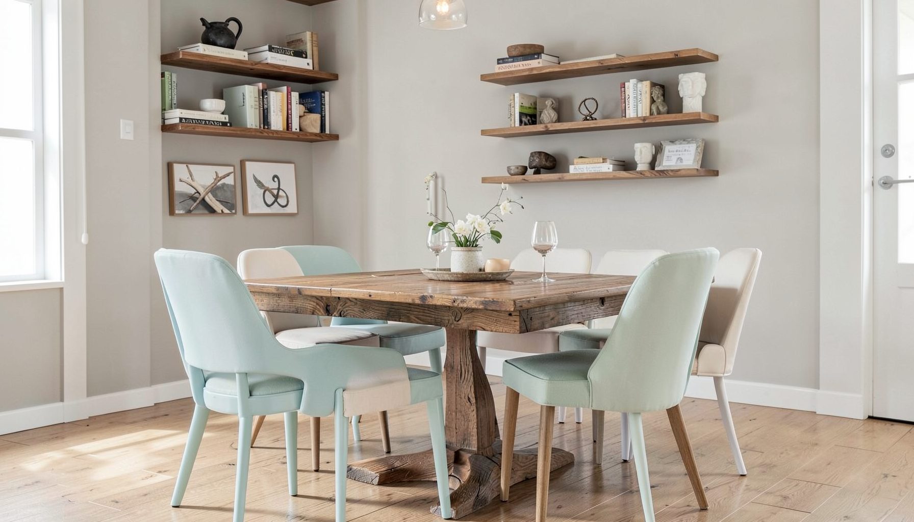
Full-service decorating that blends high and low, vintage finds with modern pieces for spaces that feel personal and collected.
Learn More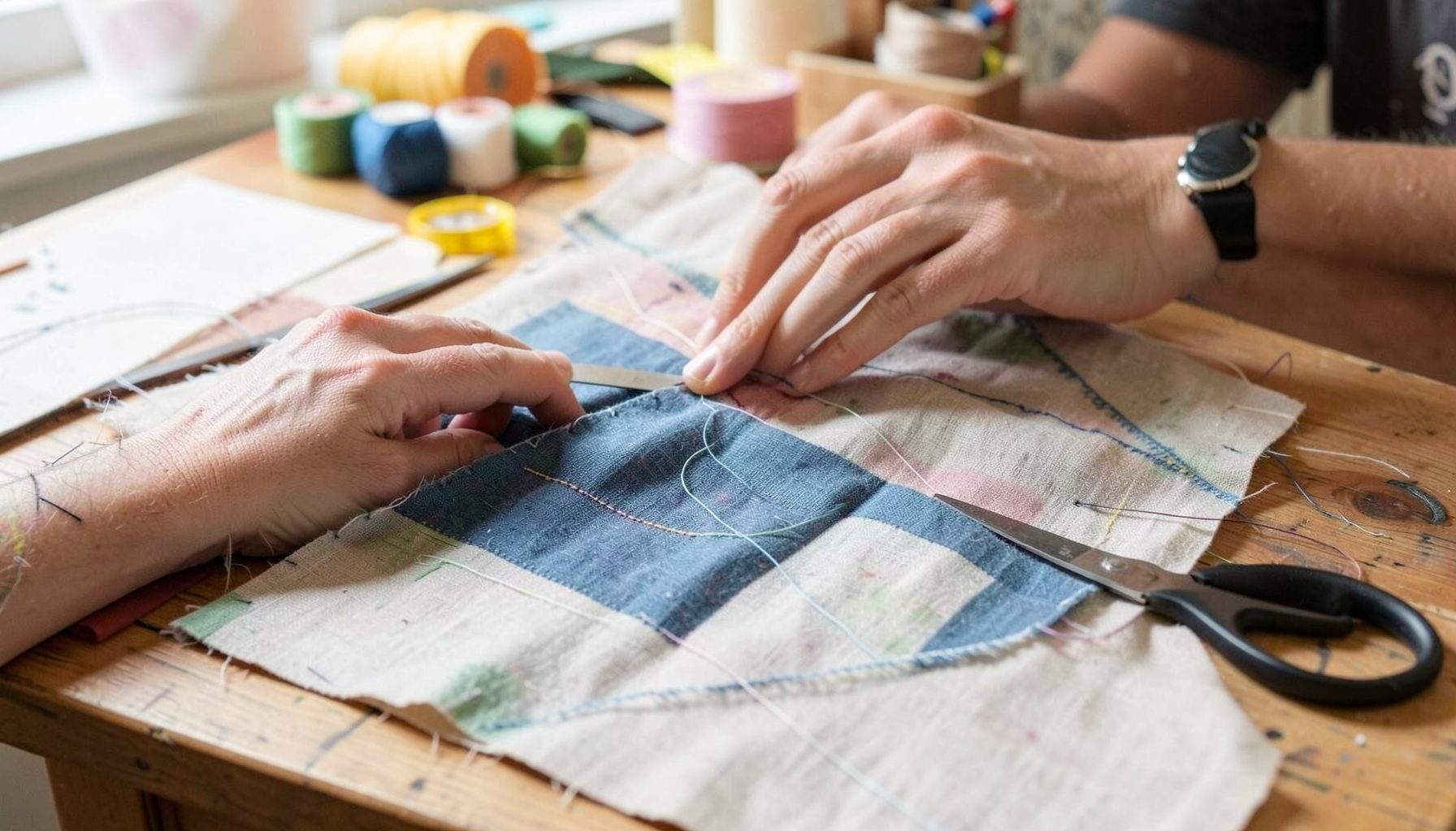
DIY Projects
Step-by-step tutorials for refinishing furniture, sewing pillows, styling bookshelves, and transforming rooms on a budget.
Learn More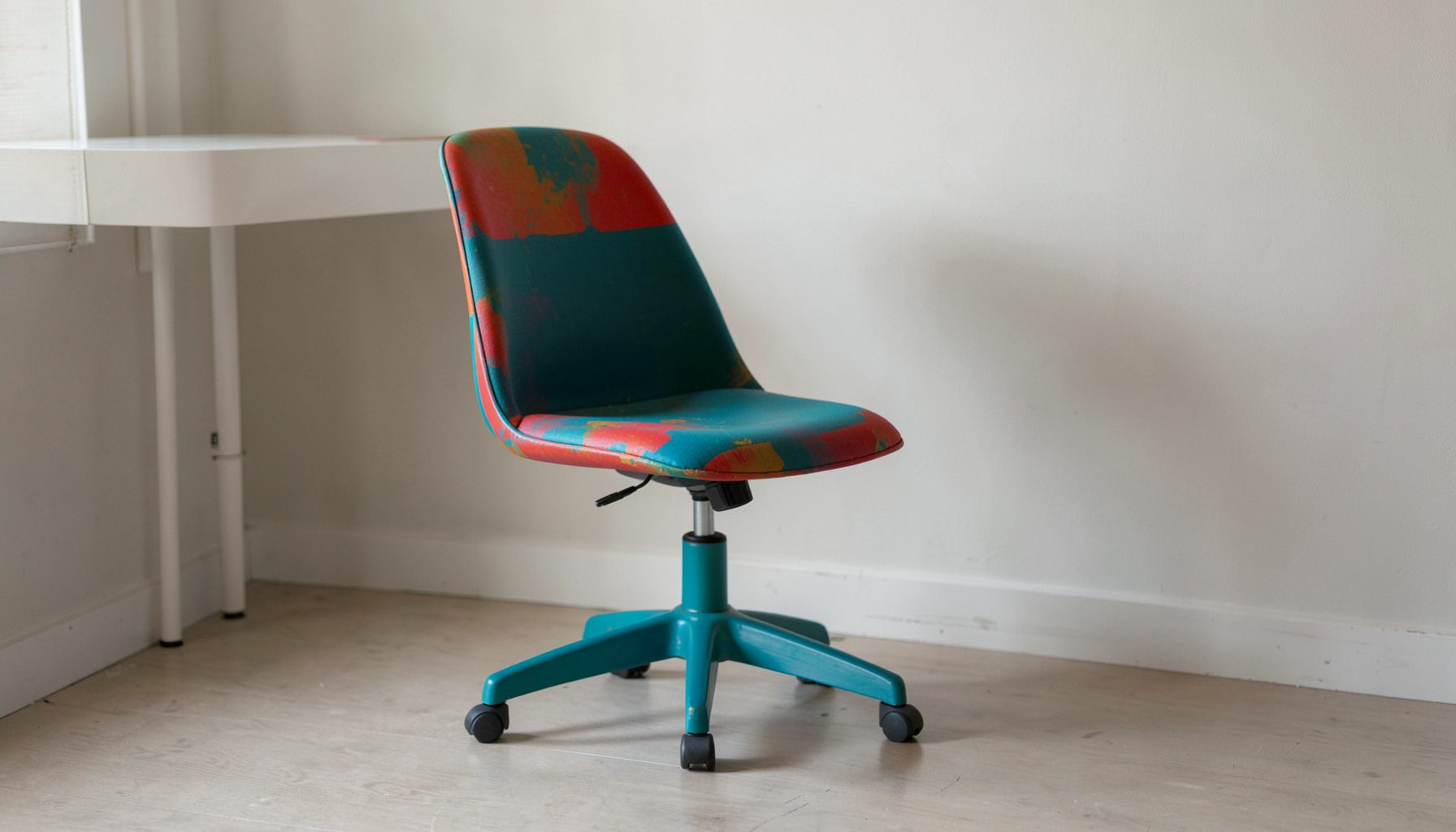
E-Decorating
Personalized design guidance delivered online — perfect for clients anywhere in the world who want a professional eye.
Learn More
Portfolio
Browse completed room makeovers, before-and-after transformations, and styling projects from Bay Area homes.
Learn More
Blog
Interior design inspiration, fashion finds, entertaining ideas, and peeks into real home renovations and styling projects.
Learn More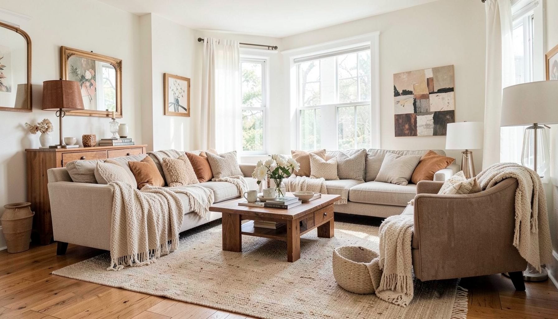
Downloads
Free curated resources for home decorating and design — guides, checklists, and inspiration to help you get started.
Learn MorePairing Bold Prints With Vintage Tufted Furniture
Pairing bold modern prints with vintage tufted furniture creates a room with depth, contrast, and unmistakable personality. A geometric wallpaper, oversized floral, or graphic rug can give a traditional sofa fresh energy, while the tufting, aged wood, and softened upholstery keep the space from feeling too sharp or overly designed.
The key is to let the old and new pieces share a visual conversation. Modern patterns bring movement and confidence; vintage furniture contributes craftsmanship, history, and tactile comfort. When their colors, proportions, and finishes are thoughtfully connected, the room feels collected rather than crowded.
This layered approach works beautifully in Bay Area homes, where relaxed sophistication often matters as much as visual impact. Whether you are refreshing a living room, guest bedroom, reading nook, or entryway, a few deliberate choices can make strong pattern and antique-inspired furniture feel naturally at home together.
Find A Shared Visual Thread
Begin with color rather than pattern. A tufted chair does not need to match a contemporary print exactly, but the two pieces should share at least one meaningful shade. A dusty blue in the upholstery might reappear in a geometric wallpaper, while a warm camel sofa could connect with ochre, rust, or tobacco accents in a modern rug.
The shared color can be subtle. It may appear in a small stripe, a flower center, the edge of a cushion, or the background of an abstract design. These quiet connections keep contrasting elements from competing. If the print is especially energetic, choose a supporting tone from the furniture and repeat it in two or three smaller accessories around the room.
Consider the undertone, too. Creamy ivory and faded beige tend to suit vintage fabrics, aged brass, and walnut wood better than a stark optic white. Likewise, a blue-gray pattern may feel more cohesive with weathered finishes than with highly polished chrome. Matching the warmth of the palette is often more important than matching the color itself.
Use Scale To Create Balance
Pattern scale determines how assertive a room feels. A large-scale botanical or oversized abstract can make a traditional settee feel current, but it needs visual breathing room. If every surface carries a dominant print, the tufted furniture loses its role as an anchor and the room can become visually restless.
A useful arrangement includes one primary pattern, one secondary pattern, and several quiet solids. For example, a broad geometric rug can serve as the main statement, a small-patterned lumbar pillow can provide contrast, and a solid velvet chair can give the eye a place to rest. The same principle applies to window treatments, wallpaper, bedding, and upholstered ottomans.
Scale should also relate to the size of the furniture. A delicate medallion may disappear against a large Chesterfield-style sofa, while a huge graphic can overwhelm a petite occasional chair. Let the proportions echo one another: substantial furniture can support confident pattern, while smaller vintage pieces often look best beside a more restrained motif.
Combine Texture With Pattern
Tufted upholstery already brings rhythm through its buttons, seams, and dimensional surface. Pairing it with a flat, crisp print creates appealing contrast. A smooth geometric rug beside a deeply buttoned ottoman, for instance, makes both textures more noticeable. The room feels layered because each surface offers a different kind of visual information.
Soft materials help bold patterns feel inviting. Try linen, brushed cotton, wool, mohair, aged leather, or nubby boucle alongside printed textiles. A modern fabric with a slight sheen can also highlight the sculptural form of a vintage chair without making the composition feel formal. Texture gives the eye a slower path through a room filled with strong visual statements.
Wood and metal finishes contribute to the balance. A glossy black side table can sharpen a faded floral chair, while antique brass lighting may soften a graphic black-and-white scheme. Select finishes that repeat existing details instead of adding an unrelated material at every turn. Two or three consistent finish families usually create a more polished result.
Choose The Right Pattern Relationship
Bold prints do not have to be identical to work together. In fact, a room often feels more sophisticated when patterns vary in style but share a common palette. Pair a broad stripe with a small check, a painterly floral with a simple block print, or an angular motif with a loosely drawn organic shape.
Pattern placement matters as much as pattern selection. A dramatic wallpaper may be appropriate behind a vintage tufted headboard, while a patterned bench at the foot of the bed could use a quieter textile. In a living room, reserve the largest print for a rug, drapery panel, or accent wall, then repeat a related shape in pillows or artwork.
When selecting upholstery for a vintage piece, study the structure of the furniture. Deep button tufting and rolled arms already communicate formality, so a modern print with generous spacing can make the silhouette feel lighter. On a cleaner, streamlined tufted sofa, you can introduce a denser pattern or a more decorative motif without creating excess visual weight.
| Vintage Furniture Feature | Print Direction | Supporting Elements |
|---|---|---|
| Deep button tufting | Geometric or widely spaced abstract | Simple rug, solid pillows, sculptural lighting |
| Rolled arms and carved wood | Modern floral or softened stripe | Linen curtains, aged brass, relaxed ceramics |
| Low-profile tufted sofa | Oversized graphic or color-block print | Clean-lined tables, minimal artwork |
| Faded velvet upholstery | Painterly botanical or small-scale check | Woven basket, wool throw, matte black accents |
| Neutral linen tufted chair | High-contrast pattern in a limited palette | Warm wood, tonal cushions, vintage accessories |
Edit The Room Around The Focal Piece
Choose one main character before adding accessories. It might be a jewel-toned tufted sofa, a patterned accent wall, or a vintage chair covered in a vivid contemporary textile. Once that focal point is established, the remaining pieces should support its shape, color, or mood rather than compete for equal attention.
A bold print can be repeated without being copied. If a rug features rust, indigo, and cream, bring those colors into a ceramic lamp, a small artwork, or a throw. Repetition makes the room feel intentional, while variation keeps it from looking like a coordinated showroom set. Vintage objects are especially effective because their patina introduces irregularity and character.
Negative space is part of the composition. Leave some walls, tabletops, and upholstery unpatterned so the strongest elements can register clearly. A tufted sofa with a graphic pillow, an antique mirror, and one substantial piece of art may feel more finished than the same sofa surrounded by a dozen smaller accessories.
For hands-on ways to refresh supporting pieces, explore these DIY decorating projects, which can help you introduce handmade detail without adding another major pattern to the room. A painted frame, updated lamp base, or thoughtfully styled shelf can reinforce the palette while preserving the collected feeling.
Make Modern And Vintage Feel Intentional
The contrast between eras should look chosen, not accidental. A contemporary print gains credibility when it appears beside something with visible age, craftsmanship, or a distinctive silhouette. Likewise, vintage tufted furniture feels more relevant when paired with clean-lined lighting, modern art, or an unexpected color combination.
Aim for a mix of approximately three design periods or influences rather than relying on one historical style. A tufted Victorian-inspired chair, a mid-century side table, and a contemporary abstract rug can coexist when their scale and color are compatible. This kind of juxtaposition creates a layered interior that reflects personal taste rather than a fixed decorating category.
Pay attention to condition and comfort. Vintage furniture does not need to be flawless, but it should be sturdy, clean, and suitable for daily use. Reupholstering a well-made piece in a modern textile can preserve its shape while giving it a new purpose. If the frame is beautiful but the fabric is fragile, use the chair in a bedroom or sitting area rather than a high-traffic family room.
Practical Styling Moves For A Collected Look
Use these adjustments to bring strong pattern and tufted furniture into balance:
- Start with a large anchor, such as a rug, sofa, or wall treatment, and keep secondary patterns smaller.
- Repeat one color from the main print in at least two accessories placed across the room.
- Mix one smooth surface with one tactile surface near every major patterned element.
- Leave some furniture and walls solid so the eye has room to rest.
- Add contemporary lighting or artwork to keep vintage upholstery from feeling overly formal.
Before committing to fabric or wallpaper, bring home samples and view them in morning, afternoon, and evening light. Bay Area interiors can shift significantly depending on window direction, fog, and the warmth of existing bulbs. A color that feels crisp in a showroom may look muted beside aged wood or deep velvet at home.
It also helps to photograph the room from the doorway and from the main seating position. Patterns that appear balanced up close may feel too dominant from across the space. Photographs reveal crowded corners, uneven color distribution, and areas where an additional solid texture would create welcome relief.
A successful room does not require every piece to make the same statement. The most memorable interiors allow modern pattern, vintage form, and personal objects to maintain their own identities while contributing to a shared atmosphere. That balance is what makes a space feel expressive, comfortable, and lived in.
Maggie Rose Interiors brings this kind of thoughtful layering to full-service decorating, online e-decorating, room makeovers, and personalized design guidance. Whether you are beginning with a beloved tufted chair or searching for the right print to transform a room, reach out to create a home where vintage character and modern confidence work beautifully together.

Recent Projects