Interior Design
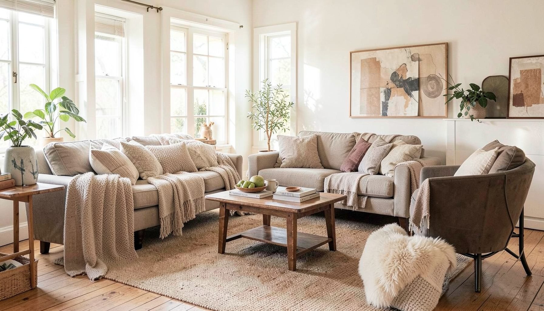
Full-service decorating that blends high and low, vintage finds with modern pieces for spaces that feel personal and collected.
Learn More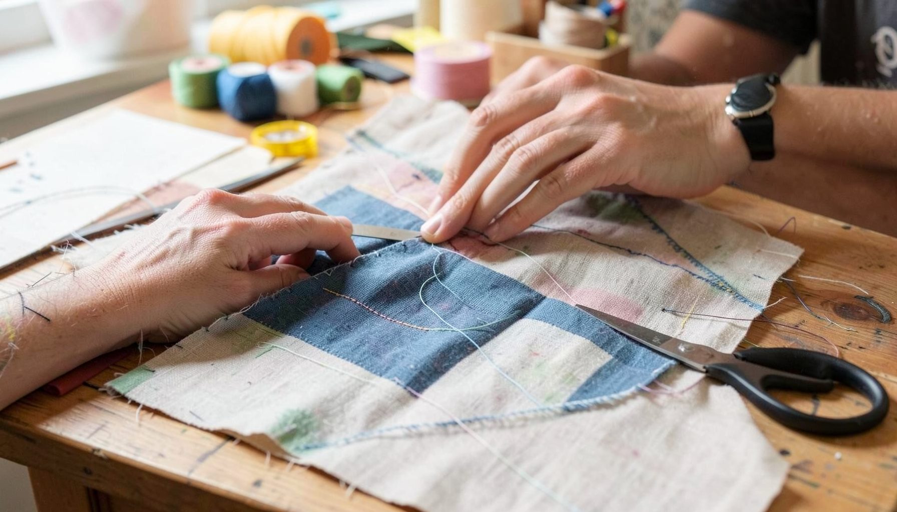
DIY Projects
Step-by-step tutorials for refinishing furniture, sewing pillows, styling bookshelves, and transforming rooms on a budget.
Learn More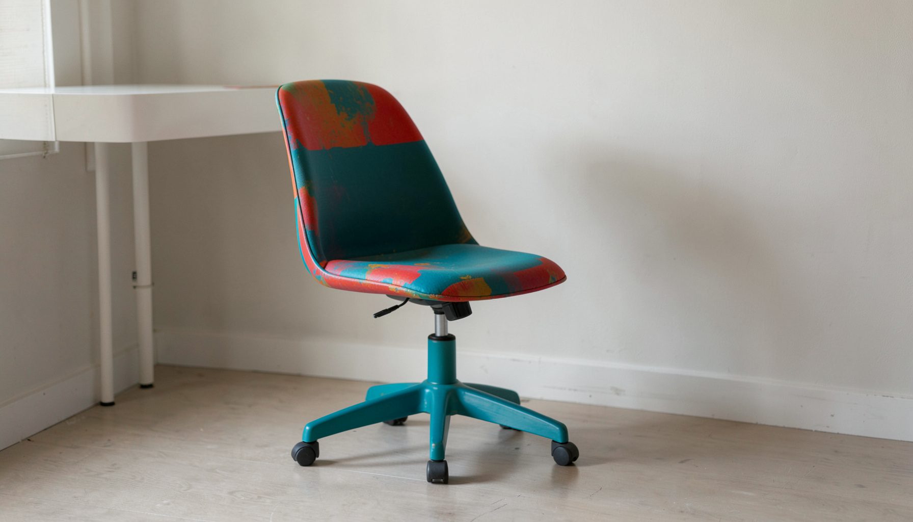
E-Decorating
Personalized design guidance delivered online — perfect for clients anywhere in the world who want a professional eye.
Learn More
Portfolio
Browse completed room makeovers, before-and-after transformations, and styling projects from Bay Area homes.
Learn More
Blog
Interior design inspiration, fashion finds, entertaining ideas, and peeks into real home renovations and styling projects.
Learn More
Downloads
Free curated resources for home decorating and design — guides, checklists, and inspiration to help you get started.
Learn MoreMixing wood tones for a beautifully collected Australian home
Most rooms have at least three or four wood surfaces competing for attention. There might be a sideboard against the wall, a dining table under the pendant, a pair of picture frames and a small stool tucked beneath a console. Making them sing in harmony rather than clash is the quiet art behind a layered, collected interior, and the rules are far easier than they first appear.
This guide is tuned to the way Australians actually live, from light-drenched Queenslanders in Brisbane to inner-city terraces in Sydney and renovated weatherboards in Melbourne. It draws on locally grown timbers such as Blackbutt, Spotted Gum, Tasmanian Oak, Messmate and Jarrah, and takes into account our strong sun, salty coastal air and the bushfire zones that quietly shape building choices around the country.
Reading the undertones beneath the grain
Wood carries hidden pigments we read as warmth or coolness long before we name a colour. Spotted Gum and Blackbutt lean warm, with caramel, honey and amber notes that glow in afternoon light. Tasmanian Oak and pale Victorian ash sit cooler, with creamy beige undertones that feel almost neutral. Jarrah reads deep and red, while American Walnut, often spotted in furniture at Temple & Webster, skews purplish and cool. Recognising these hidden colours is the first step toward combining woods that feel related rather than random.
Hold a piece of white paper next to a timber sample and look for the undertone that might otherwise pass unnoticed. A warm timber will throw a yellow or orange cast, while a cool one tends toward grey or pink. Most Australian grown species sit somewhere on the warm side, which is one reason mixing them feels instinctive here. The exception is bleached or limewashed finishes, which pull a timber toward grey and behave like a cool neutral once they are sealed.
When tones are mixed, balance matters more than parity. Two warm pieces and one cool piece will read as a balanced trio. Three warms and one pale, washed timber will also feel intentional. The pattern to avoid is the equal split, where every tone fights for attention and the room feels busy rather than layered.
Anchor the room with one statement piece
Every well-mixed scheme begins with a single anchor, the loudest voice in the room. This might be a recycled Blackbutt dining table from a Sydney maker such as Zuster, a Spotted Gum console from a Brisbane furniture studio, or a jarrah sideboard inherited from a relative in Perth. Whatever the piece, its tone becomes the reference against which everything else is measured.
Once the anchor is chosen, the room builds outward. If the anchor is warm honey, pair it with timbers that share at least one undertone. A warm walnut bookshelf will feel like a cousin, while a pale ash chair will offer contrast without shouting. The anchor does not have to be the largest piece, but it should be the one the eye lands on first when entering the room.
For renters or anyone easing into a collected look, the anchor can be smaller. A vintage teak side table found at a Vinnies in Newtown, a mirror frame in Tasmanian Oak from a Bunnings flat-pack range, or a pair of mid-century bedside tables bought second-hand through Facebook Marketplace can all carry the palette. The principle holds: name the dominant tone, then echo it elsewhere in the room.
Vary the grain, not just the tone
Tone alone will not carry a room. Grain pattern and figure matter just as much, because two pieces in similar colours but contrasting grains will read as siblings rather than twins. Messmate has dramatic, wavy grain that catches the eye, while Blackbutt is more even and slightly coarse. Mixing a high-figure timber with a quieter one gives the eye places to rest.
In a Brisbane living area with broad Blackbutt floorboards, a smoother Tasmanian Oak coffee table introduces a calm counterpoint. Add a small Spotted Gum side table and the room gains rhythm. Each timber reads as a different tempo, yet all share the warm Australian character that makes the palette feel native to the home.
Finishes also start to work for or against the scheme. A matte oil finish absorbs light and feels soft and quiet. A satin lacquer reflects more and feels polished. Two highly lacquered pieces will compete, while a matte anchor paired with a satin accent will settle into a clear hierarchy. The variation in sheen is a subtle but powerful way to keep the room from looking like a catalogue spread.
Bridge the palette with a common thread
A bridge is something every timber in the room shares, whether texture, finish, a hint of colour or a stylistic era. Without a bridge, even beautiful pieces can feel unrelated. With one, the room begins to feel collected rather than curated.
Colour is the easiest bridge. A whisper of green in a velvet armchair, a hint of terracotta in a rug or warm whites on the walls can echo through every timber and tie them together. Style works the same way. If the anchor is mid-century, pair pieces from the same era or sympathetic ones, such as a 1970s teak sideboard next to a contemporary Blackbutt dining table from a Melbourne maker such as Grazia & Co. The era becomes the thread that runs through the room.
Texture is often overlooked. Rough-hewn beams above, a smooth table below and a woven seagrass rug beneath all soften the differences between timbers. In a coastal home in Coffs Harbour, for example, a limewashed Spotted Gum floor feels more cohesive with a warm walnut console if both are paired with linen drapery and unpolished stone. The textures create a common language that the wood alone cannot.
Honour the light, climate and local conditions
Australian light is famously intense, and it shifts the way timber reads throughout the day. North-facing rooms in Sydney and Brisbane flood with golden light that intensifies warm woods and can push yellow tones into the orange zone. South-facing rooms in Melbourne and Hobart, by contrast, are softer and cooler, which can make warm timbers feel muted and cool timbers feel flat. Timber samples should be observed at both the brightest and dimmest times of day before any decision is made.
Climate also matters for how wood behaves over time. Coastal homes from Coffs Harbour down to the Mornington Peninsula face salt-laden air that can darken timbers or cause movement in solid boards. Inland areas such as Canberra or Ballarat see bigger swings in humidity, with summers that dry furniture and winters that swell it. Engineered boards, sealed tops and oil finishes refreshed annually are practical responses that keep the mix stable. In bushfire-affected zones rated BAL-29 or BAL-40, timber furniture should sit well clear of openable windows and sliding doors, and any external timber near the home must meet the relevant Australian Standard AS 3959.
Lighting itself is a hidden timber tone. Warm 2700K globes, available at any Beacon Lighting or Bunnings, will warm every piece in the room by a shade, while 4000K daylight globes push everything cooler. Choosing one consistent colour temperature and dimming it for evening use lets the wood tones settle into a single mood rather than fight each other.
Layer vintage, modern and local finds
The collected look depends on era, origin and patina. A Scandinavian-style set of shelves built at the Marsden Park IKEA, a hand-turned Blackbutt stool from a Sydney furniture maker, and a vintage G-plan sideboard inherited from a family member in Adelaide can all share a room if their tones have been calibrated as above. The mix of new and old is what reads as collected, not curated.
Sourcing matters too. Local makers who work with salvaged or sustainably harvested Australian timber, such as House of Orange in Adelaide, TIDE Design in Melbourne or Jakka Studio in Sydney, tend to use finishes that flatter the grain. Their pieces often pair more easily with Australian floors because they are tuned to the same palette. Imported pieces may sit outside the spectrum and need a little more thought to integrate. Even then, a new tone can be welcomed if a bridge ties it back to the rest of the room.
The mix benefits from time. New pieces should be lived with for a few weeks before anything else is added. A chair can be moved from the corner to the window to see how its timber reads against the floor. A black picture frame can be swapped for a warm walnut one to watch the difference in the wall. A collected interior is rarely shaped in a single afternoon, piece by piece, over months and years.
Tie it all together with rugs, art and soft furnishings
Soft elements decide whether the wood mix reads as intentional or accidental. A wool rug in a mottled, undyed colour pulls together warm and cool timbers by giving the eye somewhere neutral to rest. A linen curtain in oat or natural softens the contrast between a Spotted Gum floor and a pale Tasmanian Oak shelf. A piece of art with shared hues, perhaps ochre, terracotta, soft grey or sage, repeats the palette across timber, fabric and wall.
These softer layers also test new combinations. If a piece of furniture feels out of place, a cushion, a throw or a stack of books placed near it in a tone drawn from elsewhere in the room can settle it. If the trouble spot disappears, the mix is working. If it still pulls the eye, the piece may need a bridge nearby, such as a lamp, a vase or a plant in a warm ceramic pot, to anchor it.
A simple trick used by interior decorators across Adelaide, Perth and Melbourne is to repeat each timber tone at least once in a soft furnishing. A walnut sideboard might be echoed in a walnut tray, a dark timber lamp base or the frame of a mirror hung opposite it. The repetition is subtle, almost subliminal, but it is what makes a room feel finished rather than furnished.
The most reliable way to start mixing wood tones with confidence is to gather a few physical samples and bring them home. Offcuts from a local timber yard such as Bowens, a sample pack from a flooring showroom or a few tester pots of stain from Bunnings give a small library to work with at home. Laid on the floor, the table and the sideboard, they reveal which undertones behave well in your own light and which will need a bridge nearby before any new piece is committed to.

Recent Projects