Interior Design
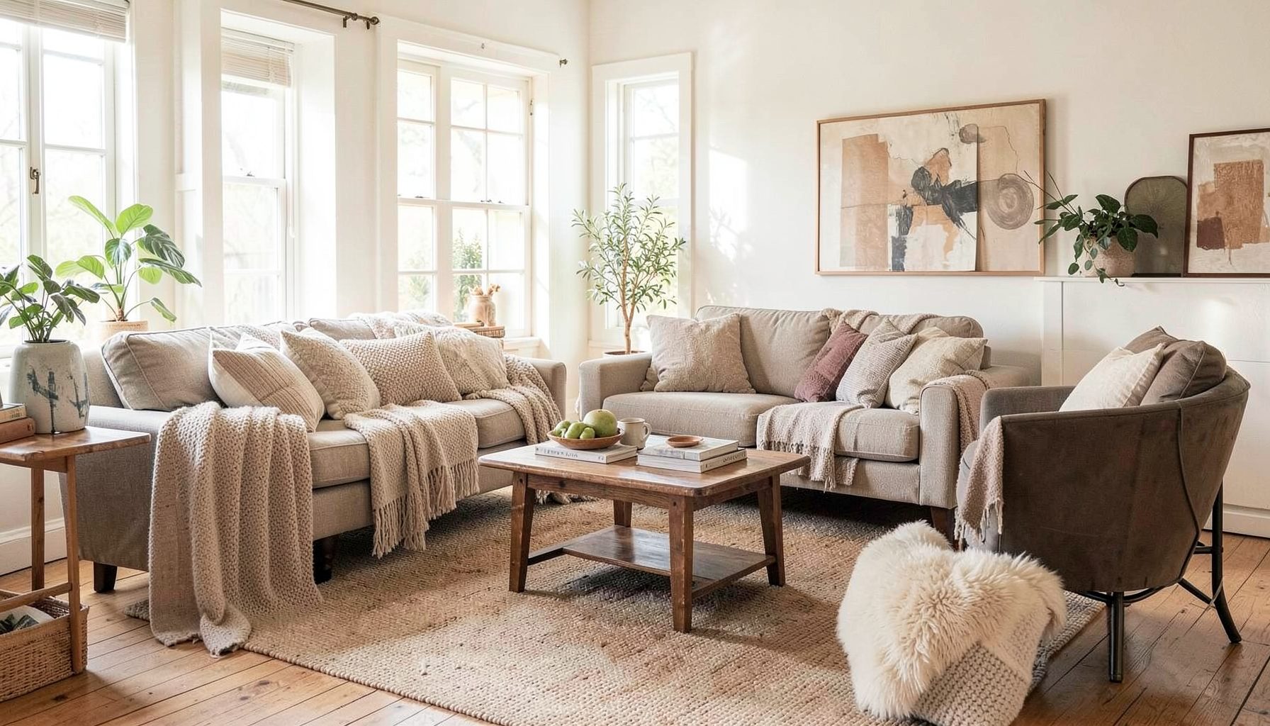
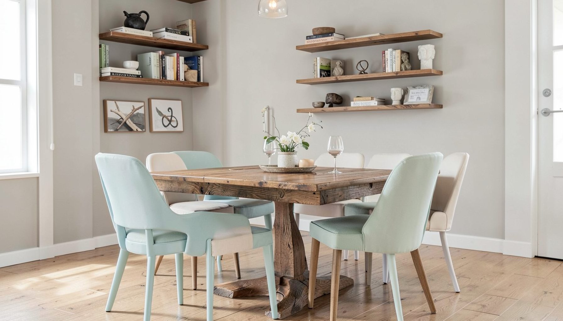
Full-service decorating that blends high and low, vintage finds with modern pieces for spaces that feel personal and collected.
Learn More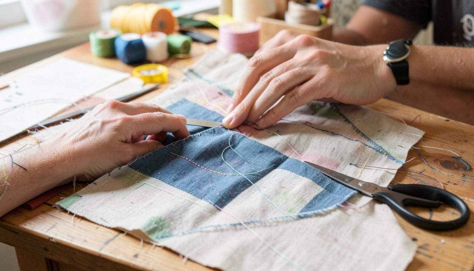
DIY Projects
Step-by-step tutorials for refinishing furniture, sewing pillows, styling bookshelves, and transforming rooms on a budget.
Learn More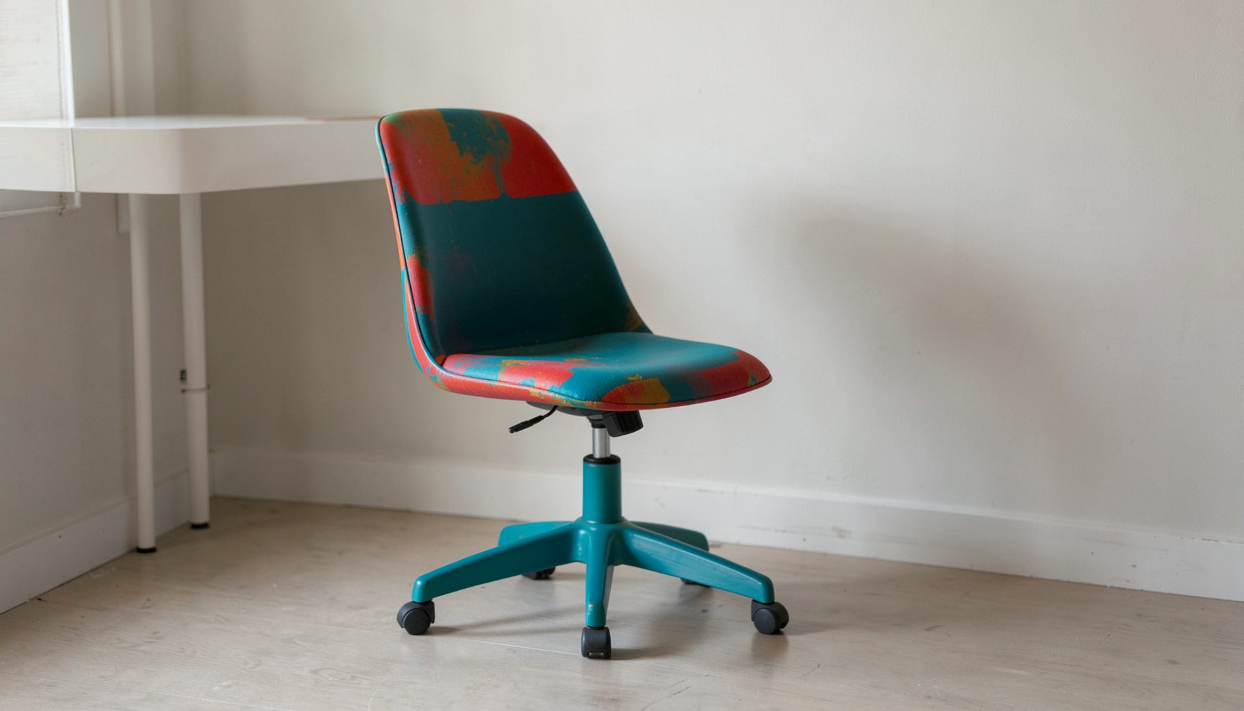
E-Decorating
Personalized design guidance delivered online — perfect for clients anywhere in the world who want a professional eye.
Learn More
Portfolio
Browse completed room makeovers, before-and-after transformations, and styling projects from Bay Area homes.
Learn More
Blog
Interior design inspiration, fashion finds, entertaining ideas, and peeks into real home renovations and styling projects.
Learn More
Downloads
Free curated resources for home decorating and design — guides, checklists, and inspiration to help you get started.
Learn MoreHow to Mix Wood Tones in a Layered Interior
Wood brings warmth, texture, and a sense of history to a room. A pale oak floor can make a space feel open and relaxed, while walnut furniture adds depth and a beautiful, grounded contrast. When several finishes appear together, the room can feel collected over time rather than purchased in a single afternoon.
Mixing wood tones successfully is less about matching every finish and more about creating a relationship between them. Grain, undertone, scale, placement, and surrounding colors all influence whether a combination feels intentional. With a few dependable principles, you can combine vintage pieces, modern furnishings, and inherited treasures without creating visual noise.
A layered interior gives each material room to contribute. The goal is to let wood tones support the larger story of the space, alongside textiles, metal, paint, art, and natural elements. The most inviting rooms often include a thoughtful range of finishes rather than one perfectly coordinated shade.
Begin With the Largest Wood Surface
Start by identifying the dominant wood tone in the room. This is usually the flooring, exposed ceiling beams, wall paneling, or a large built-in feature. Because these surfaces occupy considerable visual space, they establish the foundation for every other timber finish you bring in.
Observe the floor in daylight and artificial light. Is the wood warm and honey-toned, softly neutral, gray-washed, or deep and reddish? Look closely at the grain as well. A highly patterned oak floor creates a different backdrop from smooth, understated maple. The dominant surface does not dictate every decision, but it provides a useful reference point.
Once the primary finish is clear, choose one or two secondary wood tones with enough contrast to be noticed. A room with medium oak flooring might include a dark walnut console and a light ash stool. If every piece is nearly the same color, the space may feel flat. If every piece is dramatically different, the eye may struggle to rest.
Pay Attention To Undertones
Wood tones have undertones that can be warm, cool, neutral, yellow, red, or slightly gray. These subtle qualities often determine whether two finishes feel harmonious. A golden oak table can sit comfortably near a warm walnut cabinet, while a strongly orange pine piece may compete with a cherry-red finish.
You do not need every wood tone to share the same undertone. Contrast can be appealing when it is repeated thoughtfully. A cooler ash frame might balance warm floors, especially when soft gray upholstery, aged brass, or blue-green textiles reinforce that cooler note elsewhere in the room.
When shopping for furniture or evaluating pieces you already own, place samples together in the actual space. Compare them beside the flooring, upholstery, rugs, and wall color rather than under showroom lighting. A finish that seems neutral in a store can look distinctly warm when placed beside a white wall or a cool stone surface.
Create A Visual Relationship
Mixed finishes look intentional when at least one quality connects them. That connection might be a similar grain direction, a repeated undertone, a shared level of sheen, or a color that appears in several parts of the room. The pieces do not need to match; they need a visual reason to belong together.
Repetition is especially useful. If a dark wood coffee table is the only deep finish in a light room, it may appear disconnected. Add a darker picture frame, a small side table, or a decorative object in a similar tone, and the contrast becomes part of the design language. Repetition can be subtle rather than perfectly symmetrical.
Scale matters as well. A large, visually heavy walnut cabinet should be balanced by other substantial elements, such as a dark-framed mirror, a patterned rug, or a substantial lamp base. Small dark accents can support a larger piece without making the room feel overly dense.
A Practical Guide To Combining Finishes
Use the following guide as a starting point when selecting furniture, accessories, and architectural details. The combinations are flexible, and the surrounding materials will affect the final result.
| Dominant Wood Tone | Complementary Finish | Best Supporting Elements | Overall Effect |
|---|---|---|---|
| Light oak | Walnut or smoked oak | Cream textiles, black accents, aged brass | Warm, grounded, collected |
| Honey pine | Soft white oak or ash | Natural linen, muted green, woven textures | Casual and welcoming |
| Medium oak | Painted wood or dark walnut | Charcoal, ivory, terracotta, leather | Balanced and layered |
| Walnut | Maple, ash, or light oak | Warm white, soft blue, brushed brass | Refined with gentle contrast |
| Mahogany or reddish wood | Neutral oak or ebonized wood | Olive, camel, parchment, antique metal | Traditional with depth |
| Gray-washed wood | Natural oak or medium walnut | Stone, faded blue, blackened iron | Relaxed and contemporary |
| Dark-stained wood | Pale ash or blond oak | Light upholstery, plaster tones, reflective glass | Dramatic without feeling heavy |
A useful rule is to keep the number of major wood tones limited, then use small accessories to introduce variation. Three prominent finishes can work beautifully when they are distributed across the room. More than that may still be successful, but the additional tones should generally appear in smaller quantities.
Think of the table as a framework rather than a decorating formula. The history and shape of each piece matter just as much as the stain. A rustic pine bench and a polished walnut side table can coexist when their silhouettes, textures, and placement create an appealing dialogue.
Layer Furniture From Different Eras
Vintage and modern furniture often make wood mixing feel natural because they bring different proportions and personalities to the room. A streamlined oak dining table can soften the formality of an antique cabinet, while a mid-century walnut chair can add structure to a room filled with traditional details.
Begin with the function of each piece. A wood finish may be beautiful, but the furniture should still support the way the room is used. In a living room, combine a substantial timber coffee table with lighter-legged chairs and a textured sofa. In a bedroom, a wooden bed can be paired with mismatched nightstands if lamps, artwork, or bedding create balance.
Avoid placing every wood item around the perimeter of the room. Bring some pieces toward the center and vary their heights. A low table, medium-height cabinet, and tall wood-framed mirror create a more dynamic arrangement than a row of similar pieces. Open space between furnishings allows each finish to remain visible.
Use Textiles And Color To Soften Contrast
Textiles are essential when combining different wood finishes. Rugs, curtains, cushions, and upholstery create a visual bridge between surfaces that might otherwise feel too separate. A patterned rug containing both a pale tan and a deep brown can connect light oak flooring with walnut furniture in one easy move.
Color can either amplify or soften the contrast. Warm neutrals such as oat, camel, clay, and ivory make mixed woods feel cohesive and relaxed. Deep green, navy, and rust can emphasize the richness of darker finishes. Pale blue-gray and muted sage are useful when a room needs balance against yellow or orange undertones.
Texture has a similar effect. Linen, wool, leather, cane, rattan, and handmade ceramics interrupt large areas of hard wood and prevent the room from becoming visually rigid. A glossy finish beside a nubby textile feels more nuanced than several smooth, reflective surfaces placed together.
Balance Light And Dark Elements
Contrast gives a room definition, but it should be distributed across the space. If all dark wood is concentrated on one side, the arrangement may feel lopsided. Repeat the darker value in smaller accents across the room: an artwork frame, a lamp detail, a chair leg, or a decorative box can be enough.
The same principle applies to light finishes. A single pale wood item may seem accidental if nothing else relates to it. Pair a blond wood stool with a light woven pendant, a pale frame, or natural cane accessories. These repetitions help the eye move around the room.
Consider the amount of natural light before adding substantial dark timber. A bright room can carry deep walnut or espresso finishes with ease, while a dim room may benefit from lighter oak, reflective surfaces, and softly colored walls. Dark wood is not automatically overwhelming, but it needs breathing room and adequate illumination.
Recommendations For A More Intentional Mix
Use these practical checks before bringing another wooden piece into the room:
- Identify the dominant wood finish before choosing accent furniture.
- Limit major wood tones to two or three, then vary texture through smaller accessories.
- Repeat each significant finish at least twice when possible.
- Compare undertones in natural light beside flooring, paint, and upholstery.
- Balance heavy or dark furniture with lighter textiles, open forms, and reflective accents.
It also helps to consider what should remain quiet. If the flooring has a dramatic grain, select simpler furniture shapes so the room does not become visually busy. If the furniture is ornate or heavily carved, a calmer floor and restrained accessories may provide the necessary balance.
A layered home should feel personal rather than perfectly staged. Keep meaningful pieces that carry history, even if their finishes are different from your newer furnishings. A treasured chair, antique chest, or inherited frame can become the anchor that gives the entire room character.
Bring The Room Together With Styling
Styling is the final opportunity to connect mixed wood tones. Arrange books, ceramics, baskets, lamps, and artwork so that color and texture travel throughout the room. A small stack of books beneath a light wood object can echo a pale floor, while a dark ceramic vase can reinforce a walnut cabinet.
Plants are particularly effective in a wood-rich space. Their organic shapes and green color break up repeated horizontal lines and add freshness. Woven baskets, stone trays, and metal accents provide further material contrast without introducing another competing wood finish.
Step back regularly while arranging the room. Look at the space from the doorway and from the places where you usually sit. If one finish feels isolated, repeat it nearby or soften it with a rug, textile, or accessory. If the room feels too coordinated, introduce a piece with age, patina, or a different silhouette.
The best combinations develop gradually. A home with layered wood tones reflects the way people actually live: through a mix of discoveries, practical purchases, inherited objects, and pieces chosen for their beauty. Whether you are refreshing one room or planning a full-service interior decorating project, thoughtful contrast can make the finished space feel warm, collected, and unmistakably yours.
For tailored guidance in San Jose, San Francisco, and beyond, Maggie Rose Interiors can help shape a cohesive palette around your architecture, furnishings, and personal style. Explore the studio’s portfolio, decorating resources, and online design services to begin creating a home where every wood finish has a place.

Recent Projects