Interior Design
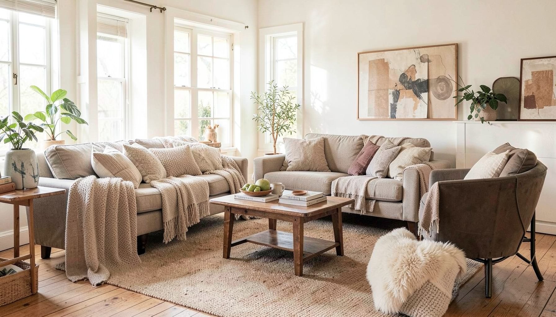
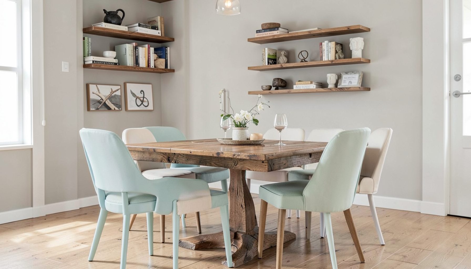
Full-service decorating that blends high and low, vintage finds with modern pieces for spaces that feel personal and collected.
Learn More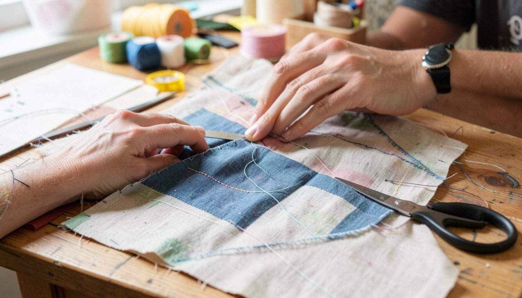
DIY Projects
Step-by-step tutorials for refinishing furniture, sewing pillows, styling bookshelves, and transforming rooms on a budget.
Learn More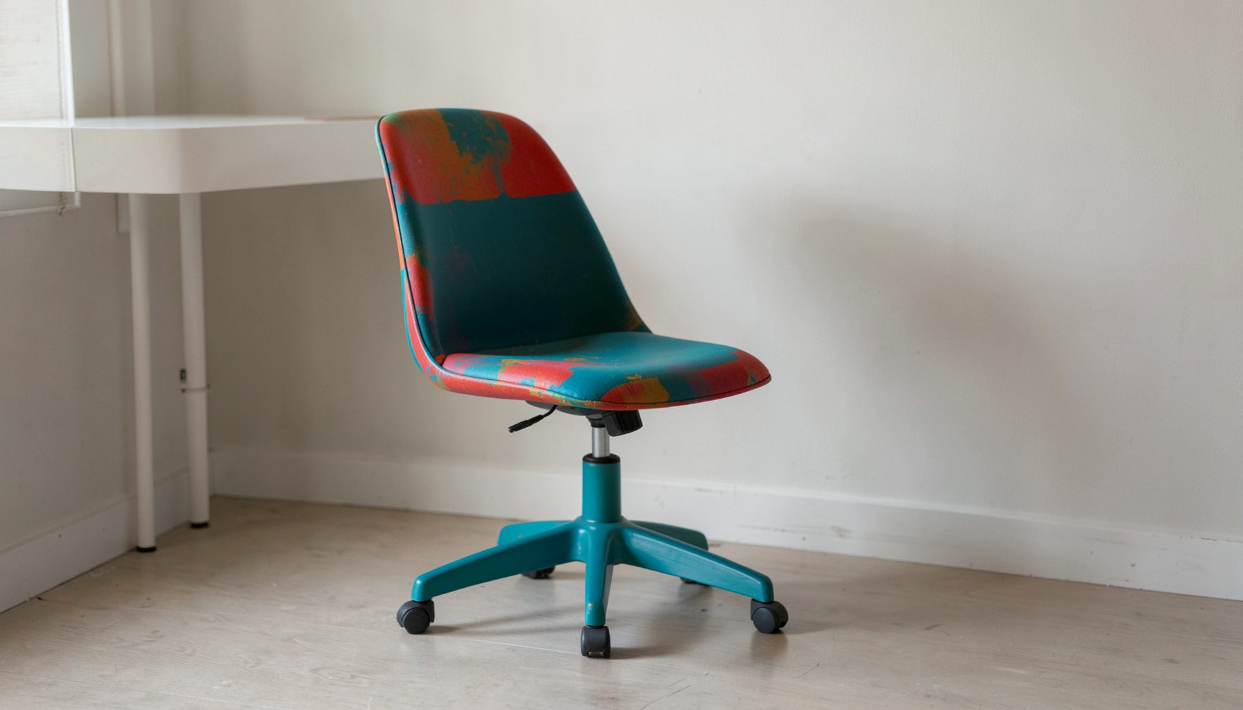
E-Decorating
Personalized design guidance delivered online — perfect for clients anywhere in the world who want a professional eye.
Learn More
Portfolio
Browse completed room makeovers, before-and-after transformations, and styling projects from Bay Area homes.
Learn More
Blog
Interior design inspiration, fashion finds, entertaining ideas, and peeks into real home renovations and styling projects.
Learn More
Downloads
Free curated resources for home decorating and design — guides, checklists, and inspiration to help you get started.
Learn MoreHow to Mix Stripes, Florals, and Solids in Guest Room Bedding
A guest room should feel considered without looking overly matched. Bedding is one of the easiest places to create that balance because stripes, florals, and solid-coloured layers each bring a different kind of energy. Stripes add rhythm, florals soften the scheme, and solids give the eye somewhere to rest.
The most successful combinations usually have a quiet connection running through them: a shared colour, a similar visual weight, or a repeated scale. Once those relationships are in place, you can combine vintage finds, contemporary linen, patterned cushions, and practical everyday pieces without making the bed feel chaotic.
Start with a restrained colour story
Choose two or three main colours before selecting individual bedding pieces. A warm white base with olive, rust, and faded blue can feel relaxed and collected, while ivory, dusty rose, and tobacco create a gentler bedroom suited to an older cottage or heritage home. In a modern apartment, charcoal, soft white, and muted sage can provide definition without making the space feel stark.
A useful approach is to let one colour lead and allow the others to support it. If the floral quilt has small touches of terracotta, repeat that shade in a lumbar cushion or the piping on a blanket. The connection does not need to be exact. Similar undertones often look more natural than trying to match every colour perfectly.
Australian light can influence how these choices appear. Strong afternoon sun in a west-facing Sydney room may intensify warm colours, while the cooler light common in a Melbourne winter can make blue-grey bedding appear more subdued. Test fabric swatches on the bed during different parts of the day before committing to a full set.
Give every pattern a different job
Pattern mixing works best when the designs are clearly different in scale and character. A broad stripe can act as the graphic foundation, a small floral can provide detail, and a solid quilt or coverlet can create a visual pause between them. When every layer is equally busy, the bed loses its hierarchy.
Think about the three patterns as a conversation. The stripe may appear on the duvet cover or a pair of euro pillowcases, where its direction establishes structure. The floral can then sit closer to the front in a decorative cushion or folded quilt. A solid bedspread at the foot of the bed helps separate the patterns and makes the overall arrangement easier to read.
The direction of a stripe also matters. Horizontal stripes can make a narrow bed look broader, while vertical stripes may emphasise height when used on a bedhead cushion or long bolster. If the room already has strong architectural lines, a softer floral is often more effective than another geometric pattern.
Let stripes establish rhythm
Stripes are versatile because they can feel coastal, traditional, tailored, or playful depending on their width and colour. Fine ticking stripes suit a simple guest room with shaker furniture, while wide uneven bands have a more relaxed, handwoven quality. A narrow pinstripe paired with a block-print floral can look particularly elegant because the two patterns have contrasting levels of detail.
Avoid placing too many stripes in the same direction. If the duvet cover has vertical bands, use a striped lumbar cushion with a horizontal orientation or introduce a checked textile instead. This creates movement without adding another competing motif.
The Australian market offers plenty of useful striped options in washed cotton, linen, cotton-linen blends, and heavier canvas-like fabrics. Linen is attractive in warm climates because it breathes well and becomes softer with use, though it wrinkles easily. For a guest room in Brisbane or another humid area, lighter layers that can be removed and washed often may be more comfortable than a dense, heavily quilted arrangement.
Use florals to add personality
Florals bring a sense of softness and personality, but they do not have to look traditionally feminine or overly formal. A botanical print in olive and cream can feel grounded and contemporary, while a faded chintz introduces a collected, vintage mood. Abstract florals are useful when you want organic movement without a recognisable flower pattern.
Choose the floral according to the room’s scale. A large-scale print can become the focal point on a quilt or duvet, especially when the rest of the bedding is quiet. Small florals work well on cushions, pillowcases, or a folded throw because they reward closer inspection without dominating the bed.
Pull one less obvious colour from the floral rather than repeating only its most prominent shade. A cushion in muted ochre, soft lilac, or clay can make the arrangement feel layered and intentional. This is also a practical way to connect bedding with artwork. If you are sourcing affordable pieces for the walls, these ideas for budget-friendly art sourcing can help extend the bedroom palette beyond the bed.
Use solids to create breathing room
Solid fabrics are the quiet architecture of a layered bed. They prevent patterned pieces from competing and give guests a comfortable visual landing place. A plain linen quilt, matelassé coverlet, or brushed cotton blanket can sit between a patterned duvet and decorative cushions, making the entire arrangement feel more polished.
Solids do not need to be flat or boring. Texture adds interest while keeping the colour calm. Consider waffle cotton, quilted linen, velvet, boucle, washed canvas, or a subtly ribbed knit. A tonal combination of warm white and oatmeal can be more sophisticated than a collection of unrelated bright neutrals.
Use the strongest texture where it will be noticed but not constantly handled. A quilt folded across the foot of the bed can provide depth, while smooth cotton sheets remain practical for sleeping. In a guest room, keep the actual sleeping surface relatively simple and reserve the decorative complexity for the top layers and cushions.
Build the bed for real Australian living
Begin with breathable sheets, then add the main patterned layer, a lighter blanket, and one or two decorative pieces. This arrangement allows visitors to adjust the bed to their comfort instead of wrestling with a heavy stack. In southern states, a wool blanket or quilt can be welcome in winter; in warmer Queensland homes, cotton layers and a lightweight quilt may be more appropriate.
Check the mattress dimensions before buying fitted sheets and coverlets. Australian beds include king single, queen, and king sizes that differ from American and European measurements. A king single, common in smaller bedrooms and secondary suites, needs bedding designed for its 107-by-204-centimetre proportions. Oversized European pieces may drape attractively, but they can also bunch or obscure the bed frame.
Care matters as much as appearance. Look for clear fibre content and care instructions when buying textiles, particularly from overseas online shops. Australian consumer protections apply to purchases made from Australian businesses, so retain receipts and product details if a fabric arrives misdescribed or significantly different from its listing. Wash new sheets and removable covers before guests arrive, and choose cushion covers with zips or envelope closures so they can be cleaned easily.
Rental and strata conditions may also shape the room. If the guest bedroom is in a Melbourne apartment or a rented Sydney terrace, a freestanding bedhead can provide impact without drilling into walls. Before installing substantial wall-mounted pieces, check the tenancy agreement or strata rules. A beautiful room should remain practical, reversible, and easy to maintain.
Arrange the layers with intention
Make the bed starting with the visual foundation. Place the solid or lightly patterned duvet first, then add the stripe in a way that establishes direction. A floral quilt can be folded at the foot, or a floral cushion can sit in front of the sleeping pillows. This prevents every pattern from occupying the same plane.
Pillow placement helps control the final impression. Two large sleeping pillows create a calm base, euro pillows add height, and one or two smaller patterned cushions provide the detail. If the floral is bold, keep the front cushions quieter. If the floral is tiny and delicate, a larger striped cushion can give the bed more presence.
Finish with an element that looks slightly relaxed rather than perfectly symmetrical. Fold one corner of the throw back, angle a lumbar cushion, or allow a quilt to fall naturally over the edge. The aim is a welcoming guest bed rather than a showroom display. A collected interior gains its charm from small variations in texture, age, and proportion.
The same principle can guide the surrounding room. Repeat one bedding colour in a lamp base, rug, artwork, or curtain trim, then introduce materials that are not fabric: timber, rattan, ceramic, aged brass, or painted furniture. This prevents the bedroom from becoming a pattern exercise and helps the bedding belong to the wider design.
A considered room makeover does not require replacing every piece. Begin with the existing sheets, bed frame, and one favourite textile. Add a stripe for structure, a floral for character, and a solid for balance. If the combinations feel difficult to judge, personalised design guidance can help refine the palette while keeping the room connected to your taste and budget.
Remember that successful pattern mixing depends less on strict rules than on contrast with connection. Vary the scale, repeat a few colours, leave space for solids, and select layers that suit the climate and the way guests will actually use the room. When stripes provide rhythm, florals bring personality, and solids create calm, the bedding feels layered, welcoming, and naturally collected.

Recent Projects