Interior Design
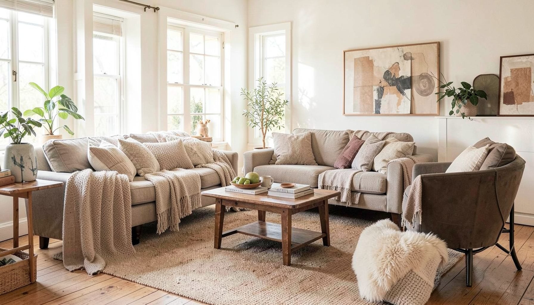
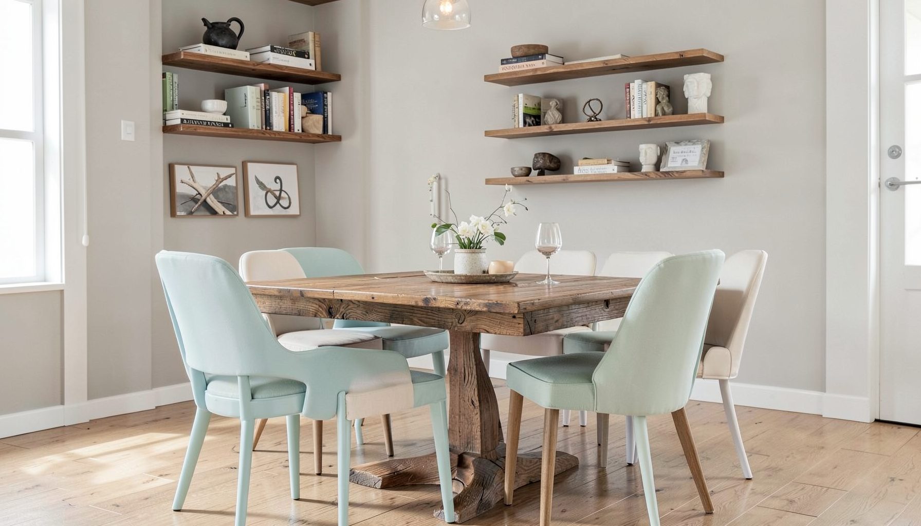
Full-service decorating that blends high and low, vintage finds with modern pieces for spaces that feel personal and collected.
Learn More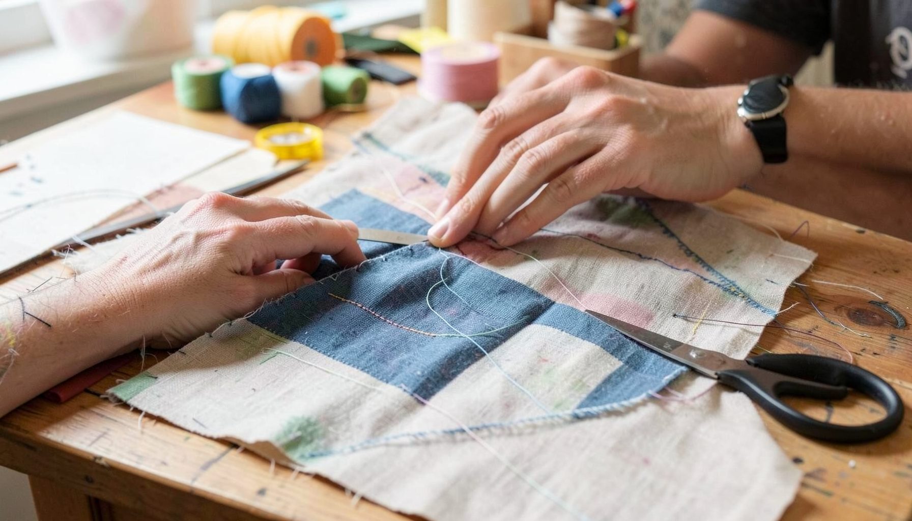
DIY Projects
Step-by-step tutorials for refinishing furniture, sewing pillows, styling bookshelves, and transforming rooms on a budget.
Learn More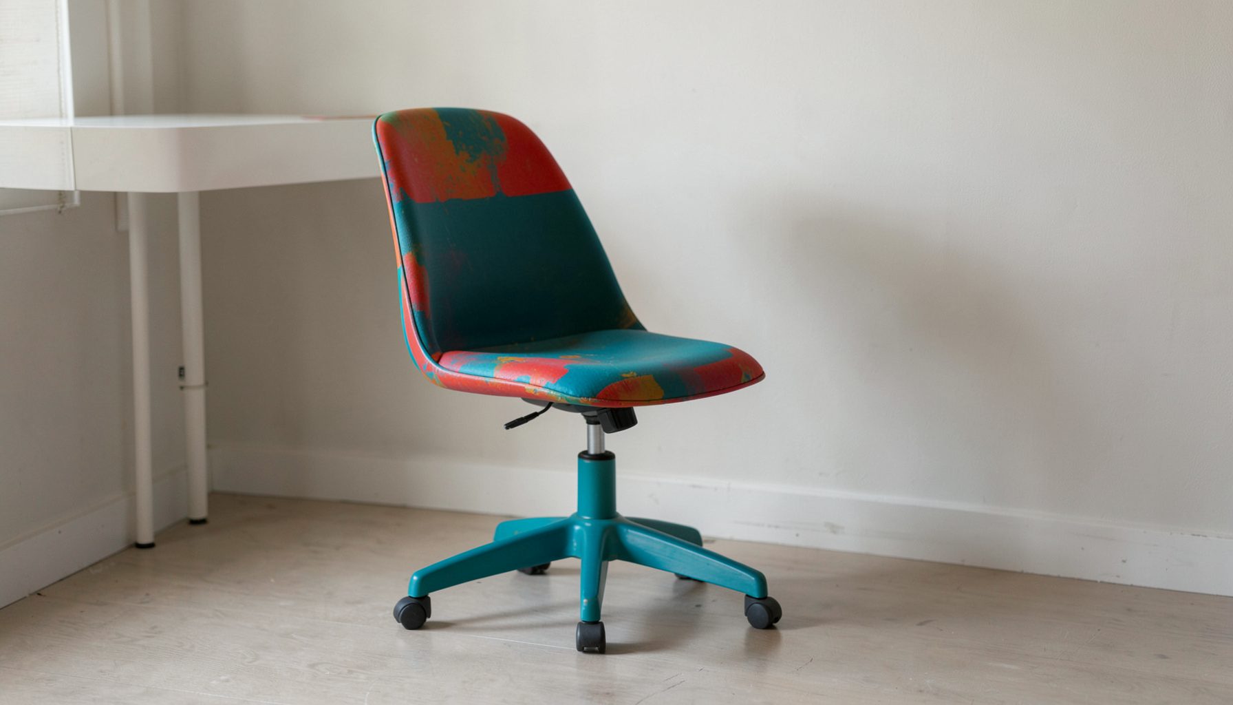
E-Decorating
Personalized design guidance delivered online — perfect for clients anywhere in the world who want a professional eye.
Learn More
Portfolio
Browse completed room makeovers, before-and-after transformations, and styling projects from Bay Area homes.
Learn More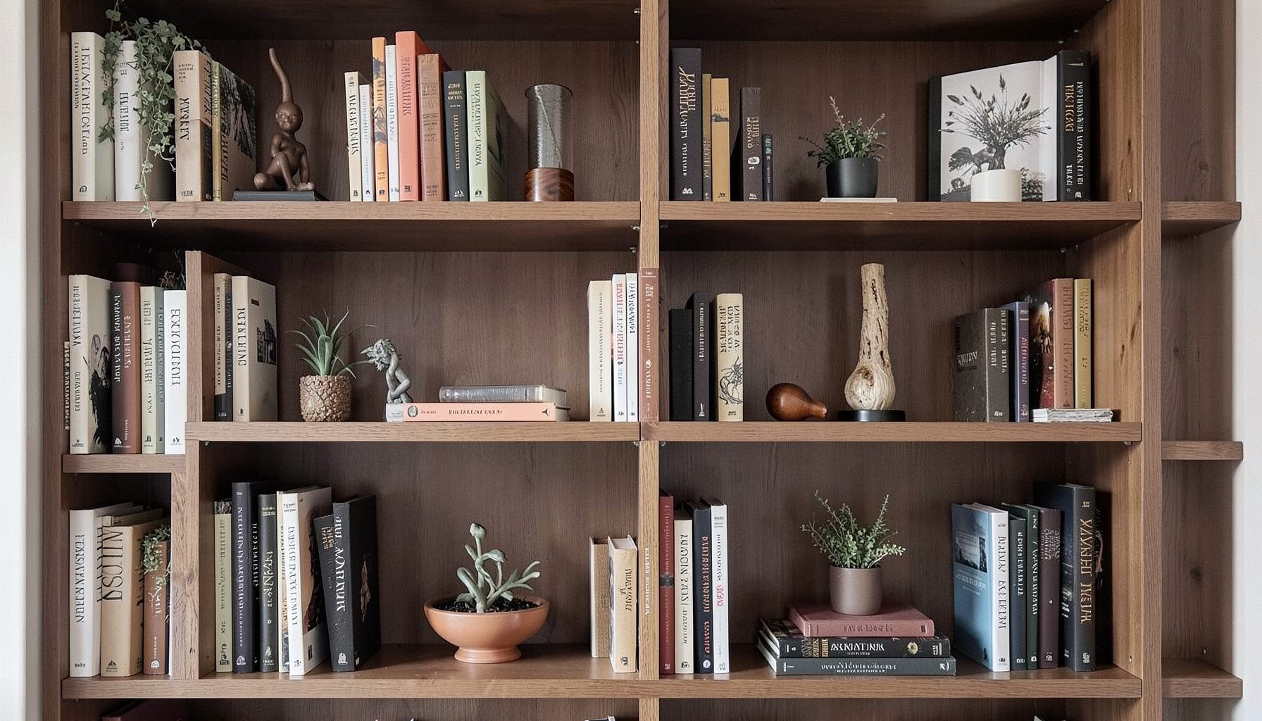
Blog
Interior design inspiration, fashion finds, entertaining ideas, and peeks into real home renovations and styling projects.
Learn More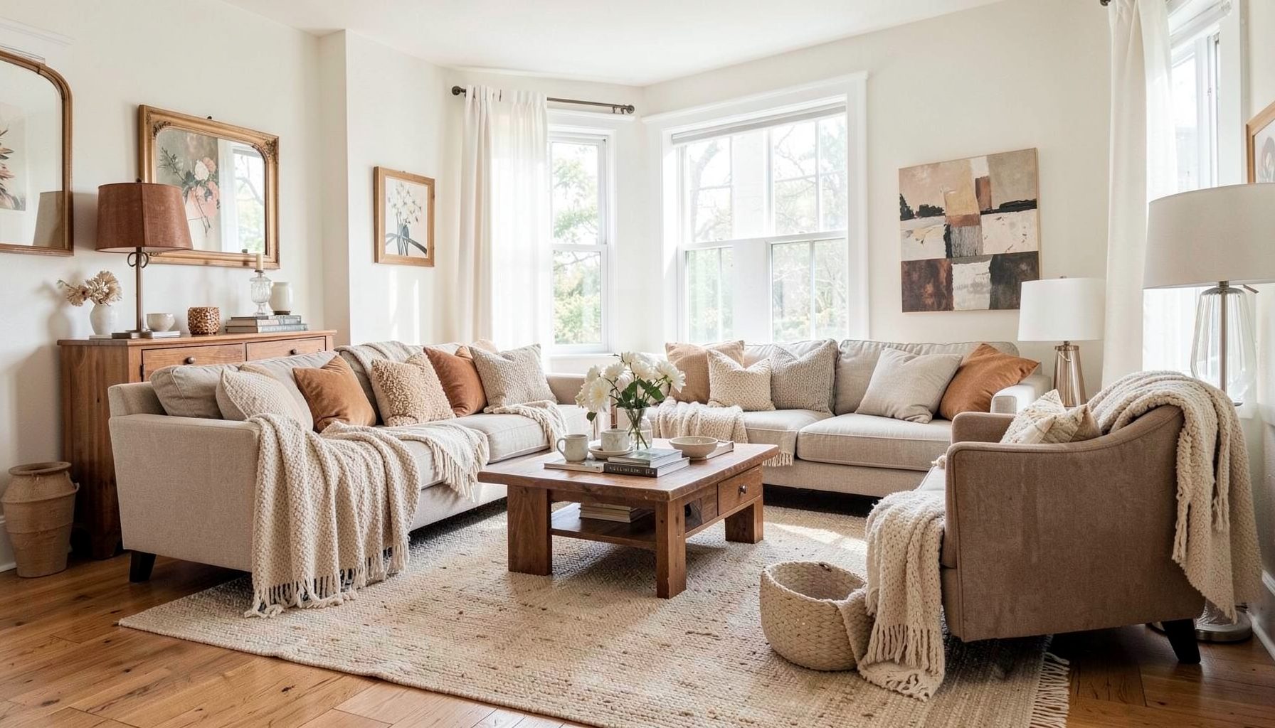
Downloads
Free curated resources for home decorating and design — guides, checklists, and inspiration to help you get started.
Learn MoreHow to Mix Patterns in a Bedroom Without Overwhelming the Space
A bedroom should feel layered, personal, and restful. Pattern is one of the easiest ways to bring that character into the room, yet combining florals, stripes, checks, geometrics, and textured motifs can quickly make the space feel visually noisy. The key is not to avoid pattern, but to give each print a clear role.
Successful pattern mixing comes from balance. A large-scale botanical can sit comfortably beside a narrow stripe when both share a color relationship and are separated by solid fabrics. A vintage-inspired rug may feel right at home with contemporary bedding when the room includes quiet surfaces that allow the more expressive pieces to breathe.
Whether you are refreshing a primary bedroom, guest room, or compact apartment suite, a thoughtful combination of scale, color, texture, and placement creates a collected look. The most inviting spaces rarely appear purchased as a matching set; they feel assembled over time around the people who live in them.
Start With a Calm Visual Foundation
Before choosing prints, decide which elements will remain relatively quiet. Walls, large upholstered pieces, flooring, and the largest bedding layer often form the visual foundation of a bedroom. These surfaces do not have to be plain white. Soft clay, warm ivory, muted sage, dusty blue, and gentle taupe can all act as neutrals while adding depth.
A calm foundation gives patterned accents somewhere to land. If the wallpaper is already expressive, a simple upholstered headboard and understated duvet may be the right counterpoint. If the walls and headboard are restrained, patterned bedding, curtains, or a statement rug can take the lead.
Consider the architecture of the room as part of this foundation. In a San Francisco flat with original trim, a subtle stripe or small-scale floral may reinforce the home’s character. In a newer San Jose room with clean lines, an aged rug or block-printed pillow can introduce warmth and history without making the space feel crowded.
Build A Pattern Hierarchy
Pattern mixing becomes easier when every print does not compete for attention. Establish a hierarchy with one dominant pattern, one supporting pattern, and one or two smaller accents. The dominant print should be the first one noticed, such as a botanical duvet cover, dramatic wallpaper, or patterned area rug.
A supporting pattern can echo the main design without copying it. For example, pair a large floral with a medium-scale stripe, or combine a bold geometric quilt with a small check on the lumbar pillow. The accent pattern should be quieter in scale and distribution. A tiny dot, delicate vine, or narrow ticking stripe can add detail without creating another focal point.
The three-pattern approach is a useful starting point, but it is not a strict rule. Solid fabrics, woven textures, and subtle tonal designs also count as visual layers. A linen duvet with visible slubbing, a velvet bench, or a nubby wool throw can break up printed surfaces while keeping the room rich and tactile.
Think about how the eye moves around the room. If every pattern is concentrated on the bed, the arrangement may feel heavy. Repeat smaller motifs across the room through a cushion, lampshade, curtain trim, artwork, or upholstered chair to create a gentle visual rhythm.
Connect Prints With Color
Color is the thread that makes unrelated patterns feel intentional. Choose one dominant color, one secondary shade, and one or two supporting neutrals before shopping for fabrics. The colors do not need to match exactly; they simply need to relate in temperature and intensity.
A blue-and-cream bedroom might include an indigo block print, a faded denim stripe, and a pale blue botanical. A warmer scheme could combine terracotta, ochre, olive, and natural linen. Repeating one color in several patterns creates cohesion even when the motifs come from different design traditions.
Pay attention to the background color of each print. Two fabrics may both contain green, yet one may sit on a bright white ground while the other rests on a warm beige background. That contrast can make the combination feel accidental. Bringing in a shared base color, such as ivory, tobacco, charcoal, or soft gray, helps bridge the difference.
Patterned rooms also benefit from visual breathing room. Use solids to repeat the palette without adding another motif. A solid velvet pillow, painted nightstand, or plain bed skirt can reinforce a color from the patterned fabrics and keep the overall scheme grounded.
Balance Scale, Texture, And Placement
Scale is the size of a motif in relation to the room and to neighboring patterns. A large-scale print has broad leaves, oversized checks, or widely spaced geometric shapes. A small-scale print may feature tiny dots, fine stripes, or closely packed flowers. Combining different scales prevents the patterns from blending into one indistinct surface.
Texture matters just as much as printed design. Smooth cotton, washed linen, velvet, boucle, wool, rattan, and aged wood each reflect light differently. A bedroom with several patterns can still feel serene when some of those layers are tactile rather than graphic.
Placement determines how much visual weight each pattern carries. A full patterned headboard is more prominent than a pair of printed pillows. Floor-to-ceiling curtains create a stronger impression than a small accent at the foot of the bed. Use the boldest print where you want the eye to settle, then distribute quieter motifs in secondary positions.
| Bedroom Element | Pattern Role | Useful Scale | Balancing Choice |
|---|---|---|---|
| Wallpaper or accent wall | Dominant backdrop | Medium to large | Solid or softly textured bedding |
| Duvet or quilt | Main focal layer | Large or medium | Simple sheets and restrained shams |
| Area rug | Grounding pattern | Medium, often faded | Quiet upholstery and open floor space |
| Curtains | Framing accent | Small to medium | Unpatterned walls or headboard |
| Pillows | Supporting details | Small to medium | Solid lumbar or textural throw |
| Bench or chair | Secondary statement | Medium | Plain cushion or natural material |
When the room is compact, keep large motifs to one major surface and use smaller patterns elsewhere. In a larger bedroom, two substantial patterned elements can work well if they are separated by solids and connected through color. The goal is a considered composition rather than equal visual volume everywhere.
Layer Bedding Without Creating Clutter
The bed is usually the largest patterned surface in a bedroom, so begin with practical layers. Start with simple sheets, add a duvet or quilt, and finish with a restrained arrangement of shams, sleeping pillows, and one or two decorative cushions. Too many differently shaped pillows can distract from the pattern story and make the bed difficult to use.
A patterned duvet can pair with solid linen euro shams and a small-print lumbar cushion. A plain coverlet allows patterned pillowcases and a folded block-print throw to become the focal point. If the quilt contains several colors, repeat just one or two of them in the surrounding accessories rather than matching every shade.
Window treatments and rugs should support the bed rather than compete with it. When the bedding is expressive, consider solid curtains with a woven texture and a rug with a faded, low-contrast motif. When the bed is mostly neutral, a striped roman shade or vintage Persian-style rug can introduce pattern at a different height and plane.
Layering also gives you flexibility between seasons. Lightweight cotton, linen, and washed percale keep a patterned bedroom feeling fresh in warmer months. Wool throws, velvet cushions, and quilted coverlets bring depth during cooler weather without requiring a full redesign.
Use Solids And Texture As Visual Rest
A patterned room needs pauses. Solid areas allow the eye to rest and make the decorative pieces appear more intentional. These pauses can come from a plain wall, a solid upholstered headboard, a natural fiber rug, or a single-color throw.
Texture is particularly useful when you want richness without another print. A slubbed linen pillow can sit beside a striped cushion and add dimension through its irregular weave. A woven basket, cane nightstand, hammered metal lamp, or ceramic vessel contributes interest while keeping the pattern count under control.
Use negative space deliberately. Do not fill every corner with a chair, plant, artwork, or accessory simply because the room has space. A clear nightstand surface or an unadorned section of wall can make the surrounding layers feel more luxurious and considered.
This approach works well with a collected decorating style. Vintage and modern pieces can share a bedroom when their relationship is supported by color, proportion, and restraint. A contemporary lamp may balance an antique chest, while a simple upholstered bed can make a patterned heirloom rug feel current.
Let The Room Reflect Your Personal Style
Pattern should support the mood you want from the bedroom. Botanical prints can create a relaxed, garden-inspired atmosphere. Stripes feel tailored and timeless. Checks bring a casual, welcoming quality, while geometric designs can give a room a more graphic, modern edge. Mixing these categories is most successful when the overall mood remains consistent.
Look beyond current trends and notice the patterns you naturally return to in clothing, artwork, travel finds, or vintage textiles. A room feels more authentic when its prints connect to personal memories and preferences. One carefully chosen antique textile can provide more character than a collection of coordinated accessories.
Before committing, place fabric samples together in the actual room. View them in morning light, afternoon sun, and evening lamplight. A pattern that seems subdued in a store may become dominant beside the bed, while a color that looks bright online may feel gentle against your existing wall paint.
Practical Choices For A Cohesive Bedroom
Use these guidelines when selecting and arranging patterned pieces:
- Choose one dominant print and let the remaining motifs play supporting roles.
- Repeat at least one color across two or three fabrics, accessories, or furnishings.
- Combine different pattern scales instead of placing several equally sized motifs together.
- Break up printed surfaces with solids, natural materials, and tactile fabrics.
- Distribute visual interest around the room so the bed, windows, and floor feel connected.
A little editing can make a significant difference. Remove one pillow, simplify a nightstand, or replace a busy curtain with a textured solid. Step back from the room and assess the overall composition from the doorway, since pattern balance is easier to judge at a distance than up close.
The most comfortable patterned bedrooms have room for real life. They accommodate books, layered blankets, changing light, and furnishings collected from different places. A clear plan provides structure, while personal pieces keep the space from feeling overly styled.
When you are ready to create a bedroom with layered prints, meaningful furnishings, and a balanced point of view, Maggie Rose Interiors can help shape the details into a cohesive whole. From full-service design in the Bay Area to online decorating guidance and focused room makeovers, the studio brings together vintage finds, modern pieces, and practical choices that reflect your style. Explore the portfolio and decorating resources, or connect with Maggie Rose Interiors to begin planning a bedroom that feels collected, welcoming, and entirely your own.

Recent Projects