Interior Design
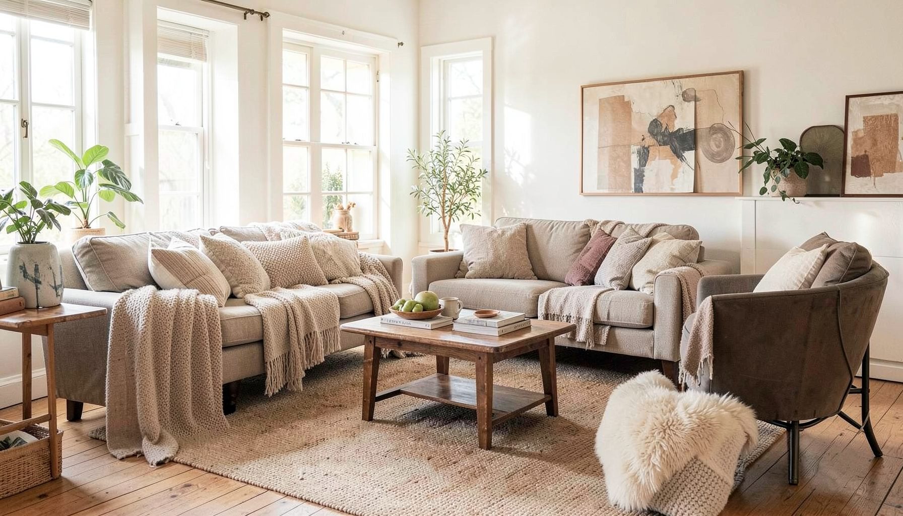
Full-service decorating that blends high and low, vintage finds with modern pieces for spaces that feel personal and collected.
Learn More
DIY Projects
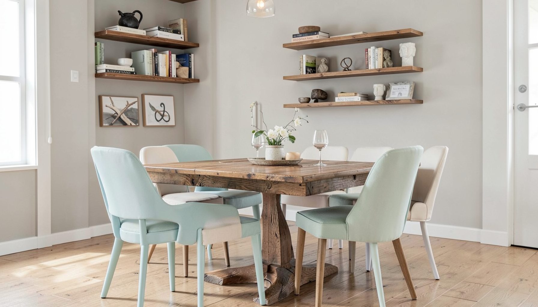
Step-by-step tutorials for refinishing furniture, sewing pillows, styling bookshelves, and transforming rooms on a budget.
Learn More
E-Decorating
Personalized design guidance delivered online — perfect for clients anywhere in the world who want a professional eye.
Learn More
Portfolio
Browse completed room makeovers, before-and-after transformations, and styling projects from Bay Area homes.
Learn More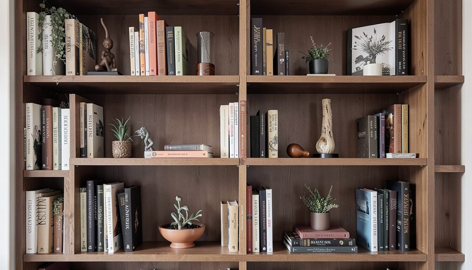
Blog
Interior design inspiration, fashion finds, entertaining ideas, and peeks into real home renovations and styling projects.
Learn More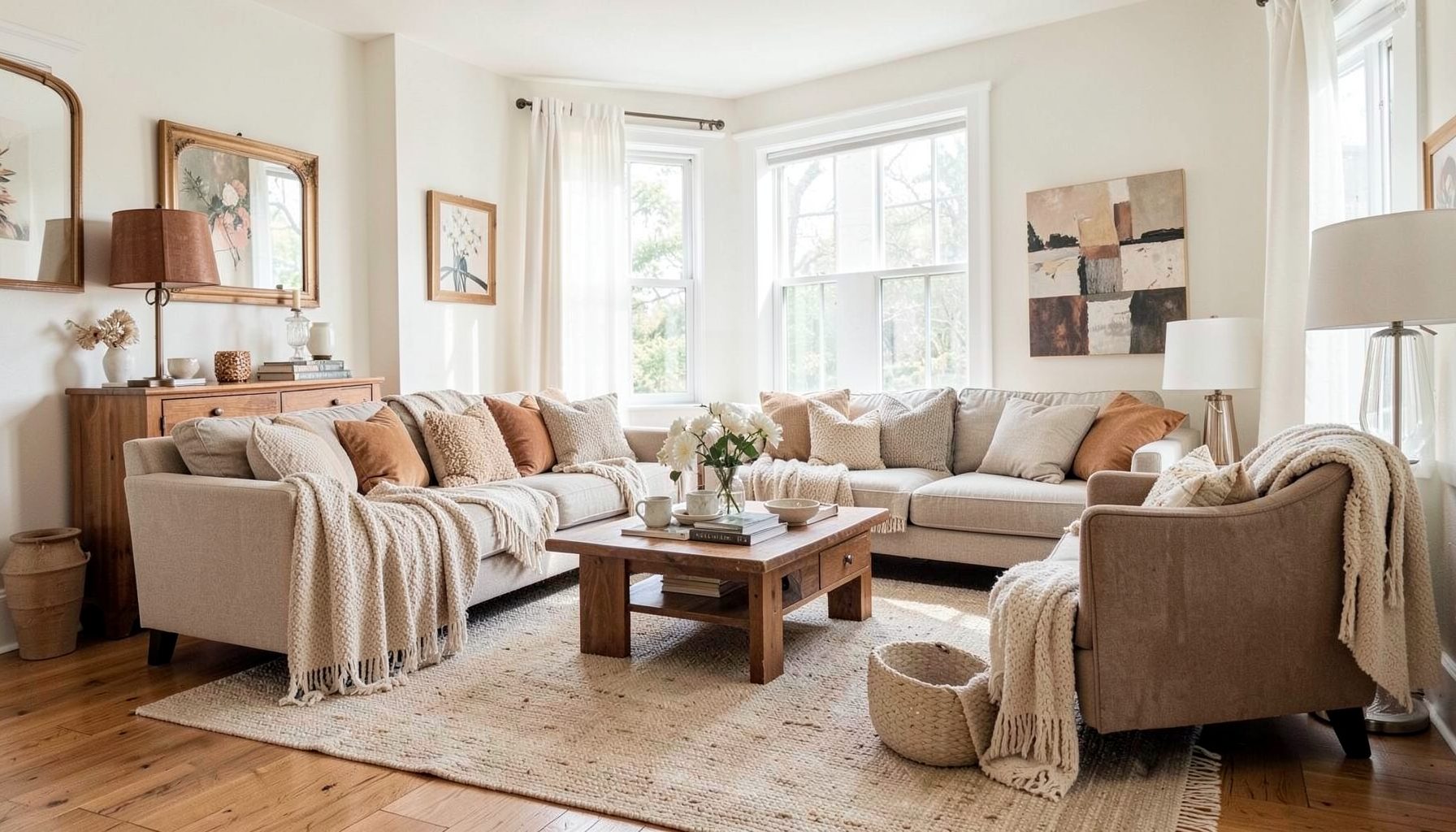
Downloads
Free curated resources for home decorating and design — guides, checklists, and inspiration to help you get started.
Learn MoreHow to mix bathroom metals without creating visual chaos
Mixing metal finishes can give a bathroom the collected, considered quality of a well-designed home. A warm brass tap beside a dark bronze mirror frame or a polished nickel shower fitting can add depth, especially when the room includes timber, stone, handmade tile or vintage furniture. The trick is to create a visual relationship between the finishes rather than selecting every fitting in the same colour.
How to mix metals in a bathroom without it looking chaotic comes down to hierarchy, repetition and restraint. You do not need every finish to match, though each one should have a purpose. When the choices are connected through colour, shape or placement, a combination of metals feels layered rather than accidental.
Australian bathrooms often need to work hard within modest footprints, from compact apartment ensuites in Sydney and Melbourne to family bathrooms in Brisbane, Perth or Adelaide. That makes the planning stage especially important. A few well-placed finishes can make a small room feel tailored, while too many competing details can quickly look busy.
Choose a dominant finish first
Start by selecting the metal that will appear most often. This is usually the finish on the basin tapware, shower hardware and bath filler, because these fittings are permanent, functional and visually prominent. Polished chrome, brushed nickel, matte black, aged brass and gunmetal are all common options in the Australian market, with availability varying between specialist showrooms, independent suppliers and large retailers such as Reece or Bunnings.
The dominant finish should suit the room’s overall character. Brushed nickel has a soft, versatile quality that works with pale stone and contemporary joinery. Aged brass brings warmth to white or green tile, while matte black creates definition against light surfaces. If your bathroom already contains strong materials, such as patterned encaustic tile or dramatic marble, a quieter metal finish may provide better balance.
A useful ratio is 60 percent for the main finish, 30 percent for a supporting finish and 10 percent for a small accent. This does not need to be calculated precisely. It simply prevents each metal from competing for equal attention. For example, brushed nickel might lead on the plumbing fixtures, with aged brass on the mirror and wall lights, while a small amount of black appears in a cabinet handle or shower screen detail.
Keep the undertones working together
Metal finishes have undertones, just like paint and stone. Yellow brass is warm, chrome is cool, and bronze can sit somewhere between depending on its brown or black content. Combining finishes becomes easier when you identify the undertone of the surrounding materials first.
Warm white tiles, terracotta, timber and creamy stone usually support brass, bronze and copper. Cool white tiles, grey porcelain and blue-green colours tend to pair naturally with chrome, polished nickel or gunmetal. This does not mean warm and cool finishes cannot be mixed; they simply need a bridge. A timber vanity, taupe grout, natural stone benchtop or soft neutral wall colour can connect a warm accent to cooler tapware.
Pay attention to the difference between brushed, satin and polished surfaces. Two finishes can share a colour yet appear unrelated if one is highly reflective and the other is heavily textured. A polished chrome tap with a brushed stainless-steel mirror frame may look less cohesive than a polished chrome tap with a satin nickel cabinet pull, even though the latter colours are slightly different.
Repeat every finish with intention
A secondary metal should appear at least twice whenever possible. Repetition gives the eye a pattern to follow and makes the choice feel deliberate. If aged brass is used on a mirror frame, repeat it in the wall sconces, vanity handles or a small shelf bracket. If black appears on the shower frame, echo it in the tapware, towel rail or a thin picture frame.
The repetition does not have to be exact. A satin brass pendant and an antique brass mirror can work together when their tones are close and they share a similar visual weight. The aim is harmony rather than a showroom set. Mixing slightly different versions of a finish can add character, particularly in a home that combines new fittings with vintage or restored pieces.
Small decorative elements are helpful for linking the scheme. A tray, vase or candle holder can bring a subtle metal note into an area that would otherwise be dominated by tile and plumbing. For a handmade detail that suits a layered bathroom shelf, these DIY candle holders can introduce texture and a restrained metallic accent without adding another major fixture.
Let the room’s permanent elements lead
Before choosing handles or accessories, identify the elements that are difficult or expensive to replace. These may include the shower frame, tapware, floor waste, towel rails, mirror edging and wall lights. In many Australian renovations, plumbing positions and waterproofing decisions are made early, so changing a fitting later can involve more than a simple product swap.
The basin and shower fittings generally deserve the strongest visual consistency. If your tapware is matte black, a bright polished brass shower rail may look disconnected unless that brass is repeated prominently elsewhere. When the shower screen has a black frame, it can serve as the dominant dark element, allowing a softer metal such as brushed nickel or aged brass to add contrast without creating a second competing statement.
Mirrors and lighting can act as transition pieces because they sit between architecture and decoration. A slim brass mirror frame may warm a room with chrome tapware, while a black-framed mirror can anchor pale brass fixtures. Look at the bathroom from the doorway and consider what is seen together. Finishes that are separated by walls or hidden behind the door have less influence than those gathered around the vanity.
Balance shine, texture and visual weight
A room can feel chaotic when the issue is reflection rather than colour. Polished surfaces catch light and draw attention, particularly in a small bathroom with overhead downlights. If every fitting is glossy, the room may feel sharp and fragmented. Brushed or aged finishes absorb more light and tend to create a calmer backdrop.
Use the most reflective metal where you want a focal point. A polished nickel tap can look elegant against handmade tile, while a satin brass mirror frame keeps the surrounding wall quieter. Conversely, matte black can be visually heavy, so it benefits from repetition through fine, lightweight details rather than several large black blocks.
Scale matters as much as finish. A substantial bronze mirror frame can support a smaller brass handle, but a tiny antique brass knob may look lost beside an oversized black shower frame. Consider the thickness of the metal, the shape of the fitting and the amount of negative space around it. Curved forms can soften a bathroom filled with straight-lined cabinetry, while angular fittings can give a traditional space a sharper edge.
Work with Australian bathroom conditions
Australian bathrooms need materials that cope with regular moisture, strong sunlight and practical cleaning routines. Near the coast, salt-laden air can make poorly finished metals deteriorate more quickly, particularly on open balconies or beachside properties in places such as the Northern Beaches or the Gold Coast. Check the manufacturer’s care instructions and choose finishes designed for wet areas rather than relying on appearance alone.
Hard water can also affect the way tapware looks over time. Mineral deposits may show more readily on dark matte finishes and highly polished surfaces, especially in areas with harder local water supplies. A finish that looks beautiful in a showroom may require frequent drying and gentle cleaning at home. Avoid abrasive products and confirm that the manufacturer permits the cleaning method you intend to use.
Compliance should be part of the design conversation. Plumbing products in Australia may need WaterMark certification, and installation work should comply with relevant plumbing requirements, including AS/NZS 3500. Wet-area waterproofing is governed by requirements such as AS 3740, while electrical work around bathroom lighting must be handled with the appropriate safety rules and a licensed electrician. These details affect which products can be installed, where they can be positioned and how a renovation proceeds.
Create a finish sample before committing
A sample board is one of the simplest ways to prevent expensive mistakes. Place your proposed tapware finish beside tile, grout, stone, cabinetry, mirror edging, handles and lighting samples. View the board in both natural daylight and warm artificial light, because brass and bronze can shift considerably depending on the bulbs used.
Do not judge a metal by a tiny online image alone. Order physical samples where possible, or visit a showroom with a tile or stone sample in hand. Australian suppliers often describe finishes differently, so “brushed brass”, “satin brass” and “champagne” may vary between brands. Products from different manufacturers can have noticeably different undertones even when their names sound similar.
Live with the sample board for several days. Put it near the window in the morning, under the vanity light at night and beside the adjoining bedroom or hallway finishes. This is particularly useful in open-plan homes, where a bathroom’s metal palette may be visible from a larger living area. Once the combination feels settled, repeat the chosen finishes across the room and stop adding new ones.
The most successful mixed-metal bathrooms usually have a clear lead finish, a supporting note and a small amount of contrast. Begin with the fittings that must perform every day, then use mirrors, lighting, cabinetry hardware and accessories to add personality. Allow tile, timber, stone and paint to provide the connection between metal tones.
For an Australian renovation, appearance and suitability need to sit together: select products made for wet areas, check certification, consider coastal exposure and plan around licensed trades. The room should feel collected rather than perfectly matched, with enough repetition to create calm and enough variation to make it personal. The key thing to remember is that mixed metals look intentional when each finish has a role, a partner and a place in the wider material palette.

Recent Projects