Interior Design
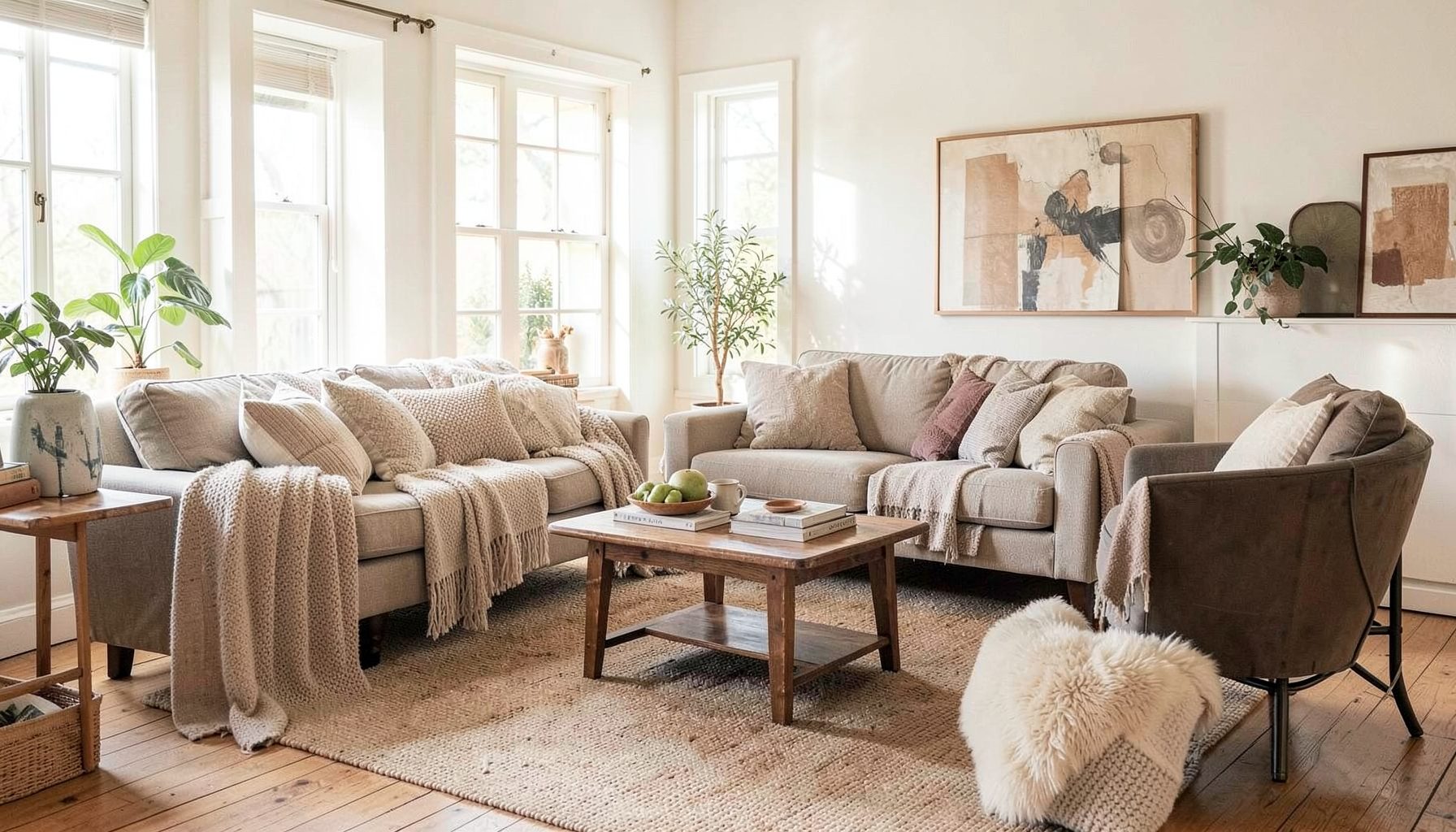
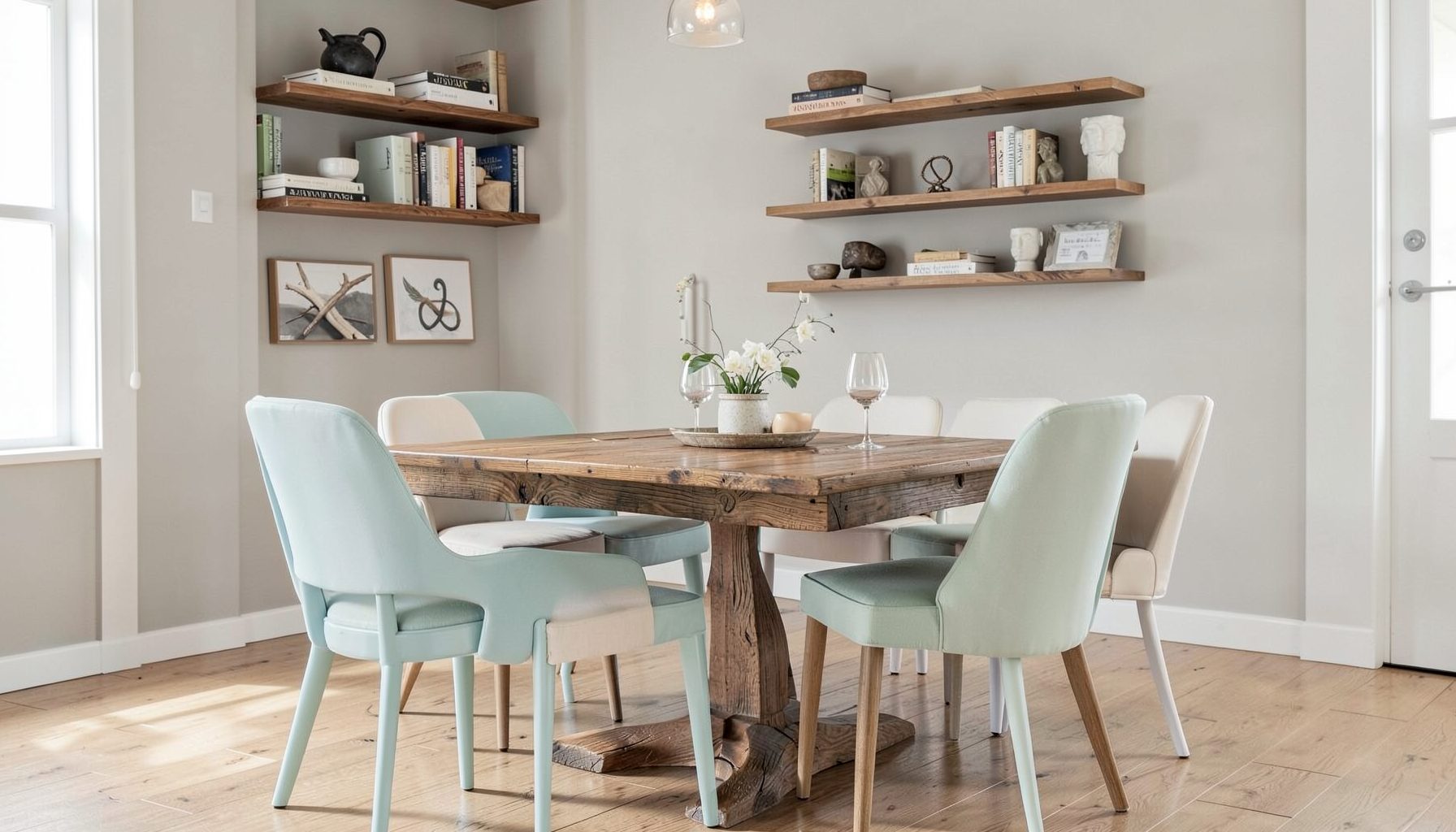
Full-service decorating that blends high and low, vintage finds with modern pieces for spaces that feel personal and collected.
Learn More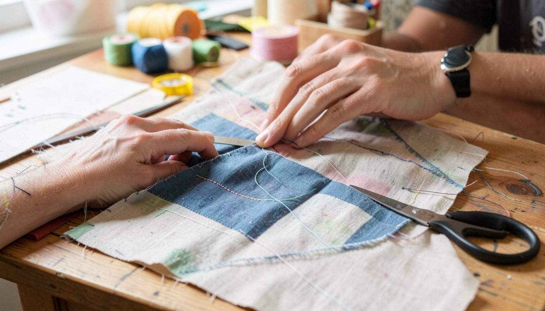
DIY Projects
Step-by-step tutorials for refinishing furniture, sewing pillows, styling bookshelves, and transforming rooms on a budget.
Learn More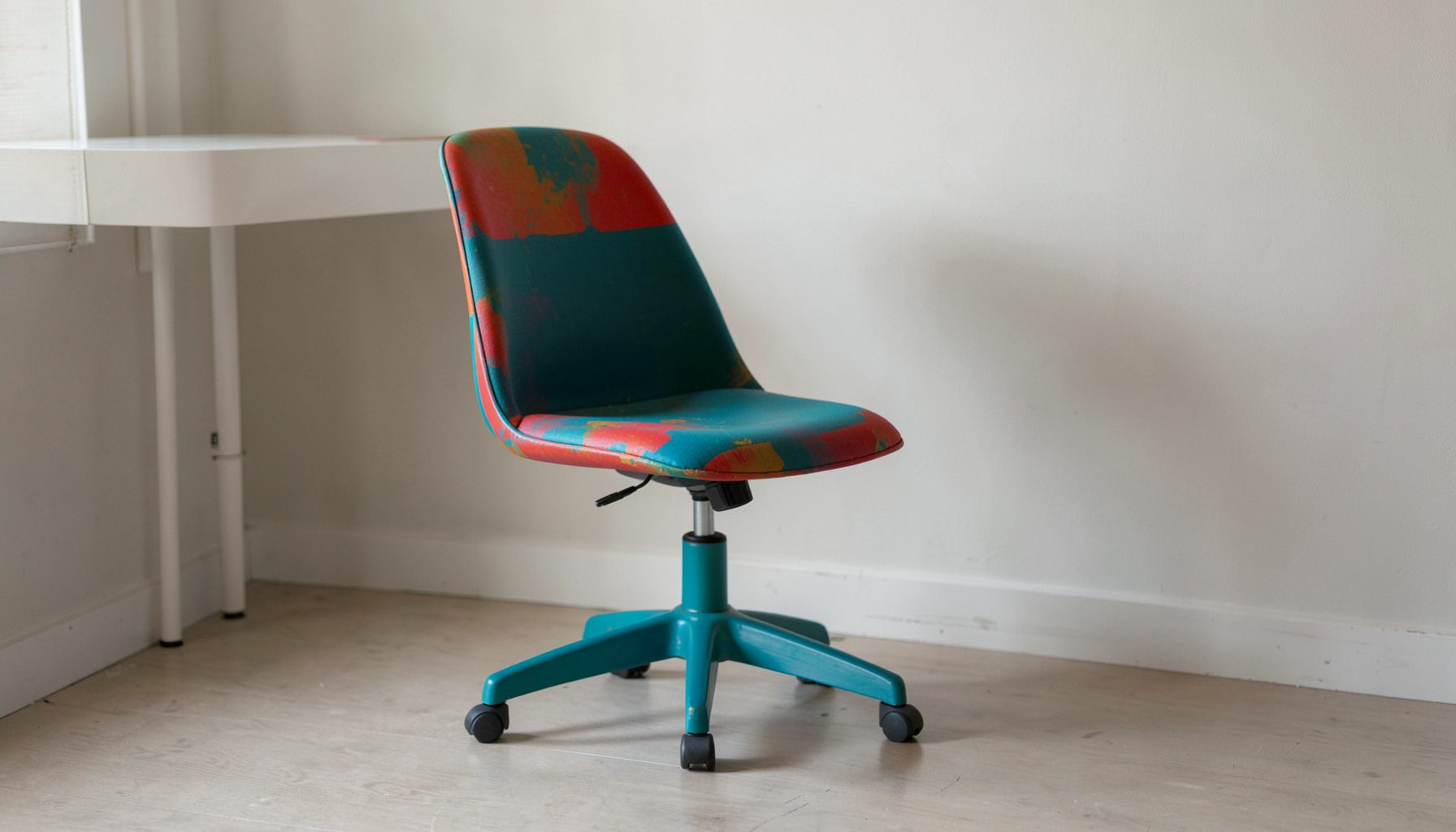
E-Decorating
Personalized design guidance delivered online — perfect for clients anywhere in the world who want a professional eye.
Learn More
Portfolio
Browse completed room makeovers, before-and-after transformations, and styling projects from Bay Area homes.
Learn More
Blog
Interior design inspiration, fashion finds, entertaining ideas, and peeks into real home renovations and styling projects.
Learn More
Downloads
Free curated resources for home decorating and design — guides, checklists, and inspiration to help you get started.
Learn MoreHow To Mix Geometric Patterns With Floral Prints
A room becomes memorable when its patterns feel collected rather than purchased as a matching set. Crisp stripes, arches, checks, and grids bring structure to an interior, while botanical motifs add softness, movement, and a sense of history. Together, they can create a layered look that feels polished without becoming predictable.
The key is not finding prints that look identical. Successful pattern mixing depends on relationships: color, scale, rhythm, texture, and placement. A large floral can sit comfortably beside a small geometric print when both belong to the same visual conversation.
This approach works in a traditional dining room, a relaxed bedroom, a colorful apartment, or a compact Bay Area home. Whether you are refreshing one reading nook or planning a complete room makeover, a thoughtful combination of organic and structured motifs can give the space depth and personality.
Start With A Clear Visual Hierarchy
Begin by choosing one pattern to lead the room. This primary print may appear on a sofa, area rug, wallpaper, or upholstered headboard. It should have enough presence to establish the mood, but it does not need to be the most colorful item in the space.
A bold floral often makes a natural focal point because its leaves and petals create an expressive, irregular shape. If the floral is oversized, pair it with a quieter geometric design such as a narrow stripe, a small check, or a restrained diamond. The geometric pattern should support the focal print instead of competing for attention.
You can reverse the arrangement when the room needs more architectural definition. A strong grid rug or graphic Roman shade can anchor the design, while a smaller botanical cushion or floral accent chair introduces softness. Giving every pattern equal visual importance is one of the fastest ways to make a room feel busy.
Choose A Shared Color Story
Color is the strongest connection between contrasting motifs. Look closely at the colors in your favorite floral print and select one or two of them for the geometric elements. A navy-and-cream stripe can make a coral floral feel intentional, while a muted sage check can draw out the leaves in a botanical fabric.
A shared color does not have to be an exact match. Slight variations often make the room feel more layered. Pair dusty blue with ink, warm ivory with cream, or olive with moss. These related tones create harmony while avoiding the flatness that can come from repeating the same color everywhere.
Neutrals are useful when several patterns are already present. Soft white, oatmeal, camel, charcoal, and natural wood can create breathing room between brighter prints. In a collected interior, pattern does not need to fill every surface; a neutral wall, plain linen curtain, or solid upholstered piece can make the decorative moments feel more special.
Balance Scale And Pattern Density
Scale describes the size of the individual shapes in a print. Pattern density describes how much of the surface is covered by those shapes. These two qualities should vary across the room. A large, open floral works well with a tightly spaced geometric print, while a small floral may need a larger-scale stripe or abstract grid beside it.
Think in terms of visual distance. A large rug is viewed from across the room, so it can handle a substantial motif. A lumbar pillow is seen up close and may be better suited to a detailed print. Curtains, bedding, and accent chairs fall somewhere in between, depending on how much surface they occupy.
Texture also affects perceived pattern intensity. A nubby boucle, woven grasscloth, pleated shade, or embroidered fabric adds visual interest without introducing another strong motif. When the room already contains several prints, tactile materials can provide richness in a quieter way.
Give The Eye A Rest
Solid colors are the pauses that make a pattern combination readable. Use them on larger pieces when you want flexibility, especially on a sofa, bed, or dining chairs. A solid foundation allows you to change pillows, throws, artwork, and smaller accessories as your taste evolves.
A useful rhythm is to move from pattern to solid, then back to pattern. For example, a floral armchair might sit beside a solid linen sofa with geometric cushions layered across it. In a bedroom, patterned wallpaper can be balanced by a plain upholstered bed, solid bedding, and one patterned bolster.
Do not overlook natural materials as visual rest points. Wood, rattan, leather, stone, ceramic, and metal all interrupt a sequence of prints without making the room feel empty. These materials are especially helpful in layered decorating, where the goal is a relaxed mix of vintage finds, modern furnishings, and meaningful objects.
Compare Pattern Pairings Before You Commit
Different combinations create different moods. Consider the room’s architecture, natural light, and existing furnishings before selecting a pairing. A crisp pattern may sharpen a casual space, while a hand-drawn botanical can soften a room filled with clean-lined furniture.
| Floral Print | Geometric Partner | Overall Effect | Best Placement |
|---|---|---|---|
| Oversized botanical | Small check | Relaxed and collected | Accent chair with checked pillows |
| Loose watercolor floral | Narrow stripe | Light and tailored | Bedding, curtains, or a bench |
| Traditional chintz | Simple grid | Classic with a modern edge | Drapery with a geometric rug |
| Small scattered flower | Large abstract shape | Playful and energetic | Cushions with an area rug |
| Dark moody floral | Repeating diamond | Dramatic and intimate | Wallpaper with an upholstered headboard |
| Tropical leaf print | Soft organic stripe | Fresh and casual | Outdoor-inspired living room |
The safest pairings usually differ in both shape and scale. A delicate floral and a delicate geometric can blur together, while two large, high-contrast prints may fight for attention. The goal is contrast with a point of connection, not contrast for its own sake.
Before ordering fabric or wallpaper, collect physical samples whenever possible. View them in morning light, afternoon light, and evening lamp light. Place them next to flooring, paint, upholstery, and wood finishes. A combination that works on a screen may feel entirely different beside a warm oak floor or a cool marble surface.
Layer Motifs Through The Room
Pattern mixing works best when motifs are distributed rather than concentrated in one corner. A floral sofa with geometric pillows can look disconnected if the rest of the room has no related details. Echo the colors or shapes in artwork, books, ceramics, lampshades, or a small textile elsewhere.
Repetition creates continuity. A curved petal shape might be echoed by an arched mirror, rounded coffee table, or scalloped lamp. A linear geometric print can relate to a bookcase, window muntins, or the clean edge of a console. These subtle connections help different patterns feel connected to the architecture.
Use the following guidelines when building a layered room:
- Select one dominant pattern, one supporting pattern, and one low-contrast texture.
- Repeat at least one color from the main floral in a geometric accent.
- Vary scale so large, medium, and small motifs have distinct roles.
- Keep some large surfaces solid to prevent visual fatigue.
- Test fabrics, rugs, and wallpaper together before making a final purchase.
Accessories are a good place to experiment. A patterned vase, framed textile, or vintage pillow can introduce a motif without requiring a major investment. If the arrangement feels too restrained, add pattern gradually through small pieces. If it feels too active, remove one accent rather than changing the entire room.
Adapt The Mix To Your Decorating Style
For a traditional interior, consider botanical chintz, ticking stripes, trellis designs, and classic checks. Keep the palette slightly softened and add aged wood, antique brass, or vintage case goods. The result can feel established and comfortable without looking overly formal.
A contemporary room benefits from cleaner pattern shapes and more negative space. Pair a graphic floral with a restrained grid, block print, or architectural stripe. Choose fewer accessories and let the silhouettes of the furniture carry some of the design interest.
For an eclectic or collected home, mismatched pieces can work beautifully when their undertones are connected. A vintage floral cushion, modern geometric rug, and handwoven throw may come from different eras, yet share warm neutrals or a similar level of saturation. This is where personal objects add the finish that a coordinated showroom arrangement cannot provide.
In a small space, use scale carefully. A large floral does not automatically overwhelm a compact room; a spacious, low-contrast motif can actually make the design feel more intentional. Limit the number of competing colors, repeat patterns across adjacent areas, and use mirrors or reflective finishes to keep the room visually open.
Let Personal Details Complete The Room
The most successful interiors leave room for discovery. A geometric print may bring order, and a floral may introduce movement, but the objects you live with give the space its meaning. Family art, travel finds, inherited furniture, and everyday books can keep a patterned room from feeling overly styled.
Look for opportunities to combine luxury and budget-friendly choices. Invest in the pieces that receive heavy use, such as a sofa, rug, or window treatment, then bring in character through vintage textiles, secondhand artwork, and affordable accent pillows. A beautiful room is shaped by editing and proportion as much as by price.
When you are ready to develop a more personal pattern palette, Maggie Rose Interiors can help translate your preferences into a cohesive space. From online e-decorating and room refreshes to full-service interior design in San Jose, San Francisco, and beyond, the process can be tailored to your home, lifestyle, and level of involvement. Bring together the prints, textures, and objects you love, and create a room that feels collected over time rather than decorated all at once.

Recent Projects