Interior Design
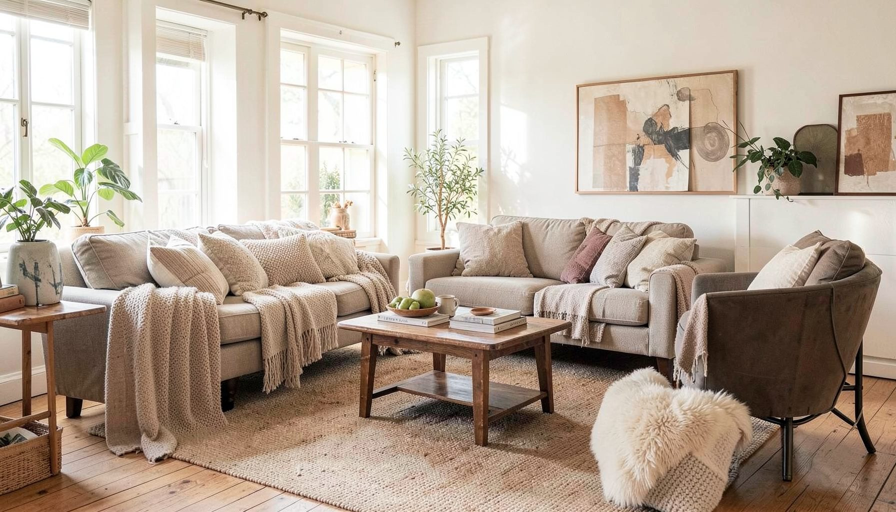
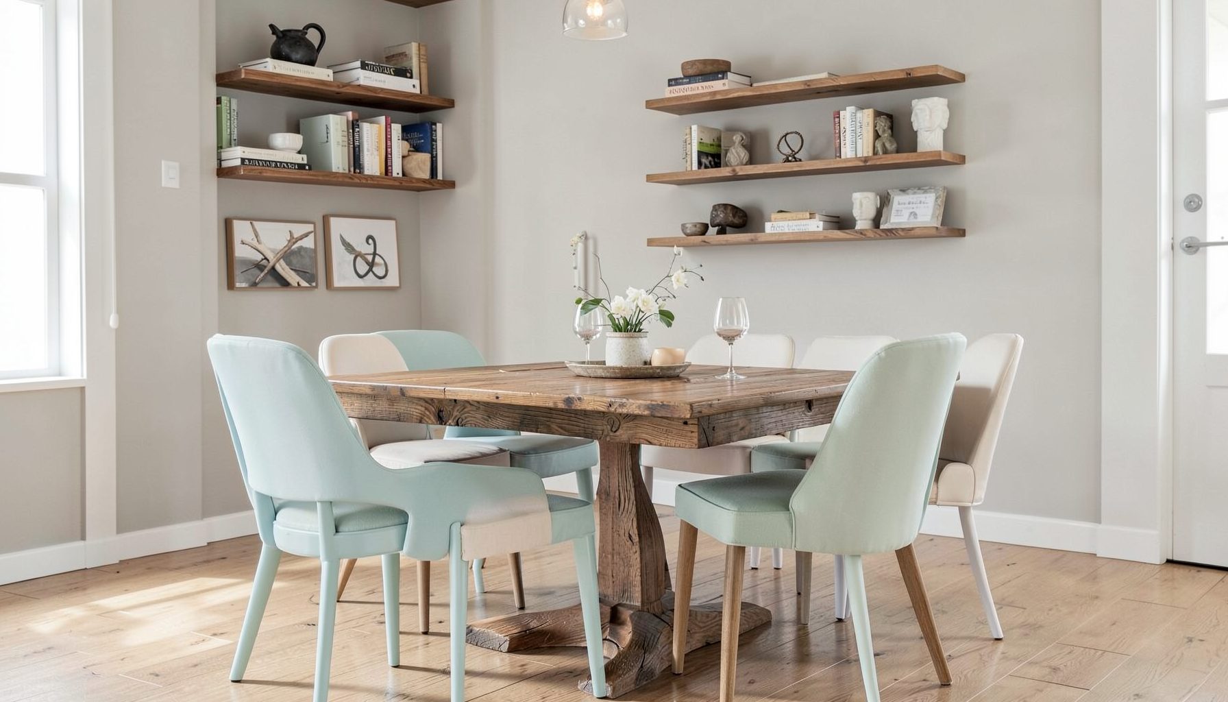
Full-service decorating that blends high and low, vintage finds with modern pieces for spaces that feel personal and collected.
Learn More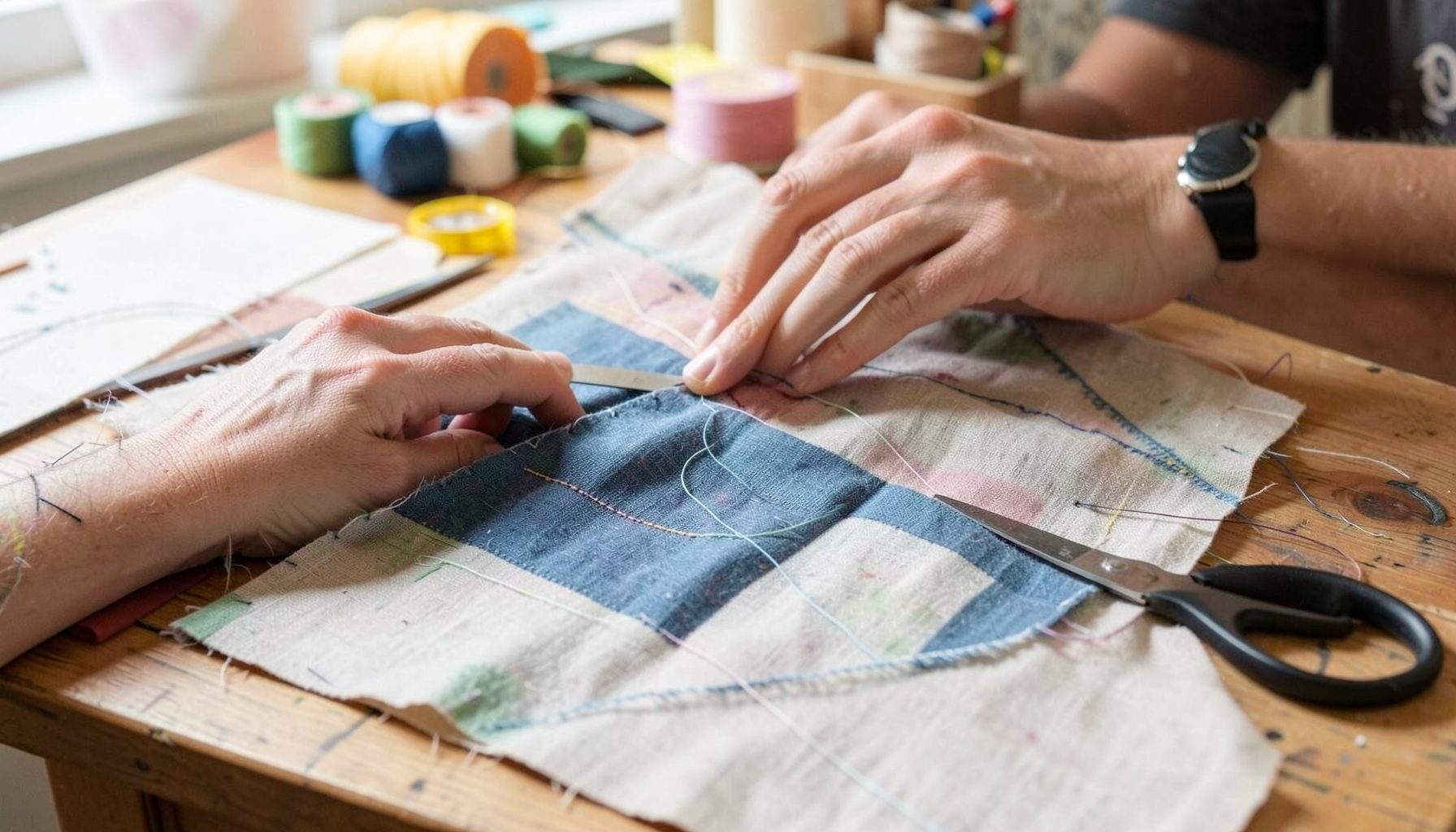
DIY Projects
Step-by-step tutorials for refinishing furniture, sewing pillows, styling bookshelves, and transforming rooms on a budget.
Learn More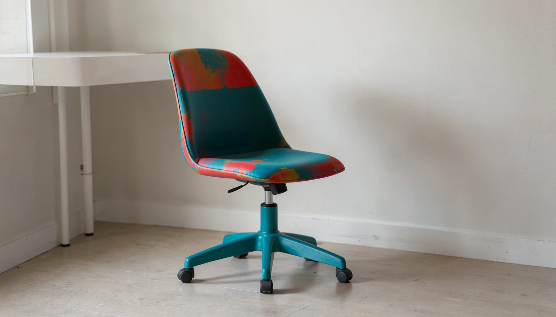
E-Decorating
Personalized design guidance delivered online — perfect for clients anywhere in the world who want a professional eye.
Learn More
Portfolio
Browse completed room makeovers, before-and-after transformations, and styling projects from Bay Area homes.
Learn More
Blog
Interior design inspiration, fashion finds, entertaining ideas, and peeks into real home renovations and styling projects.
Learn More
Downloads
Free curated resources for home decorating and design — guides, checklists, and inspiration to help you get started.
Learn MoreHow to Mix Bold and Neutral Colours in a Living Room Scheme
A successful living room colour palette usually needs both energy and restraint. Neutrals create breathing space, help furniture feel cohesive and make a room easier to live with, while bold shades bring personality, depth and a clear point of view. The aim is not to divide the room into “colourful” and “plain” areas. It is to make saturated tones feel intentional within a calm, layered setting.
This approach suits the collected style associated with Maggie Rose Interiors: vintage finds can sit beside contemporary pieces, a statement fabric can balance a modestly priced sofa, and personal treasures can feel at home alongside polished finishes. For Australian homes, the palette should also respond to strong daylight, open-plan layouts, changing temperatures and the relaxed way many households use their living rooms.
Start With A Balanced Colour Formula
A useful starting point is the 60-30-10 approach. Around 60 per cent of the room can be a dominant neutral, such as warm white, sandy beige, soft taupe or muted grey. A secondary colour may occupy roughly 30 per cent through upholstery, rugs, curtains and larger accessories. The remaining 10 per cent can be a bold accent used in smaller, more deliberate moments.
This is a guide rather than a decorating rule. A deep olive sofa could become the main colour, supported by walls in chalky cream and accents in rust, ink blue or ochre. In a compact Melbourne terrace, the balance may need to be lighter so the room retains a sense of space. In a larger Brisbane or Perth home with generous glazing, richer colours can be used across more substantial surfaces without feeling enclosed.
Think in terms of visual weight rather than simply counting coloured objects. A single large navy armchair may carry as much presence as several cushions. A patterned rug can combine the room’s neutrals and bold tones at once, making the scheme feel connected instead of scattered.
Choose A Neutral With The Right Undertone
Neutral does not mean colourless. Every white, beige, grey and greige has an undertone that changes in different light. Warm neutrals contain hints of yellow, red or brown; cool neutrals lean towards blue, green or violet. Combining the wrong undertones can make a room look unsettled, particularly when bold colours are introduced.
Australian daylight can be intense and varies significantly between locations. A pale grey that feels elegant in a softly lit southern room may appear stark in bright Sydney sun. North-facing rooms often receive strong, warm light, while south-facing spaces can benefit from creamy whites, tan upholstery and timber tones that prevent the scheme from feeling cold.
Test paint samples on several walls and view them in the morning, afternoon and evening. Place fabric swatches beside the flooring, cabinetry and existing furniture rather than assessing each sample in isolation. Warm white walls tend to work well with terracotta, tobacco, olive and ochre. Soft blue-grey neutrals can support rust, burgundy, forest green and mustard when the room needs a cooler foundation.
Give The Bold Colour A Clear Role
A strong colour works best when it has a defined job. It might anchor the seating arrangement, draw attention to an architectural feature, add rhythm through artwork or create contrast around a fireplace. When bold tones appear without a visual purpose, the room can feel busy even if there are only a few colourful pieces.
Large upholstered furniture is a confident way to establish a scheme. A moss-green sofa can become the foundation for cushions in cream, tobacco and faded rose. A cobalt occasional chair may be enough to energise an otherwise neutral living room, especially when its colour is repeated in a small artwork or ceramic vase. Repetition should be subtle; matching every accessory can make the room look staged.
Consider saturation as well as hue. A bright, clear yellow beside a muted beige will create a sharper contrast than ochre beside camel. For a relaxed Australian interior, earthy versions of bold colours often feel approachable: eucalyptus green, clay, paprika, ink, peacock blue and mulberry. These shades have enough depth to stand out without overwhelming natural materials such as timber, linen, rattan and leather.
Build Layers Through Texture And Pattern
Colour becomes easier to manage when it is distributed through different textures. A flat block of strong paint can dominate a room, while the same colour in velvet, wool, linen or glazed ceramic may feel more nuanced. Texture also helps a neutral scheme maintain interest when the bolder elements are limited.
Layer a jute or wool rug beneath a patterned flatweave, then add a linen sofa, a timber coffee table and cushions in cotton, boucle or velvet. The materials will catch light differently, giving the room variation even when the colour palette is restrained. This is especially useful in Australian homes where hard surfaces, polished concrete or timber floors are common and can make a living room feel acoustically sharp.
Pattern can connect bold and neutral shades in a single item. A botanical print might combine olive, cream, tan and faded blue. A geometric rug could repeat the wall colour while introducing a stronger rust or charcoal. Vintage textiles are particularly useful because their softened colours tend to sit comfortably beside new furnishings. If a pattern is lively, keep surrounding pieces simpler; if the furniture is plain, a patterned curtain, artwork or rug can provide the needed movement.
Work With Light, Layout And Everyday Living
A colour scheme should respond to how the living room is actually used. In an open-plan Australian home, the lounge palette needs to sit comfortably beside the kitchen, dining area and circulation paths. Repeating one accent colour across zones can create continuity, but each area does not need identical cushions or accessories. A blue artwork in the living room might relate to blue-grey cabinetry without making the spaces look matched.
Sun exposure matters for both appearance and longevity. Direct afternoon light can fade some textiles, timber finishes and artworks over time. Use lined curtains, blinds or UV-filtering window treatments where appropriate, and position valuable vintage pieces away from harsh direct sun. In coastal areas, pale timber, washed linen and chalky colours can reinforce an airy feeling, while homes in cooler regions may benefit from deeper upholstery and heavier woven textiles.
Daily habits should guide practical choices. If the sofa is used for family film nights, pets or frequent entertaining, a washable slipcover or hard-wearing performance fabric may be more suitable than delicate velvet. In a smaller Sydney apartment, a bold ottoman can provide colour and extra seating without occupying the room like a large armchair. In a Queensland home, ceiling fans, cross-ventilation and lightweight window coverings may make a lighter, less visually heavy palette feel appropriate.
Renters should also distinguish between removable decoration and permanent changes. Australian tenancy rules differ by state and territory, and painting or installing fixed fittings generally requires the landlord’s written consent. Apartment residents may also need to check strata by-laws before altering window treatments, flooring or built-in lighting. Cushions, rugs, art and freestanding furniture offer plenty of colour without creating approval issues.
Edit The Palette With A Personal Point Of View
The final stage is editing. Gather the objects you already love, including art, books, ceramics, heirlooms and travel finds, then identify recurring colours. These existing pieces often reveal a more personal palette than a trend forecast. A faded red in an old landscape painting may lead to terracotta cushions, while a dark timber frame could suggest chocolate brown, walnut or black accents.
Use the 70 per cent rule for confidence: if most of the room feels calm, a smaller proportion can be adventurous. One unusual lamp, a painted side table or a pair of patterned cushions may provide enough contrast. Avoid buying every accessory in the accent colour at once. Add pieces gradually and live with the arrangement, since colour relationships become clearer once the room is being used.
Budget can be managed through the same layered strategy. Invest in the items that receive the most wear, such as the sofa, rug and window furnishings, then introduce bold colour with artwork, second-hand furniture, lampshades and textiles. Australian vintage markets, charity shops and local makers can offer distinctive pieces, although availability and delivery costs vary between capital cities and regional areas. Check dimensions carefully, ask about fabric care and remember that the Australian Consumer Law provides consumer guarantees for many goods and services, including that products must be of acceptable quality and match their description.
A well-edited room should feel collected rather than decorated all at once. It may include a contemporary Australian-made chair, a vintage timber cabinet, a budget cushion from a high-street retailer and a treasured object with no obvious design pedigree. The common thread is the palette and the way each item supports the room’s atmosphere.
The strongest living rooms give bold colour enough space to be noticed and enough neutral colour to be enjoyed. Begin with the light, flooring and pieces you already own, select a neutral with a compatible undertone, and repeat accent shades through varied textures rather than identical objects. Keep practical needs, tenancy or strata requirements and Australia’s changing daylight in mind. What the reader should remember is simple: a calm base makes bold colour feel considered, while personal layers make the entire scheme feel like home.

Recent Projects