Interior Design
Full-service decorating that blends high and low, vintage finds with modern pieces for spaces that feel personal and collected.
Learn More
DIY Projects
Step-by-step tutorials for refinishing furniture, sewing pillows, styling bookshelves, and transforming rooms on a budget.
Learn More
E-Decorating
Personalized design guidance delivered online — perfect for clients anywhere in the world who want a professional eye.
Learn More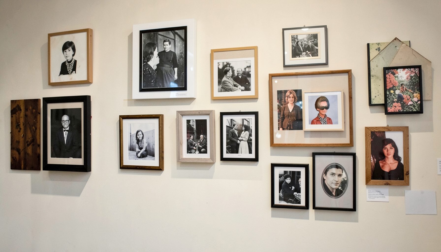
Portfolio
Browse completed room makeovers, before-and-after transformations, and styling projects from Bay Area homes.
Learn More
Blog
Interior design inspiration, fashion finds, entertaining ideas, and peeks into real home renovations and styling projects.
Learn More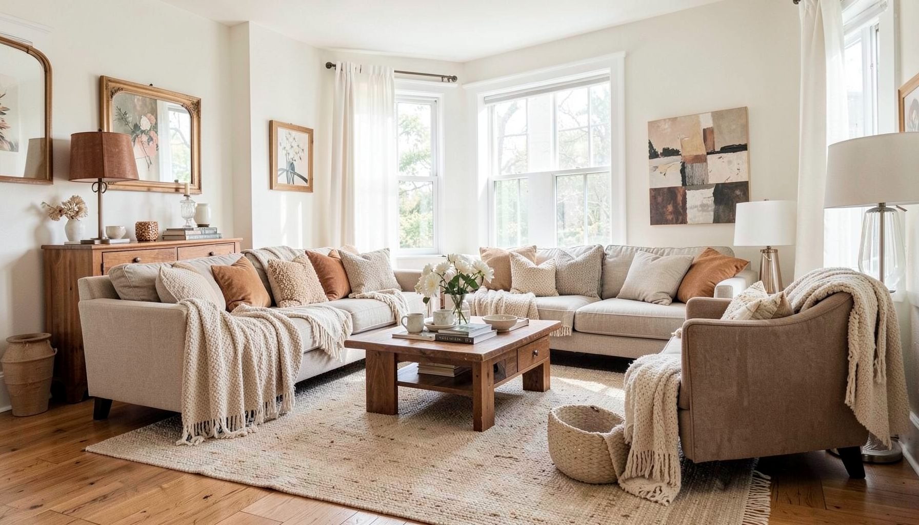
Downloads
Free curated resources for home decorating and design — guides, checklists, and inspiration to help you get started.
Learn MoreHow To Layer Shades Of White Without Looking Boring
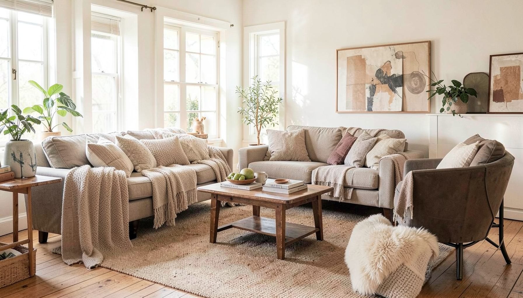
A white room can feel calm, luminous, and deeply personal, but achieving that effect takes more than buying several objects labeled “white.” The most successful pale interiors rely on subtle shifts in undertone, texture, proportion, and light. Those small variations give the room movement while preserving a quiet visual rhythm.
Layering white also creates a flexible foundation for decorating. Vintage wood, tailored upholstery, aged metals, artwork, and collected accessories can all sit comfortably within a pale scheme. The result feels relaxed rather than overly coordinated, especially when modern pieces are balanced with timeworn or handcrafted details.
The key is to think of white as a family of related shades rather than a single color. Warm ivory, soft cream, chalk, pearl, linen, and blue-tinged white each bring a different mood. Once those differences are intentional, an all-white space can feel rich, welcoming, and full of character.
Start With The Undertone
Every white has an undertone, even when it appears pure at first glance. Warm whites carry hints of yellow, beige, pink, or peach, while cool whites lean toward blue, gray, or green. These subtle qualities become much more visible when several surfaces are placed next to one another.
In rooms with oak floors, brass hardware, woven baskets, or traditional furnishings, creamy whites and soft ivory usually feel at home. A cool white may make those elements appear dull or disconnected. By contrast, a cooler palette can complement polished concrete, black accents, chrome, pale gray upholstery, and modern architecture.
Test paint, fabric, and wallpaper samples in the actual room rather than relying on small store cards. Look at them in morning light, afternoon sun, and evening lamplight. A shade that looks clean and neutral near a bright window may appear distinctly yellow beneath a warm bulb. Observing those changes helps you select whites that relate to the room’s permanent finishes.
Let Texture Create The Contrast
When color contrast is minimal, texture becomes essential. A smooth painted wall beside nubby linen curtains creates a quiet difference that the eye can feel even when the colors are nearly identical. Add a boucle chair, a woven pendant, a ribbed ceramic lamp, or a loosely knitted throw, and the palette gains depth without becoming visually busy.
Use texture across different scales. A fine cotton weave can sit beside a chunky wool, while a honed stone surface contrasts with glossy ceramic or aged wood. Natural materials are especially useful because they introduce variation without overpowering a restrained color scheme. Rattan, jute, cane, marble, plaster, and raw timber each bring their own character to pale rooms.
Texture also affects how formal the space feels. Crisp cotton and tailored upholstery create a polished look, while washed linen, brushed oak, and handmade pottery feel more relaxed. Combining both allows a room to look considered without seeming precious. This balance is central to a layered, collected interior.
Build A White Palette With Clear Roles
Instead of choosing every finish independently, assign each shade a role. One white can cover the largest surface, another can support upholstery, and a deeper cream can define accents. This approach creates cohesion while leaving room for natural variation.
A useful palette usually includes a dominant shade, a supporting shade, and one or two quiet contrast tones. The difference does not need to be dramatic. A wall in warm white, a sofa in oyster linen, and curtains in pale stone may read as nearly monochromatic from across the room, yet reveal enough distinction up close.
| Element | Suitable White Family | Effect In The Room |
|---|---|---|
| Walls and ceiling | Soft warm white or balanced ivory | Creates an enveloping background |
| Upholstery | Oyster, linen, or pale greige | Adds a gentle visual shift |
| Trim and doors | Clean warm white or slightly lighter cream | Defines architectural details |
| Window treatments | Natural linen or chalk white | Filters light and introduces softness |
| Case goods | Whitewashed oak, painted cream, or pale stone | Brings structure and material contrast |
| Decorative accents | Pearl, bone, muted beige, or aged white | Adds small-scale variation |
The table is a starting point rather than a strict formula. A small room may benefit from keeping walls, trim, and ceiling close in value so the architecture feels continuous. In a larger space, a slightly deeper ivory on built-ins or a chalkier shade on trim can add definition.
Work With The Light In The Room
Natural light changes the appearance of white more dramatically than many other colors. A south-facing room may make warm shades glow, while a north-facing room can turn the same paint cooler and grayer. Rooms with limited daylight often benefit from creamy neutrals that prevent the space from feeling stark.
Window direction is only part of the equation. Nearby trees, brick buildings, neighboring walls, and flooring can reflect color onto pale surfaces. At sunset, a white room may take on a peach or golden cast; on an overcast day, it may appear silvery. These shifts are part of the atmosphere, so choose a palette that remains appealing across changing conditions.
Artificial lighting deserves equal attention. Layer overhead fixtures with sconces, table lamps, and floor lamps to create pools of warmth. Bulbs in a warm-to-neutral range can make ivory and linen feel inviting without turning the room yellow. Lampshades matter, too: parchment, linen, and woven shades diffuse light softly, while clear glass and polished metal create sharper highlights.
Add Warmth With Collected Details
A white foundation becomes more interesting when it frames objects with history and personality. A vintage landscape, an antique mirror, a worn leather stool, or a stack of art books can provide contrast without disrupting the peaceful palette. These pieces keep a pale room from feeling like a showroom.
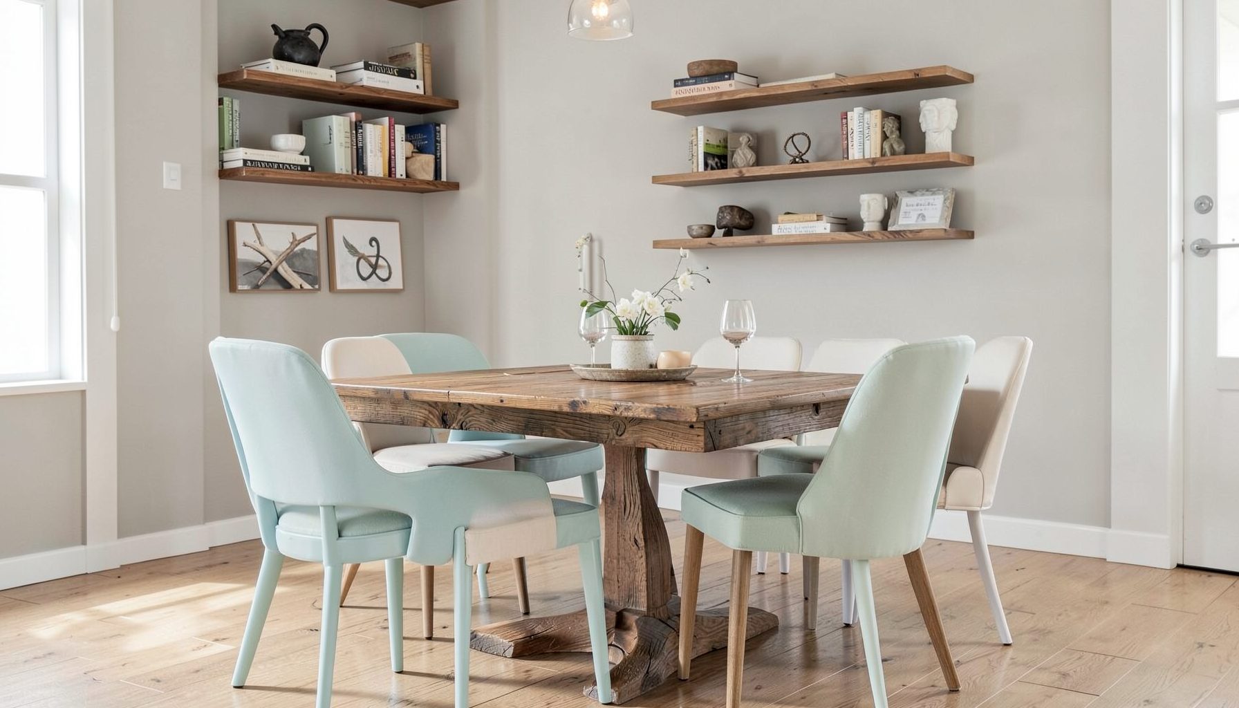
Wood is one of the most effective ways to ground white decorating. Pale oak creates an airy Scandinavian influence, walnut introduces richness, and reclaimed timber brings irregularity and patina. You do not need to use a single wood finish throughout the room. Related but varied tones often make the space feel collected over time.
Muted color can have a place in a white scheme as well. Dusty blue, faded terracotta, olive, charcoal, and soft blush work as restrained accents. Use them in artwork, ceramics, pillows, flowers, or a small upholstered piece rather than distributing them evenly everywhere. A few deliberate notes are more compelling than a room filled with equal doses of every accent color.
Make The Palette Feel Personal
The most memorable pale interiors reflect the people who live in them. Include objects that have a story, even if they do not match perfectly: a travel find, a family photograph, a favorite chair, or a handmade bowl. White provides visual breathing room around these belongings, allowing them to stand out without competing for attention.
Scale is another way to add personality. A large abstract painting can anchor a quiet wall, while a cluster of small frames can create an intimate moment nearby. Vary the height of lamps, tables, plants, and artwork so the eye moves through the room. Repetition helps unify the arrangement, but exact symmetry is rarely necessary.
Consider how the room will be used before selecting pale upholstery and accessories. Performance linen, washable slipcovers, indoor-outdoor fabrics, and durable rugs can make a light space practical for everyday life. The goal is a room that welcomes real living, not one that requires constant protection.
A Calm Editing Checklist
If the space feels flat, the answer is usually not more decoration. First identify what is missing: a darker anchor, a rougher texture, a warmer material, or a stronger change in scale. Making one thoughtful adjustment is often more effective than adding several unrelated accessories.
Use this checklist when refining a room with layered whites:
- Compare every major white finish in the room’s natural and artificial light.
- Combine at least three distinct textures, such as linen, wood, and ceramic.
- Include one grounding element in walnut, charcoal, aged metal, or another deeper tone.
- Repeat a material or shade in at least two locations to create visual connection.
- Remove pieces that are similar in size, finish, and shape when the arrangement feels monotonous.
Editing also protects the room from becoming overly themed. A white sofa, white rug, white curtains, and white accessories can work beautifully when their surfaces and proportions differ. If they are all smooth, bright, and identical in tone, however, the room may lose dimension. A little imperfection—a creased textile, irregular pottery, or weathered wood—can restore the sense of ease.
Layering shades of white is ultimately an exercise in observation. Notice how materials respond to light, how finishes meet at architectural edges, and how personal objects change the mood of a quiet backdrop. With thoughtful variation, white becomes less of a color choice and more of a versatile design language.
For a home that needs a more tailored direction, Maggie Rose Interiors can help develop a layered palette around your architecture, furnishings, lifestyle, and personal taste. Explore the studio’s design services, room makeovers, online decorating guidance, and portfolio for ideas on creating a collected space that feels luminous, livable, and distinctly yours.

Recent Projects