Interior Design
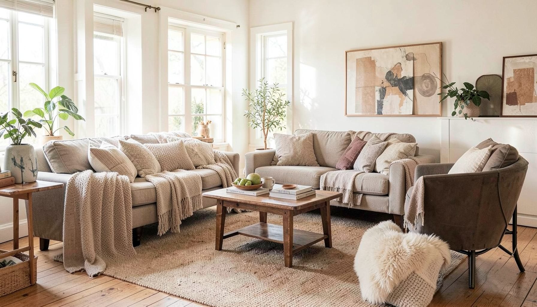
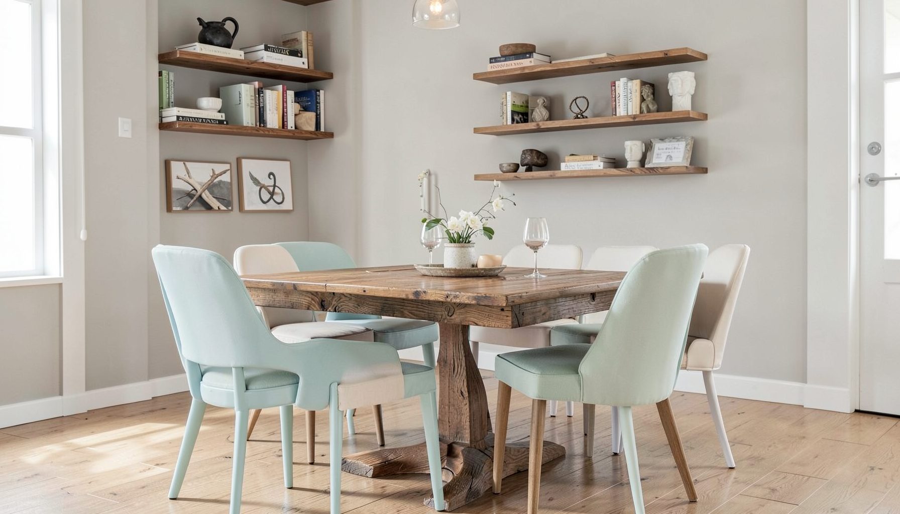
Full-service decorating that blends high and low, vintage finds with modern pieces for spaces that feel personal and collected.
Learn More
DIY Projects
Step-by-step tutorials for refinishing furniture, sewing pillows, styling bookshelves, and transforming rooms on a budget.
Learn More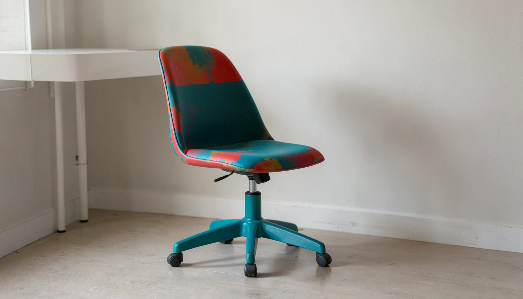
E-Decorating
Personalized design guidance delivered online — perfect for clients anywhere in the world who want a professional eye.
Learn More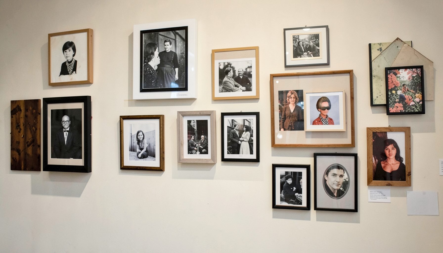
Portfolio
Browse completed room makeovers, before-and-after transformations, and styling projects from Bay Area homes.
Learn More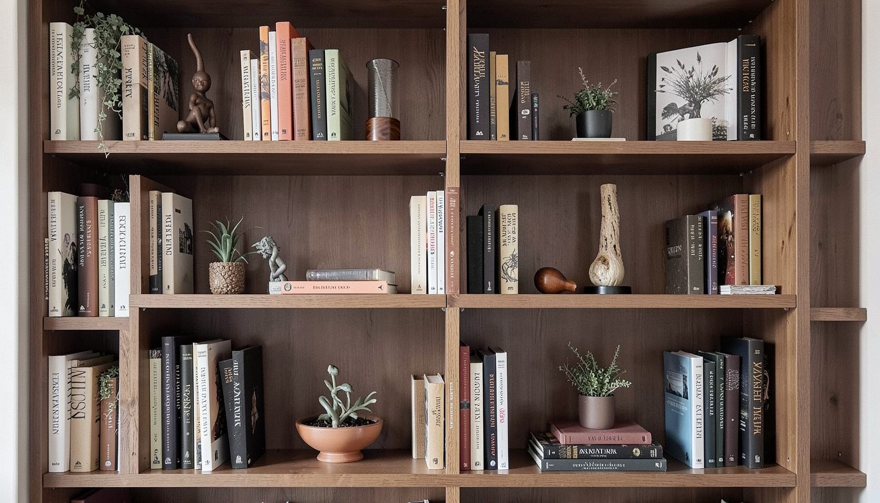
Blog
Interior design inspiration, fashion finds, entertaining ideas, and peeks into real home renovations and styling projects.
Learn More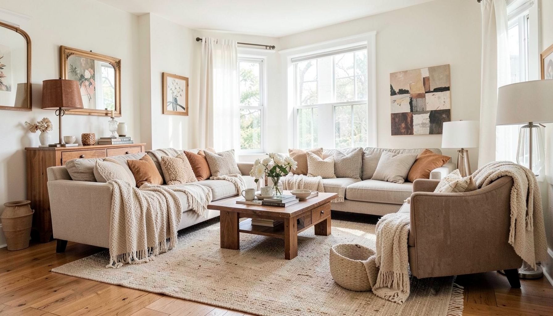
Downloads
Free curated resources for home decorating and design — guides, checklists, and inspiration to help you get started.
Learn MoreHow to Create a Gallery of Personal Photos That Looks Curated
A wall filled with personal photographs can make a home feel intimate, welcoming, and distinctly yours. The difference between a thoughtful display and a cluttered collection usually comes down to editing, proportion, and a little visual rhythm. When every image has meaning, the goal is to give those memories enough structure to feel intentional.
A curated photo wall does not need matching frames, professional photography, or a large budget. Family snapshots, travel pictures, childhood portraits, film photographs, and candid moments can live together beautifully when they share a subtle connection. That connection might be color, subject, frame finish, spacing, or the story the images tell as a group.
The most successful displays often mix polished and imperfect details. A faded photograph can sit beside a crisp black-and-white print, while an antique frame can add character to a collection of contemporary images. The result should feel collected over time rather than purchased in a single afternoon.
Start With The Story You Want To Tell
Before choosing frames or measuring the wall, decide what the gallery should communicate. A collection of family photographs might celebrate generations, while a travel display could trace places that shaped your life. You may prefer a quieter arrangement built around landscape images, architectural details, or a particular color palette.
This theme does not need to be strict. A personal gallery should have room for contrast, and the most memorable displays often combine different types of images. Still, identifying the overall mood will help you decide what belongs and what should be saved for another room.
Lay every possible photograph on a table, floor, or large bed. View the images together instead of evaluating them one at a time. Remove photographs that are blurry, repetitive, too small to read, or meaningful only because of a memory that is not visible in the image. Keeping fewer, stronger pieces will make the final arrangement feel more considered.
Pay attention to emotional balance as you edit. A wall filled entirely with formal portraits may feel static, while a collection of candid images can become visually restless. Combine close-up faces, wider scenes, objects, and quieter images to create a display with both energy and breathing room.
Choose A Layout That Fits The Room
The shape of the wall should guide the shape of the arrangement. A wide wall above a sofa usually benefits from a horizontal gallery, while a narrow stair landing may call for a vertical sequence. In a dining room or entryway, a compact grid can provide a sense of order without overwhelming the space.
There are two broad approaches: a structured grid and an organic salon-style arrangement. A grid uses consistent spacing and aligned edges, making the display feel clean and architectural. An eclectic arrangement allows different frame sizes and orientations, creating a layered look with more movement.
Neither approach is inherently better. A grid works well when the photographs have a common treatment, such as matching black-and-white prints or identical mats. An informal arrangement is ideal for mixing family snapshots, vintage photographs, artwork, and objects with varied proportions.
Create a paper template for each frame using kraft paper, newspaper, or leftover wrapping paper. Mark the hanging hardware on each template, then tape the shapes to the wall. Live with the arrangement for a day or two and view it from different parts of the room. This simple step makes it easier to adjust the composition before making holes.
Create Cohesion With Frames And Matting
Matching frames can unify photographs that have very different content, but a mix of frames can bring warmth and personality. The key is to repeat at least one visual element. You might use several wood tones, a consistent mat color, a shared metallic finish, or a limited palette of black, brass, and natural wood.
A collected display benefits from variation in moderation. If every frame is a different color, material, and profile, the photographs may compete with one another. Instead, select two or three frame families and repeat them throughout the arrangement. An aged walnut frame, a slim black frame, and a simple brass frame can create contrast while still feeling connected.
Matting is especially useful when image sizes vary. A generous white or ivory mat gives smaller photographs more presence and allows them to sit comfortably beside larger pieces. For a softer, traditional appearance, try warm white, linen, or pale gray. Bright white can feel crisp and modern, while cream tends to complement vintage prints and warm interiors.
Consider the finish of the room as you make these choices. Dark frames can echo window trim, lighting, or furniture, while natural wood can connect the gallery to floors and woven materials. In a colorful room, neutral frames may keep the wall from becoming visually busy. In a restrained room, painted or antique frames can provide a welcome layer of character.
| Display Style | Best For | Frame Direction | Spacing | Overall Effect |
|---|---|---|---|---|
| Clean Grid | Similar prints or modern interiors | Matching frames and mats | Even, usually 2–3 inches | Orderly and polished |
| Organic Salon | Mixed photographs and collected rooms | Two or three coordinating frame styles | Consistent but flexible | Personal and layered |
| Vertical Column | Narrow walls, hallways, and stair areas | Similar widths with varied heights | Aligned along one edge | Tall and intentional |
| Picture Ledge | Frequently changing displays | Leaning frames in varied sizes | Overlapping or closely grouped | Relaxed and adaptable |
| Anchor-and-Cluster | One large photograph with smaller pieces | A dominant frame plus supporting styles | Tighter around the anchor | Balanced and expressive |
Get The Scale And Spacing Right
A gallery wall should relate to the furniture beneath it. Over a sofa, console, or bed, the display generally looks strongest when it occupies about two-thirds to three-quarters of the furniture’s width. A tiny cluster floating above a large sofa can feel accidental, while an oversized arrangement may make the room feel crowded.
The bottom edge of the gallery should also feel connected to the furniture. Leave enough room for cleaning, lamps, and everyday use, but avoid pushing the artwork too high. In many rooms, the center of the overall arrangement should sit near eye level, with the furniture acting as a visual anchor below it.
Spacing determines the personality of the display. Narrow gaps create a more collected, intimate effect, while wider gaps make each piece feel independent. Two to three inches between frames is a dependable starting point, though larger works may need slightly more room.
Look for alignments within the arrangement. The top edges do not have to match, but a few shared lines will keep the composition from feeling random. Align the bottom edges of two frames, place a small print beneath the center of a larger one, or create a strong vertical line along one side. These quiet relationships make an eclectic gallery feel designed.
Mix Personal Photos With Meaningful Objects
A gallery of personal photographs can become more distinctive when it includes items beyond framed prints. A small textile, a child’s drawing, a vintage postcard, a pressed botanical, or a shallow decorative object can add texture and make the wall feel connected to your life.
Use dimensional pieces sparingly and make sure they suit the installation method. Lightweight objects can rest on picture ledges, while heavier pieces need secure anchors. If the wall is in a busy hallway or near a seating area, avoid fragile elements that project too far into the room.
Picture ledges offer an easy way to experiment with layers. Place the largest frames at the back, lean medium pieces in front, and add one or two smaller photographs at the edges. Overlap should be slight enough that each image remains visible. This approach also makes it simple to rotate seasonal pictures or add new memories without redesigning the entire wall.
When combining photos and objects, repeat color or material to create a bridge between them. A woven textile may relate to a rattan chair, while a brass frame can echo a nearby lamp. These connections help the display feel like part of the room rather than a separate installation.
Edit The Images For A Unified Look
Photographs taken in different decades often have very different colors and exposure levels. That variety can be charming, but small adjustments will help the collection sit together. Consider converting selected images to black and white, softening overly saturated colors, or printing everything with a similar warm or neutral tone.
You do not need to make every photograph identical. A few color images among monochrome prints can create emphasis, especially when the accent color appears elsewhere in the room. The important point is to choose the exceptions deliberately rather than allowing the printer, paper, or editing app to make the decision for you.
Print quality matters when photographs are displayed at a larger scale. Use high-resolution digital files whenever possible, and choose a paper finish that suits the mood. Matte paper reduces glare and feels soft, while a lightly textured fine-art paper can give an ordinary snapshot a more substantial presence.
For very old or delicate photographs, scan the original and display a high-quality reproduction. This protects the source image from sunlight, humidity, and handling. Keep the original stored safely, especially if it is the only copy of an important family memory.
Finish The Wall With Practical Details
Strong installation is part of the design. Use picture-hanging hardware rated for the weight of each frame, and choose anchors appropriate for drywall, plaster, brick, or another surface. Adhesive strips may work for lightweight pieces, but they are not a universal substitute for secure hardware.
Before hanging, photograph the paper template arrangement and label each frame on the back. If the display includes many pieces, mark the order and location with small pieces of painter’s tape. This prevents confusion when several frames look similar and makes future adjustments much easier.
Think about light exposure as well. Direct sunlight can fade photographs and damage paper, especially vintage materials. Position the display away from strong afternoon sun when possible, or use UV-protective glazing for valuable images. In rooms with changing daylight, observe the wall at different times before finalizing the placement.
Step back frequently as you work. A gallery wall is experienced from across the room, not just from a ladder. Check whether one frame pulls too much attention, whether the arrangement feels balanced beside nearby furniture, and whether the surrounding wall has enough quiet space.
A Simple Styling Checklist
- Select a clear mood, story, or visual thread before choosing frames.
- Edit out weak, repetitive, or visually distracting photographs.
- Repeat two or three frame finishes to connect varied images.
- Test the full arrangement with paper templates before drilling.
- Leave enough negative space for the display to feel intentional.
- Protect meaningful photographs with quality scans and suitable glazing.
The best personal photo displays remain flexible. Your family, travels, and interests will continue to change, so the arrangement should allow new pieces to join without losing its balance. A consistent frame palette, a picture ledge, or a few open spaces can make room for future memories.
At Maggie Rose Interiors, layered rooms begin with the details that make a home feel lived in and personal. Whether you are refining a single photo wall or shaping an entire space around your collected pieces, thoughtful decorating can bring structure to what you already love. Explore design inspiration and personalized interior services to create a home where every photograph has a place and every room tells your story.

Recent Projects