Interior Design
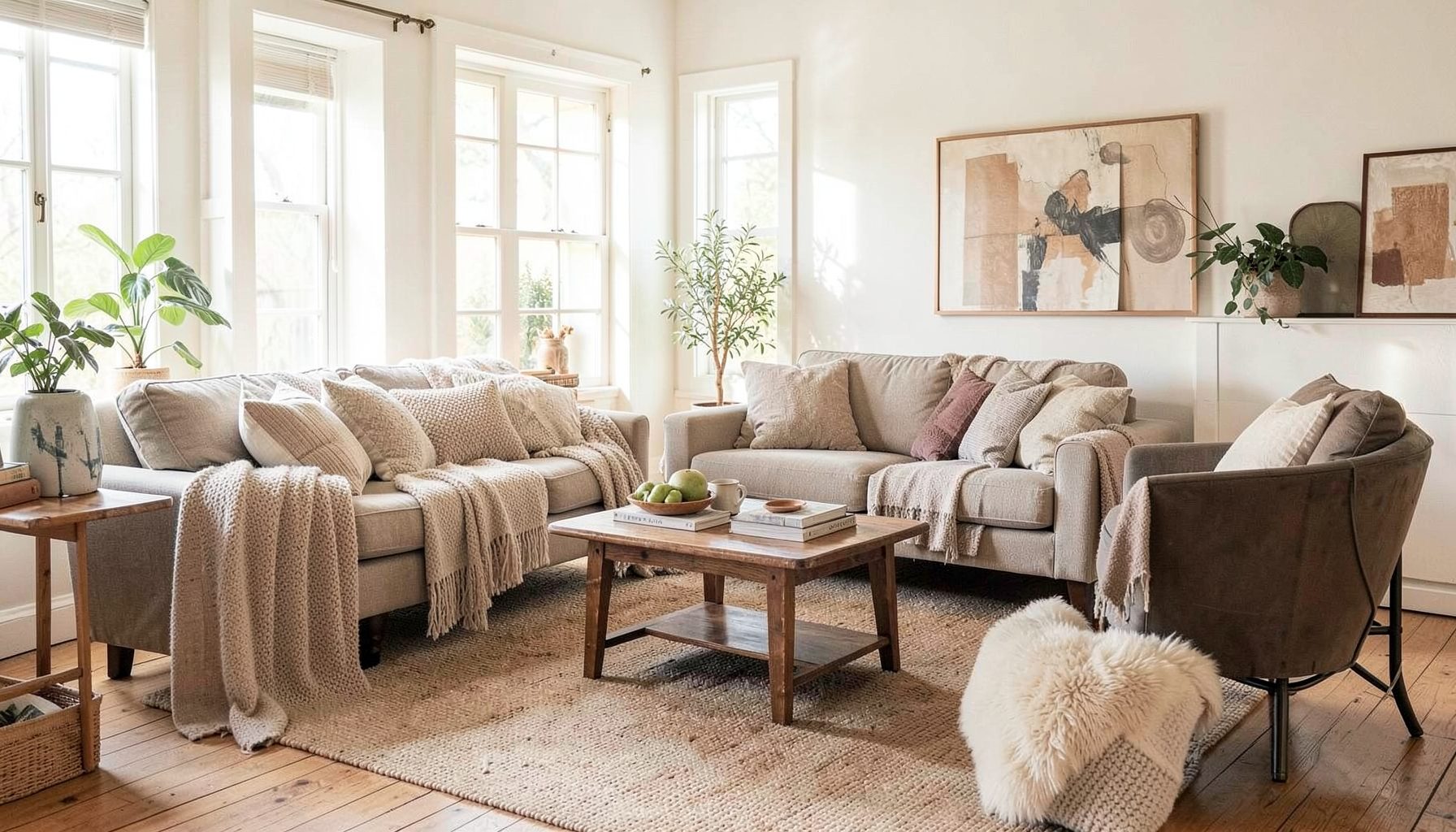
Full-service decorating that blends high and low, vintage finds with modern pieces for spaces that feel personal and collected.
Learn More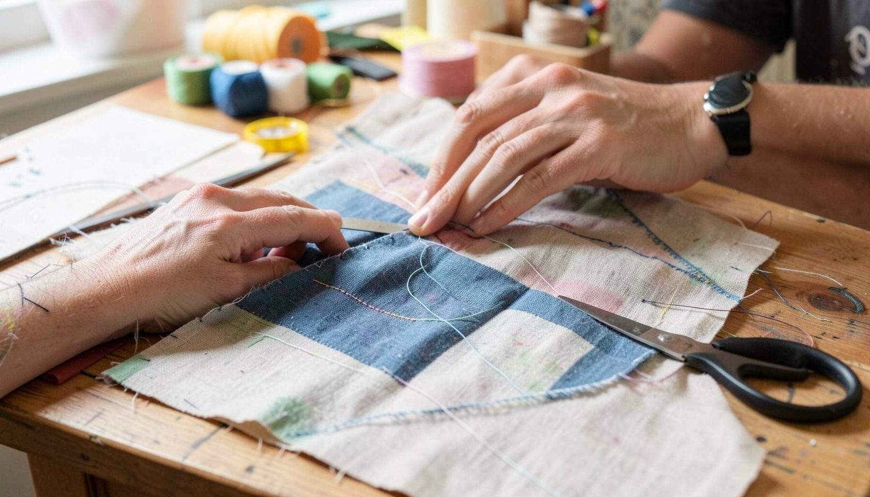
DIY Projects
Step-by-step tutorials for refinishing furniture, sewing pillows, styling bookshelves, and transforming rooms on a budget.
Learn More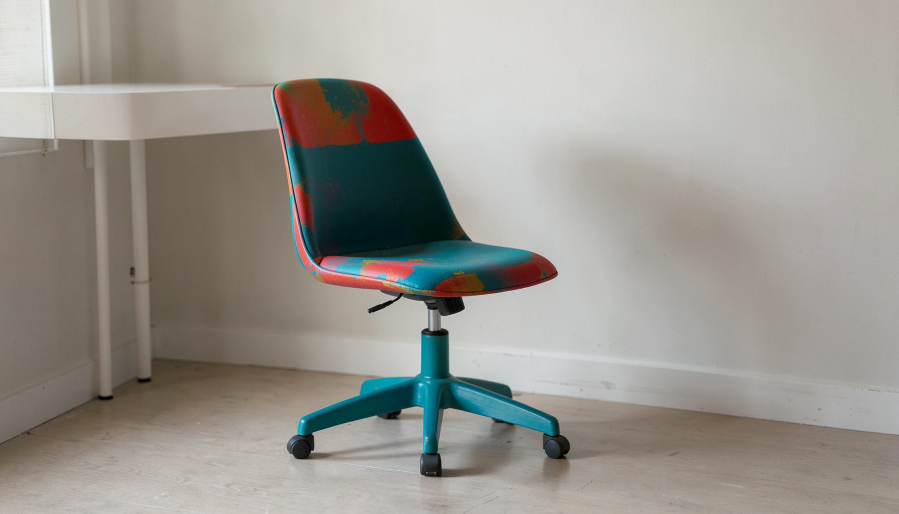
E-Decorating
Personalized design guidance delivered online — perfect for clients anywhere in the world who want a professional eye.
Learn More
Portfolio
Browse completed room makeovers, before-and-after transformations, and styling projects from Bay Area homes.
Learn More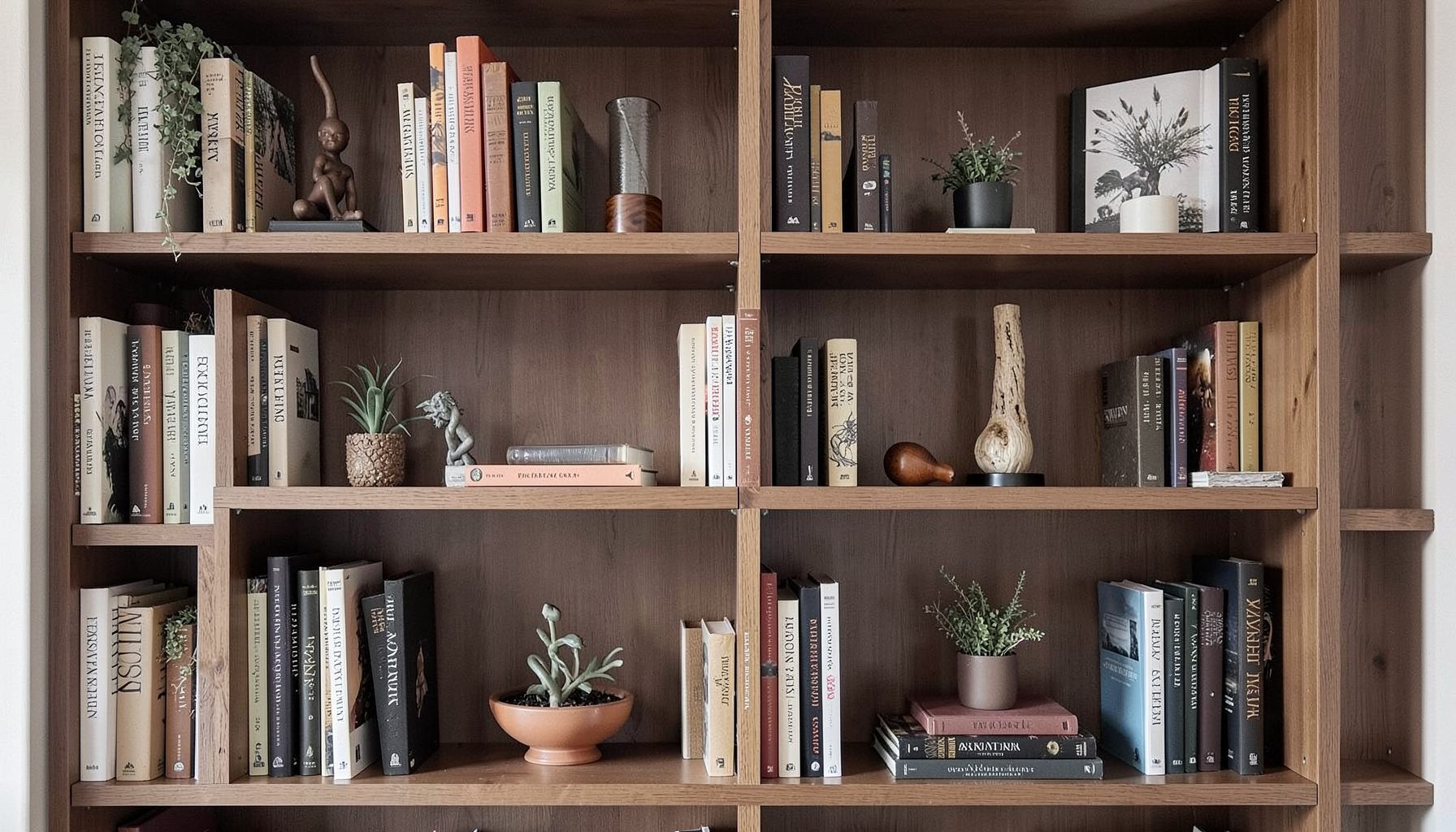
Blog
Interior design inspiration, fashion finds, entertaining ideas, and peeks into real home renovations and styling projects.
Learn More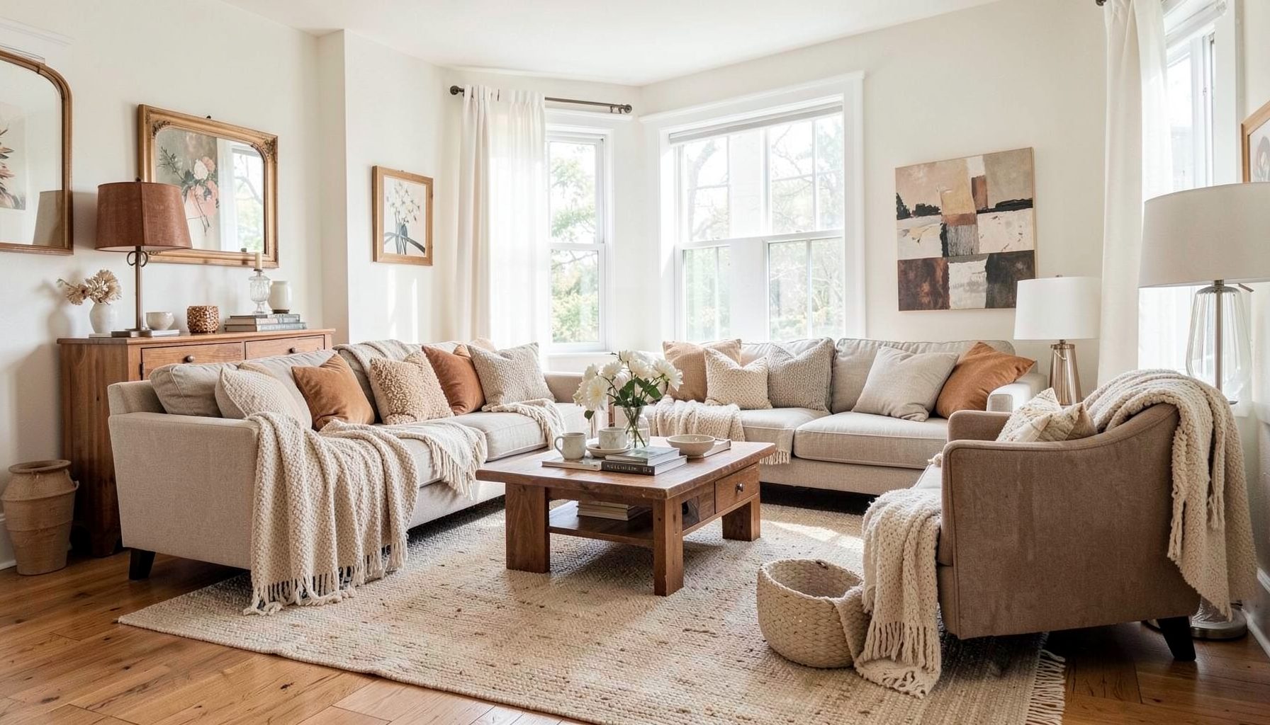
Downloads
Free curated resources for home decorating and design — guides, checklists, and inspiration to help you get started.
Learn MoreHow to Create a Cohesive Look Using a Single Color Palette
A room can feel collected, polished, and full of personality without relying on a rainbow of colors. The key is learning how to work with one carefully considered color family, then building depth through tone, texture, pattern, material, and proportion. This approach creates visual continuity while leaving plenty of room for vintage finds, modern furnishings, artwork, and the details that make a home feel personal.
A single palette does not mean every surface must match. A successful monochromatic interior may include several shades of blue, warm neutrals, earthy greens, or blush tones. The colors can shift from pale to saturated, cool to warm, matte to glossy, and quiet to expressive while still feeling connected.
For a Bay Area home, where natural light can vary dramatically from room to room, palette planning is especially useful. Morning light, coastal gray skies, warm afternoon sun, and artificial lighting can all change how a color appears. Thoughtful layering helps a home feel cohesive throughout the day and across connected spaces.
Start With A Color Story
Before choosing paint or ordering furniture, define the emotional quality you want the room to express. A palette built around soft sage may feel relaxed and organic, while camel, cream, and tobacco can create a warm, collected atmosphere. Deep navy, faded blue, and misty gray offer a moodier direction without becoming visually heavy.
Think beyond a single color name. “Green,” for example, could mean olive, eucalyptus, moss, celadon, or forest. “White” may lean blue, yellow, pink, or gray. Identifying the undertone is essential because colors that share a visual temperature usually sit together more comfortably than unrelated shades.
Gather fabric swatches, paint chips, photographs, tile samples, and small objects that represent the direction you like. Look at them together in natural and artificial light. This simple exercise reveals whether the palette feels too flat, too cool, overly saturated, or just right before you make expensive decisions.
Choose A Dominant Shade And Supporting Tones
A cohesive room generally benefits from a dominant color, a supporting tone, and one or two accent variations. The dominant shade may appear on the walls, a large area rug, or an upholstered sofa. Supporting tones can show up in curtains, case goods, bedding, or smaller furnishings. Accent shades bring definition to lamps, artwork, pillows, and decorative objects.
The 60-30-10 approach can be a helpful starting point, though it should never become a rigid formula. Approximately 60 percent of the room might be the main color or neutral foundation, 30 percent a secondary shade, and 10 percent a stronger accent. In a neutral room, the accent could be a darker version of the same family rather than a contrasting color.
When using one color family, value becomes more important than hue. Value describes how light or dark a shade is. A room filled with mid-tone terracotta can feel dense, while pale clay walls, rust-colored upholstery, and dark cinnamon accents create a more dimensional composition. Aim for visible variation so the space has rhythm.
Build Depth With Texture And Materials
Texture prevents a monochromatic room from looking flat. A linen curtain, nubby boucle chair, weathered wood table, woven basket, ribbed ceramic lamp, and smooth lacquered surface may all share a similar color, yet each reflects light differently. These differences give the eye something to discover.
Use a combination of soft, hard, matte, reflective, rough, and polished finishes. In a warm neutral room, pair creamy walls with a sisal rug, aged brass hardware, a velvet ottoman, and a honed stone surface. In a blue room, mix washed denim, glazed ceramic, painted wood, wool, and a slightly glossy accent fabric.
Natural materials also keep a controlled palette from feeling overly designed. Wood grain, rattan, stone veining, leather, and woven fibers introduce subtle tonal variation. Their organic irregularities work particularly well in layered interiors that combine inherited pieces with contemporary furniture.
Balance Light, Dark, And Pattern
The lightest shade in a palette creates breathing room, while the darkest shade provides structure. Without a pale element, a room can feel enclosed; without a deep tone, it may lack visual anchoring. Use contrast intentionally through trim, furniture legs, picture frames, lighting, or a small architectural detail.
Pattern is another way to add movement without introducing a competing color. Look for stripes, checks, florals, geometrics, and organic motifs that use the same family in different intensities. A cream-and-tan stripe can sit comfortably beside a larger botanical print in sand, caramel, and ivory.
Scale matters when combining patterns. A large motif works well on a rug or drapery, a medium pattern can cover a chair or pillow, and a smaller print can add detail through accent cushions or accessories. Keep the background colors related, and allow some solid surfaces to rest between busier elements.
| Design Element | Quiet Palette Approach | More Layered Approach | Effect On The Room |
|---|---|---|---|
| Walls | Pale version of the main color | Paint, grasscloth, or tonal wallpaper | Establishes the visual foundation |
| Upholstery | Solid fabric in a middle value | Solid sofa with patterned occasional chair | Adds comfort and distinction |
| Flooring | Natural wood or subtle rug | Tonal rug with a geometric or vintage motif | Grounds the palette |
| Window Treatments | Linen in a related neutral | Patterned or textured fabric | Softens light and adds height |
| Accent Pieces | One deeper shade in small doses | Several shades across pillows, art, and objects | Creates rhythm and focus |
| Metals | One consistent finish | Mixed metals with similar warmth | Adds polish without color clutter |
Connect Adjacent Rooms
A single-palette strategy becomes especially effective when several spaces are visible from one another. The colors do not need to be identical in every room, but they should relate through undertones, repeated materials, or a shared accent. This creates a natural transition from entryway to living room, kitchen, dining area, and hallway.
Choose a thread that travels through the home. It might be warm white upholstery, aged brass lighting, walnut wood, a particular shade of blue, or artwork with recurring earth tones. Repeating that element in different forms creates continuity without making each room feel copied.
Open-plan homes benefit from assigning each zone a slightly different emphasis. A living area may use a deeper version of the palette in upholstery, while the dining area carries the same colors through artwork and window treatments. The kitchen could rely on cabinetry, backsplash, or bar stools to echo the overall color story.
Pay attention to sightlines before selecting large pieces. When a sofa, island, or hallway wall can be seen from another room, its color has an outsized influence on the home’s visual flow. Sample fabrics and paint in place whenever possible instead of making decisions from isolated swatches.
Personalize The Palette With Collected Pieces
A cohesive color scheme should support the people who live in the home, not erase their history. Vintage furniture, travel finds, family artwork, books, and handmade objects can all work within a limited palette. Their shape, patina, and story often bring more character than perfectly coordinated accessories.
If an inherited piece falls slightly outside the chosen colors, treat it as a deliberate accent. A red-painted cabinet may become a focal point in a room of warm neutrals, while a multicolored rug can inspire the smaller tones used elsewhere. Cohesion comes from repetition and balance, not from forcing every object into the same visual category.
For a collected look, repeat a color at least two or three times in meaningful ways. A muted green in a landscape painting might reappear in a velvet pillow and a ceramic vessel. A brass frame can relate to lighting and cabinet hardware. These echoes make individual elements feel connected without becoming predictable.
Budget-friendly updates can also make a major difference. Re-covering a seat cushion, adding a tonal throw, painting a small table, changing lampshades, or rearranging existing artwork may be enough to bring a room closer to its intended palette. Thoughtful editing often matters more than purchasing everything new.
Refine The Room Through Editing
Once the main furnishings and finishes are in place, step back and evaluate the room as a whole. Look for areas that feel visually crowded, repetitive, or disconnected. A cohesive palette still needs negative space, and a few quiet surfaces allow the more distinctive pieces to stand out.
Photograph the room from several angles, including the view from the doorway and the perspective from adjacent spaces. Images can reveal color imbalances that are easy to overlook in person. You may notice that all the dark tones are concentrated on one side, that the accent color appears only once, or that a patterned rug needs a calmer companion nearby.
Use accessories in groups rather than scattering isolated objects across every surface. A stack of books, a small sculpture, and a vessel can form a stronger arrangement than many unrelated items. Vary height and shape while keeping the color story in mind.
Practical Palette Decisions
- Test paint and fabric samples in the room where they will be used, observing them in morning, afternoon, and evening light.
- Select one dominant shade, then add lighter and darker values before introducing another color family.
- Repeat important tones across at least two or three furnishings, textiles, artworks, or accessories.
- Mix matte, woven, polished, natural, and reflective materials to give the palette tactile depth.
- Leave room for meaningful vintage and personal pieces, using them as accents rather than treating them as visual problems.
Color continuity should feel natural rather than obvious. The most successful spaces often contain subtle shifts that become apparent over time: a gray with a green undertone beside weathered oak, a cream textile against a warm white wall, or a faded blue object that quietly repeats the shade of a nearby painting. These details create a sense of ease.
A limited palette also gives you freedom to focus on form. Curved furniture, sculptural lighting, architectural trim, and unusual silhouettes can make a strong impression when the colors remain restrained. This is particularly useful for clients who want a room to feel distinctive without appearing busy.
The process can be adapted to a full-service decorating project, a single-room makeover, or an online e-decorating plan. Begin with what you already own, identify the pieces worth keeping, and make decisions that strengthen the relationship between color, light, texture, and daily life.
When you are ready to bring a layered color story into your home, Maggie Rose Interiors can help shape the direction—from palette development and furnishings to styling the final details. Explore the studio’s design services and portfolio to begin creating a space that feels connected, collected, and unmistakably yours.

Recent Projects