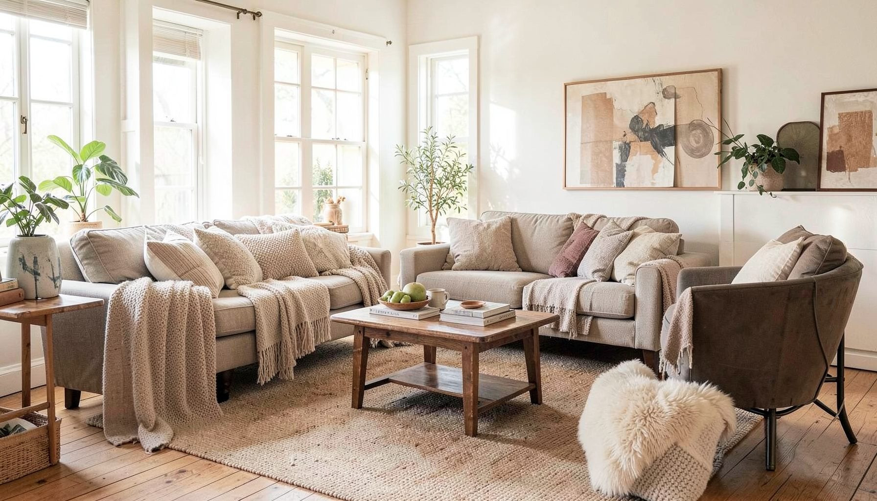
Interior Design
Full-service decorating that blends high and low, vintage finds with modern pieces for spaces that feel personal and collected.
Learn More
DIY Projects
Step-by-step tutorials for refinishing furniture, sewing pillows, styling bookshelves, and transforming rooms on a budget.
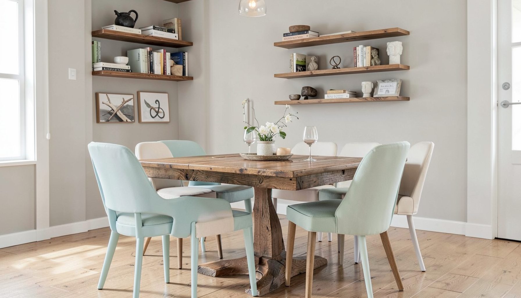
Learn More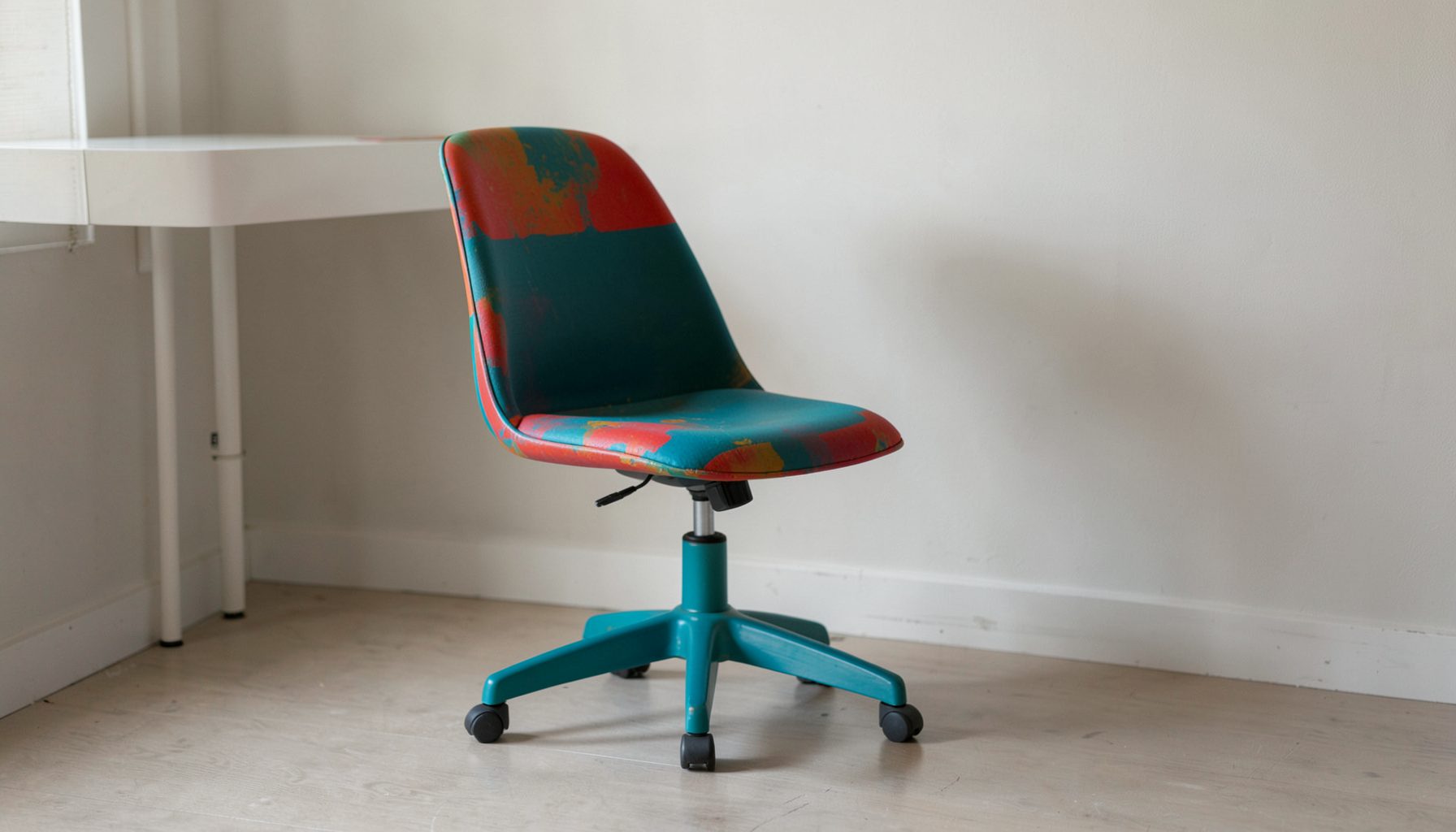
E-Decorating
Personalized design guidance delivered online — perfect for clients anywhere in the world who want a professional eye.
Learn More
Portfolio
Browse completed room makeovers, before-and-after transformations, and styling projects from Bay Area homes.
Learn More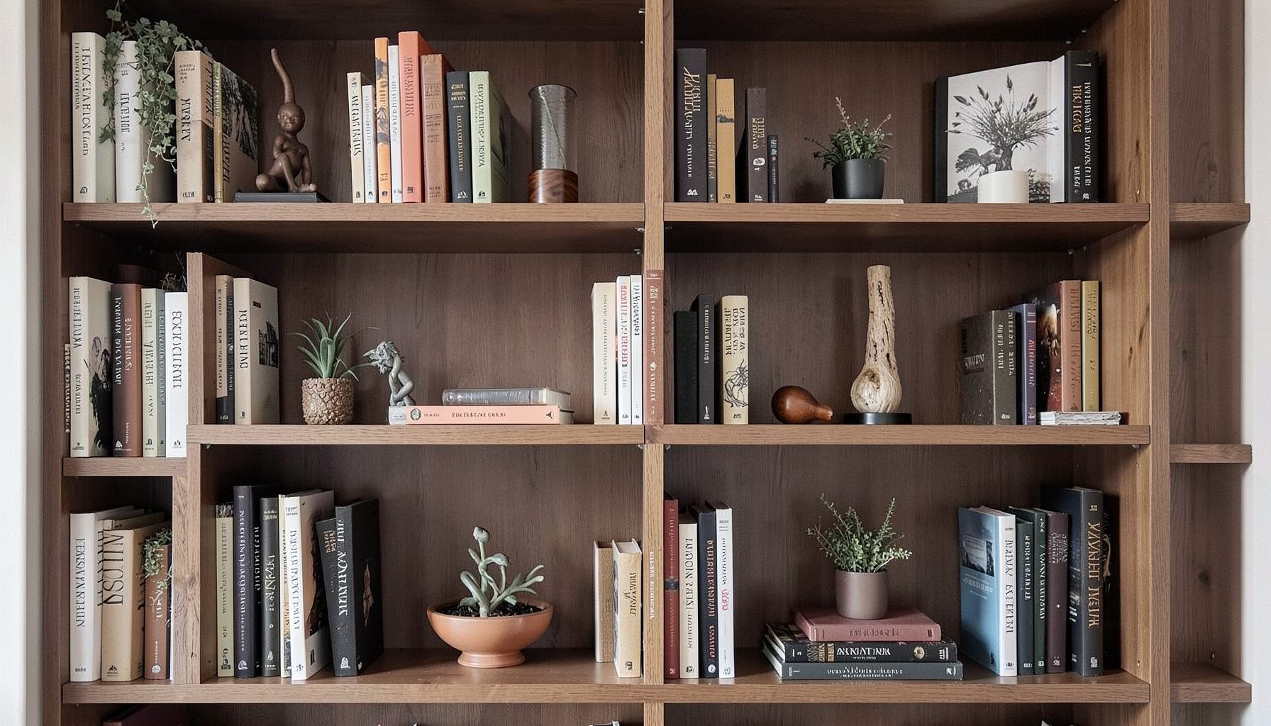
Blog
Interior design inspiration, fashion finds, entertaining ideas, and peeks into real home renovations and styling projects.
Learn More
Downloads
Free curated resources for home decorating and design — guides, checklists, and inspiration to help you get started.
Learn MoreChoosing Paint Colors for an Open-Plan Kitchen and Living Room
Open-plan kitchen and living rooms have become the heart of modern Australian homes, particularly in new builds across Melbourne's outer suburbs and Sydney's growing family neighbourhoods. The challenge lies in making one large, multi-functional space feel connected yet distinct, and paint is the most powerful tool for achieving this balance. Choosing colours for an open-plan layout is far more complex than selecting a shade for a single room, because every wall, surface, and transition contributes to the overall experience of the space.
Australian light is intense and variable. From the bright, clear days of Perth to the softer, cloudier skies of Hobart, the way colour reads shifts dramatically throughout the day. Add to this the harsh afternoon sun streaming through west-facing windows in Brisbane summers, and you have conditions that test any paint colour. Australian homes often feature large sliding doors opening to outdoor entertaining areas, which means interior colours must also harmonise with the deck, garden, and view beyond.
Many homeowners make the mistake of choosing colours room by room, then wondering why their open-plan space feels disjointed. The kitchen needs to feel like a hardworking, easy-clean zone while the living area should feel relaxed and inviting. Achieving this balance requires thinking of the whole space as a single canvas, with subtle variations rather than abrupt changes. It also means respecting the fixed elements that already exist, such as timber floors, stone benchtops, or cabinetry that cannot easily be changed.
Working with a professional can take the guesswork out of the process. Designers familiar with Australian architecture and climate can help you choose colours that flow beautifully from the kitchen through to the lounging area and beyond. For those tackling the project independently, there are clear steps to follow that avoid costly mistakes and create a home feeling both cohesive and full of personality.
Reading the Light in Your Open-Plan Space
Before falling in love with a paint chip, spend a few days observing how natural light moves through your kitchen and living area. In Australian homes this is especially important because our orientation to the sun is often reversed compared to northern hemisphere design advice. North-facing windows in the southern hemisphere receive the least direct sun, which can make colours appear cooler and slightly washed out, while south-facing windows flood the room with bright, consistent light that intensifies warm tones.
Think about the time of day you use each zone most. If your living room catches the golden glow of late afternoon sun from the west, a common feature in suburban Brisbane and Perth homes, cooler colours like soft greys, muted blues, or gentle greiges will balance that warmth beautifully. Kitchens facing east will be filled with crisp morning light, making them ideal for warmer, cosier tones that feel inviting as you start the day. For help visualising how different colours respond to your specific layout, exploring resources from https://maggieroseonline.com/ can provide useful inspiration tailored to real homes.
Artificial lighting matters just as much as natural light. Australian open-plan spaces often combine downlights, pendant lights over the kitchen island, and floor or table lamps in the living zone. Warm white globes around 2700K to 3000K will make a creamy white look rich and inviting, while cool white globes can push the same colour towards stark and clinical. Decide on your lighting plan before finalising your paint palette, or risk choosing colours that look completely different once the sun goes down.
Building a Cohesive Colour Story
The secret to a successful open-plan kitchen and living room is choosing one dominant colour that anchors the entire space, then layering two or three supporting shades that relate back to it. This is not about painting everything the same colour, but about creating a clear visual hierarchy. Many Australian designers follow the 60-30-10 rule, where 60 percent of the space is the dominant colour, 30 percent is a secondary shade, and 10 percent is an accent.
For the dominant colour, consider soft, muted tones that work with both the kitchen and the living area. Warm whites with a hint of cream, gentle greiges, or pale sage greens are perennial favourites in Australian homes because they pair equally well with timber cabinetry, stone benchtops, and comfortable upholstered furniture. Avoid anything too stark or saturated for the main wall colour, as it will fight with the other elements in the room and quickly become tiring to live with.
The secondary colour often works beautifully on the kitchen cabinetry or the living room feature wall. A slightly deeper version of your dominant colour, or a complementary tone, creates depth without disrupting the flow. For example, if your main walls are a warm off-white like Dulux Natural White, your cabinetry might be a soft mushroom grey, and your feature wall behind the sofa could be a dusty olive or muted clay. The result is a space that feels curated rather than chaotic.
Respecting the Fixed Elements
Every open-plan space has elements that cannot easily be changed: the flooring, kitchen benchtops, splashback, cabinetry, and sometimes the fireplace surround or built-in shelving. Your paint colours need to honour these choices rather than fight them. In Australian renovations, engineered timber floors in tones like spotted gum or blackbutt are enormously popular, and they pair beautifully with warm, earthy paint colours that echo the timber's undertones.
If you have a stone benchtop with grey veining, pulling soft grey into your wall colour will make the kitchen feel intentional and pulled together. If your cabinetry is a crisp white, you have more freedom with your wall colours, but be careful not to choose a wall shade that makes the cabinetry look yellow or dirty by comparison. Holding paint swatches next to your fixed elements in both natural and artificial light is essential before committing.
Don't forget the architectural details that often get overlooked. Skirting boards, architraves, doors, and window frames in older Australian homes, particularly Californian bungalows and federation properties across Sydney and Melbourne, are often painted in a specific white that may need to stay for heritage reasons. If you cannot change these trims, your wall colours need to complement them. Similarly, exposed beams, brick walls, or concrete ceilings in contemporary builds need to be considered as part of the colour palette, even if left unpainted.
Sampling and Testing in Australian Conditions
Never choose a paint colour from a small chip in the store. Australian lighting conditions in hardware aisles are notoriously inconsistent, and bright fluorescent lights can make colours look completely different than they will in your home. Instead, purchase sample pots from Australian brands such as Haymes, Dulux, Taubmans, or British Paints, and apply them to large pieces of cardboard or directly onto the wall in patches at least 50 centimetres square.
Live with these samples for at least a week, observing them at different times of day and in different weather conditions. Watch how the colour shifts when the room is flooded with midday sun versus overcast winter mornings. Pay attention to how it looks when the blinds are open and light reflects off the outdoor entertaining area, as this uniquely Australian scenario can unexpectedly change the undertones of a colour.
Australian paint brands have developed colours specifically formulated for our harsh UV conditions and varied light. Dulux's Wash & Wear range is designed for the durability needed in busy family homes, while Haymes offers a beautiful selection of heritage-inspired tones suited to period Australian properties. Take advantage of the colour-matching and consultation services offered at Bunnings or independent paint stores, where staff can mix custom shades and provide advice tailored to your specific project.
Weaving in Accents and Transitions
Once your main palette is established, the finishing touches bring everything together. The transition between kitchen and living zones can be subtly highlighted through a change of paint colour on a single feature wall, a different shade on the back of an open shelving unit, or a contrast colour on the inside of the pantry door. These small moments of difference create visual interest without breaking the open-plan flow.
Ceilings are often the most overlooked surface in Australian homes, but painting them a soft, warm white or a slightly deeper version of your wall colour can make a room feel cosier and more grounded. In homes with higher ceilings, common in newer builds across the Sunshine Coast and coastal Victoria, a tinted ceiling helps bring the scale down and makes the space feel more intimate. Flat or matte finishes work best on ceilings, while low-sheen or washable finishes are ideal for kitchen walls that need to handle splashes and frequent cleaning.
Remember that paint is just the foundation. Artwork, rugs, cushions, and indoor plants will add the layers of texture and personality that turn a freshly painted open-plan space into a home. Choose accent colours that echo your paint palette to tie everything together, and don't be afraid to introduce one or two unexpected shades through decor that can be easily changed as your style evolves.
The key thing to remember when selecting paint colours for an open-plan kitchen and living room is that the space should feel like one thoughtfully designed home, not two competing rooms joined together. Start with the light, respect the fixed elements, build a cohesive palette with a clear hierarchy, and always test your colours in the specific Australian conditions of your home. With patience and a clear vision, the result will be a space that feels both beautifully connected and perfectly suited to everyday life.

Recent Projects