Interior Design
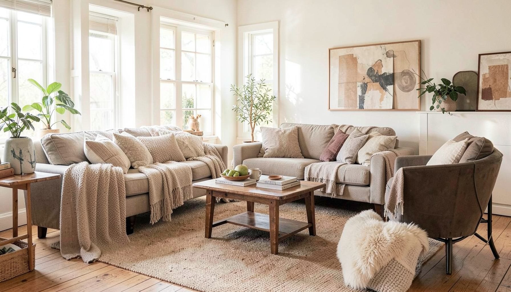
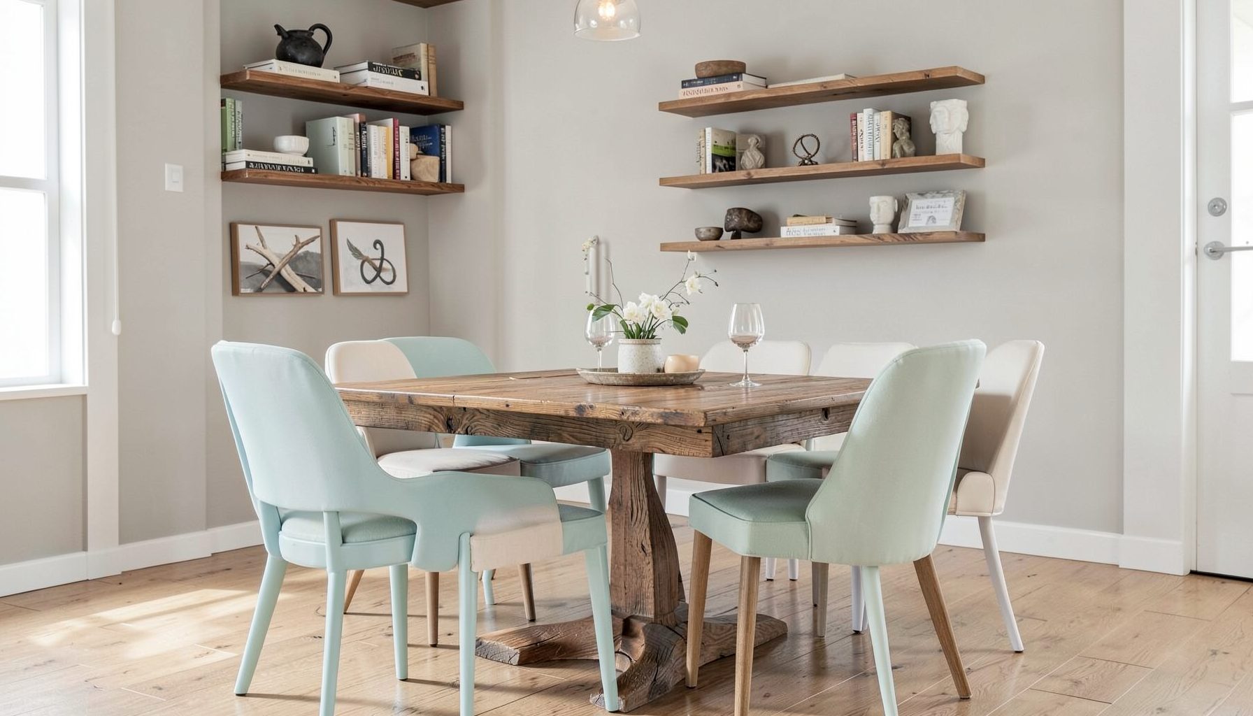
Full-service decorating that blends high and low, vintage finds with modern pieces for spaces that feel personal and collected.
Learn More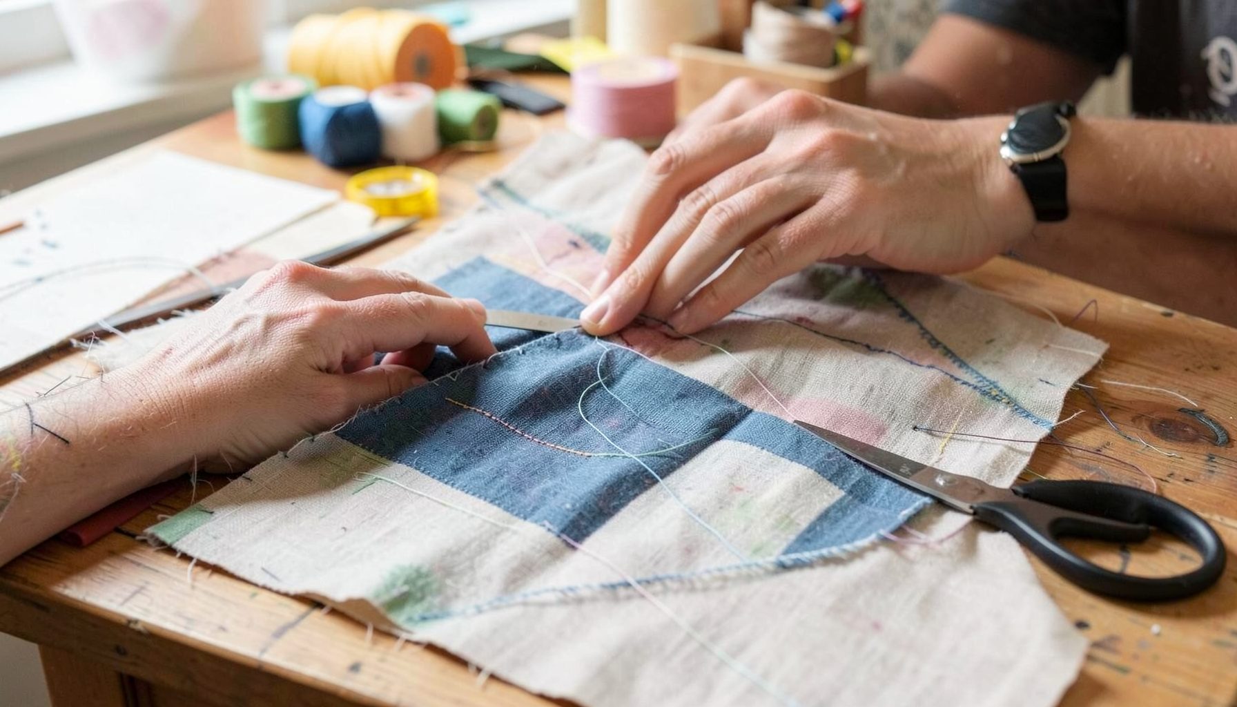
DIY Projects
Step-by-step tutorials for refinishing furniture, sewing pillows, styling bookshelves, and transforming rooms on a budget.
Learn More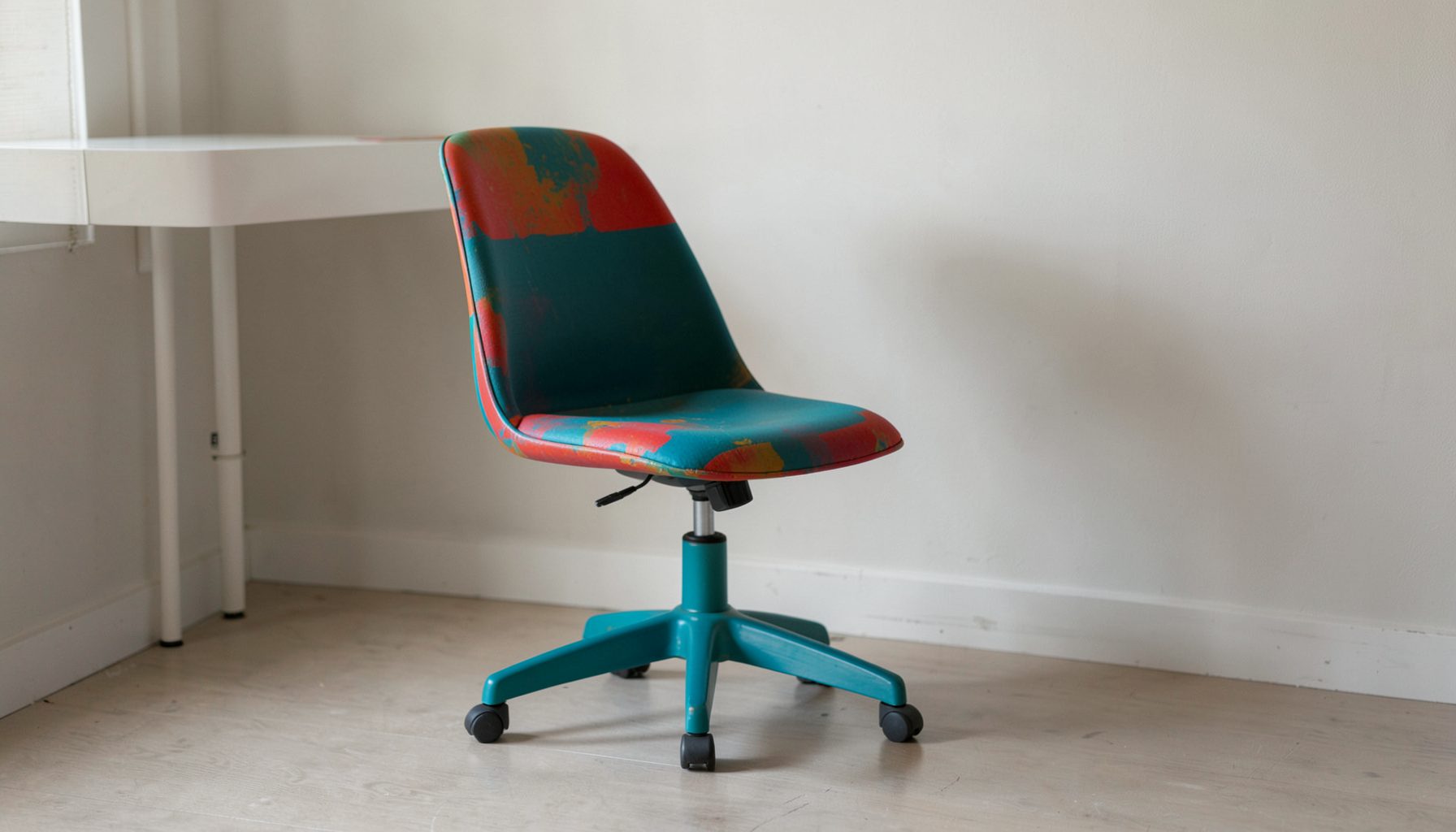
E-Decorating
Personalized design guidance delivered online — perfect for clients anywhere in the world who want a professional eye.
Learn More
Portfolio
Browse completed room makeovers, before-and-after transformations, and styling projects from Bay Area homes.
Learn More
Blog
Interior design inspiration, fashion finds, entertaining ideas, and peeks into real home renovations and styling projects.
Learn More
Downloads
Free curated resources for home decorating and design — guides, checklists, and inspiration to help you get started.
Learn MoreHow to Balance Bold Wallpaper with Subdued Furnishings
Bold wallpaper can transform a room faster than almost any other design choice. A dramatic botanical print, oversized geometric pattern, or richly colored mural gives the walls presence and personality, creating a strong foundation for the rest of the space. The challenge is making that statement feel intentional rather than visually overwhelming.
The most successful rooms use contrast with control. Wallpaper supplies pattern, color, and movement, while quieter furnishings provide breathing room. This balance allows the print to remain the focal point without making the room feel busy or difficult to live in.
Subdued does not have to mean plain or predictable. Softly tailored upholstery, warm wood, aged metals, woven textures, and thoughtfully chosen vintage pieces can add depth without competing with the walls. The goal is a layered interior that feels collected, comfortable, and connected to the people who use it.
Start With The Wallpaper’s Visual Hierarchy
Before selecting furniture, study the wallpaper as a complete composition. Identify its background color, strongest accent shade, scale, contrast level, and overall mood. A dark floral with ivory details creates a different design direction than a pale grasscloth-inspired pattern or a playful multicolor stripe.
The dominant color should influence larger upholstered pieces, while smaller colors can guide accent furniture and accessories. For example, a wallpaper with a muted sage background and rust-colored flowers might pair beautifully with a mushroom-colored sofa, walnut tables, and a few terracotta accents. Repeating every shade throughout the room is unnecessary; selecting two or three supporting tones is usually enough.
Scale deserves particular attention. Large-scale wallpaper often works best with furnishings that have clean silhouettes and generous visual space around them. Smaller patterns can tolerate more detail, though an excess of decorative objects may still make the room feel crowded. Let the print establish the room’s rhythm, then choose pieces that support rather than interrupt it.
Choose Furnishings In Quiet, Layered Tones
Neutral furniture creates a calm counterpoint to expressive walls, but neutral does not mean limiting the room to white, beige, and gray. Consider camel leather, oatmeal linen, charcoal wool, dusty blue cotton, warm taupe velvet, or a soft olive performance fabric. These restrained shades absorb some of the wallpaper’s intensity while keeping the space welcoming.
A useful approach is to vary the texture while keeping the color palette controlled. A linen sofa, boucle chair, woven ottoman, and lightly distressed wood cabinet can feel rich even when each piece is visually quiet. Texture adds the depth that pattern would otherwise provide, helping the room feel finished without introducing additional competing motifs.
Furniture shape matters as much as upholstery color. Rounded chairs and curved lamps can soften a sharp geometric print, while streamlined case goods can bring order to a romantic floral. Avoid filling the room with pieces that all have the same visual weight. A substantial sofa may be balanced by an airy side table, an open-leg chair, or a slender floor lamp.
Create A Calm Color Relationship
A subdued furnishing palette should relate to the wallpaper without matching it too precisely. Pulling one pale or softened shade from the pattern often produces a harmonious result. If the wallpaper includes cream, dusty rose, and deep green, a warm ivory sofa and muted rose accent chair may be more effective than furniture covered in the exact green.
The value of each color is important too. Value refers to how light or dark a color appears. A high-contrast wallpaper can benefit from furnishings in middle values, which create a transition between the brightest and deepest areas of the room. When every element is either very light or very dark, the overall effect can feel more dramatic than intended.
Use the floor, ceiling, and window treatments as visual buffers. A natural jute rug can ground a colorful wallcovering, while a painted ceiling in a softened version of the wallpaper’s background color can make the room feel cohesive. Simple woven shades or solid drapery panels are often preferable to another patterned textile.
| Wallpaper Character | Furnishing Direction | Helpful Materials | Accents To Limit |
|---|---|---|---|
| Large botanical print | Solid upholstery in warm neutrals | Linen, rattan, oak, aged brass | Additional florals and leafy motifs |
| High-contrast geometric | Soft, rounded furniture with simple profiles | Boucle, wool, plaster, matte wood | Sharp repeating patterns |
| Dark, moody mural | Medium-tone furnishings with reflective details | Velvet, leather, glass, antique brass | Too much black or heavy furniture |
| Small-scale traditional pattern | Tailored pieces with restrained color | Cotton, painted wood, brushed nickel | Excessive collections of small objects |
| Textured neutral wallcovering | Slightly richer solids and natural patterns | Cane, linen, travertine, wool | Flat, overly cool finishes |
Use Solids Strategically, Not Uniformly
Solid furnishings are the safest way to quiet a bold wall, but a room made entirely from flat solids can lose its character. Introduce low-contrast materials that create visual interest without competing for attention. A subtle stripe on a lumbar pillow, a tonal check on a throw, or a rug with a gentle irregular weave can add variation while preserving the wallpaper’s leading role.
Repeat shapes as well as colors. If the wallpaper includes rounded leaves, echo that softness with a circular mirror or curved occasional table. For a linear pattern, consider a rectangular coffee table, a framed architectural print, or a boxy chair. These connections are subtle, yet they make the design feel considered.
Pattern should be distributed according to scale. The wallcovering may carry the largest and most noticeable pattern, while a rug or pillow can carry a smaller, quieter one. Avoid using several patterns with the same scale, since they tend to compete instead of creating a layered progression.
Balance Contrast With Light And Negative Space
Bold wallpaper needs room to breathe. Negative space can come from an open area of floor, a mostly uncluttered tabletop, or a light-colored furnishing that visually separates the pattern from darker objects. This pause is especially valuable in compact rooms, where every surface is close to the eye.
Lighting also determines how assertive wallpaper feels. Ambient light softens saturated colors, while directional sconces can emphasize texture and pattern. Use a combination of ceiling fixtures, table lamps, sconces, and natural light so the wallcovering changes gently throughout the day rather than appearing flat or overly intense at night.
Reflective elements can provide balance when used thoughtfully. An antique mirror, glazed ceramic lamp, or small glass table will catch light and prevent a deep wallpaper palette from feeling closed in. Keep the finish selection edited. One or two reflective moments usually create enough lift without turning the room glossy.
Make Vintage And Modern Pieces Work Together
A collected room is often the ideal setting for statement wallpaper because the furnishings can soften its sense of newness. A vintage dresser, old-world mirror, or worn leather chair introduces patina and individuality. These pieces keep the design from looking like a matching showroom and give the wallpaper a more personal context.
Modern furnishings can provide necessary restraint. A simple sofa, sculptural side table, or contemporary floor lamp creates a clean visual pause among older pieces and decorative details. The contrast between eras makes the room feel layered rather than themed.
When combining styles, look for a shared thread. Similar wood tones, a repeated metal finish, related proportions, or a consistent color temperature can connect pieces from different periods. The wallpaper itself can act as the bridge, bringing traditional and contemporary elements into the same composition.
Edit Accessories With A Clear Point Of View
Accessories should reinforce the room’s palette and function rather than fill every available surface. Begin with a few meaningful pieces: a ceramic vessel, framed artwork, a stack of books, a sculptural object, or a small collection gathered over time. Place them where they can be appreciated without obscuring the wallpaper.
Artwork requires special consideration. A busy print may need a quiet wall or a generous mat to prevent competition. In a room with highly patterned wallpaper, black-and-white photography, simple line drawings, or artwork with broad areas of negative space can be particularly effective. A single oversized piece may have more impact than several small frames.
Window treatments, pillows, and rugs are opportunities to repeat texture instead of pattern. Choose fabrics that relate to the wallpaper’s mood, such as washed linen for a relaxed botanical, wool for a tailored geometric, or velvet for a richly colored traditional print. A restrained mix of materials keeps the room expressive without making it visually noisy.
A Practical Editing Process For The Finished Room
Once the main furniture is in place, evaluate the room from its entry point and from the seating area. Notice what the eye sees first, where it rests, and whether any object pulls attention away from the wallpaper. This perspective is more useful than judging each item individually because balance depends on the room as a whole.
Remove one or two pieces if the space feels crowded. Designers often create calm by editing rather than adding. A less cluttered console, a simpler coffee table arrangement, or a single accent pillow instead of a group can restore the hierarchy between wallcovering and furnishings.
Use these final checks before considering the space complete:
- Confirm that the largest furniture pieces sit in quiet or moderately textured fabrics.
- Repeat one or two wallpaper colors through small, intentional accents.
- Keep competing patterns smaller, softer, or farther from the main wall.
- Add natural materials such as wood, rattan, wool, or stone for warmth.
- Leave visible breathing room around major furniture and decorative objects.
The result should feel comfortable at close range and balanced from across the room. Bold wallpaper can remain expressive while the furnishings provide the ease, softness, and practicality that make a space feel livable.
Let The Room Reflect Its Residents
The best decorating decisions are grounded in how a room is used. A family living room may need durable solid upholstery and washable textiles, while a guest room can accommodate more delicate materials and decorative furnishings. A dining room might benefit from a dramatic wallcovering paired with simple dining chairs and a quiet wood table.
Personal objects are essential to keeping a bold design from feeling impersonal. Travel finds, inherited furniture, favorite books, and handmade pieces add stories that no trend can replicate. Their presence also helps the wallpaper feel like part of the homeowner’s world rather than a separate design statement.
For a Bay Area home, this layered approach works across many architectural settings, from San Francisco apartments to San Jose houses and spaces beyond. Older details can sit comfortably beside modern furnishings, and relaxed California materials can temper a formal print. With thoughtful editing, bold walls become a backdrop for everyday life rather than the entire story.
Maggie Rose Interiors brings together vintage character, contemporary comfort, luxury finishes, and accessible pieces to create rooms with personality and balance. Whether the project calls for full-service interior decorating, a focused room makeover, online e-decorating, or personalized design guidance, the process can begin with the elements already meaningful to you. Explore the portfolio and design resources, then take the next step toward a layered room where striking wallpaper and subdued furnishings feel perfectly at home.

Recent Projects