Interior Design
Full-service decorating that blends high and low, vintage finds with modern pieces for spaces that feel personal and collected.
Learn More
DIY Projects
Step-by-step tutorials for refinishing furniture, sewing pillows, styling bookshelves, and transforming rooms on a budget.
Learn More
E-Decorating
Personalized design guidance delivered online — perfect for clients anywhere in the world who want a professional eye.
Learn More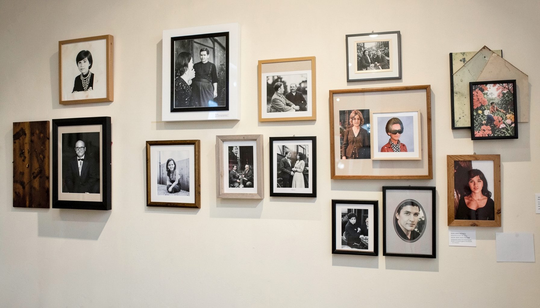
Portfolio
Browse completed room makeovers, before-and-after transformations, and styling projects from Bay Area homes.
Learn More
Blog
Interior design inspiration, fashion finds, entertaining ideas, and peeks into real home renovations and styling projects.
Learn More
Downloads
Free curated resources for home decorating and design — guides, checklists, and inspiration to help you get started.
Learn MoreHow to Arrange a Gallery Wall with Mixed Frames
A gallery wall can make a room feel collected, personal, and finished without looking overly coordinated. The most appealing arrangements often combine family photographs, original art, vintage finds, mirrors, textiles, and small objects in frames that vary in color, material, and scale. The result should feel as though it developed over time rather than arrived as a matching package.
Mixed-frame gallery walls work especially well in layered interiors because they bring together contrasting details: warm wood beside aged brass, a simple black border beside an ornate antique frame, or a quiet photograph beside a colorful print. The key is to create enough repetition for the display to feel connected while allowing each piece to retain its character.
Before reaching for a hammer, consider the wall as part of the larger room. Furniture placement, ceiling height, nearby lighting, and the colors already present in upholstery or rugs should influence the composition. A successful gallery wall supports the room’s personality instead of competing with every other focal point.
Begin With A Meaningful Collection
The strongest display starts with pieces that have something in common beyond their appearance. You might gather travel photographs, botanical illustrations, inherited artwork, children’s drawings, black-and-white family portraits, or a mixture of objects that reflect a particular chapter of your life. A shared story gives an eclectic arrangement a natural sense of purpose.
Spread everything on the floor before deciding what belongs on the wall. Include more pieces than you think you will need, then remove anything that feels unrelated, too repetitive, or difficult to see at the intended distance. A gallery wall benefits from editing; an overcrowded display can make individual artwork disappear.
Size and orientation matter as much as subject matter. Include a few large anchors, medium pieces that connect them, and smaller works that fill visual gaps. A horizontal landscape can balance a vertical portrait, while a square frame can provide a pause between several rectangular pieces.
Personal collections can also include heirlooms without making a room feel formal or traditional. A vintage portrait, embroidered textile, or inherited landscape may become a compelling counterpoint to contemporary furniture. These heirloom decorating ideas can help blend sentimental pieces into a more modern setting.
Choose A Frame Mix With Intention
Mixed frames look considered when there is a visual thread tying them together. That thread might be a limited color palette, a repeated material, a consistent mat color, or a similar level of ornamentation. You do not need every frame to match, but a few points of repetition will keep the collection from feeling random.
A practical starting point is to choose two or three dominant frame finishes. For instance, combine walnut, black, and antique brass, then add one painted or decorative frame as an accent. If every border is a different color and material, the artwork may become secondary to the frames.
Contrast creates energy, particularly when it is balanced across the wall. Place an ornate gold frame near a simpler wood frame, then repeat gold or warm tones elsewhere in the arrangement. Avoid placing every dark frame together or concentrating all the decorative borders on one side.
Matting can unify a very diverse collection. White or ivory mats create breathing room and help varied artwork feel related, while colored mats can reinforce the room’s palette. For a relaxed, collected look, use similar mat proportions even when the exterior frames differ.
| Frame Element | Best Use | What To Watch For |
|---|---|---|
| Natural wood | Adds warmth and works well with vintage or organic interiors | Too many similar wood tones can look flat |
| Black or charcoal | Creates definition and supports modern artwork | A large concentration may feel visually heavy |
| Brass or gold | Introduces age, glow, and decorative detail | Repeat the warm metal elsewhere for balance |
| Painted color | Highlights a room accent or playful artwork | Limit bright colors unless the overall room is energetic |
| Ornate vintage frame | Gives the wall character and a collected quality | Pair with simple frames so it remains an accent |
| Frameless or floating style | Provides visual relief between heavier borders | Use selectively to avoid a disconnected appearance |
Select A Layout Before Hanging
There are several dependable gallery wall arrangements, but the best choice depends on the wall and the collection. A grid feels calm and architectural, while a salon-style arrangement feels relaxed and layered. A linear layout suits a narrow hallway, and a centered cluster works well above a sofa, console, or bed.
For a flexible arrangement, begin with the largest piece and build outward. Place it slightly off-center rather than directly in the middle, then balance its visual weight with a pair of smaller works on the opposite side. This creates movement while preserving stability.
A symmetrical layout does not require identical frames. You can create balance through equal outer dimensions, similar visual weight, or repeated spacing. Two frames may differ in finish but occupy comparable areas, allowing the arrangement to feel orderly without looking overly matched.
Use paper templates when the composition includes many pieces. Trace each frame onto kraft paper, label the template, and tape the shapes to the wall. This lets you test spacing, proportions, and overall scale before making holes. Stand across the room and view the arrangement from the doorway, since that is often where the entire composition will be seen.
Build Rhythm With Spacing And Scale
Spacing is one of the most important details in a gallery wall. A gap of two to four inches between frames is usually a useful starting point, though larger artwork can handle slightly wider spacing. Consistency matters more than following an exact measurement.
Do not let the outer edges become too rigid unless you are intentionally creating a grid. The interior relationships are more important than perfect alignment along every side. A loose arrangement can have uneven outer edges while still feeling balanced because the spaces between neighboring pieces remain connected.
Scale creates a visual rhythm that guides the eye. Place large works where they can anchor the display, then use medium and small pieces to create transitions. A narrow frame beside a broad one produces contrast, while several similarly sized pieces placed together can form a secondary cluster.
Keep the center of the arrangement at a comfortable viewing height. When hanging art above furniture, leave enough room for the display to relate to the piece below without floating too high. A gallery wall should generally feel attached to the furniture grouping rather than disconnected from it.
Hang Mixed Frames Securely
Once the layout is established, measure carefully and use hardware suited to each frame’s weight. Small lightweight frames may work with picture hooks, while large or heavy frames often need two points of support or wall anchors. Do not rely on the frame’s hanging wire alone if it causes the piece to tilt or shift.
For frames with D-rings, measure the distance from the top edge of the frame to each ring, then transfer those measurements to the wall. A level helps keep individual pieces straight, but check the full arrangement as well. Several frames can be individually level and still form a composition that appears visually uneven.
Furniture placement can affect hanging height. Above a console, leave enough surface area for lamps, ceramics, or books without allowing accessories to collide with the lowest frames. Above a sofa, maintain a comfortable relationship between the artwork and the back cushions, especially if the display extends wider than the furniture.
Expect to make small adjustments after hanging. Step back, look from several angles, and shift a frame by an inch if a gap feels awkward or one side seems too dense. The final arrangement often becomes clearer once the actual shadows, frame depth, and surrounding furniture are visible.
Add Dimension Beyond Flat Artwork
A gallery wall becomes more expressive when it includes a few dimensional or unexpected elements. Consider a shallow mirror, a woven piece, a small shadow box, a ceramic wall object, or a frame containing pressed botanicals. These additions break up rows of flat paper and create changing texture as light moves through the room.
Depth should be introduced selectively. Objects that project too far can appear awkward in a busy composition, especially in narrow walkways. Choose pieces that are secure, lightweight, and proportional to the surrounding frames.
Color can also be layered through the artwork rather than the borders. A quiet collection of neutral frames can support paintings in rust, olive, ochre, or blue, while a brighter frame may echo a small accent already present in the room. Repeating a color in at least two locations helps it feel intentional.
Lighting deserves attention once the arrangement is complete. Picture lights, directional sconces, or adjustable ceiling fixtures can highlight artwork, but avoid strong glare on glass. Warm, diffused light generally complements wood, aged metals, and vintage pieces while making the wall feel inviting in the evening.
Practical Rules For A Collected Display
A few simple guidelines can make the process easier without limiting creativity. Use them as a framework, then adjust according to the room, the artwork, and the feeling you want the wall to create.
- Start with the largest or most important piece, then build the arrangement around it.
- Repeat at least one frame finish, mat tone, color, or subject to establish cohesion.
- Keep neighboring frames close enough to read as one composition, usually two to four inches apart.
- Balance visual weight rather than matching every shape or dimension.
- Photograph the proposed layout before hanging so you can review it from a distance.
The most polished gallery walls usually contain a little asymmetry. A small empty space, an unexpected frame, or a piece that sits slightly outside the dominant shape can keep the display from looking manufactured. The goal is harmony, not perfect uniformity.
If the wall still feels unsettled, remove one piece before adding another. Negative space gives important artwork room to breathe and often solves the problem more effectively than filling every gap. A restrained collection can make a stronger impression than a crowded one.
Make The Collection Feel Like Home
A mixed-frame gallery wall should reflect the people and places connected to the room. Combine new purchases with photographs, inherited objects, and artwork discovered while traveling. When each piece has a reason for being there, the arrangement gains depth that a purely decorative collection cannot replicate.
Allow the display to evolve. You can exchange seasonal prints, add a new family photograph, or replace a frame as your taste changes. Flexible arrangements are especially useful in homes where decorating develops gradually, because the wall can grow without losing its original balance.
Take time to live with the arrangement and notice what draws your eye. A gallery wall is finished when it feels connected to the room, easy to enjoy, and personal enough that it could not belong anywhere else. Gather your favorite pieces, test the composition with paper templates, and create a layered display that brings your story into view.

Recent Projects