Interior Design
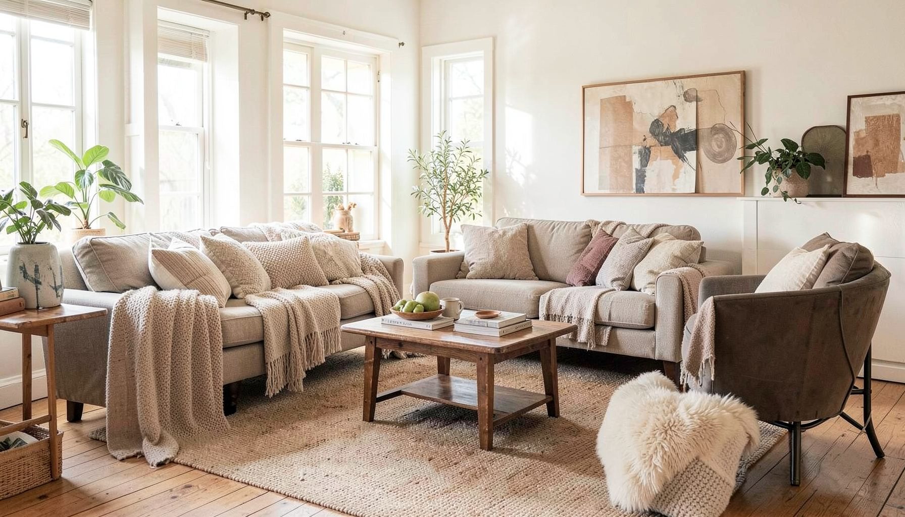
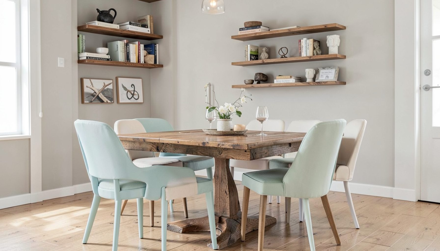
Full-service decorating that blends high and low, vintage finds with modern pieces for spaces that feel personal and collected.
Learn More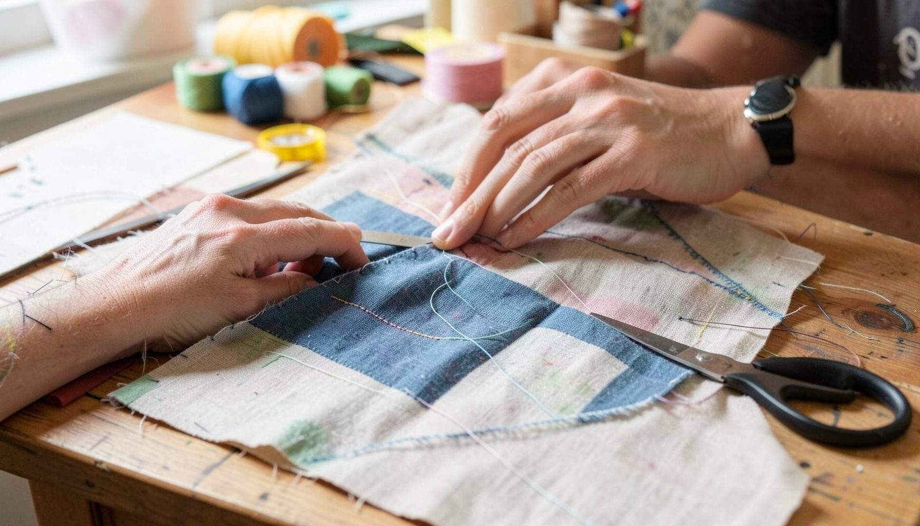
DIY Projects
Step-by-step tutorials for refinishing furniture, sewing pillows, styling bookshelves, and transforming rooms on a budget.
Learn More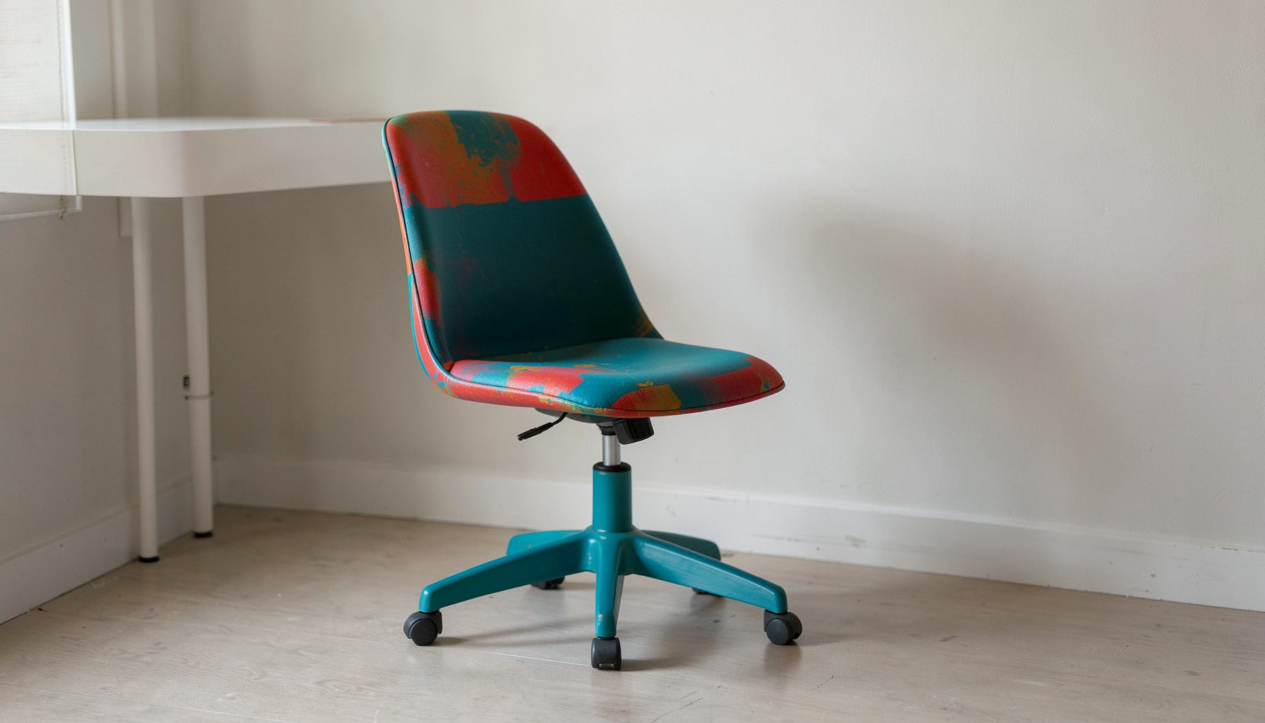
E-Decorating
Personalized design guidance delivered online — perfect for clients anywhere in the world who want a professional eye.
Learn More
Portfolio
Browse completed room makeovers, before-and-after transformations, and styling projects from Bay Area homes.
Learn More
Blog
Interior design inspiration, fashion finds, entertaining ideas, and peeks into real home renovations and styling projects.
Learn More
Downloads
Free curated resources for home decorating and design — guides, checklists, and inspiration to help you get started.
Learn MoreHow to Add Colour with Throw Pillows Without Overwhelming a Room
Knowing how to add a pop of color with throw pillows without overwhelming the room comes down to editing, not adding more. A bright cushion can give a neutral sofa a clear focal point, but competing patterns and too many competing hues quickly make a space feel busy. A restrained scheme lets the colour land, keeps the furniture in view and gives you freedom to change the mood later.
Throw pillows, also called accent cushions or decorative cushions, are among the quickest ways to transform a room because they work at sofa scale and can be moved. That matters in Australian homes, where the family-room sofa often doubles as the weekend game-viewing spot, a homework bench and a nap zone. Practical comfort matters as much as the finished photograph, so removable, washable covers and inserts that hold their shape deserve consideration alongside fabric choice and colour.
Start with the colour already in the room
Begin with the room, not the cushion shop. The walls, floor, rug, upholstery and artwork usually contain a handful of dominant colours, plus smaller notes you may have overlooked. A rust pot, a green botanical print or a stripe in the curtains can reveal which hue already belongs. Repeating one of those notes ties the new cushions to the space and makes the colour feel deliberate rather than added on afterwards.
A simple starting point is one dominant accent hue and one supporting colour, with neutrals doing the rest. Teal with warm ochre and cream feels lively; navy with dusty rose and grey feels quieter. Keep the most saturated colour to one or two pieces. If you love several strong colours, alternate them on separate surfaces rather than gathering every shade on one sofa, so each area remains visually clear.
Check the scheme in more than one light. In Sydney and Melbourne, a west-facing room can glow at sunset but fade a dyed linen cushion over time, while a north-facing room can look quite different from a photograph taken on a cloudy afternoon. Lean each cushion against the wall, step back and soften your view slightly. If the cushion is the first thing you notice from the doorway, its intensity may need reducing.
Use size and placement to control the impact
Scale determines whether a cushion reads as an accent or a blockage. Most decorative throw pillows sold in Australia measure around 40–50 cm square, but the right size depends on the seat. A small 30 cm cushion can disappear on a broad sofa, while a 60 cm cushion may overpower a compact two-seater. Measure the sofa’s width and usable back area before choosing, and check the stated insert size for each cover.
Number is only a guide, yet an odd grouping often feels relaxed. Two 45–50 cm cushions on a two- or three-seat sofa can create enough impact, while a larger sofa may suit three pieces. One 50 cm cushion paired with two 30–40 cm cushions creates depth if the smaller ones sit slightly forward. Avoid a tight row or a pile that blocks the arm; leaving a little space allows the upholstery to remain part of the composition.
Shape and placement can reduce visual weight. A lumbar cushion against a deep sofa softens a hard edge, and firm inserts help decorative pillows stand upright instead of slumping. Vary the orientation slightly, but keep the colours within the same family. For a calm finish, repeat the same solid cushion on two separate chairs and let the sofa carry the pattern. Texture—bouclé, linen, wool, velvet or a flat-woven kilim—adds interest without introducing another loud hue.
Mix patterns while keeping a shared colour
Pattern mixing works best when the patterns share a colour or a scale. Combine one bold geometric print with a fine stripe and one plain cushion, or pair a large floral with a smaller, quieter motif. The anchor pattern can be the largest visual event; the others should support it. Avoid several patterns with equally loud contrasts, since the eye will have no obvious place to settle. If the rug already has a strong pattern, choose mostly solid cushions and pick up one or two of its colours so the floor and seating feel connected.
Budget should guide the mix rather than dictate the scheme. Australian homes often combine new pieces from stores such as IKEA Australia or Adairs with finds from The Salvos, Red Cross op shops and local makers. A thrifted cushion with a beautiful textile can become the focal point when you add a new plain cushion in a matching hue and replace its insert if needed. Mixing price levels is entirely compatible with a collected, layered look and gives each piece more personality.
If you are building the scheme gradually, browsing this furniture sale alongside your local options can reveal accent pieces that suit the colours already in the room. Compare scale, colour and fabric quality in the same light, and consider buying one statement cover rather than a matching set. The aim is contrast with control, so a single unexpected shape or pattern has room to be noticed.
Build a layered, collected look
Layering means giving each cushion a role. Let one patterned piece provide the focal point, one solid colour ground the arrangement, and one textured or vintage piece bridge old and new. Arrange the largest cushion first, angle the second and place the smallest slightly forward. This visual hierarchy keeps a collection from becoming a crowd, even when the patterns look unrelated at first glance.
A collected feel comes from variety with shared cues. Repeat a hue across two cushions and let shape, weave and age provide the differences. A rust kilim-style textile can sit beside smooth velvet in olive; an embroidered vintage cushion can work with a new linen one in cream. These combinations feel sophisticated because the materials speak to each other through colour, rather than because every piece belongs to the same set.
Plan for two palettes if the sofa changes with the season. Bright linen and cotton in summer can give way to wool, velvet and deeper russets for winter, even though the furniture stays put. Store spare covers clean and dry, following the care label; humid weather in Brisbane or Sydney calls for good ventilation before packing wool cushions away. Reversible covers or a second set of plain covers also make seasonal changes inexpensive.
Edit the scheme until it feels resolved
Give the finished arrangement a quiet test. Remove one cushion, then another, and photograph what remains at different times of day. The scheme should still have a focal point when the largest piece is gone. Move the arrangement to another chair if you want the colour to travel through the room, and check it from the doorway as well as from the seat. This is also a good time to notice whether the cushions encourage people to sit comfortably.
A worked example shows how restraint can still feel expressive. Imagine a warm-white sofa, a walnut coffee table, a charcoal rug and a framed landscape with a rust-red sky. One rust kilim-style cushion and one smaller muted-ochre cushion repeat the artwork without copying it; a plain cream cushion with a textured weave gives the eye somewhere to rest. Add a deep olive lumbar cushion only if the artwork contains green. Each piece then has a clear job, and the room feels layered without becoming loud.
Keep the practical checks in view as you refine the palette. Most new textiles sold in Australia must include fibre-content and care information, so read the label before machine-washing a wool blend or choosing a cover for a busy family sofa. Move cushions away from the strongest afternoon sun, plump the inserts and remove anything whose shape is poor or whose colour fights the established palette. The practical takeaway is to choose one anchor colour, repeat it across a few related cushions, and let scale and texture provide the variety.

Recent Projects