Interior Design
Full-service decorating that blends high and low, vintage finds with modern pieces for spaces that feel personal and collected.
Learn More
DIY Projects
Step-by-step tutorials for refinishing furniture, sewing pillows, styling bookshelves, and transforming rooms on a budget.
Learn More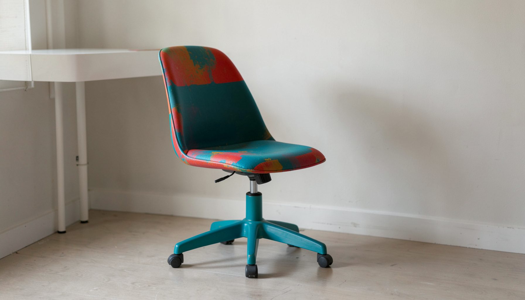
E-Decorating
Personalized design guidance delivered online — perfect for clients anywhere in the world who want a professional eye.
Learn More
Portfolio
Browse completed room makeovers, before-and-after transformations, and styling projects from Bay Area homes.
Learn More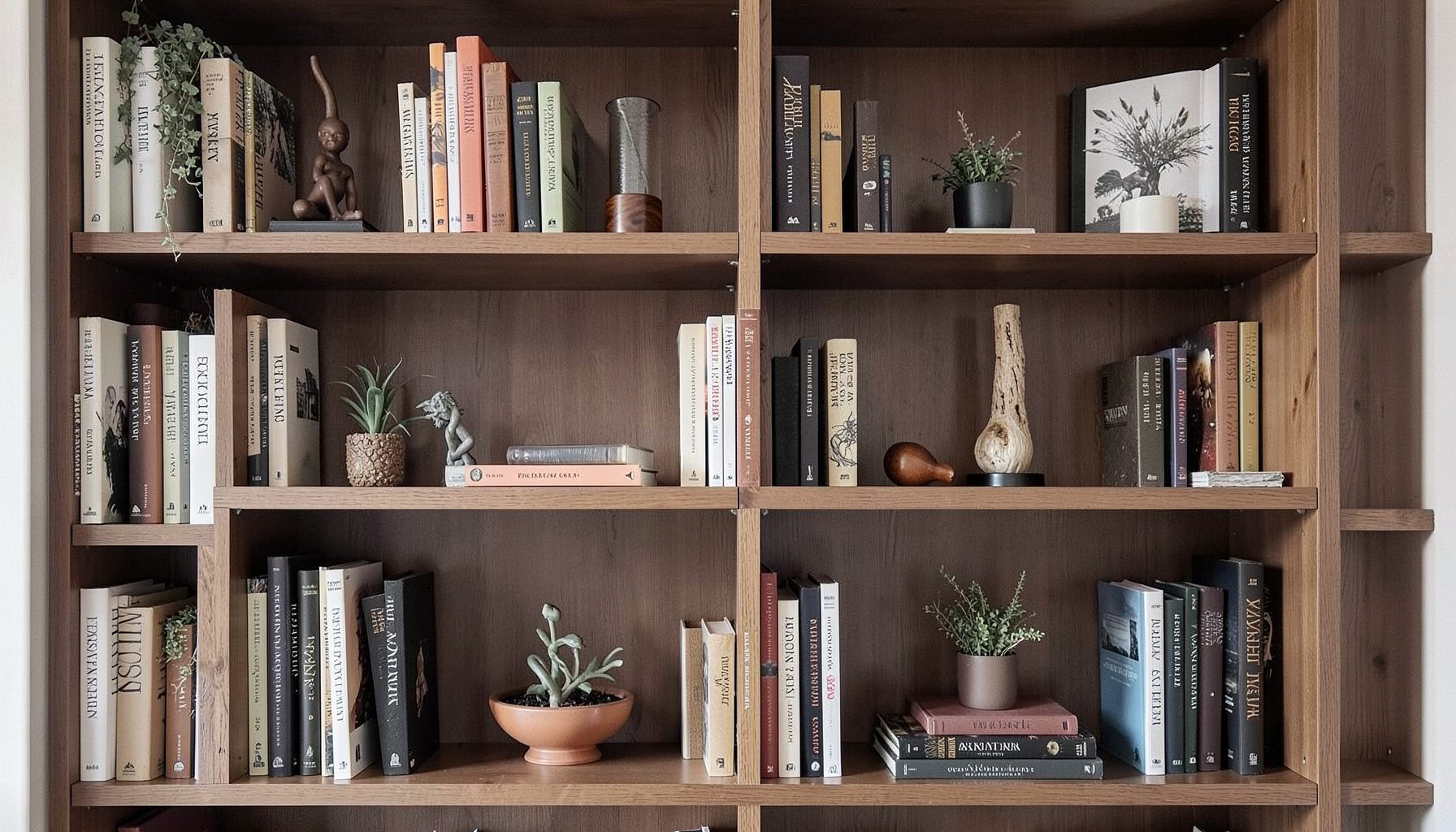
Blog
Interior design inspiration, fashion finds, entertaining ideas, and peeks into real home renovations and styling projects.
Learn More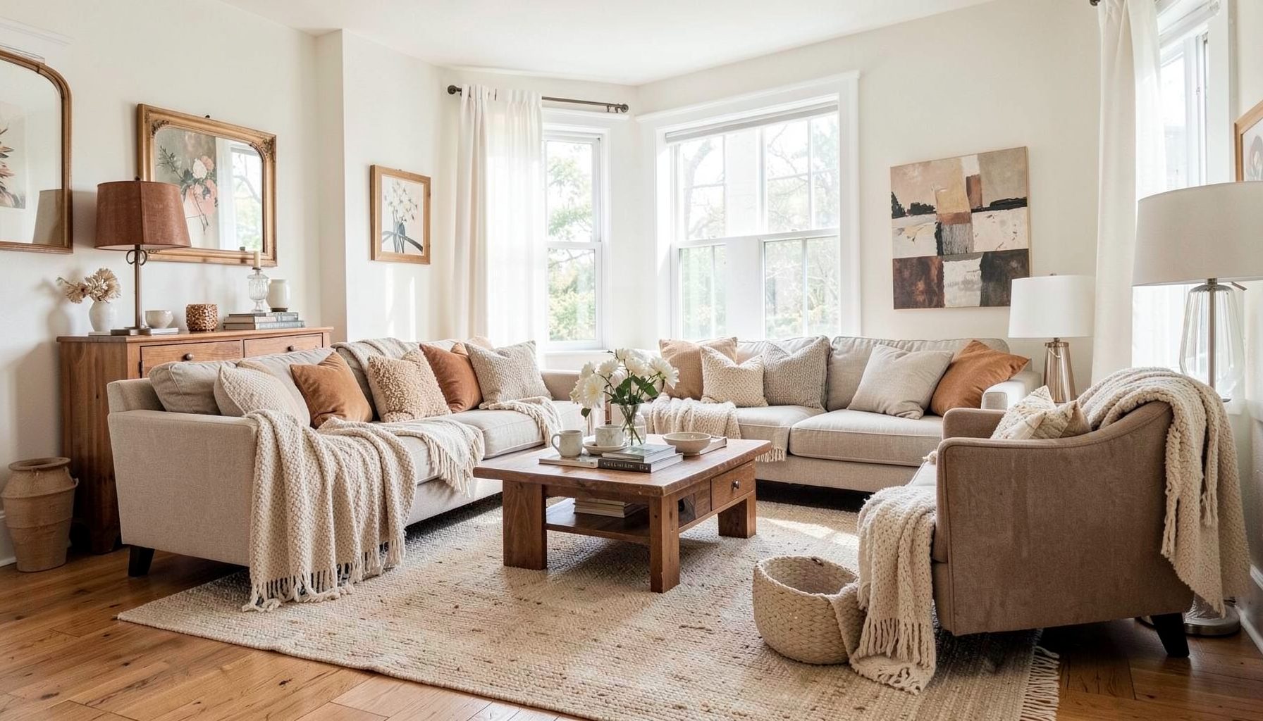
Downloads
Free curated resources for home decorating and design — guides, checklists, and inspiration to help you get started.
Learn Morea serene blue and white master bedroom for Australian homes
A restful bedroom is one of the few spaces in the home where the eye truly rests. Soft blues have long been associated with quieter breathing, lower heart rates, and the kind of mental ease that follows a long, demanding day. White, when chosen thoughtfully, amplifies daylight, softens hard edges, and provides the breathing room a busy mind needs before sleep. Together, these two tones create one of the most enduring colour stories in interior decoration, equally at home in a Victorian terrace or a contemporary coastal build.
Across Australia, the appeal of a blue and white bedroom has grown as homeowners look for palettes that feel timeless rather than tied to a single trend. In Sydney's eastern suburbs and Brisbane's river precincts, cooler duck-egg and denim washes sit comfortably alongside the bright, salt-bleached light pouring through east-facing windows. In Melbourne's inner north, where older weatherboard homes are being gently restored, warmer navy and powder blue accents are layered against crisp whites to balance the often overcast skies.
The Australian climate adds its own considerations. Harsh UV light along the Western Australian coast, humid summers in Queensland, and dry heat inland all influence how paint reads on the wall. A blue that looks like a soft seafoam in a Sydney showroom can read chalky and washed out in a sun-drenched Perth living room, while a richer indigo may feel heavier than expected during a long Adelaide winter.
Working with a calm, layered palette is also a chance to bring in pieces that carry personal history. Vintage finds from a local op shop, an inherited cane chair, a piece of art gathered on a trip to Hobart or Broome — these objects add depth without disrupting the sense of quiet. The aim is a master bedroom that feels collected, lived-in, and unmistakably yours.
Why blue and white encourages a calmer night
Blue sits at the cool end of the spectrum, where the eye lingers without strain. People consistently sleep more deeply in rooms painted in softer blue tones, and decorators have leaned into this instinct for generations. White, used on ceilings, trims, or as a backdrop for textiles, bounces light around the room and prevents the cooler hues from feeling flat or heavy.
A blue and white scheme also adapts well to different intensities. A powdery sky blue reads gentle and almost neutral, while a deeper navy or midnight tone anchors the room and pairs beautifully with brass or pale timber. The combination can shift easily between coastal, Hamptons, country, or quietly modern, which suits Australian homes where one property often passes through several style eras within a single renovation.
When planning the bedroom, think of blue as the emotional anchor and white as the visual breath. Most designers recommend spending no more than sixty to seventy per cent of the room on the dominant blue, leaving the remaining space for whites, off-whites, and natural fibres. This balance keeps the space from feeling themed and lets seasonal accents swap in without clashing.
Reading the light in your bedroom
Before choosing any paint chip, spend a full day observing how light moves through the room. Australian bedrooms often have wide windows, sliding glass doors, or full-length louvres that flood the space with strong natural light for much of the day. North-facing rooms in Sydney or Brisbane receive bright, slightly warm light, while south-facing rooms in Melbourne can stay cool and bluish for hours.
Orientation will shape which whites and blues work best. A warm chalk white such as Dulux Natural White or Taubmans Vivid White pairs well with deeper navy in cooler rooms, lifting the overall brightness. In sun-warmed coastal homes, a softer off-white with a hint of grey feels gentler on the eye and will not compete with the blue.
Glazing also matters. Modern double-glazed windows, now widely encouraged under the updated National Construction Code energy efficiency provisions, filter UV more effectively and prevent richer blues from fading prematurely. If your home still has older single-pane glass, consider sheers or block-out curtains to protect deeper pigments over time.
Choosing the right blue for your walls and soft furnishings
Not all blues are created equal, and the undertones make a real difference once the paint is on the wall. Blues with a green undertone lean coastal and feel fresh against white, while those with a violet undertone read richer and more dramatic. Before committing, sample at least three colours on large A2 cards, moving them around the room at different times of day.
For Australian interiors, several shades tend to hold up beautifully. Dulux Blue Duck, a soft mid-blue with a green base, is a perennial favourite for Hamptons-style bedrooms. Taubmans Tradex Polar Mist offers a quieter option for rooms that already receive plenty of light. For a more grounded look, British Paints Ocean Boulevard brings in just enough depth to feel considered without overwhelming the space.
Beyond paint, consider layering blues through soft furnishings. A linen quilt cover in washed indigo, scatter cushions in powder blue, and a woollen throw in slate can build depth without committing to a saturated wall colour. The variety of tones keeps the palette from feeling one-note and gives you freedom to refresh the look seasonally.
Pairing whites without falling flat
White is rarely just white, and the wrong choice can make a beautiful blue feel clinical or sterile. The trick is to mix at least two or three whites across walls, trims, ceilings, and textiles so the room gains subtle dimension.
A warm white with a touch of cream works well with cooler, almost-grey blues and adds softness through winter. A crisper, slightly blue-toned white suits deeper navies and keeps a coastal bedroom feeling fresh through a long, hot summer. Many Australian decorators reach for a combination like Dulux Lexicon on the trims paired with a softer tone such as Hog Bristle Half on the walls, with ceilings taken up a touch brighter to draw the eye upward.
For bedding and curtains, look for fabrics with natural fibres. Cotton, linen, and a small percentage of wool will drape more naturally and age into their colour rather than against it. Australian retailers such as Adairs, Bed Bath N' Table, and the in-house linen ranges at Temple & Webster and Mocka all offer layered neutrals that sit beautifully alongside a blue-dominant scheme.
Layering patterns, textures and vintage finds
A serene room is rarely a flat one. Pattern, texture, and a few well-chosen vintage pieces bring the palette to life and prevent it from feeling styled rather than lived in.
Stripes, ticking fabrics, simple botanical prints, and faded paisleys all sit comfortably alongside blue and white. The key is to keep the scale varied, so a wide stripe on curtains, a smaller geometric on a cushion, and a barely-there floral on the bedhead let the eye move gently from one element to the next. A vintage kilim rug, picked up from a Vinnies or Salvos op shop on a weekend browse through Fitzroy or Newtown, adds warmth underfoot and an unexpected note of pattern.
Cane, rattan, and pale oak are natural partners to this palette. A rattan armchair, a pair of woven bedside pendants, or a simple oak bench at the foot of the bed will balance cooler tones with the warmth of natural material. If you are working with a tighter budget, an IKEA PAX wardrobe front in a soft white, paired with cane handles sourced locally, can achieve a high-end look for a fraction of the cost.
Furniture, art and lighting that hold the room together
Furniture choices should support the palette rather than compete with it. A pale timber or painted bedhead reads softer against a blue wall than a heavy dark-stained piece, and a white or lightly upholstered bedhead lets the wall colour do the talking.
Lighting deserves particular attention in an Australian bedroom, where daylight hours shift dramatically between long summer evenings and short winter mornings. Layer bedside lamps, a soft ceiling fixture, and ideally a reading sconce that can be dimmed for evening wind-down. Consider warm 2700K bulbs in the main light sources to balance cooler blues and keep skin tones flattering in the morning.
Artwork is the easiest place to introduce a slightly stronger note. A framed abstract in deeper navy and white, a single botanical print, or a piece collected from a local artist market in Paddington or Salamanca Place will anchor the room and give it a personal signature. Group smaller pieces in a quiet grid for a calm, considered feel, or hang one larger work above the bed for a clear focal point.
Finishing touches for the changing seasons
A blue and white bedroom is wonderfully adaptable through the year. In summer, swap heavier wool throws for light linen covers and introduce breezy cotton curtains that catch the afternoon breeze. Coastal Queensland and northern New South Wales homes in particular benefit from breathable fabrics that do not trap humidity.
In winter, layer a quilted throw, a heavier rug, and a few extra cushions in deeper blues to create warmth without losing the palette's overall lightness. A small vase of eucalyptus or seasonal natives from a local farmers' market brings the outside in and grounds the room in its Australian setting.
If the project feels larger than a weekend refresh, it can be worth speaking with a professional who can guide the structural and decorative decisions together. Professional decorating services from Maggie Rose Interiors begin with a thorough walkthrough and a clear plan for paint, furniture, lighting, and styling in one cohesive direction.
Begin with a single wall, a single shade, and a single weekend: sample two blues and two whites on large cards, tape them to the wall, and watch how the light treats each one from morning to dusk.

Recent Projects