Interior Design
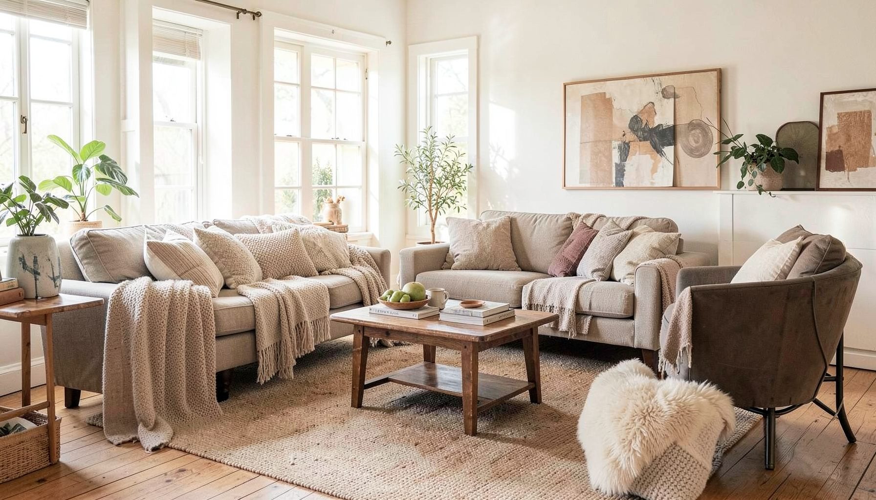
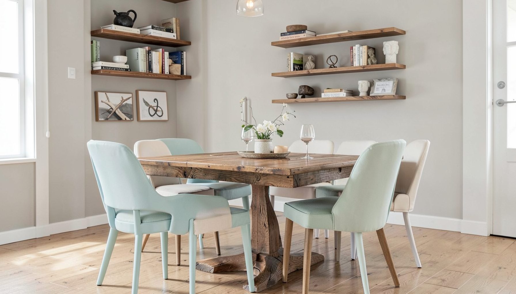
Full-service decorating that blends high and low, vintage finds with modern pieces for spaces that feel personal and collected.
Learn More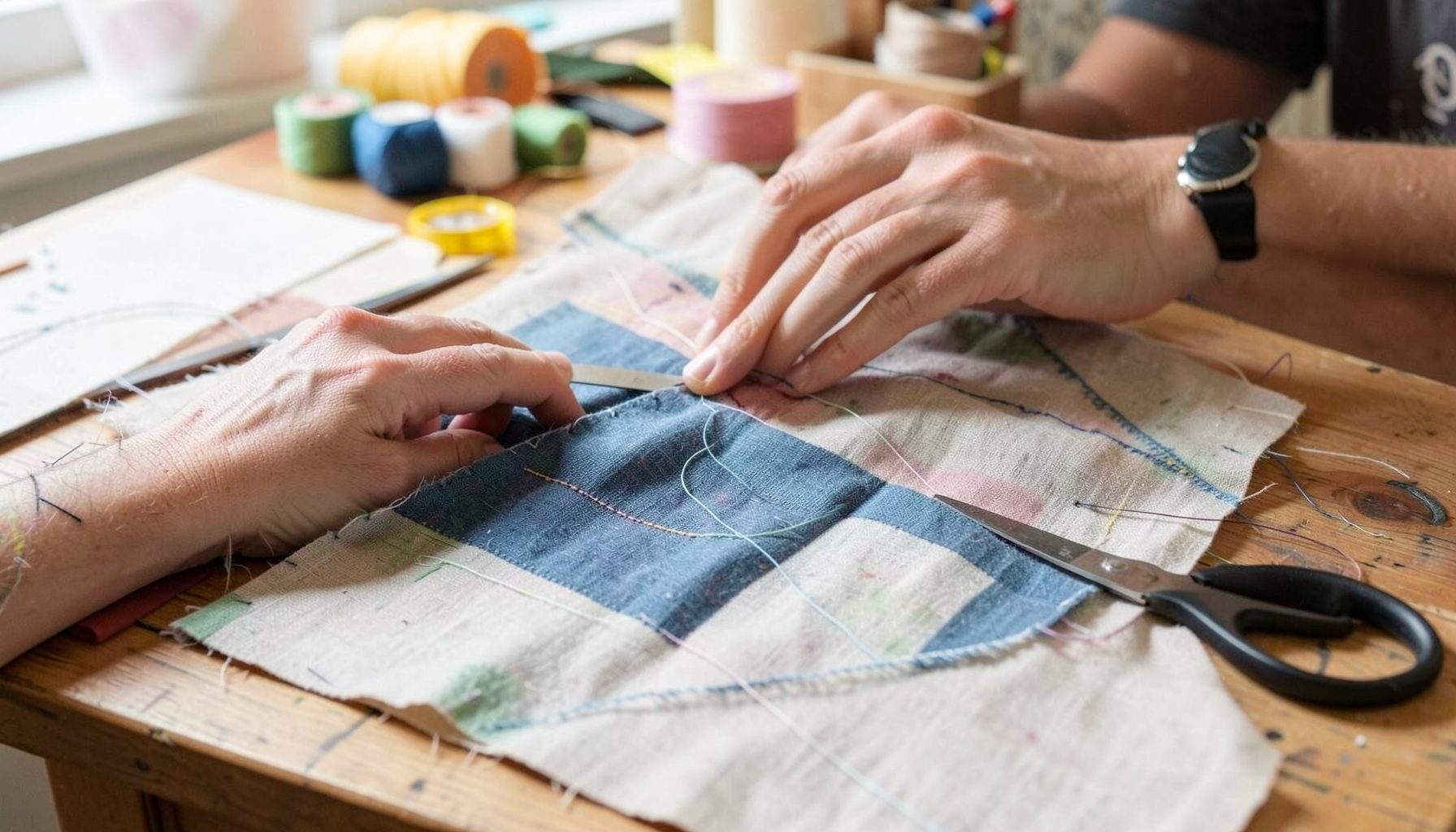
DIY Projects
Step-by-step tutorials for refinishing furniture, sewing pillows, styling bookshelves, and transforming rooms on a budget.
Learn More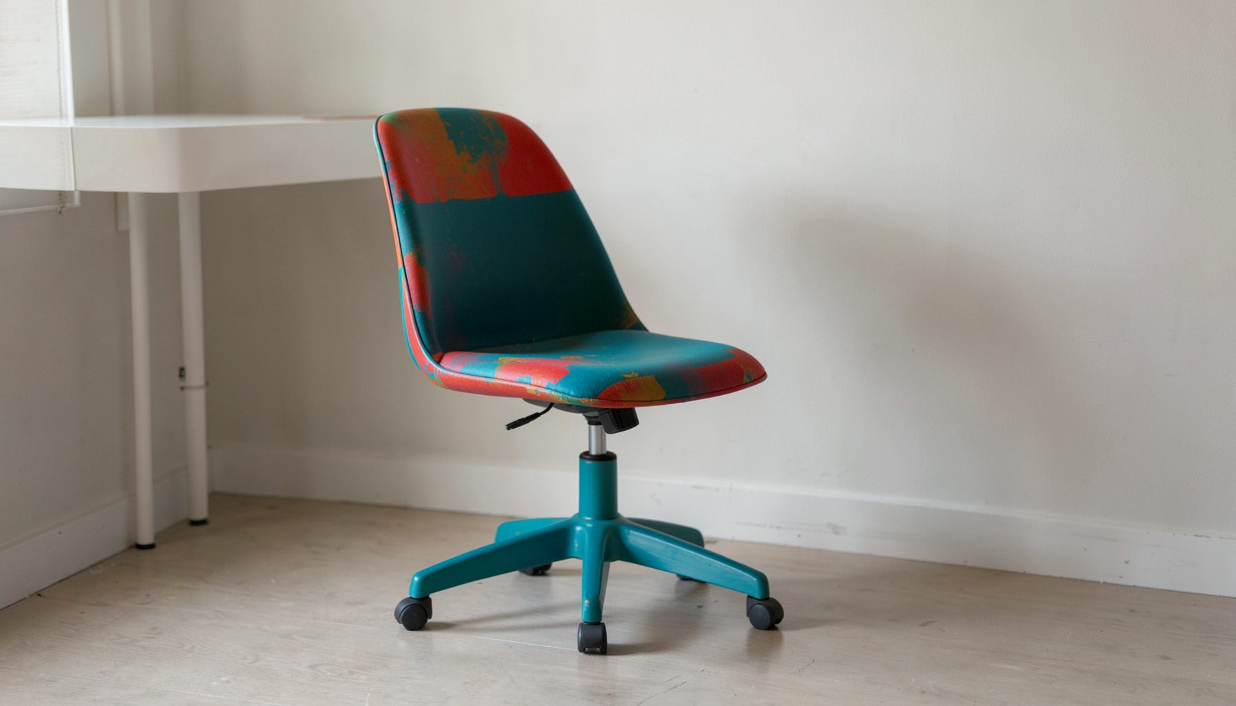
E-Decorating
Personalized design guidance delivered online — perfect for clients anywhere in the world who want a professional eye.
Learn More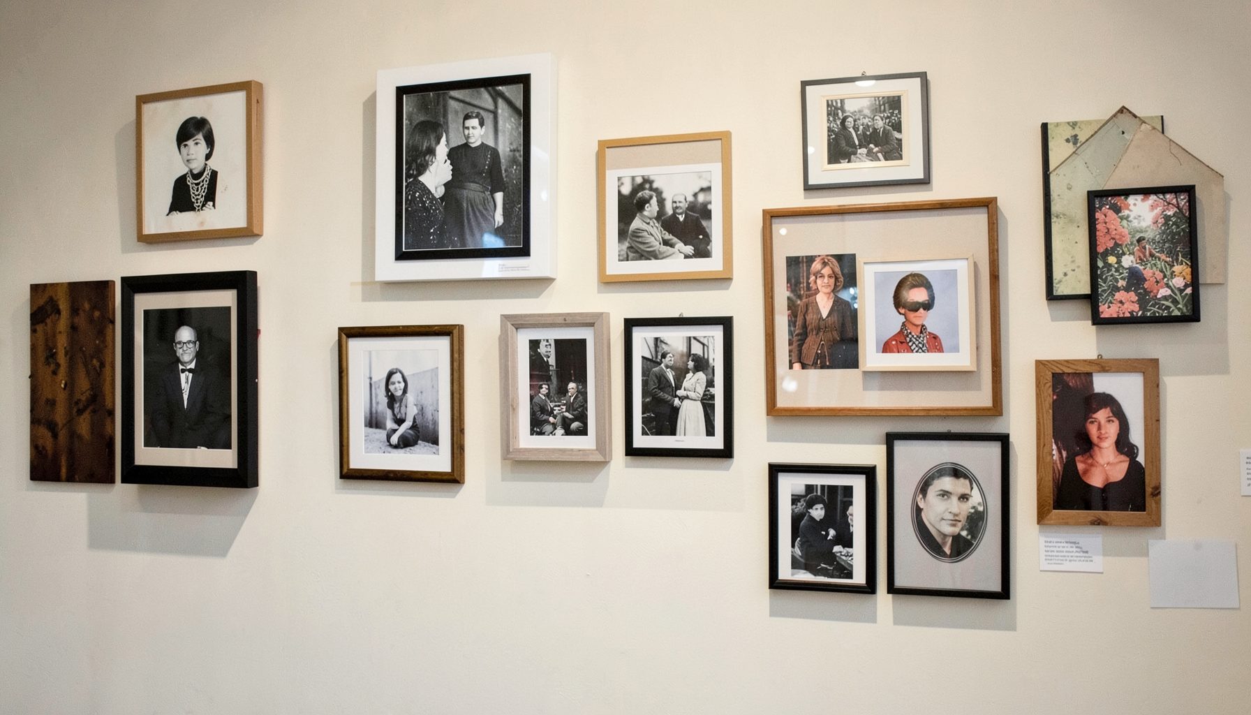
Portfolio
Browse completed room makeovers, before-and-after transformations, and styling projects from Bay Area homes.
Learn More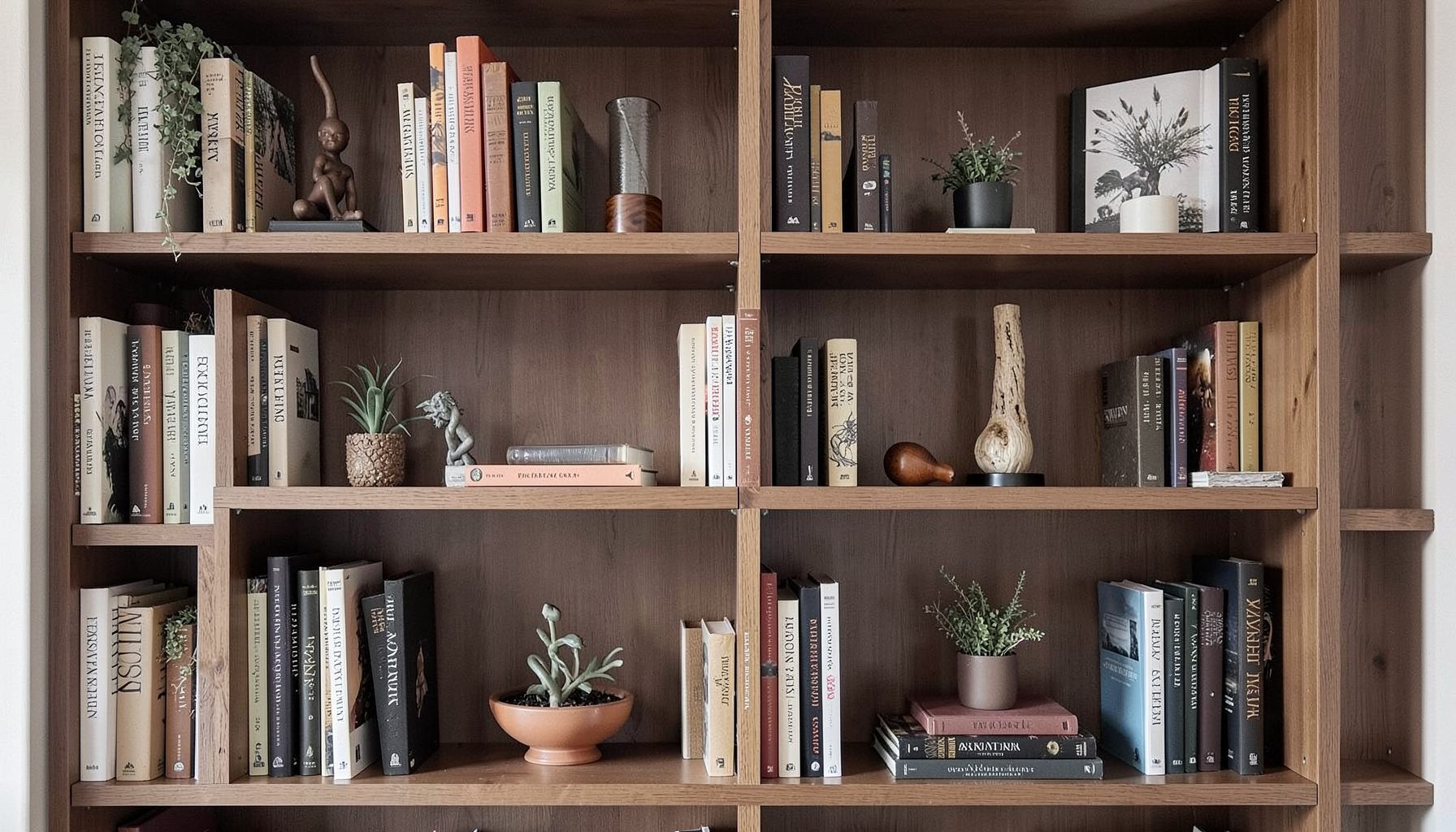
Blog
Interior design inspiration, fashion finds, entertaining ideas, and peeks into real home renovations and styling projects.
Learn More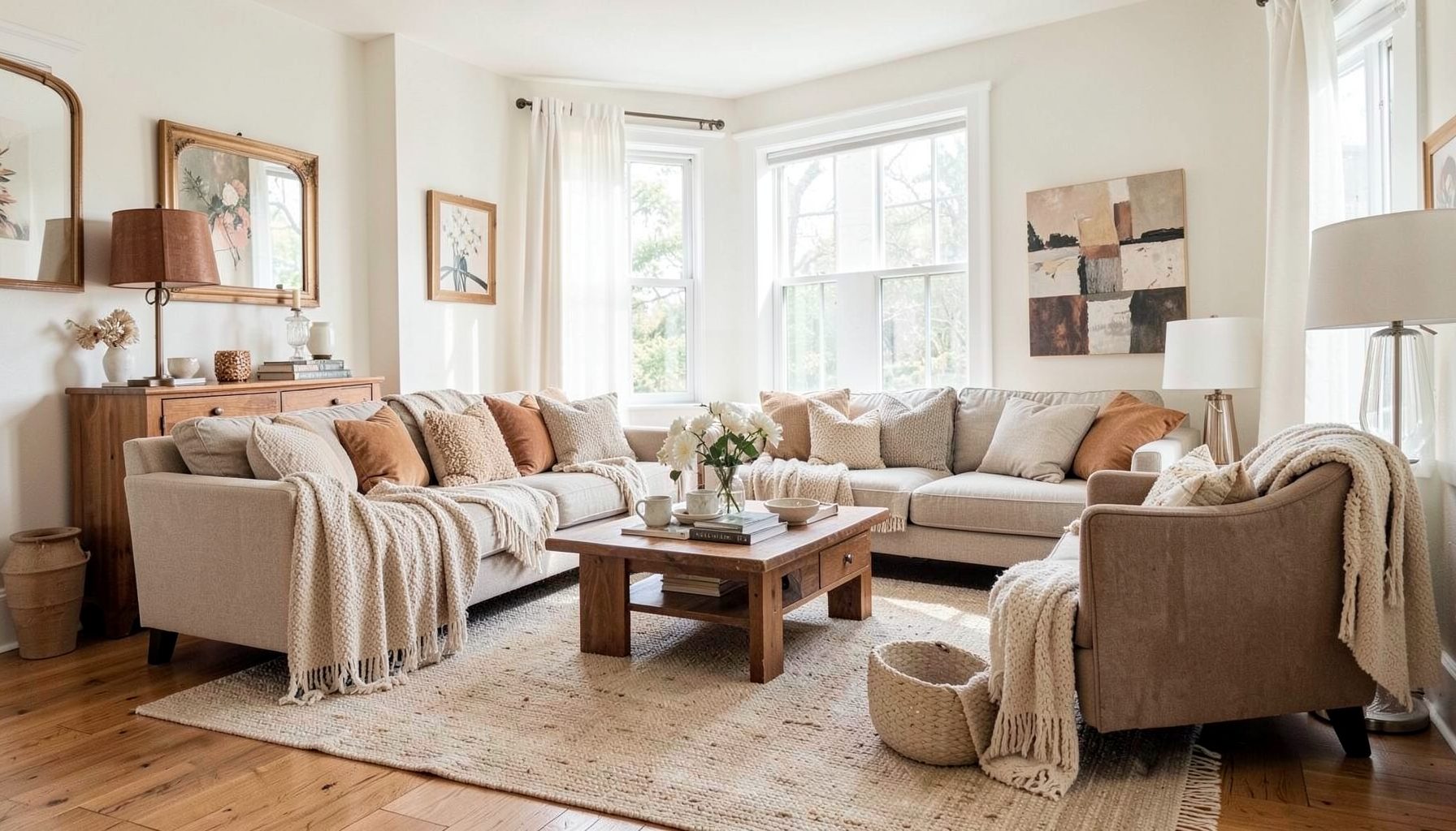
Downloads
Free curated resources for home decorating and design — guides, checklists, and inspiration to help you get started.
Learn MoreCreating A Gallery Wall That Feels Curated, Not Cluttered
A gallery wall can bring warmth, personality and rhythm to a room, yet the difference between collected and chaotic often comes down to a few considered decisions. The most successful arrangements feel as though they have grown over time, with artwork, photographs, textiles and found objects sharing a visual conversation.
This look suits the layered style of Maggie Rose Interiors, where vintage and contemporary pieces sit comfortably together and a home feels personal rather than showroom-perfect. A polished display does not require every frame to match, nor does it depend on expensive original art. It needs a clear point of view, enough breathing room and a relationship between the pieces.
Australian homes provide plenty of interesting opportunities for this kind of decorating. A gallery wall can add character to a narrow Melbourne terrace, soften the long hallway of a Sydney apartment or bring a more collected feel to the open-plan living area of a Brisbane Queenslander. The proportions and architecture may differ, but the principles remain useful.
The aim is to create a display that looks intentional without appearing overly arranged. With a little planning before the first picture hook goes into the wall, you can combine sentimental treasures, locally made pieces and affordable finds into an artwork arrangement that feels relaxed, balanced and distinctly yours.
Start With A Visual Direction
Before choosing frames, decide what you want the wall to communicate. A collection inspired by the coast might include blue-toned abstract art, shell studies, woven textures and sun-faded photographs. A more urban arrangement could combine graphic prints, black-and-white photography, architectural sketches and a bold typographic piece.
This does not mean every item needs to follow a strict theme. Instead, look for a thread that links the collection, such as colour, subject, mood or material. Three or four recurring tones can be enough to make an eclectic group feel cohesive. In a neutral room, rust, olive, ochre or dusty blue can provide the visual connection between otherwise unrelated artworks.
Consider the room’s existing details as part of the palette. Timber flooring, brass lighting, a linen sofa or a painted fireplace can all guide the choice of frames and artwork. The display should belong to the room rather than float independently on the wall.
Mix Pieces With A Common Rhythm
A curated gallery wall usually includes variation, but variation works best when it has a pattern. Pair a large landscape with several smaller works, place a portrait near an abstract print or balance a rectangular frame with a circular mirror. The eye enjoys contrast when the overall arrangement still has a steady rhythm.
A useful starting point is to choose one anchor piece. This might be a large painting, a family photograph, a textile panel or a vintage map. Build outward from it with smaller works that support its scale and colour. Avoid making every item equally important, as a wall full of competing focal points can feel busy very quickly.
You can also repeat one element throughout the arrangement. A consistent frame finish, similar matting, a recurring line colour or a shared subject matter will help disparate pieces relate to one another. In Australian homes, where open-plan living zones are common, this repetition can also help a gallery wall connect visually with nearby furniture and styling.
Choose Frames That Create Breathing Room
Matching frames are the simplest way to create order, but they are not the only option. A mixed-frame gallery can feel warm and collected when the finishes are limited to two or three families. For example, combine aged timber, slim black frames and one or two brass details rather than using six unrelated finishes.
Matting is particularly valuable when artwork varies in colour or size. A generous white or warm neutral mat creates a pause around a busy print and gives smaller works enough visual weight. It also allows you to display pieces purchased from different sources without making the arrangement feel haphazard.
Pay attention to the depth and profile of the frames. Chunky timber suits a relaxed, heritage-inspired room, while slim metal frames can sharpen a more contemporary interior. In a rental, lightweight poster rails, removable hooks and leaning frames on a console may offer a practical alternative to extensive wall mounting, especially when your lease limits fixings.
Plan The Arrangement Before Hanging
The easiest way to avoid unnecessary holes is to plan the layout on the floor. Cut paper templates to match each frame, label them with the artwork title or dimensions, and arrange them on a clear section of floor. Move the pieces around until the composition feels balanced from left to right and top to bottom.
Keep the gaps relatively consistent, although they do not need to be identical. Around five to eight centimetres between frames often feels connected without becoming cramped. Larger works can tolerate slightly more space, while a small salon-style cluster may benefit from tighter spacing. The key is to make the gaps look deliberate.
Once you like the arrangement, photograph it from above. Transfer the templates to the wall using painter’s tape, then step back and check the shape from different parts of the room. This is especially helpful in compact Australian apartments, where a display may be viewed from the sofa, kitchen bench and entry at the same time.
Use Scale To Suit The Wall And Furniture
A gallery wall should relate to the furniture beneath it. Over a sofa, sideboard or bed, the arrangement generally looks most balanced when it occupies around two-thirds to three-quarters of the furniture’s width. A tiny cluster above a large sofa can appear disconnected, while a display that extends too far beyond the furniture may dominate the room.
The centre of the arrangement is usually best positioned around eye level, with the lower edge sitting comfortably above the furniture. Leave enough room for lamps, cushions and decorative objects to remain visually separate. In a hallway, a lower centre point may work better because the display is viewed at closer range and while people are moving through the space.
High ceilings can support a vertical arrangement, while a broad blank wall often benefits from a horizontal composition. In a Melbourne terrace with tall ceilings, extending the display upwards can emphasise the architecture. In a low-ceilinged coastal home, a wider arrangement with generous horizontal movement may feel more relaxed.
Add Unexpected Objects With Restraint
Artwork does not have to mean framed paper alone. A woven basket, small mirror, ceramic wall piece, pressed botanical, vintage plate or embroidered textile can make a gallery wall feel more tactile. These additions are particularly effective in a relaxed Australian interior, where natural materials and handmade objects can soften a formal arrangement.
Use three-dimensional pieces selectively. One or two objects can create a welcome change in texture, but too many may make the wall feel like a crowded collection shelf. Check that anything projecting from the wall is secure and positioned where it will not catch clothing or become vulnerable to knocks.
Sentimental items are often the most meaningful additions. A child’s drawing, a postcard from a trip to Hobart, a family photograph or a small artwork bought at a local makers’ market can sit alongside more polished pieces. For further hands-on ideas, browse these DIY decorating projects for ways to personalise artwork, framing and styling without relying on a large budget.
Edit The Wall Over Time
A curated display does not need to be completed in a single afternoon. Begin with the pieces you genuinely love, then leave the arrangement in place for a few days before deciding what is missing. Living with it will reveal whether one frame feels too dominant, whether the lower edge is too low or whether the wall needs a little more colour.
Editing is as important as adding. Remove anything that feels included merely to fill a gap, even if it is attractive on its own. A gallery wall can look cluttered when every piece has equal visual intensity, so consider taking out one busy print or replacing it with a calmer photograph.
Local sourcing can make this process easier and more affordable. Look through weekend markets, independent galleries, vintage shops, op shops and online marketplaces such as Gumtree for frames and artwork with character. In Australia, standard frame sizes can also make it simpler to find ready-made options from retailers such as Kmart, Target, IKEA or Bunnings, while custom framing remains useful for unusual pieces and valuable originals.
When buying online, check measurements carefully and allow for Australian postage costs, particularly for larger frames or fragile glass. A frame that looks inexpensive can become less of a bargain once delivery is added. For larger displays, sourcing locally may also reduce damage risks and give you the chance to inspect colour, glass reflection and frame quality in person.
Keep the display connected to the rest of the room through styling. Repeat a frame’s timber tone in a side table, echo a print’s ochre detail in a cushion or place a ceramic object nearby in a related colour. This makes the wall feel like part of a larger interior scheme rather than an isolated decorative feature.
Lighting deserves attention as well. Natural light can make artwork glow, but direct sun may fade prints and textiles over time. Avoid placing delicate works where harsh afternoon light reaches them, particularly in west-facing rooms. A discreet picture light, adjustable wall fitting or carefully aimed track light can give the arrangement presence after dark without turning every frame into a glare-filled rectangle.
The strongest gallery walls combine structure with personality. Use a clear anchor, repeat a few visual elements, leave enough space around the frames and allow unusual pieces to have their moment. Then resist the urge to fill every empty patch: the quiet spaces are what let the collection breathe.
Before hanging anything permanently, make paper templates, test the arrangement at eye level and check its relationship with the furniture below. Keep the pieces that feel meaningful, edit anything that competes, and use consistent spacing as your practical guide. The result should feel like a story gathered over time—carefully composed, but still completely at home.

Recent Projects