Interior Design
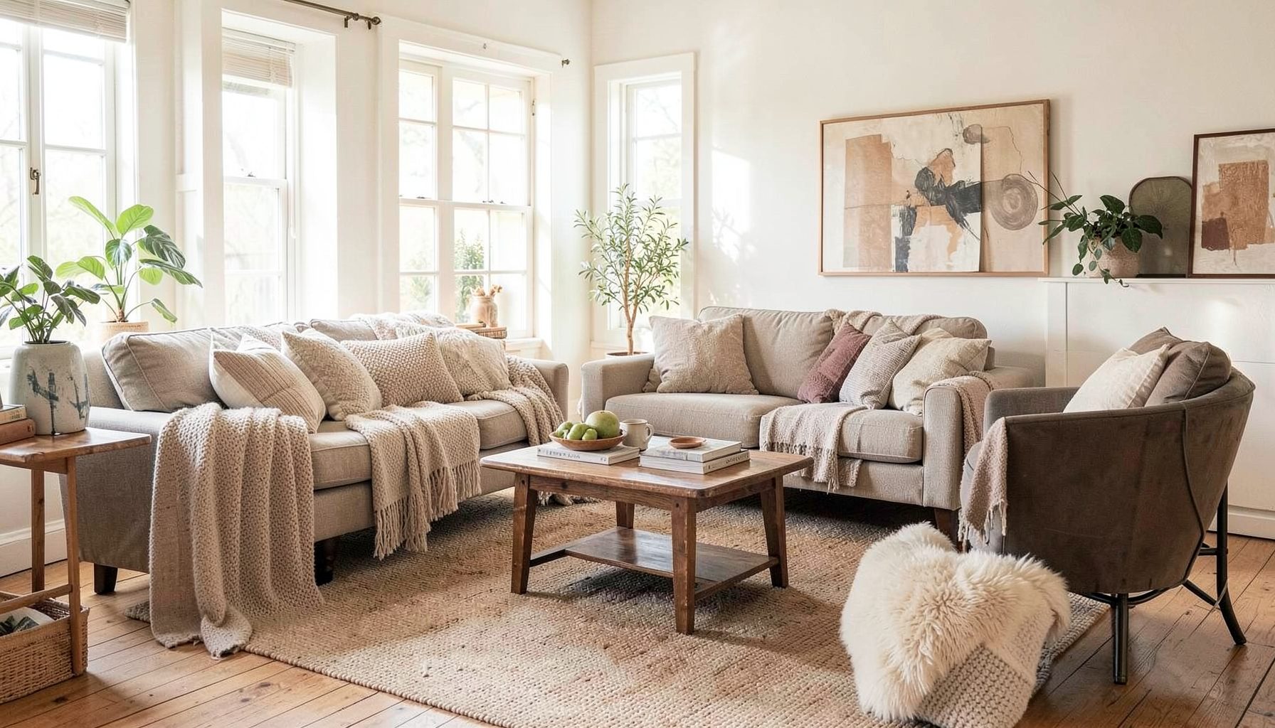
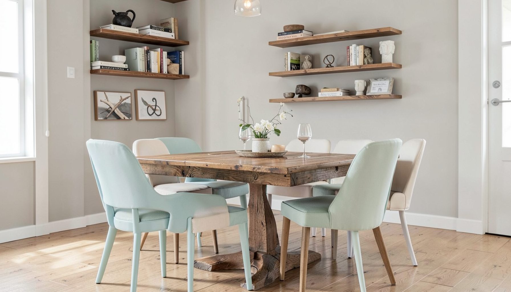
Full-service decorating that blends high and low, vintage finds with modern pieces for spaces that feel personal and collected.
Learn More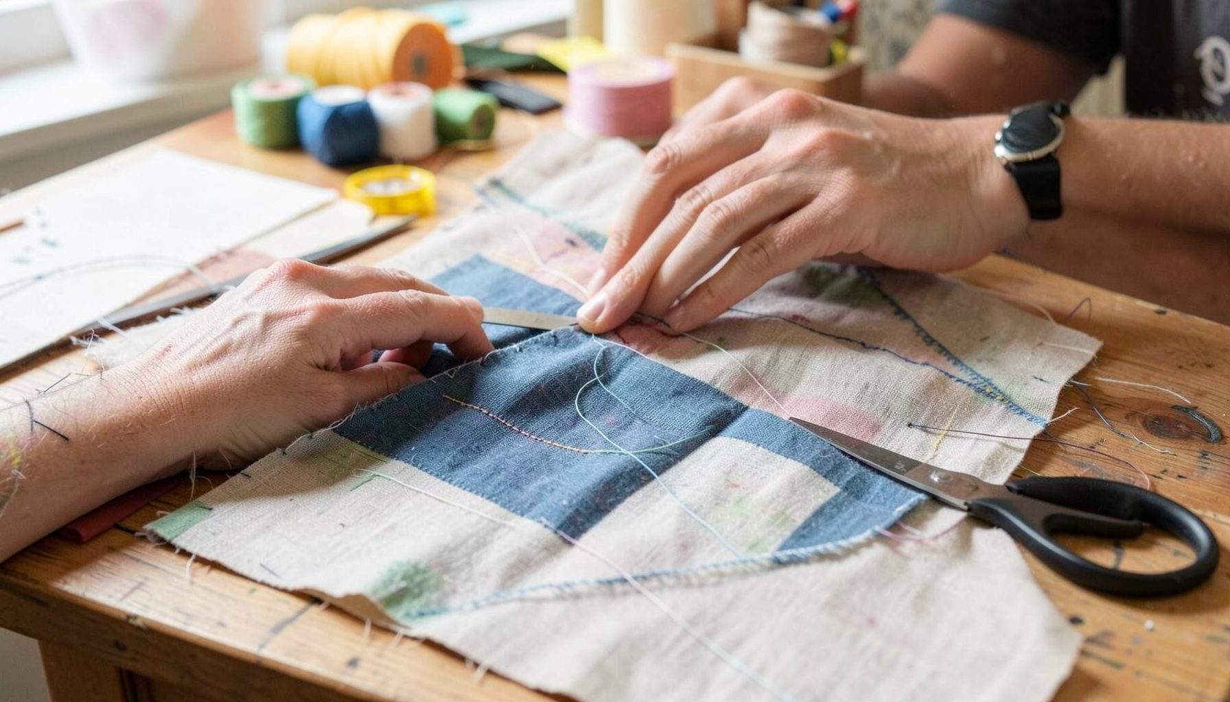
DIY Projects
Step-by-step tutorials for refinishing furniture, sewing pillows, styling bookshelves, and transforming rooms on a budget.
Learn More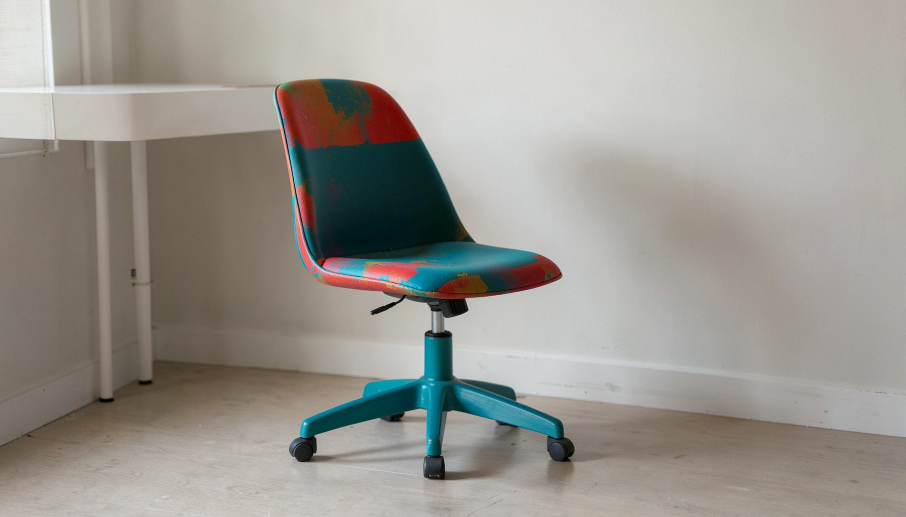
E-Decorating
Personalized design guidance delivered online — perfect for clients anywhere in the world who want a professional eye.
Learn More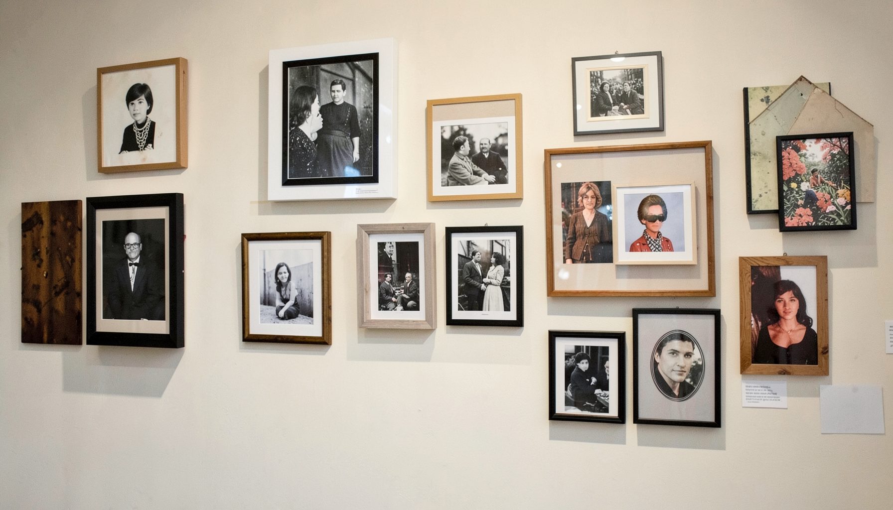
Portfolio
Browse completed room makeovers, before-and-after transformations, and styling projects from Bay Area homes.
Learn More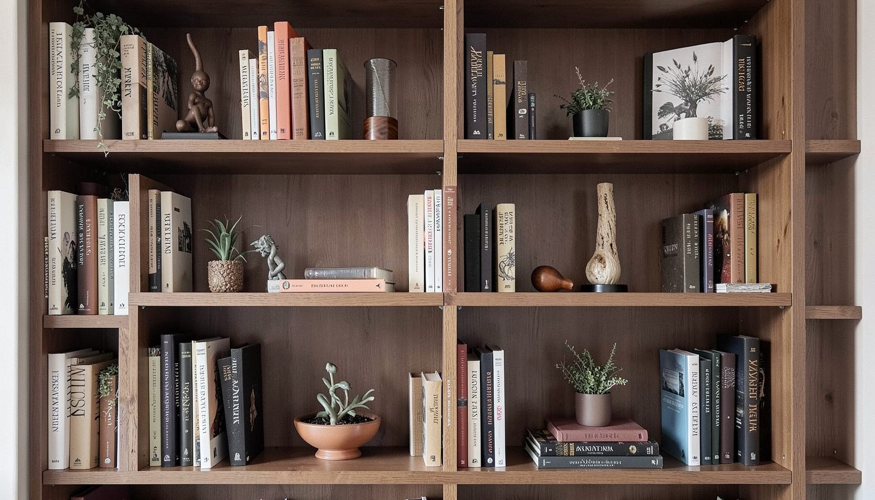
Blog
Interior design inspiration, fashion finds, entertaining ideas, and peeks into real home renovations and styling projects.
Learn More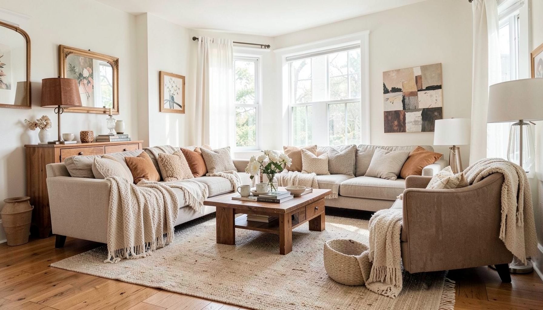
Downloads
Free curated resources for home decorating and design — guides, checklists, and inspiration to help you get started.
Learn MoreCreating a Feature Wall with Shiplap and Contrast
Creating a feature wall with shiplap and a contrasting paint colour can turn an ordinary living room, bedroom or home office into a layered focal point. Horizontal boards add rhythm and texture, while a deeper or more saturated shade gives the composition depth. Done well, the result feels collected rather than overworked: useful, comfortable and closely connected to the people who use the room.
Planning matters in Australian homes, where open-plan layouts, rendered brick veneer and generous windows are common. A wall that looks strong in a mood board can behave very differently in bright summer sun or beside a cool evening lamp. Before ordering timber, settle the wall’s purpose, measure the space and decide whether the boards should cover the full surface or form a lower feature panel.
Choose a Wall Worth Changing
Start with the wall’s job in the room. It may need to anchor a sofa, frame a bed, support a television or give a home office a backdrop, but it should not compete with a fireplace, large window or important artwork. In an open-plan Australian interior, favour an uninterrupted surface where the feature can be seen from the kitchen and living area. Note doors, vents, power points and the path of evening light before choosing paint.
Scale the treatment to the ceiling. Australian homes frequently have ceilings around 2.4 metres, and horizontal boarding can make a room feel lower if it runs to the cornice. In compact Sydney or Melbourne apartments, a panel about 1.8 to 2.1 metres high behind a sofa or desk may feel more generous; a full-height wall can suit a larger Adelaide or Perth room. These are visual tests rather than fixed rules, especially in homes with tall ceilings, covered alfresco areas or stairways.
Decide how much help you need before buying materials. Maggie Rose Interiors offers full-service decorating, online e-decorating and room makeovers, with personalised guidance for clients who want a second opinion. Its completed-project portfolio and DIY tutorials can help you judge scale and finish, while past client feedback offers a useful check on communication, problem-solving and the final result.
Plan the Shiplap Layout
Choose the board material before the colour. Solid timber brings grain, small irregularities and a handcrafted quality, while painted MDF gives a flatter surface and usually costs less. Builders’ merchants and home-improvement stores such as Bunnings and Mitre 10 stock both options, often in metric sizes. Common exposed board heights range from roughly 75 to 150 millimetres, and timber is frequently sold in 2.4 or 2.7 metre lengths. Check the actual profile because the width visible after installation matters more than the label on the pack.
Map the layout before the first cut. Draw the wall to scale, mark every opening and establish one level horizontal line. With genuine overlapping boards, an overlap of about 6 to 10 millimetres can be a practical starting point, but follow the manufacturer’s fixing instructions. Use spacers and a laser level to keep the shadow lines consistent. If you are working with 900 or 1,200 millimetre panels, plan symmetrical cuts around the room’s focal point rather than leaving narrow strips at awkward edges.
Plan the substrate and services as well. Over brick veneer or masonry, timber furring battens provide a reliable fixing surface and allow ventilation behind the boards; use suitable masonry anchors rather than ordinary screws. Locate studs and cables before drilling, and involve a qualified electrician if power points or switches must move. Timber expands and contracts as weather changes, so allow for movement rather than gluing every board rigidly, particularly in Brisbane’s humidity or through Melbourne’s seasonal temperature swings.
Build Contrast with Paint
Contrast can come from the boards, the surrounding wall or both. Deep eucalyptus green against warm white, ocean blue beside oatmeal, or terracotta with a soft cream neighbouring wall all create clear separation. For a relaxed Australian interior, earthy shades often sit comfortably with timber floors and neutral upholstery, but the strongest choice is the one that supports the room rather than simply standing out. If the furniture already carries a strong pattern, a quieter background colour may preserve the layered look.
Test before committing. Paint a 300-millimetre square sample on spare timber or MDF, using the primer and topcoat intended for the final wall, then view it beside the existing floor, skirting and furniture in morning daylight and artificial light. Strong sun can make dark colours warmer and make lighter colours look washed out, a shift that is easy to miss in a small test patch. A larger sample also reveals how a textured board catches light differently from the flat wall.
Choose a compatible paint system from the Australian market. Taubmans, Dulux, British Paints and Resene are among the brands commonly available, although ranges differ by store and state. A satin finish is practical in a busy family room because it is easier to clean, while a matte finish softens reflections and highlights the timber profile. Always use the primer, topcoat and colour recommendation published for your chosen board, particularly for MDF edges, knotty timber and any surface that will be rubbed or knocked.
Install and Finish the Boards
Prepare the wall before it disappears behind the feature. Remove wall art, fittings and loose debris, fill minor holes, and check that the surface is clean and reasonably flat. Sand rough paint gently and vacuum thoroughly. In older Australian properties, especially those built before the 1990s, do not sand or cut suspicious textured coatings or sheets until they have been checked for asbestos; a small area of disturbance can release fibres that should not be inhaled.
Install over a level substrate. Fix furring battens where the wall is masonry, then check them with a straightedge or laser level. Nail or staple solid boards into studs or battens at the fixing points recommended by the profile, keeping the fastener heads flush and the visible line straight. For tongue-and-groove panels, use the manufacturer’s clips or designated fixing points so the boards can move slightly, and maintain the specified expansion gaps at ends and corners. Use a clean cloth to remove marks before the final surface preparation.
Paint in a controlled sequence. Mask the adjoining wall, architrave and fittings, lay a drop sheet, and use a small brush for edges with a roller across the broad faces. Fill nail holes, sand with fine grit and remove the dust before applying primer to bare timber, resinous knots or MDF edges. Let each layer dry as directed, then apply two even topcoats, keeping a wet edge and maintaining the same paint batch where possible. Painting individual boards before installation can be neater, provided there is enough flat space to handle them without marking the finish.
Allow the finish to cure before loading the wall with objects. Add shelves by fixing into studs or suitable anchors rather than relying on the cladding, and keep heavy frames clear until the paint has hardened. Paint skirting and architrave to match the adjacent wall for a continuous background, or repeat the feature colour on the trim for a more deliberate framed effect. Warm-white lamps around 2700K will soften a strong wall colour after sunset and highlight the horizontal texture without making the room feel harsh.
Style the Wall as Part of the Room
Treat the feature as a setting for objects, not a display cabinet. One generous artwork can establish scale, while a smaller arrangement of photographs, vintage pieces and modern ceramics feels more personal. Leave enough exposed boarding to show the installation itself; covering most of the wall with furniture defeats the texture. If the room is a home office that also serves as a guest room, advice on art for flexible rooms can help you choose something that works daily and still feels intentional when visitors arrive.
Build the vignette in layers. A narrow shelf, a framed print, one larger artwork and a plant can create variety without spending heavily on every object. Mix inherited or second-hand pieces with a few better-quality anchors, repeat one colour from the wall in the cushions, and let the timber connect the feature to the floor or furniture. Place a mirror carefully: leaning it against the wall will interrupt the boards, while hanging it nearby can reflect the pattern and extend the room.
Finish by checking the result from the places where you actually sit. Walk past it from the hallway, view it from the kitchen and sit at the desk or sofa to see whether the contrast remains balanced. The next concrete step is to tape a full-size paper template of the intended board layout to the selected wall and view it from the room’s main viewing point.

Recent Projects