Interior Design
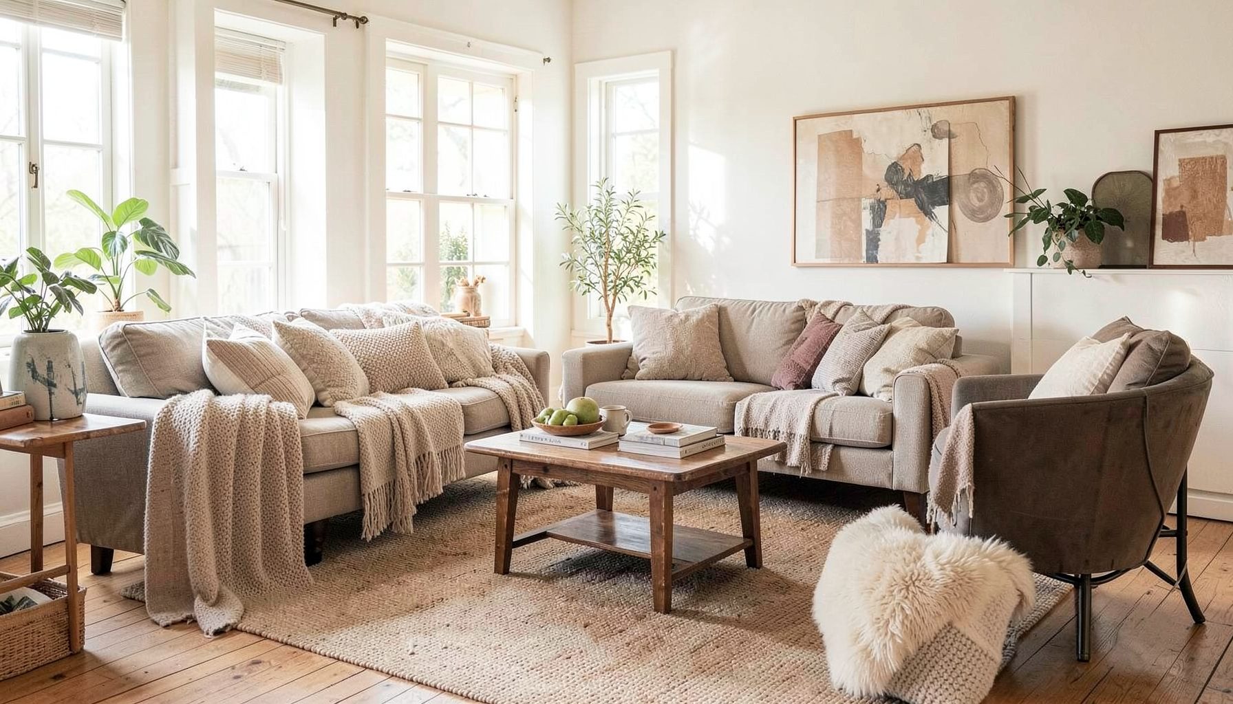
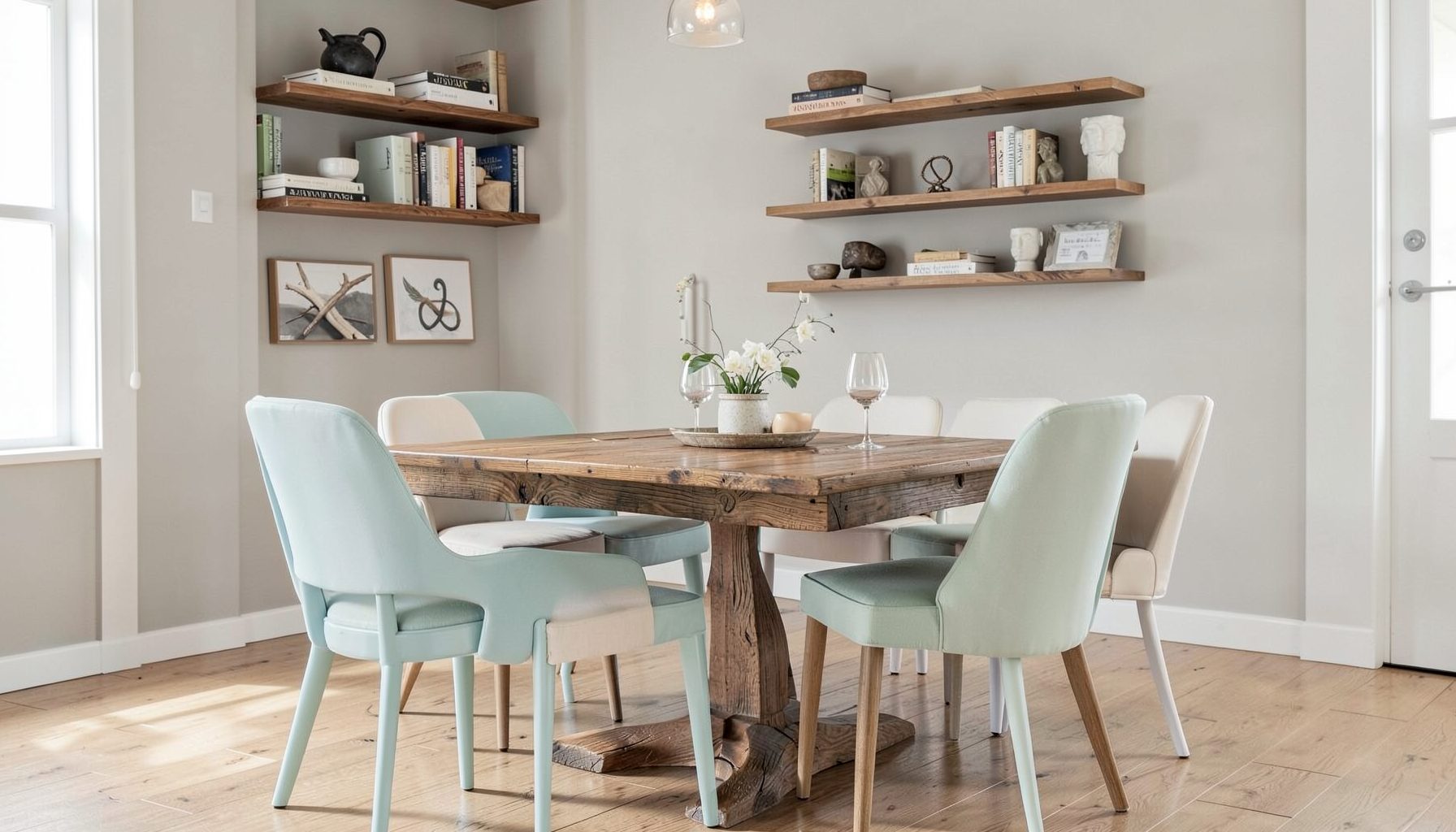
Full-service decorating that blends high and low, vintage finds with modern pieces for spaces that feel personal and collected.
Learn More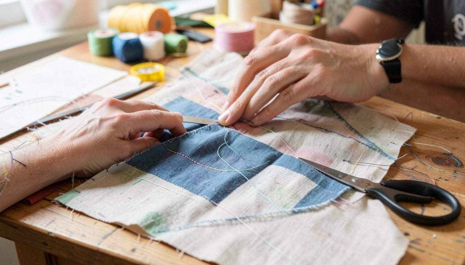
DIY Projects
Step-by-step tutorials for refinishing furniture, sewing pillows, styling bookshelves, and transforming rooms on a budget.
Learn More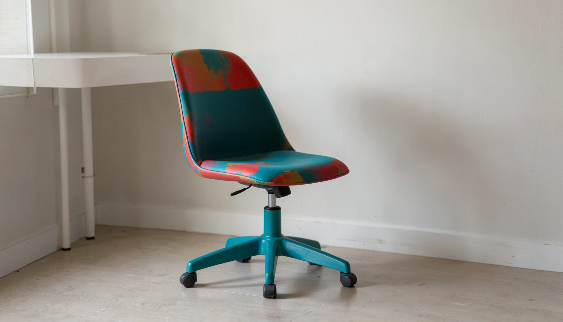
E-Decorating
Personalized design guidance delivered online — perfect for clients anywhere in the world who want a professional eye.
Learn More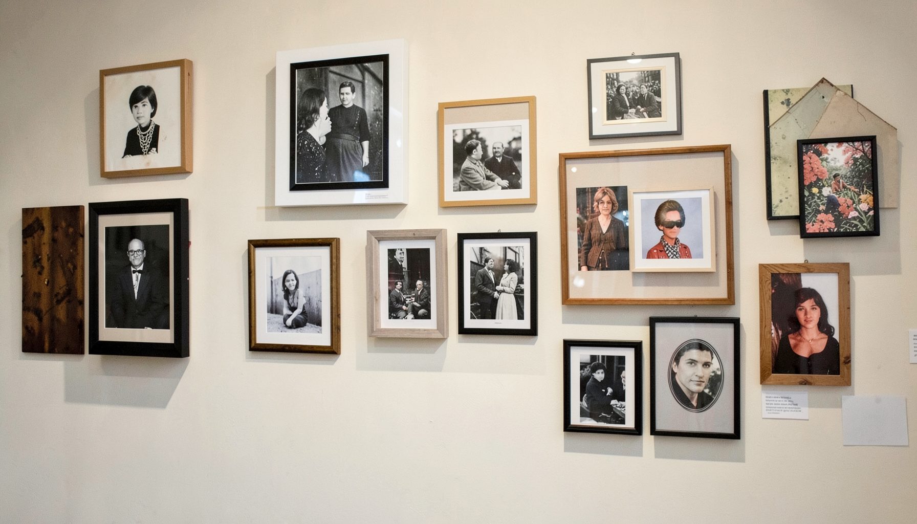
Portfolio
Browse completed room makeovers, before-and-after transformations, and styling projects from Bay Area homes.
Learn More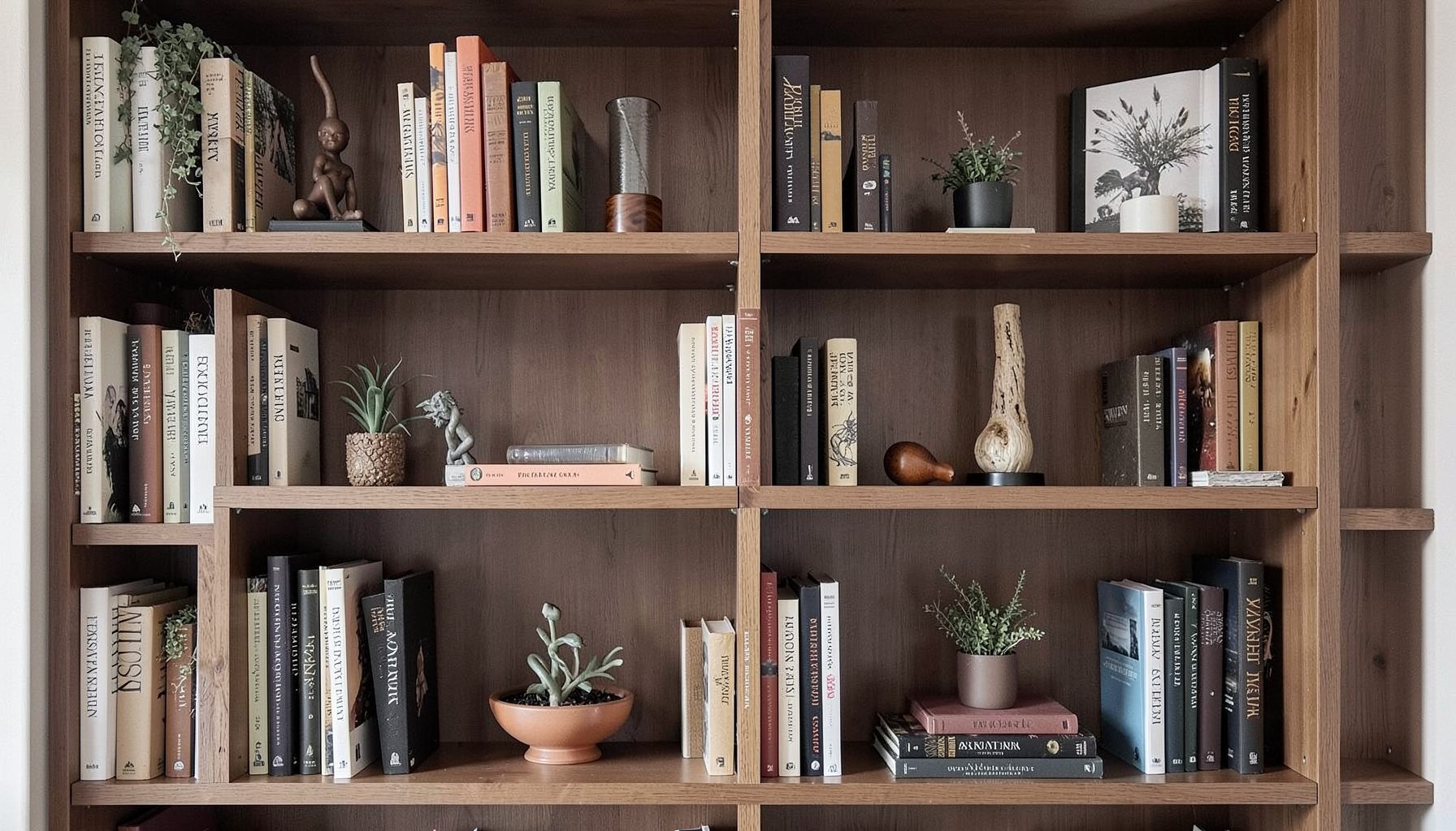
Blog
Interior design inspiration, fashion finds, entertaining ideas, and peeks into real home renovations and styling projects.
Learn More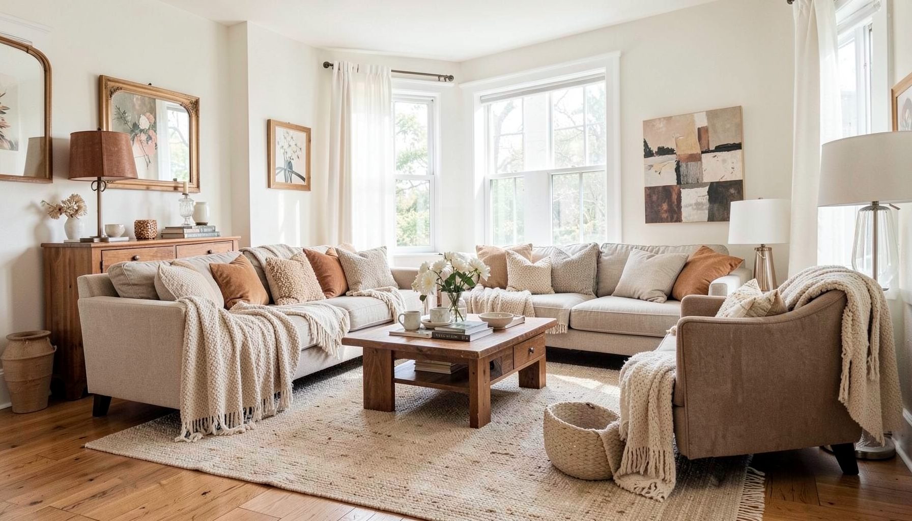
Downloads
Free curated resources for home decorating and design — guides, checklists, and inspiration to help you get started.
Learn MoreArt ideas for the wall between two windows
A narrow wall between two windows often becomes an awkward leftover in a living room, dining area or bedroom. Daylight draws attention to the empty space, while the windows create strong vertical edges that can make a small artwork feel cramped. A well-chosen piece can act as a calm focal point, connect the architecture and give the room a more finished sense of balance.
Choosing art for this position requires more than finding an image you like. The wall’s proportions, the direction and intensity of the light, nearby furniture and the character of your home all affect the result. Measure first, compare options in place and think beyond the frame. The strongest choice may be a single horizontal work, a pair of related prints, a layered collection or something entirely personal.
Measure the space and find its purpose
Begin with the usable wall area, not simply the distance from one window reveal to the other. Note the ceiling height, skirting profile, light switches, vents and any furniture that will sit below the art. Narrow walls between windows are common in Sydney terraces and weatherboard homes, while Melbourne’s Victorian and Edwardian semis frequently feature similar proportions. In either setting, a small gap can still feel prominent because it interrupts a long run of joinery, plasterwork or doors.
Decide what the artwork needs to do. If a console, sideboard, bed or banquette sits beneath it, the art can visually complete that furniture and make the arrangement feel intentional. If the wall remains empty, the piece may need greater scale to hold its own against the windows. An open wall can accommodate a deeper frame or sculptural object, whereas a shallow section above cabinetry usually calls for something flatter and more restrained.
Proportion is the next consideration. Artwork generally works best at around two-thirds to three-quarters the width of the furniture below it, with a gap of roughly 15 to 25 centimetres between the frame and the furniture. The bottom edge should not float too high, particularly in a formal living room, but it should also avoid crowding the surface. Use painter’s tape to mark the proposed dimensions on the wall and step back from the doorway. This simple test often reveals whether a diptych, horizontal painting or compact vertical work fits the space better than a large single frame.
Read the changing daylight
Light has a major influence on colour, texture and perceived size. A wall facing north in Brisbane may receive strong sun for part of the day, while a west-facing wall in Perth can become intensely bright in the late afternoon. Sydney homes may catch sharp coastal glare, and Melbourne’s variable weather can make the same artwork look different from morning to evening. Pale or glossy glazing can also create reflections that compete with the art.
Photograph the empty wall at several times of day and notice whether the light is direct, filtered or evenly diffused. Strong sunlight can fade vulnerable pigments, printed photographs and natural fibres over time. Subtler colour may disappear in glare, while highly saturated work can look harsh when hit by direct rays. A photograph or botanical print might benefit from a mat and protective glazing, while an oil painting can handle changing light differently because of its depth and surface.
Framing materials matter in Australian conditions. UV-filtering acrylic or conservation-grade glass can reduce fading, and a mat can soften reflections. In humid rooms, avoid inexpensive backing boards that readily absorb moisture and choose frames made from stable timber, metal or suitable composite materials. If the wall receives little natural light, a carefully positioned picture light may reveal colour and texture more effectively than relying on the windows alone.
Match the format to the wall
A single horizontal artwork often suits a narrow wall because it echoes the line of the windows without appearing trapped between them. For a wall measuring roughly 85 to 110 centimetres, a wide landscape, abstract composition or panoramic photograph can feel confident without dominating the room. The frame should have enough presence to register from the main seating position, but it does not need to extend into the window reveals.
A diptych or triptych can create a different rhythm. Two related pieces with a small gap between them can make the wall feel taller and more architectural, especially when each work is narrow. The images should feel connected through colour, subject or scale rather than being selected merely because they fit the same opening. A salon-style arrangement offers more flexibility, combining different sizes and frame styles, but it works best when the overall shape has a clear edge and the spacing is controlled.
Vertical proportion suits a narrow wall that extends well above a console or bed. A tall print can draw the eye upwards and balance the strong geometry of two windows. This format can feel too narrow in a low room, however, and can become top-heavy if its bottom edge sits too high. Leave enough breathing room around the composition, particularly where curtains, pelmets or furniture create additional lines nearby.
Select artwork that reflects the room
The subject should connect with the way the room is used and the objects already in it. In a layered interior, a traditional botanical print can sit comfortably beside a modern abstract painting, vintage frame or sculptural lamp. Family photographs, collected travel images and meaningful pieces of Australian design can make the wall more personal than a generic decorative print chosen only to match the colour scheme.
Local makers offer a rich source of distinctive work. Adelaide’s SALA Festival brings together artists, printmakers and ceramic designers, while Melbourne’s studio culture and design markets support many small-scale editions. Across Australia, buyers can find original paintings, limited prints, textile art and affordable reproductions from local sellers. When prices are shown in Australian dollars, check whether GST is included and whether the quoted dimensions include the frame, as this can affect both the budget and the available wall space.
First Nations artwork should be purchased directly from the artist or through a reputable gallery, with clear information about the artist, story and rights. It also deserves careful placement and thoughtful context rather than being used as a generic motif. For practical ideas on filling awkward gaps without overspending, these budget-friendly wall art options show how existing collections can be rearranged, reframed or combined with inexpensive finds.
A mixed-media arrangement can introduce texture and personality, but each element should have a reason to be there. Grouping several small works close together can look richer than one oversized piece, while a large simple work can provide calm within a busy room. Consider how the palette changes throughout the day and how the art relates to nearby rugs, upholstery, timber and metal finishes.
Coordinate the frame, furniture and installation
The frame should support the artwork and relate to the room without making every element compete. One substantial frame with a simple moulding can anchor an eclectic arrangement of smaller pieces. Conversely, matching frames can make unrelated images feel overly uniform. Mat colours such as warm white, soft ivory or pale timber often bridge vintage and modern furnishings, while black or dark metal frames create a sharper graphic effect.
Lighting, curtains and furniture should be considered before the artwork is ordered. Check that the frame will not clash with a lamp, pelmet or window treatment, and leave enough space for furniture to be used comfortably. If artwork will sit above a sideboard, style the surface lightly so it remains part of the composition rather than creating a crowded second display. In a dining room, allow for chairs to be pulled out and for people to move around the table.
Install the art after the main furniture is in place. Mark the centre and use a level before fixing the hooks, then have a second person help lift the frame into position. For a light frame in a rental or temporary setting, suitable hanging strips may be practical, while heavier or valuable work needs proper wall anchors suitable for the wall type. The Maggie Rose Interiors approach to layered, collected spaces often combines vintage pieces with modern art and a mixture of considered and budget-friendly furnishings. That balance can make the narrow wall feel rich without becoming overly styled.
A useful way to approach the project is to gather several images in the same scale and compare them beside the wall. Narrow the selection according to fit, light and emotional response, then adjust the frame, mat and arrangement. Measure the final outer dimensions one last time, including any hanging hardware, before ordering.
The practical takeaway is straightforward: measure the usable wall, observe the light and choose the art to suit both. Once those three elements work together, the space between two windows can become a deliberate focal point and one of the most characterful parts of the room.

Recent Projects