Interior Design
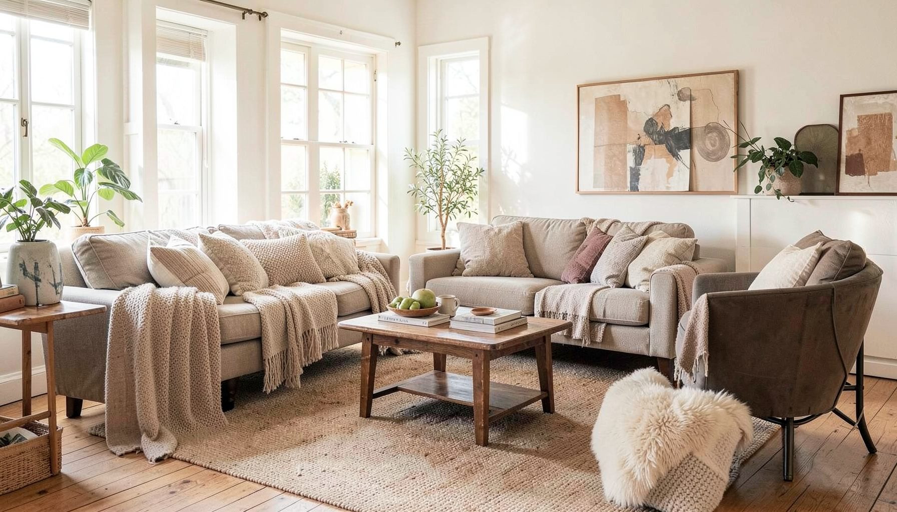
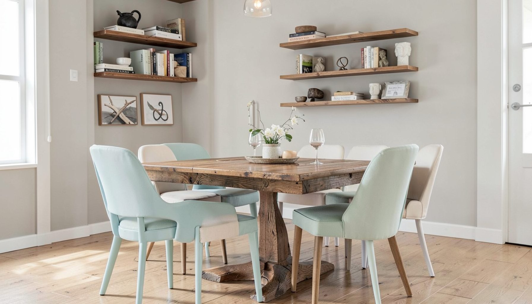
Full-service decorating that blends high and low, vintage finds with modern pieces for spaces that feel personal and collected.
Learn More
DIY Projects
Step-by-step tutorials for refinishing furniture, sewing pillows, styling bookshelves, and transforming rooms on a budget.
Learn More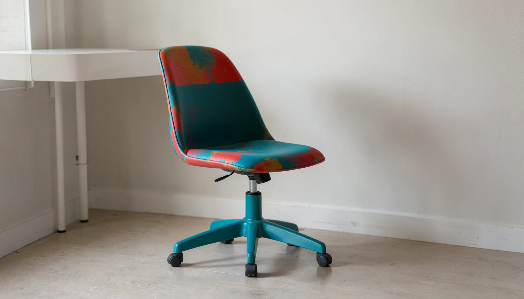
E-Decorating
Personalized design guidance delivered online — perfect for clients anywhere in the world who want a professional eye.
Learn More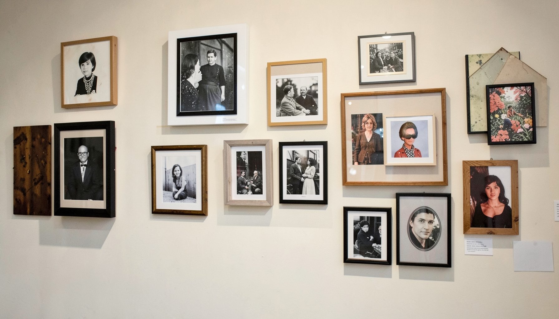
Portfolio
Browse completed room makeovers, before-and-after transformations, and styling projects from Bay Area homes.
Learn More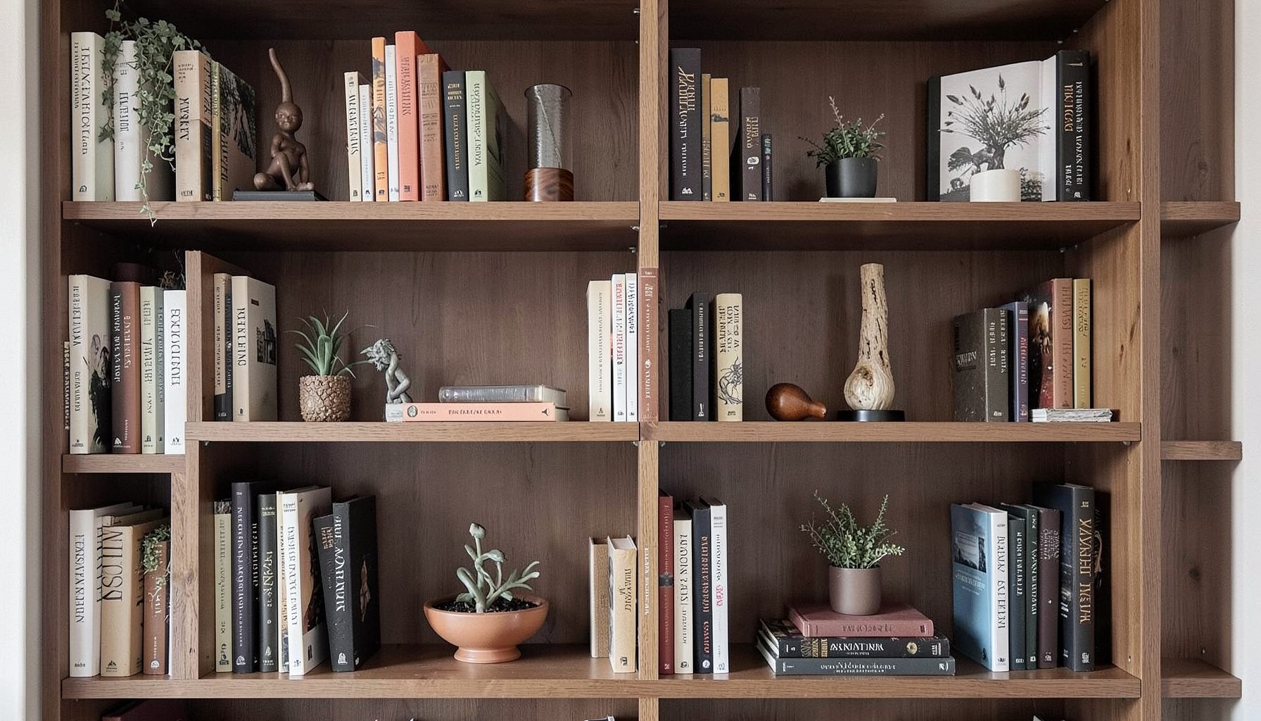
Blog
Interior design inspiration, fashion finds, entertaining ideas, and peeks into real home renovations and styling projects.
Learn More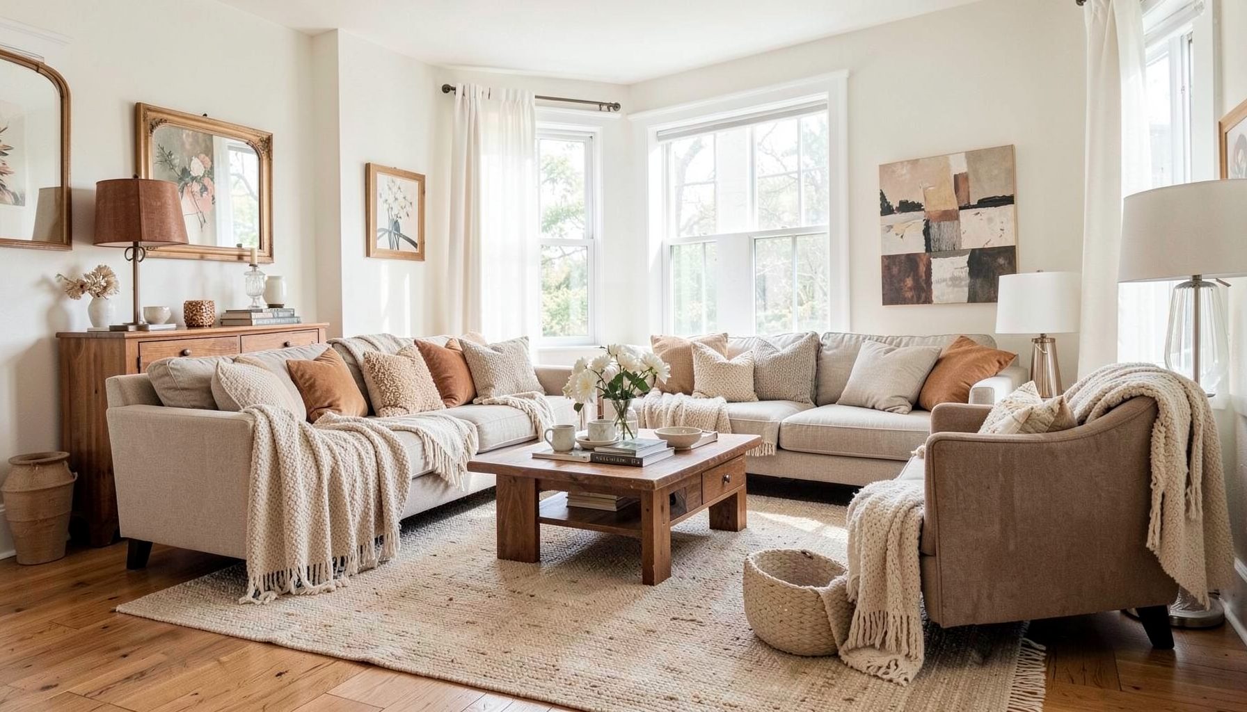
Downloads
Free curated resources for home decorating and design — guides, checklists, and inspiration to help you get started.
Learn MoreChoosing a Colour Scheme for an Open-Plan Living Area
An open-plan kitchen, dining and living area needs a colour palette that feels connected without becoming flat. With fewer walls to separate functions, every shade influences the atmosphere of the entire space, from the first coffee in the kitchen to a relaxed dinner and an evening on the sofa.
The most successful schemes usually combine a calm architectural colour with warmer supporting tones, varied textures and carefully placed accents. This creates gentle transitions between zones while allowing the room to feel collected rather than matched from a single showroom display.
Australian homes bring their own considerations to the process. Strong northern light, pale timber floors, compact apartment layouts and a natural preference for indoor-outdoor living can all affect how a colour appears. The right palette should suit the light, the building and the way your household actually uses the room.
Start With Light And Fixed Finishes
Before choosing paint, examine the permanent elements in the room. Kitchen cabinetry, stone benchtops, splashbacks, flooring, window frames and large architectural features will occupy more visual space than a few cushions or artworks. Their undertones should guide the colour direction rather than be treated as an afterthought.
Place sample boards around the room and view them at different times of day. A warm white can look soft and creamy in a Melbourne kitchen on an overcast morning, then noticeably yellow in strong afternoon sun. Cool grey may appear crisp near a bright window but become chilly beside charcoal cabinetry or polished concrete.
Australian sunlight can be especially intense in north-facing rooms, while western windows may cast a golden glow late in the day. If the area opens to a deck or courtyard, look at the exterior colours as well. Red brick, sandstone paving, gum trees and a green garden can all reflect into the room and subtly change how neutral walls are perceived.
Paint samples should be large enough to judge properly, and they should sit beside the flooring and benchtop. A small colour card can be deceptive. Test the shortlisted shades on foam board so they can move from the kitchen to the dining area and living room, allowing you to see whether the palette remains balanced across the whole open space.
Build A Flexible Base Palette
A useful open-plan colour scheme often begins with three layers: a grounding colour, a connecting neutral and one or two accent families. The grounding shade might come from timber flooring, a rug or dark joinery. The connecting neutral can appear on walls, upholstery or larger furnishings. Accent colours then bring personality through art, textiles, ceramics and occasional furniture.
This approach is more adaptable than assigning one colour to each function. Painting the kitchen blue, the dining area beige and the living room green can make an open room feel visually chopped up. Instead, use one consistent wall colour and create subtle differences through texture, tonal variation and furniture placement.
Warm whites, soft greiges, putty tones, clay colours and muted olive can work beautifully with Australian materials. A sandy neutral can echo coastal light without making the room feel themed, while a smoky blue-grey can provide depth in a contemporary apartment. If the fixed finishes are cool, introduce warmth through woven baskets, aged brass, walnut, terracotta or tan leather.
A layered palette also leaves room for pieces with history. A vintage dining table, modern pendant, budget-friendly sofa and hand-thrown vase can sit comfortably together when they share a restrained colour relationship. For additional decorating inspiration, look for spaces where colour is repeated in small, imperfect details rather than applied identically everywhere.
Define Zones Without Breaking The Flow
Colour can help distinguish the kitchen, dining and living functions, but it should do so quietly. The kitchen might carry the darkest tone through cabinetry or a runner, the dining area may introduce a richer wall textile or artwork, and the living zone can soften the scheme with upholstery and layered rugs.
Repeat key colours across the room to make these transitions feel intentional. If the kitchen has a muted green island, bring a similar green into a dining artwork or living-room cushion. A clay-coloured pendant might be echoed in a ceramic bowl, a patterned rug or the spine of a decorative book. Repetition creates rhythm, while variation keeps the space from feeling overly coordinated.
Rugs are especially useful in an open layout because they establish visual boundaries without blocking sightlines. In the living area, choose a rug large enough for at least the front legs of the seating to sit on it. Under the dining table, a generously sized flatweave allows chairs to move back without catching on the edge. Similar undertones can link the rugs even when their patterns differ.
Furniture orientation matters as much as colour. A sofa can mark the living zone, while a pendant centred over the dining table gives that area its own identity. In a smaller Australian apartment, a large piece of art or a change in rug texture may be enough to signal the shift from cooking to dining to relaxing without adding visual clutter.
Balance Bold Colours With Restraint
A strong colour can make an open room memorable, but it needs breathing space. Rather than spreading a vivid shade across every surface, choose one meaningful location: the island cabinetry, a built-in bookcase, a pair of dining chairs or a dramatic artwork. The rest of the room can support it through quieter, related tones.
Deep navy, forest green, rust, burgundy and ochre can all work well when balanced by natural materials. In a sunny Queensland home, rich colours may look vibrant and energetic, so use them with chalky whites, pale oak or woven textures. In a darker south-facing room, the same colours may feel heavier, making warm lighting and lighter upholstery important.
A practical rule is to use the strongest colour in smaller quantities than the supporting neutrals. This does not mean every accent must be tiny. A large patterned rug can be bold if its colours are softened by a restrained background and repeated sparingly elsewhere. The goal is a visual hierarchy: the eye should know where to land.
Consider how the palette will look during everyday Australian routines. A home that handles a quick brekkie, school bags, weekend guests and an arvo drink needs finishes that are forgiving and colours that do not show every mark. Mid-toned upholstery, washable slipcovers and textured surfaces often offer a more livable result than an all-white scheme, especially in a busy open-plan space.
Add Texture, Pattern And Personal Character
Colour becomes more convincing when it is supported by texture. Linen curtains, timber grain, boucle upholstery, woven pendant lights, stone, aged metal and glazed ceramics each reflect light differently. These variations prevent a neutral room from looking blank and give a restrained palette a sense of depth.
Pattern can perform a similar role. A striped cushion, botanical fabric, geometric rug or framed textile may contain several colours that help unite the kitchen and living areas. Choose patterns that share at least one tone with the larger furnishings, then allow their scale to vary. A small motif on cushions can sit beside a larger rug design without competing for attention.
Personal pieces are often what make a colour scheme feel finished. A collection of coastal ceramics, an inherited timber cabinet, travel photographs or artwork from a local maker can introduce colours that would be difficult to select from a paint fan alone. These objects tell you which accent shades deserve to be repeated and which should remain occasional.
Styling should happen gradually. Live with the main furniture and window treatments first, then add lamps, art, books and smaller decorative pieces. This is particularly useful when working with the Australian design market, where furnishings may arrive at different times and custom upholstery or locally made pieces can have longer lead times. A flexible base palette prevents the room from feeling unfinished while you wait.
The best open-plan palette is one that supports real life while giving the room a clear visual identity. Begin with the light and fixed finishes, select a calm connecting neutral, then build character through repeated accents, natural materials and meaningful objects. Keep the strongest colours purposeful, define zones with rugs and furniture, and let texture do as much work as paint.
What the reader should remember is simple: an open room does not need identical colours everywhere. It needs relationships between colours, finishes and furnishings, so the kitchen, dining area and living space feel distinct, comfortable and part of the same home.

Recent Projects