Interior Design
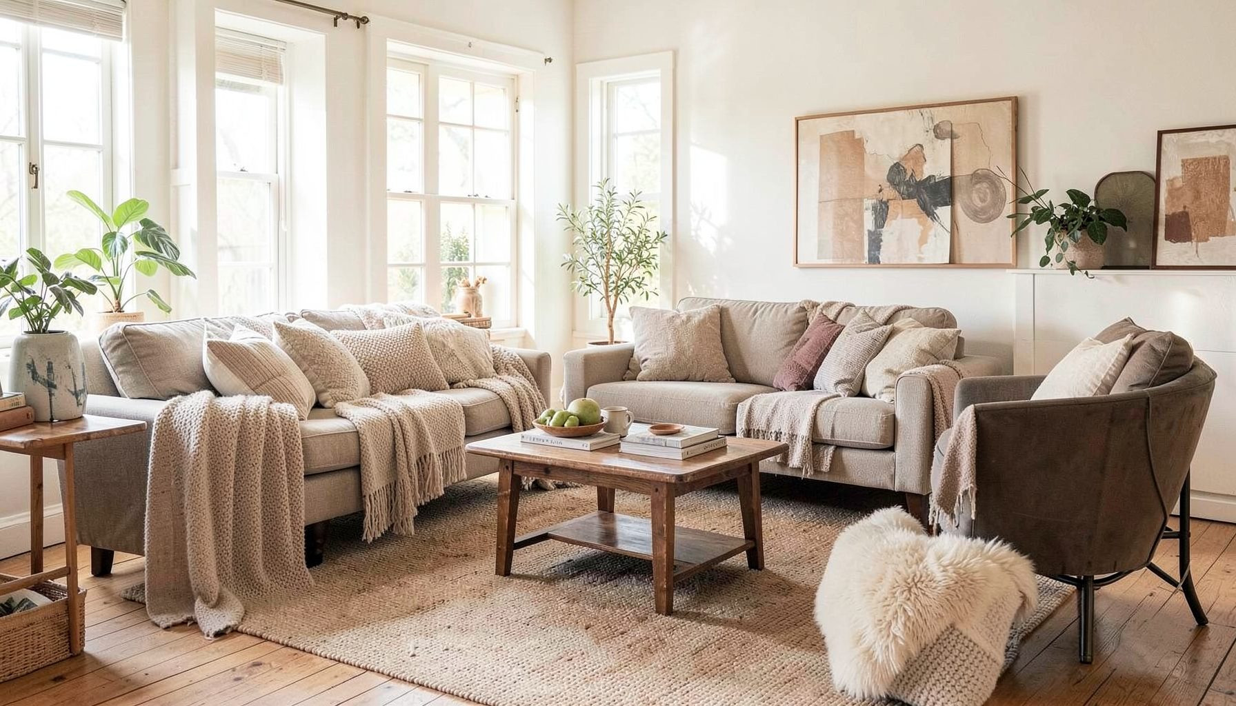
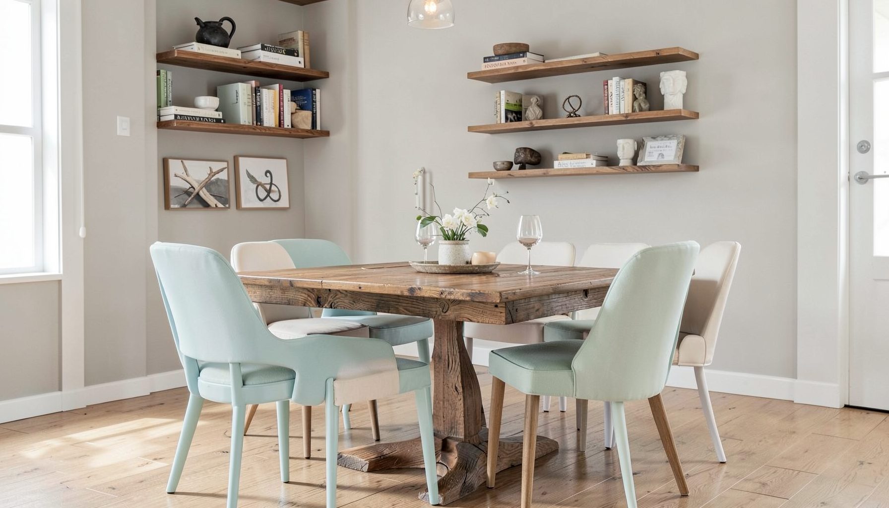
Full-service decorating that blends high and low, vintage finds with modern pieces for spaces that feel personal and collected.
Learn More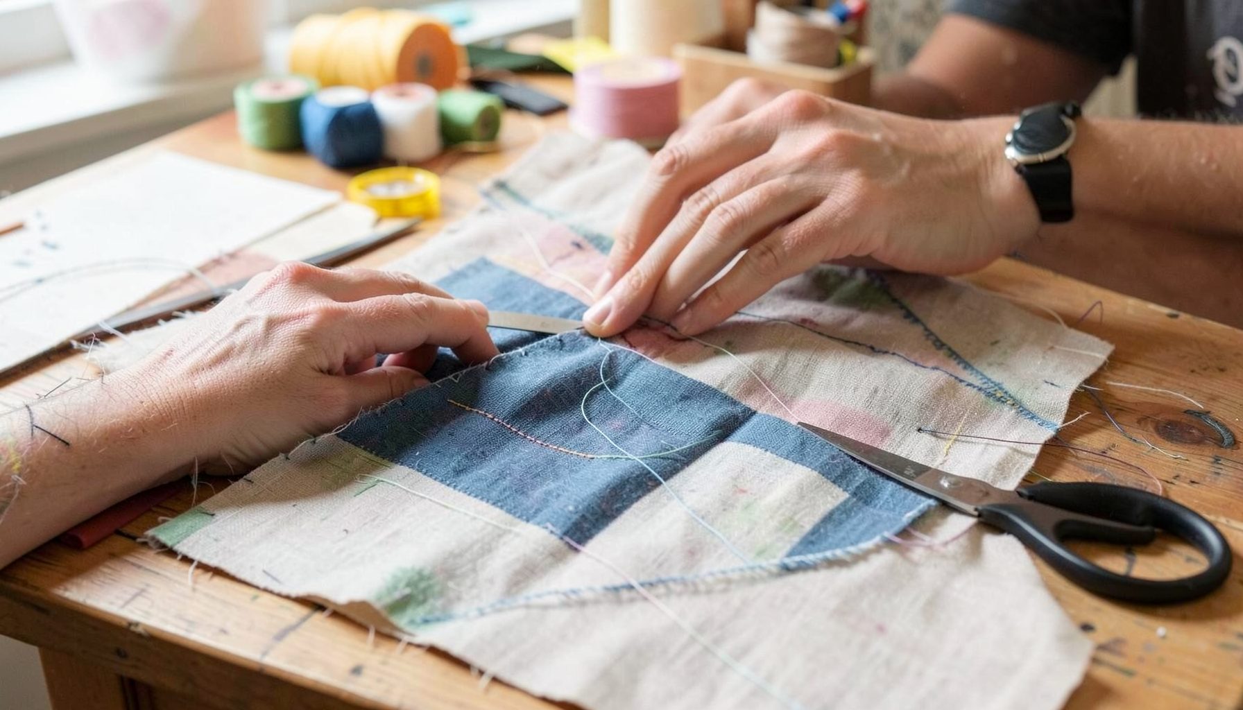
DIY Projects
Step-by-step tutorials for refinishing furniture, sewing pillows, styling bookshelves, and transforming rooms on a budget.
Learn More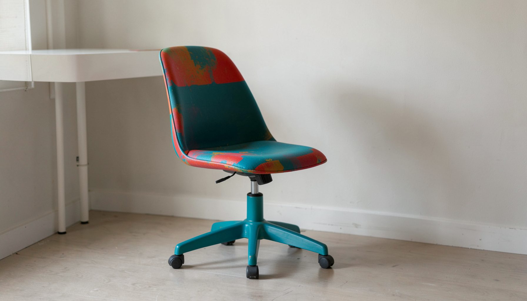
E-Decorating
Personalized design guidance delivered online — perfect for clients anywhere in the world who want a professional eye.
Learn More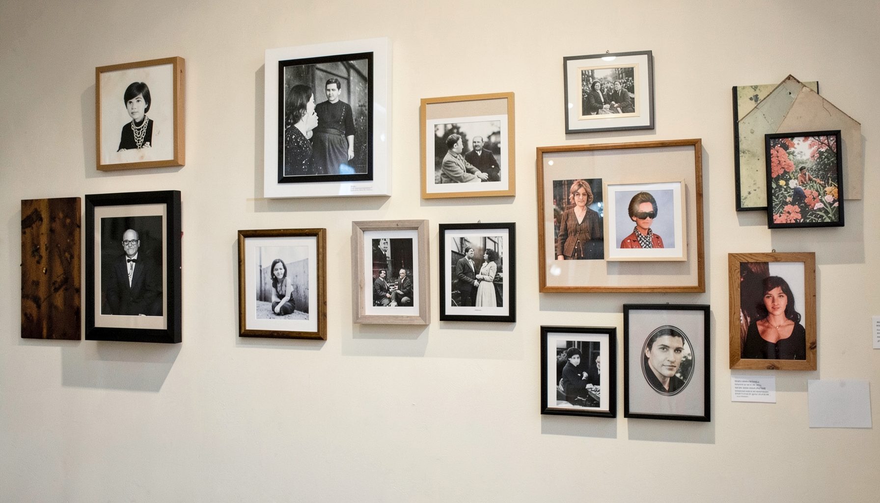
Portfolio
Browse completed room makeovers, before-and-after transformations, and styling projects from Bay Area homes.
Learn More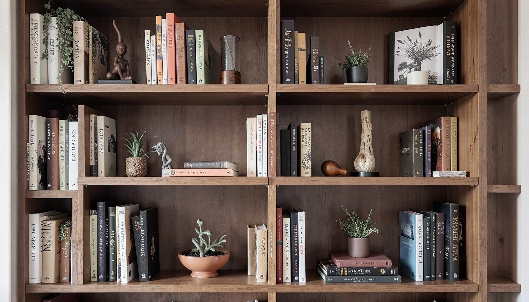
Blog
Interior design inspiration, fashion finds, entertaining ideas, and peeks into real home renovations and styling projects.
Learn More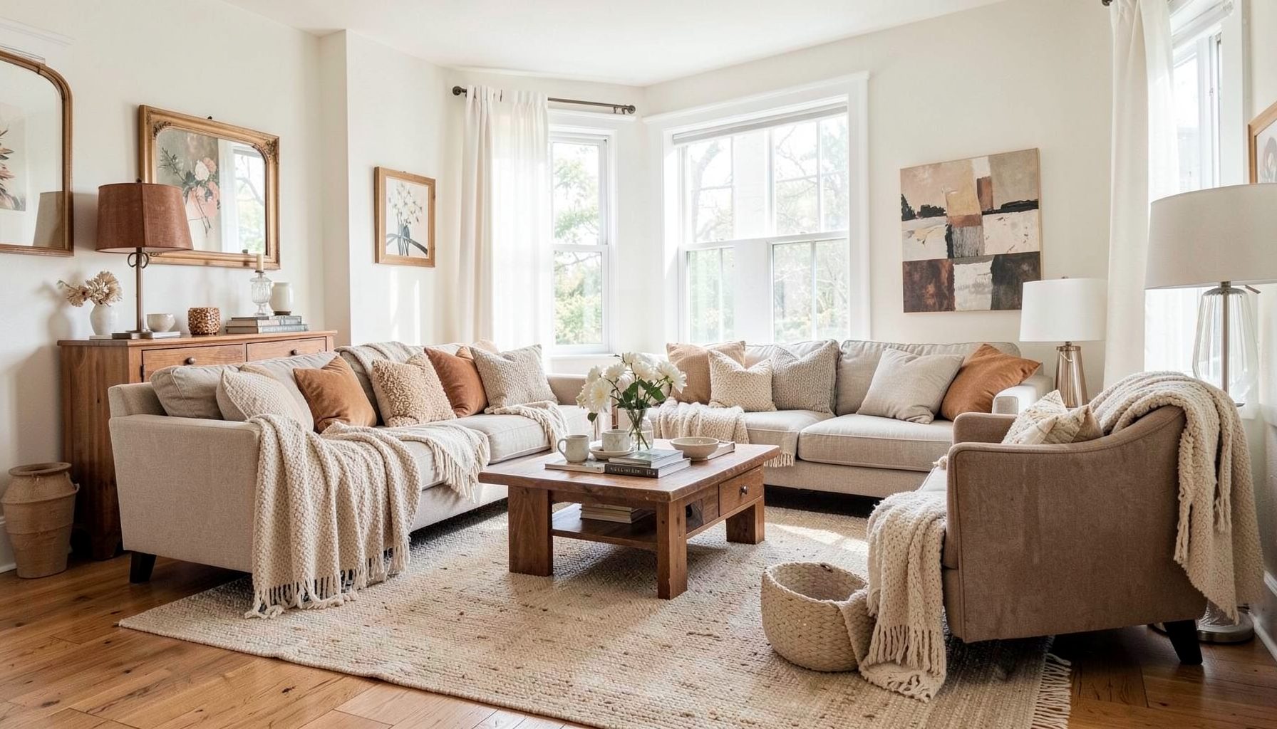
Downloads
Free curated resources for home decorating and design — guides, checklists, and inspiration to help you get started.
Learn MoreFrame prints beautifully without overspending
A thoughtful frame can turn an inexpensive print, poster, or flea-market find into a finished piece of room décor. The goal is not to make every artwork look formal or expensive. It is to give the image enough structure, breathing room, and visual weight to feel intentional within your home.
Framing also offers a practical way to bring personality into a layered interior. A vintage botanical, a contemporary art print, a child’s drawing, or a travel poster can sit comfortably beside collected objects and modern furnishings when the frame relates to the room’s colors, materials, and proportions.
With a few professional techniques, you can avoid common framing mistakes and create a polished result at a manageable price. The right paper, mat, frame profile, glazing, and hanging placement will make a larger difference than the cost of the artwork itself.
Choose artwork that rewards framing
Start with the print rather than the frame. Look for artwork with a clear focal point, appealing colors, and enough resolution to look crisp at the size you want. Open-edition prints, museum posters, digital downloads, vintage maps, and pages from old books can all become compelling wall art when presented with care.
Before buying or printing, measure the artwork and consider its visual orientation. A tall botanical print may suit a narrow wall, while a wide landscape poster could anchor a console or sofa. If the image has a strong border or lettering near the edges, leave plenty of room around it so the design does not feel cramped beneath the mat.
Paper quality matters, especially for pieces you hope to keep for years. Choose acid-free or archival paper when possible, and avoid thin copy paper for large prints because it can wrinkle and appear temporary. A heavier matte stock usually reduces glare and gives budget artwork a more substantial presence.
For vintage or irreplaceable pieces, inspect the surface before framing. Foxing, fading, tears, and brittle edges may require professional conservation rather than a quick craft-store solution. Affordable framing is a good fit for replaceable prints; valuable originals deserve archival materials and specialized handling.
Build a frame-ready foundation
A professional-looking result begins with clean preparation. Wash and dry your hands before handling the print, and work on a flat, dust-free surface. Use a soft brush or air blower to remove loose particles. Avoid wiping delicate paper with a damp cloth, since moisture can spread marks or distort the sheet.
If the print has curled from storage, do not force it flat with heavy objects directly on top of the image. Place it between clean sheets of paper and let it rest under a broad, even weight for a day or two. Severe curling, creases, or waves can worsen when sealed behind glass, so address them before assembly.
The artwork should usually be mounted so it does not touch ordinary glass. A mat creates a protective air space and adds visual breathing room. If you are using a floating mount or a frame without a mat, choose spacers to keep the paper separated from the glazing.
Use archival mounting corners, photo-safe hinges, or acid-free mounting strips whenever the artwork has lasting value. Avoid permanent spray adhesive, standard masking tape, and rubber cement. These products can stain paper, become brittle, or make future removal nearly impossible.
| Framing choice | Best for | Visual effect | Budget note |
|---|---|---|---|
| Ready-made frame with included mat | Standard-size prints and posters | Clean and uncomplicated | Usually the most economical option |
| Simple wood frame with custom-cut mat | Art that needs better proportions | More tailored and finished | Spend on the mat before upgrading the frame |
| Clip frame | Temporary displays and casual posters | Minimal and lightweight | Inexpensive, but offers little paper protection |
| Floating frame | Deckled edges, textiles, and layered artwork | Contemporary and dimensional | Costs more, but creates a distinctive presentation |
| Vintage frame with new backing | Thrifted art and collected interiors | Characterful and one-of-a-kind | Check stability and replace damaged components |
Select the right frame profile
The frame should support the artwork without competing with it. A slim black frame can sharpen a graphic poster, while warm oak can soften a modern print and connect it to wood furniture. Brass, antique gold, and painted finishes work well when repeated in small accents elsewhere in the room.
Frame width affects the perceived scale of the artwork. A tiny frame around a large print may look insubstantial, while an overly ornate frame can overpower a quiet image. For most posters and art prints, a moderate profile between one-half and two inches offers enough presence without dominating the composition.
Consider the room’s existing language. In a relaxed, collected space, mixing frame finishes often feels more natural than matching every edge. Keep one element consistent, such as the mat color, frame depth, or overall tone. This creates cohesion while preserving the layered quality that makes a room feel personal.
Thrift stores and resale markets can be excellent sources for inexpensive frames. Look beyond the artwork inside and assess the frame itself. A dated print may be unappealing, while its solid wood frame has beautiful proportions. Check the corners, glazing, backing, and hanging hardware before purchasing, and factor in the cost of replacing anything damaged.
Create a professional mat and border
A mat is one of the most effective ways to make affordable artwork look elevated. It separates the image from the frame, adds scale, and gives the eye a calm place to rest. White is versatile, but soft white, warm ivory, pale gray, and muted natural tones can be more flattering in a residential setting.
Avoid choosing a mat color by matching one tiny detail in the artwork. Instead, consider the dominant temperature and the surrounding room. A warm ivory may complement a vintage poster and wood furnishings, while a cool white could make a crisp black-and-white photograph feel cleaner.
The border should be proportional to both the artwork and the wall. A narrow mat can work for a small print, but larger art often benefits from a wider border. As a general starting point, make the mat visible enough to feel deliberate rather than like a narrow strip left over from an ill-fitting frame.
Slightly larger space at the bottom of the mat is a traditional framing detail that helps the artwork appear visually balanced. It is especially useful when the image is dark or dense near the lower edge. For a casual poster or modern graphic, equal borders can look equally appropriate, so let the style of the piece guide the decision.
When buying a custom mat, request acid-free board and a clean, precise window opening. A standard-size frame paired with a custom-cut mat is often a smart compromise. You gain the tailored appearance of professional framing while avoiding the expense of a fully custom frame and glazing package.
Choose glazing and backing wisely
Glass protects artwork from dust and accidental contact, but ordinary glass can create reflections and allow ultraviolet light to affect sensitive paper. Acrylic is lighter and safer for large pieces or homes with children, although it can scratch and attract static. Use a soft microfiber cloth and follow the manufacturer’s cleaning directions.
For art displayed in bright rooms, UV-filtering glazing offers an extra layer of protection. It will not prevent all fading, and it cannot reverse existing damage, but it can slow deterioration. Keep artwork away from direct sunlight, radiators, damp areas, and walls that experience major temperature changes.
The backing should be firm, clean, and properly fitted. Flimsy cardboard can bow over time, causing the artwork and mat to shift. Acid-free backing board is a worthwhile upgrade for prints you care about, and it is often less expensive than replacing damaged art later.
Seal the back of the frame with appropriate framing tape if you want to reduce dust infiltration. Do not seal a damp or recently cleaned artwork inside the frame. Any trapped moisture can create a serious conservation problem, particularly in humid conditions.
Hang and style the finished piece
Good framing can be undermined by poor placement. A single artwork usually feels connected to the room when its center sits around eye level, although furniture and ceiling height should influence the final position. Above a sofa, console, or bed, leave enough breathing room so the art does not appear attached to the furniture.
For a gallery wall, begin by measuring the overall area and arranging paper templates on the wall. Painter’s tape can mark the outside edges, while paper cutouts help you test spacing before making holes. Keep the gaps relatively consistent, then allow small variations if the collection includes mixed frame sizes and styles.
Use the largest or most visually important piece as an anchor. Place smaller works around it with attention to color, scale, and negative space. Matching every frame is unnecessary; repeating two or three finishes, such as black, natural wood, and brass, can make an eclectic arrangement feel composed.
A picture ledge is another budget-friendly display option. Leaning prints allows you to rotate artwork without creating new holes, and overlapping frames creates a relaxed, collected appearance. Add a small object, vase, or sculptural piece for depth, but keep the arrangement restrained enough that the art remains the focus.
Spend where it changes the result
A limited budget does not require every component to be the cheapest available. Prioritize the elements that affect protection and proportion, then save on decorative details that can be changed later. These choices provide a reliable starting point:
- Choose a well-proportioned ready-made frame and invest in a custom mat when the standard opening feels cramped.
- Buy archival paper and mounting materials for artwork you plan to keep, while using basic materials for temporary posters.
- Search thrift shops, estate sales, and local resale listings for solid frames with attractive profiles.
- Use a larger inexpensive print with a generous mat to create presence instead of buying several small pieces that feel disconnected.
- Reuse frames throughout the home by replacing outdated artwork, backing, or hardware rather than discarding the entire piece.
Online printing can also reduce the cost of framing a favorite image. Compare paper finishes and shipping costs, and order a small test print before committing to a large size. Matte paper usually photographs well and minimizes glare, while semi-gloss can bring out color but may need careful placement away from windows.
If a frame is almost right but the finish feels wrong, consider a small update. Lightly sanding and painting a wood frame can give it a fresh color, while wax or a toned finish can make a new frame feel more established. Test any paint or treatment on an inconspicuous area first, and protect the glazing from overspray.
Make the finished piece feel like yours
The best framed artwork reflects the people and rhythms of the home. A low-cost poster can carry more meaning than an expensive piece chosen only to fill a blank wall. Pair travel memories with inherited objects, combine contemporary prints with vintage furniture, and let a few imperfect details add warmth.
Maggie Rose Interiors approaches decorating with this same balance of polish and personality, blending vintage and modern pieces, investment furnishings and accessible finds. Whether you are refreshing one wall or shaping an entire room, thoughtful framing can help your artwork become part of a layered, collected interior.
For personalized help choosing artwork, coordinating frames, or creating a room that feels both beautiful and lived-in, connect with Maggie Rose Interiors for full-service interior decorating, online e-decorating, or focused design guidance in the Bay Area and beyond. Small, well-considered decisions can give even the most affordable print a lasting place in your home.

Recent Projects