Interior Design
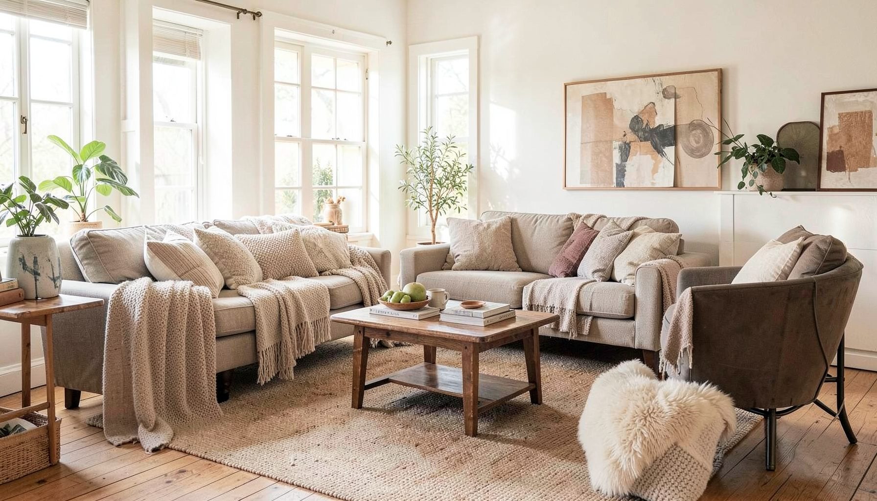
Full-service decorating that blends high and low, vintage finds with modern pieces for spaces that feel personal and collected.
Learn More
DIY Projects
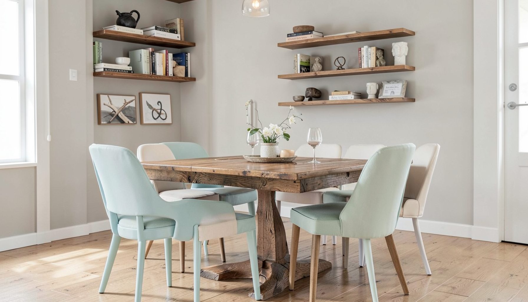
Step-by-step tutorials for refinishing furniture, sewing pillows, styling bookshelves, and transforming rooms on a budget.
Learn More
E-Decorating
Personalized design guidance delivered online — perfect for clients anywhere in the world who want a professional eye.
Learn More
Portfolio
Browse completed room makeovers, before-and-after transformations, and styling projects from Bay Area homes.
Learn More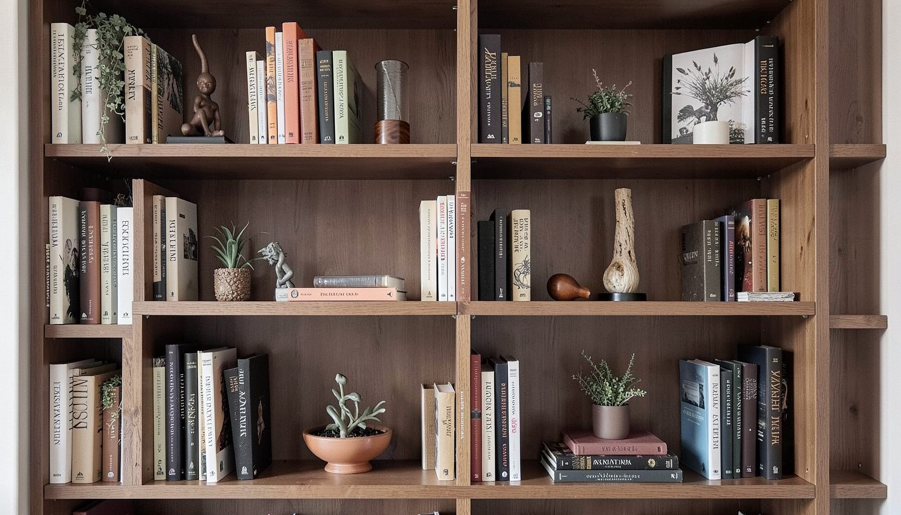
Blog
Interior design inspiration, fashion finds, entertaining ideas, and peeks into real home renovations and styling projects.
Learn More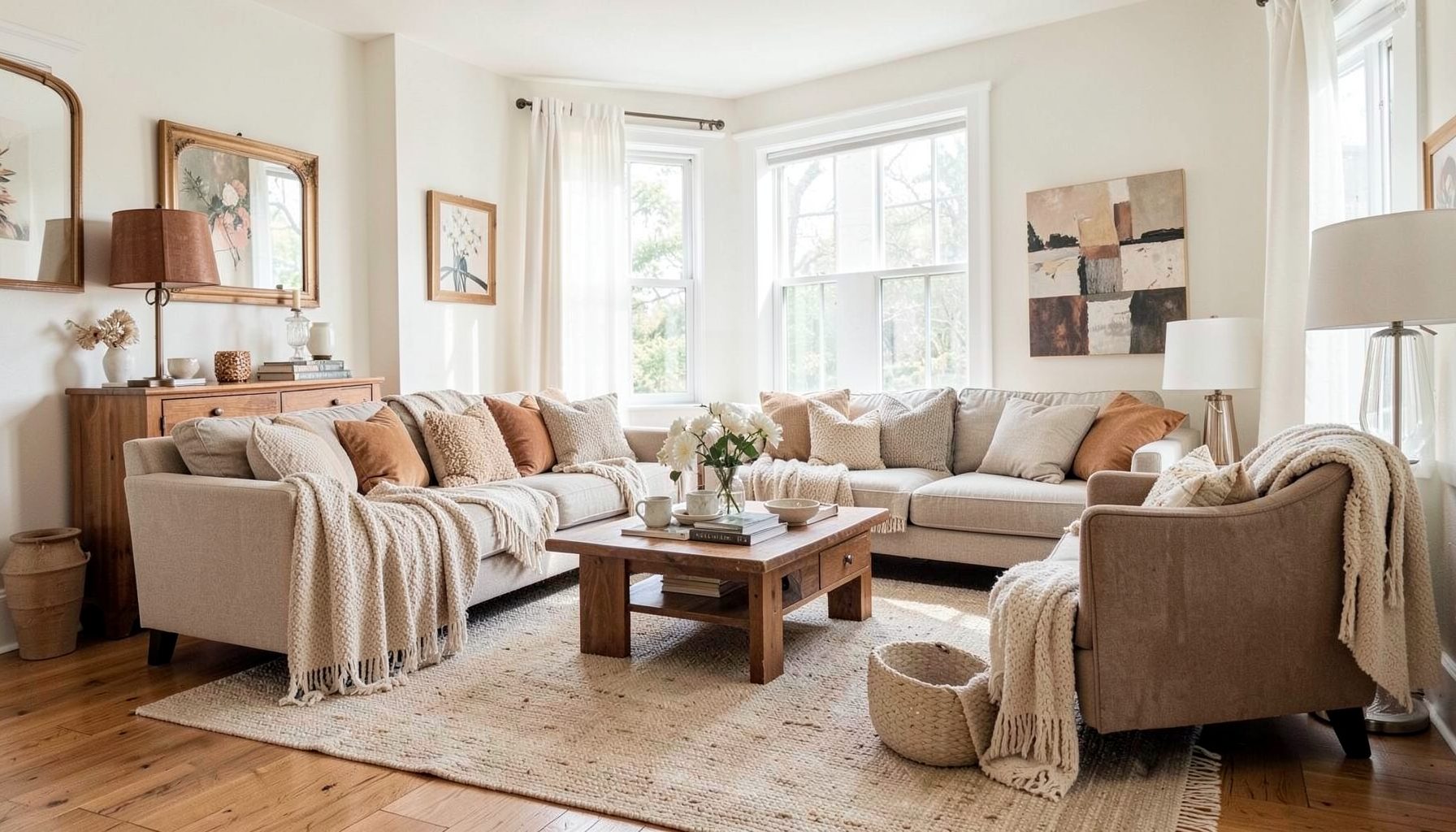
Downloads
Free curated resources for home decorating and design — guides, checklists, and inspiration to help you get started.
Learn MoreHow to add colour to a neutral kitchen with a painted island
A neutral kitchen offers a calm, flexible foundation, but an all-white, grey or timber scheme can sometimes feel unfinished. A painted island gives the room a clear focal point without requiring a full renovation. It introduces personality, defines the working zone and creates an opportunity to connect cabinetry with artwork, upholstery, lighting and nearby living spaces.
The best colour choices feel considered rather than overly matched. A soft green can bring a garden-inspired quality to a Melbourne kitchen, while a deep blue may suit a coastal home in Brisbane or a sophisticated apartment in Sydney. With the right undertone, finish and surrounding materials, a coloured kitchen island can look collected, practical and completely at home.
Start with the character of the room
Before choosing a paint swatch, consider what the neutral kitchen already communicates. Warm white cabinetry, honey-toned timber flooring and brass hardware will usually work well with earthy colours such as olive, clay, muted terracotta or smoky blue. Cool white cupboards, pale stone and stainless steel may suit mineral greens, charcoal, navy or blue-grey.
The island should support the architecture rather than compete with it. In a period home, a rich heritage green or quietly distressed blue can echo original details. In a streamlined apartment, a flat, contemporary colour may give the room enough contrast without making it look fussy. Homes in Australia receive very different kinds of light, too. Strong northern light can make pale colours appear brighter, while shaded southern rooms may need a warmer, clearer shade to avoid looking dull.
It helps to take samples into the kitchen at different times of day. Place them near the benchtop, splashback and floor, then observe them in morning sun, afternoon light and evening artificial light. A colour that appears gentle in a paint shop can become surprisingly intense beside glossy white cabinetry.
Choose a colour that relates to the rest of the home
In an open-plan layout, the island is visible from the dining and living areas, so its colour should have at least one connection beyond the kitchen. This does not mean matching the sofa or painting every room the same shade. Instead, look for a shared undertone, a repeated accent or a material relationship.
For example, a muted sage island can sit comfortably with olive cushions, botanical artwork or a vintage rug in the adjoining living room. A charcoal island may relate to black window frames, pendant fittings or the veining in a marble-look benchtop. Even a restrained dusty pink can work when it appears in ceramics, artwork or a nearby fabric.
Australian homes often favour relaxed open-plan living, particularly in newer suburban builds and renovated coastal properties. That makes visual continuity especially valuable. If the kitchen opens directly towards a timber dining table, linen sofa or outdoor entertaining area, a complex colour with natural depth will generally feel more integrated than a bright primary shade.
Decide how much contrast you want
The strength of the colour relationship depends on the contrast between the island and the surrounding cabinetry. A subtle tonal scheme might pair warm white cupboards with a pale mushroom, putty or eucalyptus island. This approach adds dimension while keeping the kitchen light and visually spacious.
For greater impact, use a deeper shade such as ink blue, forest green, aubergine or warm black. Dark islands can anchor a large room and make pale surfaces feel more deliberate. They are particularly effective when balanced with light walls, open shelving or generous natural light. In a compact kitchen, however, a very dark island may feel visually heavy if it occupies most of the floor area.
The benchtop also influences the result. A white surface can sharpen the contrast, while timber softens a strong paint colour and adds warmth. If the island includes seating, consider the stools as part of the colour composition. Natural timber, woven seats or upholstered stools can keep the scheme layered instead of turning the island into a single block of colour.
Select the right paint finish
Kitchen cabinetry needs a coating that can withstand regular cleaning, cooking splashes and contact around handles and drawers. A quality water-based enamel or cabinetry-specific paint is usually more suitable than a standard wall paint. The final finish should be durable, smooth and easy to wipe without looking overly glossy.
Satin and low-sheen finishes are popular because they reflect enough light to be practical while concealing minor marks better than a high-gloss surface. A matte finish can look elegant and contemporary, although it may require extra care in a busy family kitchen. Test the actual product on a removable door or sample board before committing to the whole island.
Preparation is central to a professional result. Existing cabinetry may need thorough degreasing, light sanding, priming and repairs before colour is applied. Laminate, timber veneer and previously painted doors each require a slightly different process. In Australia, where a renovation may involve a local cabinetmaker or painter booked alongside several other trades, confirm the preparation method and drying times before the work begins.
Work with existing materials and hardware
A painted island can refresh a kitchen without replacing every element, but the new colour must work with fixed finishes. Examine the undertones in the floor, splashback, stone, tapware and appliances. A blue with a purple base may sit awkwardly beside yellow-toned timber, while a yellow-based green can clash with cool grey stone.
Hardware is a small detail with considerable influence. A soft green island with aged brass handles feels warm and collected. The same colour with brushed nickel can look cleaner and more contemporary. Black pulls create definition and suit modern farmhouse, industrial and minimalist interiors. You can also retain existing handles if their shape and finish already support the new direction.
Think about the island’s benchtop edge and side panels as well. A waterfall stone edge makes the colour feel crisp and architectural, while a decorative end panel can suit a more traditional design. Open shelves, turned legs or reeded detailing may call for a quieter shade so the overall composition remains balanced.
Use styling to make the colour feel natural
Once the island is painted, styling helps it settle into the room. Keep everyday items useful and beautiful: a timber chopping board, a ceramic fruit bowl, a linen tea towel or a collection of handmade serving pieces can soften a saturated colour. Choose a few items with related tones rather than filling the benchtop with accessories.
Lighting can enhance the painted finish. Two or three pendants above the island provide a practical layer while drawing attention to the central feature. Opal glass creates a softer effect, brass adds warmth and black metal brings graphic contrast. The scale should suit the island and ceiling height; oversized fittings can overwhelm a narrow work surface, while tiny pendants may disappear in a generous kitchen.
Plants and flowers are particularly effective with coloured cabinetry. Rosemary, eucalyptus, olive branches and leafy indoor plants complement the relaxed, natural style common in Australian interiors. In a home near the coast, woven baskets and pale timber can make a deep blue island feel breezy rather than formal. In an inner-city terrace, vintage glassware and artwork can give a darker island a more personal, layered quality.
Make the island practical as well as beautiful
Colour should never distract from the way the island functions. Work out whether it is primarily used for food preparation, casual meals, entertaining, storage or all four. A family island may need durable seating, deep drawers and a surface that tolerates daily use. A compact apartment island may work better with concealed storage and a slim overhang.
The most visible surfaces deserve particular care. Fingerprints show more readily on certain dark or high-sheen colours, especially around bin drawers and dishwasher panels. Mid-tone shades can offer a useful compromise between visual drama and maintenance. If children regularly use the island, select a finish that can be touched up and keep a small labelled tin of the final paint for future repairs.
Australian renovation projects also need to account for heat, humidity and active indoor-outdoor lifestyles. A Queensland kitchen may experience more humidity than a dry Adelaide home, while a beachside property may need finishes that cope with salt-laden air and frequent cleaning. Good ventilation, suitable products and properly sealed cabinetry will help the painted surface remain attractive for longer.
Create a layered, personal result
The strongest painted islands do not look like isolated colour experiments. They appear to have evolved with the home, combining practical decisions with pieces that carry character. A vintage stool, an inherited bowl, a contemporary pendant or a budget-friendly runner can all contribute to that sense of history.
This layered approach is central to the work of Maggie Rose Interiors, where vintage and modern furnishings, considered styling and personal details are brought together rather than treated as separate categories. The same principle can guide a kitchen update at any budget. You might invest in professional preparation and quality paint, then save with existing stools, second-hand artwork or simple open shelving.
If you are sourcing locally, Australian suppliers such as Bunnings, Laminex and Polytec make it easier to compare cabinetry colours, laminates and hardware before committing. Showrooms and sample doors are more useful than online images alone because colour changes according to surrounding finishes and daylight. A decorator can also help refine the palette, particularly when the kitchen connects to several rooms with different furniture and lighting.
A painted island is a relatively focused change, yet it can alter the atmosphere of the entire kitchen. It gives a neutral scheme warmth, rhythm and a strong visual centre while leaving the rest of the room adaptable. The colour does not need to be loud to be memorable; it simply needs to relate to the light, materials and life of the home.
What the reader should remember is that the most successful island colour is chosen as part of the whole interior. Sample it in real light, connect it to existing materials, use a durable finish and allow styling to add softness and personality. A carefully painted island can turn a quiet neutral kitchen into a space that feels welcoming, distinctive and genuinely lived in.

Recent Projects